You Might Like
-

Infographic Pencil with Data Elements -

Blue Declining Bar Graph with Arrow -

Circle Pie Chart Icon -

Book Icon with Blue Background -

34,046 CPS Appointments Text -

Pie Chart Representation -
Colorful Statistical Pie Chart -

Timeline Infographic Design -

Calculator and Chart Icon for Data Analysis -
Colorful Infographic for Data Presentation -

Line Graph for Data Visualization -
Colorful Infographic Data Visualization -
Colorful Infographic Chart -
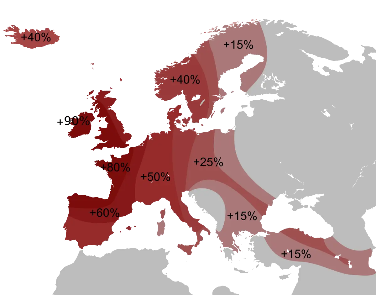
Percentage Map of Europe -

Key Considerations Infographic -
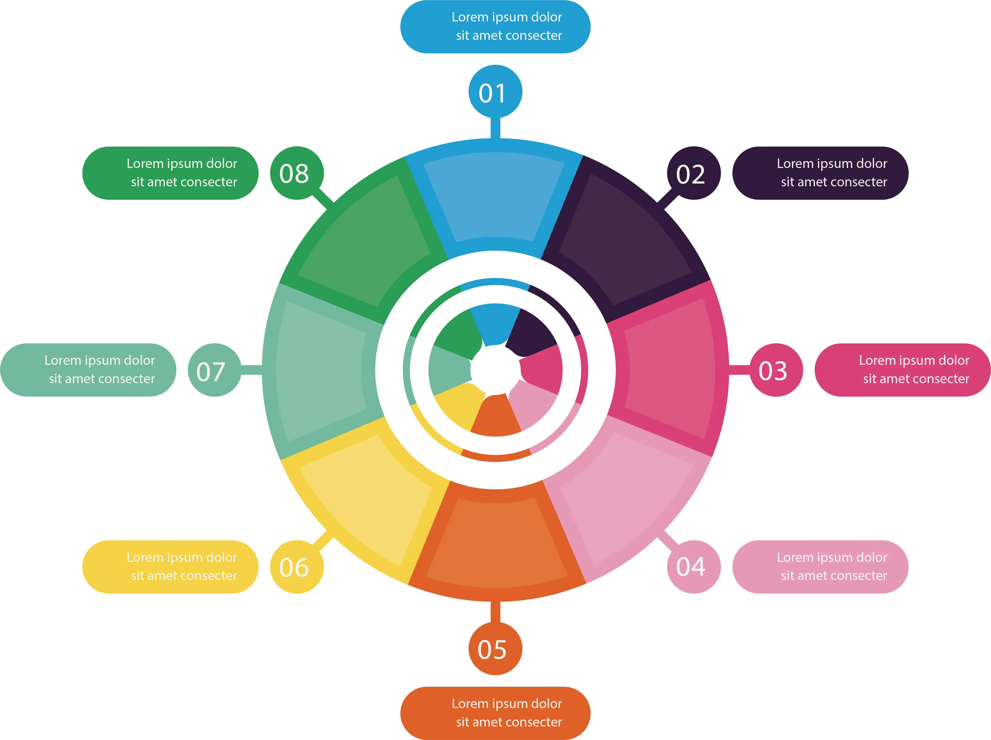
Colorful Infographic Diagram -

Vitruvian Man by Leonardo da Vinci -

Colorful Circular Chart -

Bar Chart Icon for Data Analysis -

Data Analysis Infographic Design -

House Statistics Icon for Real Estate Analytics -

Tablet with Graphs and Data Analysis -

Data Analysis Icon -

Blue Upward Arrow with Bar Chart Icon -

Data Analysis Document with Magnifying Glass -

Radiation Sources Pie Chart Infographic -
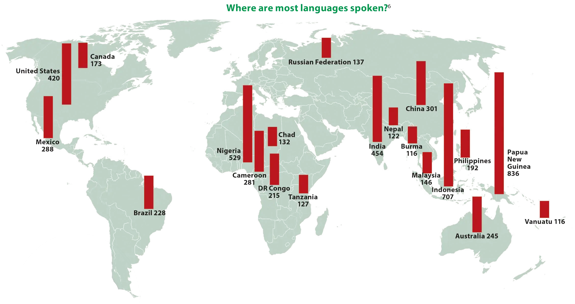
World Map Showing Language Distribution -

Upward Arrow on Bar Graph -

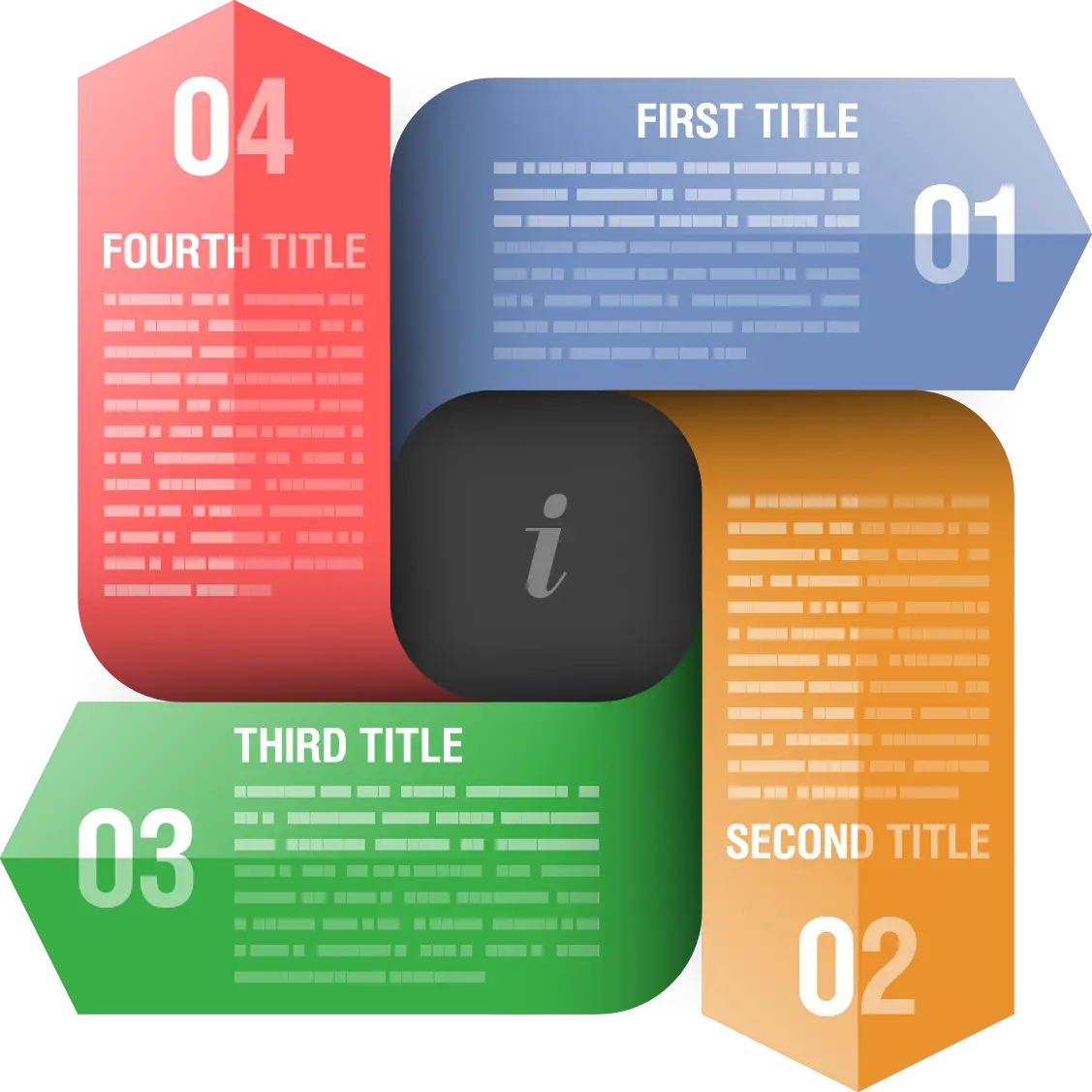
Hexagon Numbered Infographic Template -

Data Analysis Bar Chart on Monitor