You Might Like
-

Team with Growth Graph Illustration -

Business Strategy Icons -
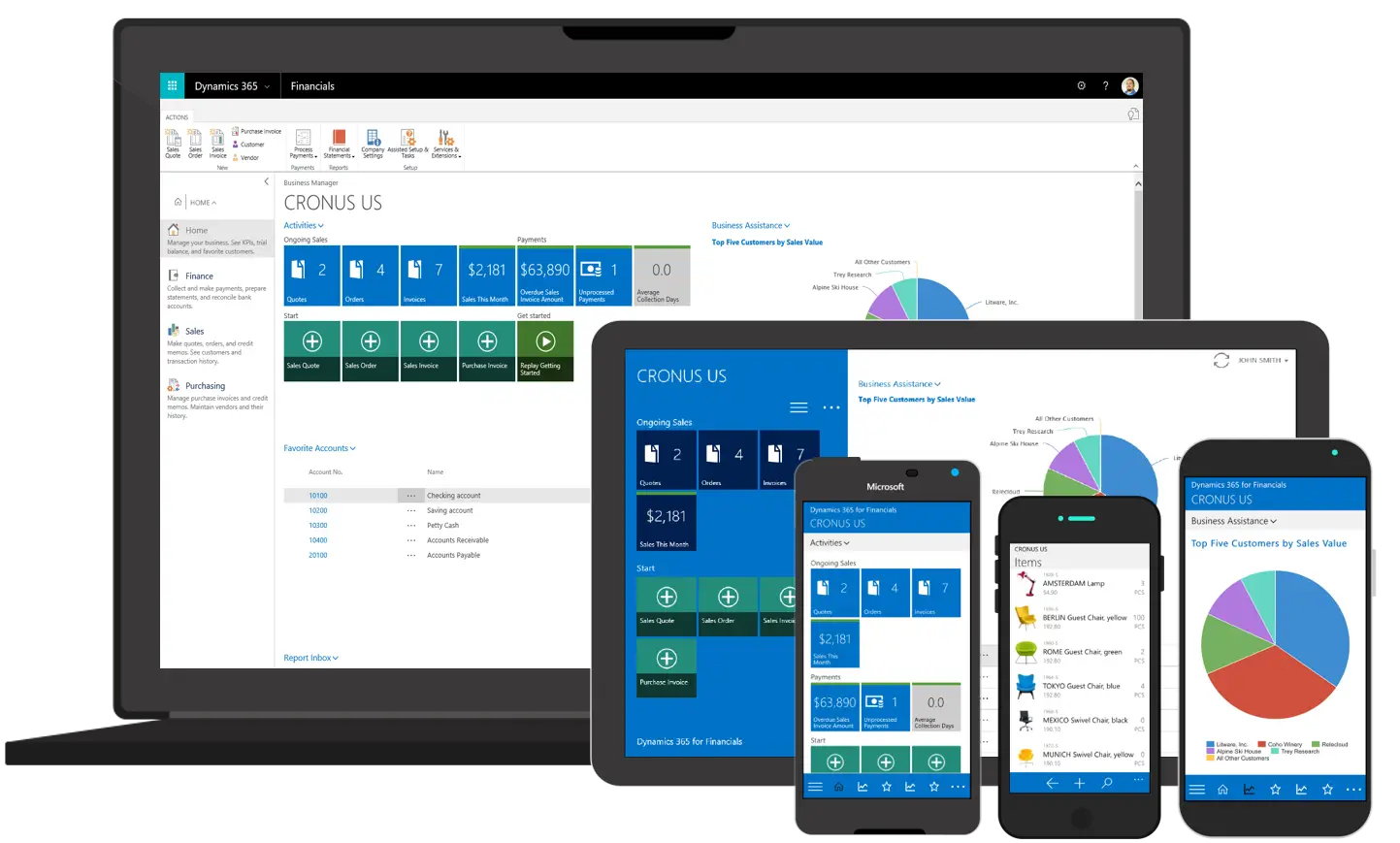
Various Devices Displaying Software -

Icon of KPI Dashboard with Graph and Person -

Zigzag Down Arrow Icon for Decline Representation -

Presentation Board with Graph for Business Concepts -

Bar Chart with Upward Arrow -

Infographic Pencil with Data Elements -

Search Growth Icon -

Illustration of Growth Chart with Upward Arrow -

SEO Concept with Magnifying Glass and Computer -

Blue Declining Bar Graph with Arrow -

Business Icons Set for Digital Workflows -

Declining Chart Illustration -

Light Bulb with Globe and Analytics -

Digital Devices with Graph -

Clipboard Illustration with Financial Chart for Data Analysis -

Magnifying Glass with Graph Illustration -

McKinsey Global Institute Logo -

Calculator and Chart Icon for Data Analysis -
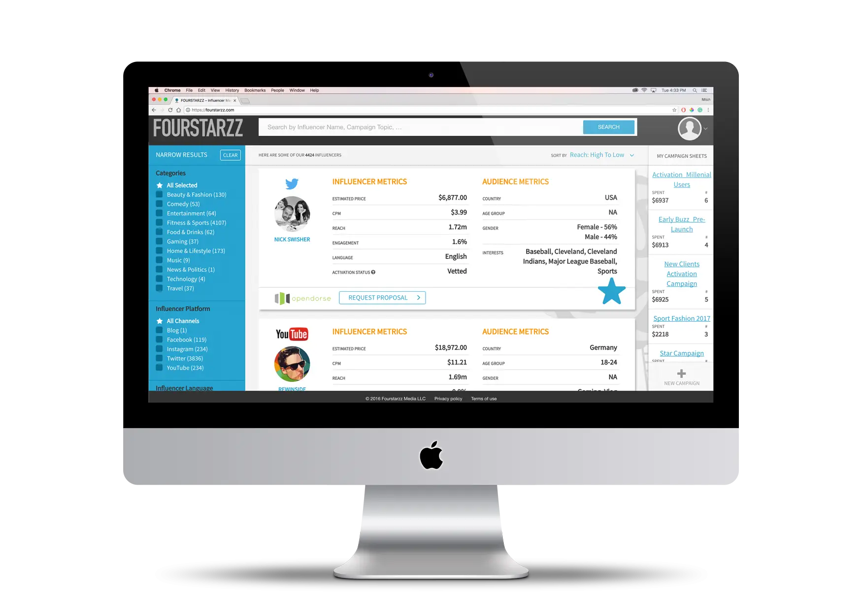
Computer Screen with Interface -

Person in Wheelchair Analyzing Data -

Upward Arrow on Graph -

Line Graph for Data Visualization -

Mobile Data Analysis Graph -

Time and Money Management Chart -

Clipboard and Calculator Icon -

Professional Team Meeting with Presentation -

Data Analysis Infographic Design -

House Statistics Icon for Real Estate Analytics