
You Might Like
-
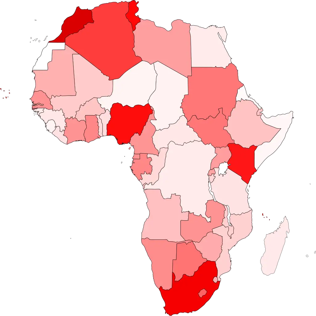
Colored Regional Map of Africa -

Checkmark Symbol Inside a Circle -

Team with Growth Graph Illustration -

Organizational Structure Chart -

Splashing Water Circle Illustration -
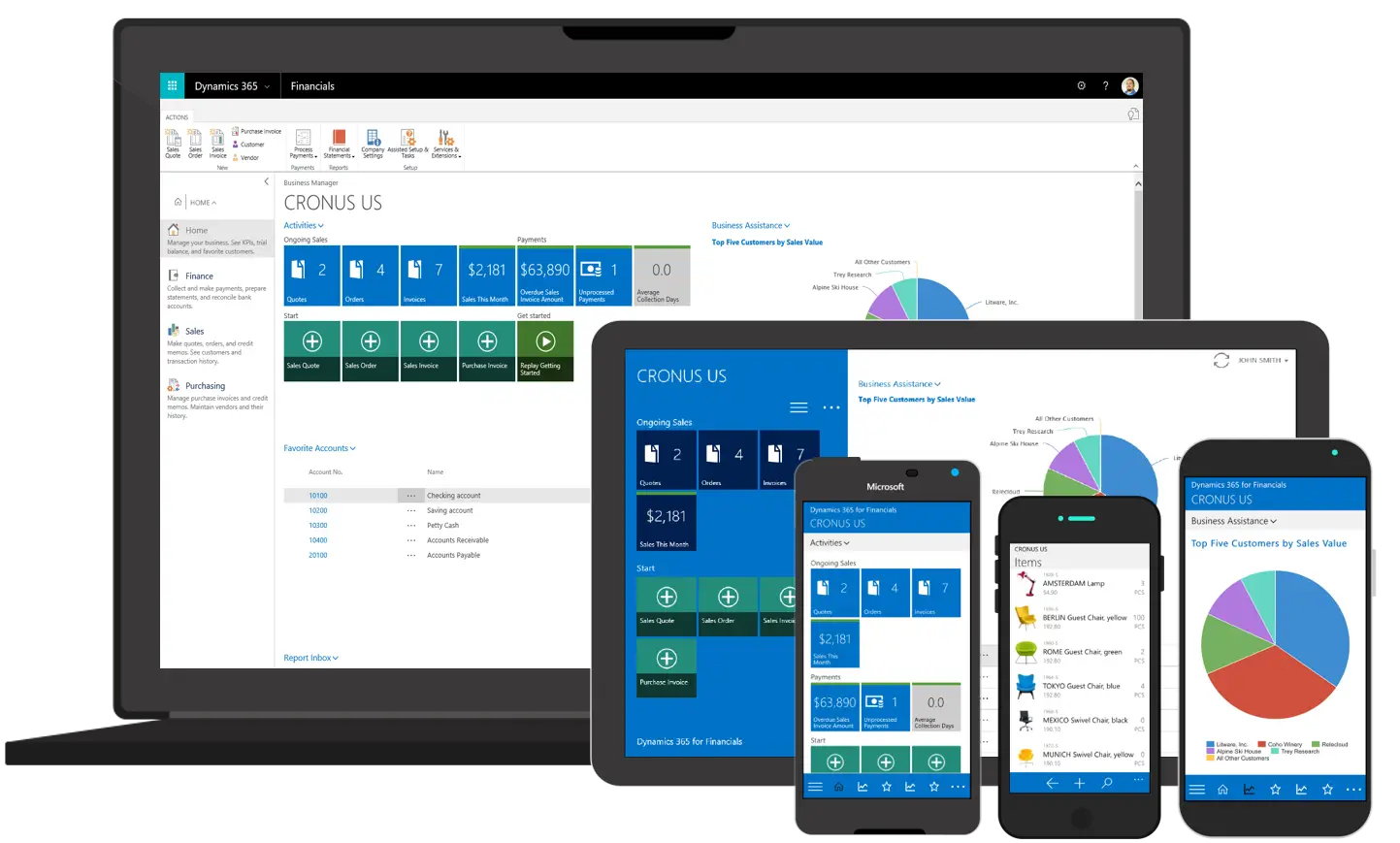
Various Devices Displaying Software -

Complete Blue World Map -

Icon of KPI Dashboard with Graph and Person -

Yellow Ethernet Cable for Network Connections -

Bar Chart with Upward Arrow -

Colorful Bookshelf -
Color Wheel for Artistic Inspiration -

Black Circular Frame or Ring Outline -

Search Growth Icon -

Illustration of Growth Chart with Upward Arrow -

Business Icons Set for Digital Workflows -

Circle Pie Chart Icon -

Grunge Circle Frame -

Simple Geometric Shape Outline -

Bull Market Symbol -

Document Processing Cycle -

Green-Circled Ying-Yang Symbol Logo -

Medical Cloud Symbol -

Number 3 in Circle -

Circle of Green Leaves -

Artificial Intelligence Laptop Interface Illustration -

Internal Hard Disk for Computer Storage -

Book Icon with Blue Background -

Abstract Grunge Black Circle Design -

Pie Chart Representation