
You Might Like
-

Blue Spiral Pattern Design -

Stylish Black Wreath with Simple Leaf Motif -

Black Mandala Decorative Pattern Design -

Organizational Structure Chart -

Transparent Soap Bubbles with Blower -
Black and White Mandala Design Outline -

Minimalist Orange Circular Logo -

Antiquated Ornate Golden Frame -

Green Soup with Bubbles Illustration -
J-Hope on the Street Logo for Music Enthusiasts -

Pink Circular Pattern Background -

Yellow Circular Arrow Symbol for Recycling -

Bar Chart with Upward Arrow -

Infographic Pencil with Data Elements -
Circular Stained Glass Artwork -

Minimalist Circular Update Icon Design -

Colorful Sparkling Circle Design -

Purple Wreath Leaves for Elegant Decoration -

Circle Pie Chart Icon -
Intricate Black Mandala Pattern -

Green Leaf with Arrows for Recycling Concept -

Double Snake Symbol -

Circular Refresh Arrow Icon -

Decorative Blue Circle with Flowers -

Book Icon with Blue Background -

Pie Chart Representation -

Flag of Germany in Circular Design -
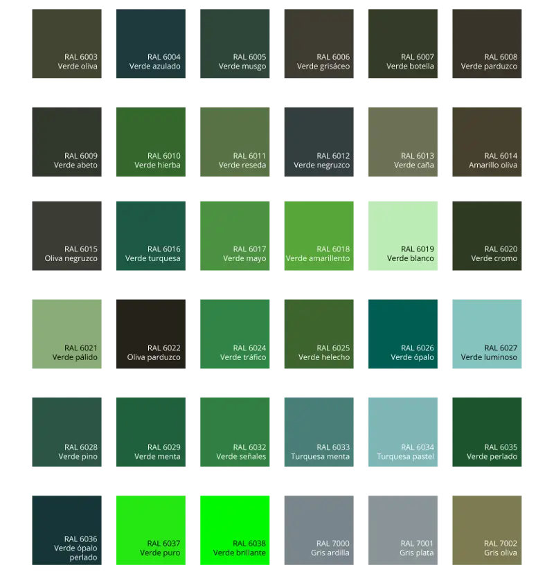
Green Color Palette Chart -

Clipboard Illustration with Financial Chart for Data Analysis -

Stylized G Logo