You Might Like
-
Colored Regional Map of Africa -

Team with Growth Graph Illustration -

Organizational Structure Chart -
Various Devices Displaying Software -

Complete Blue World Map -

Icon of KPI Dashboard with Graph and Person -

Yellow Ethernet Cable for Network Connections -

Bar Chart with Upward Arrow -

Infographic Pencil with Data Elements -

Stack of Hay Bales in Agricultural Setting -
Colorful Bookshelf -
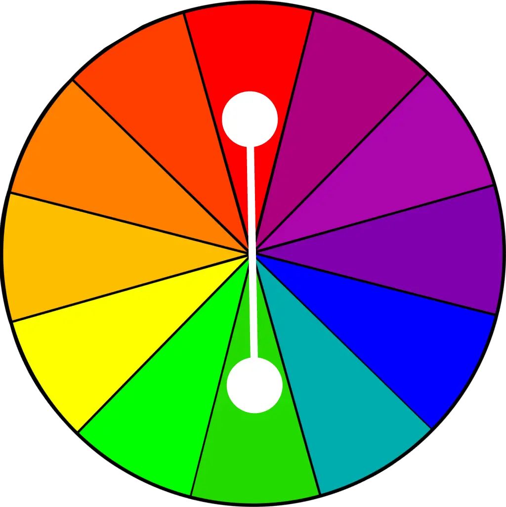
Color Wheel for Artistic Inspiration -

Search Growth Icon -

Illustration of Growth Chart with Upward Arrow -

Business Icons Set for Digital Workflows -

Circle Pie Chart Icon -

Bull Market Symbol -

Document Processing Cycle -

Medical Cloud Symbol -

Artificial Intelligence Laptop Interface Illustration -

Internal Hard Disk for Computer Storage -
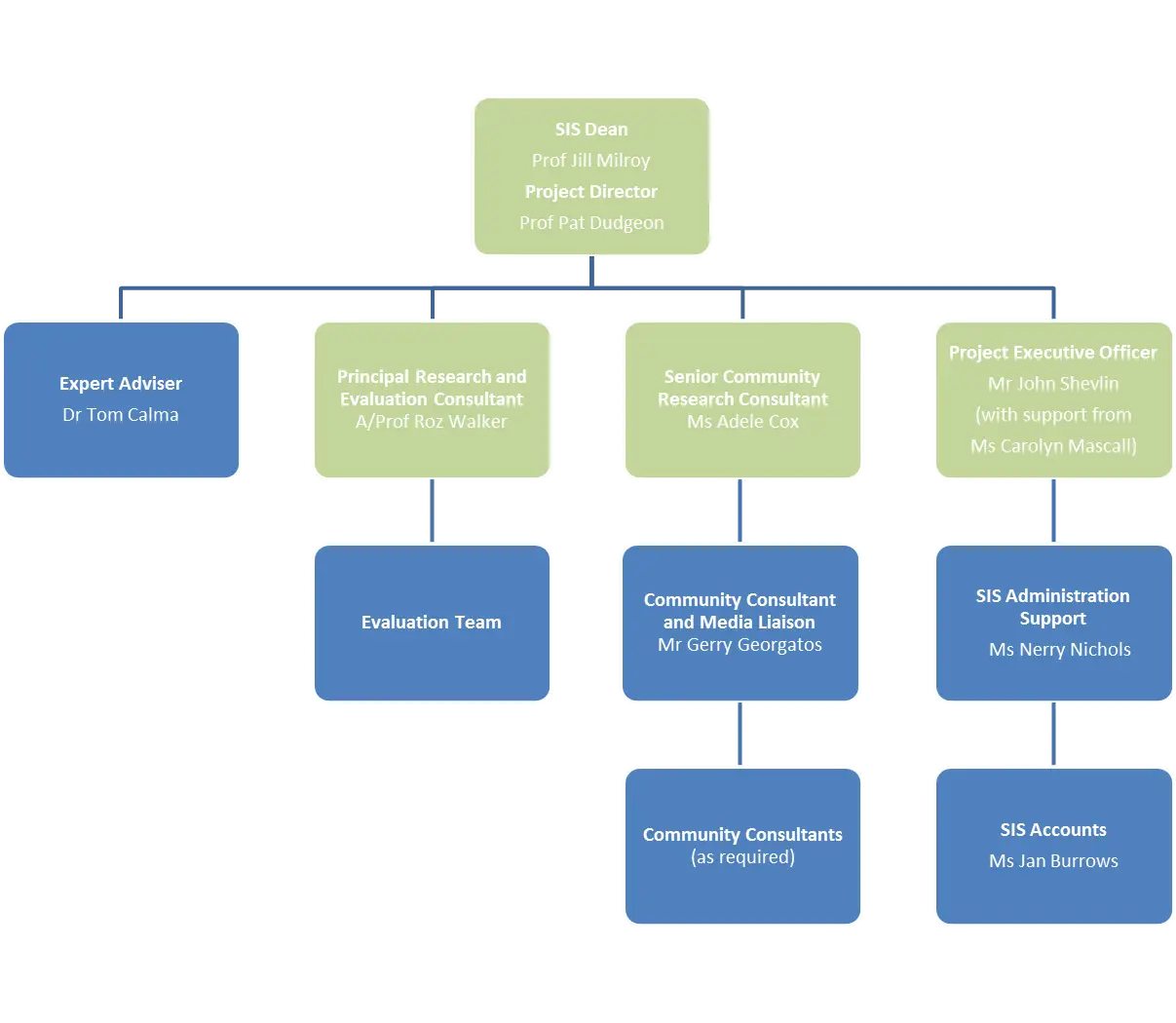
Organizational Flowchart Diagram -

Book Icon with Blue Background -

Pie Chart Representation -
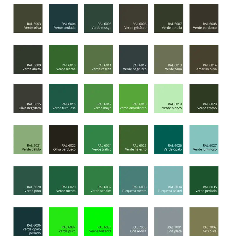
Green Color Palette Chart -

Digital Devices with Graph -

Clipboard Illustration with Financial Chart for Data Analysis -

Magnifying Glass with Graph Illustration -

Internal Computer Hard Disk Drive -

Network Globe Icon