
You Might Like
-

Hand Holding Plant with Energy Symbol -

Colorful Stack of Books with Decorative Leaves -

Organizational Structure Chart -

Sun and Hands Symbol -

Presentation Board with Graph for Business Concepts -
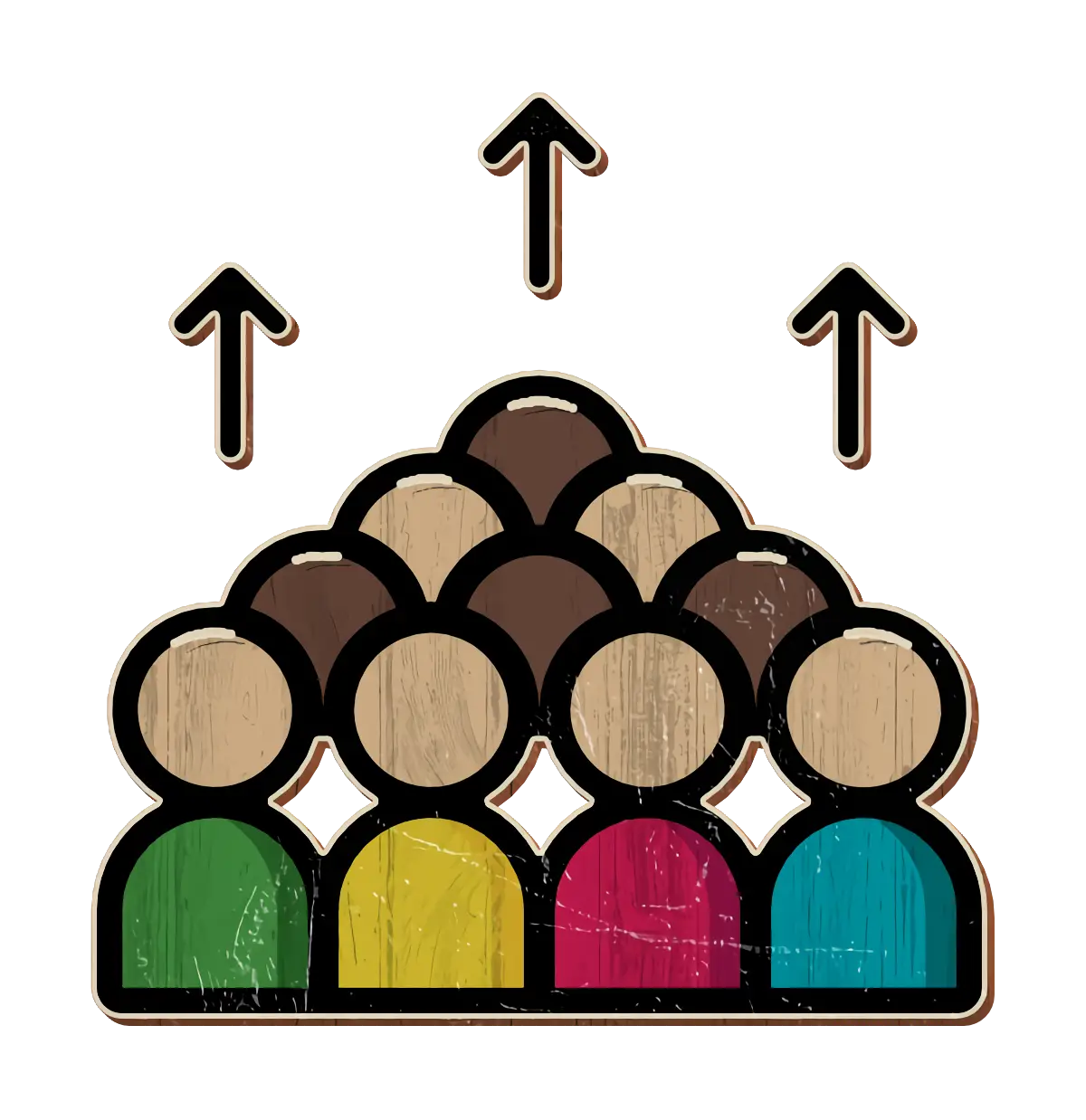
Group of People with Upward Arrows -

Bar Chart with Upward Arrow -

Infographic Pencil with Data Elements -

Search Growth Icon -

Illustration of Growth Chart with Upward Arrow -

Business People with Circular Chart -

Old Tree with Branches and Leaves -

Curved Black Upward Arrow -
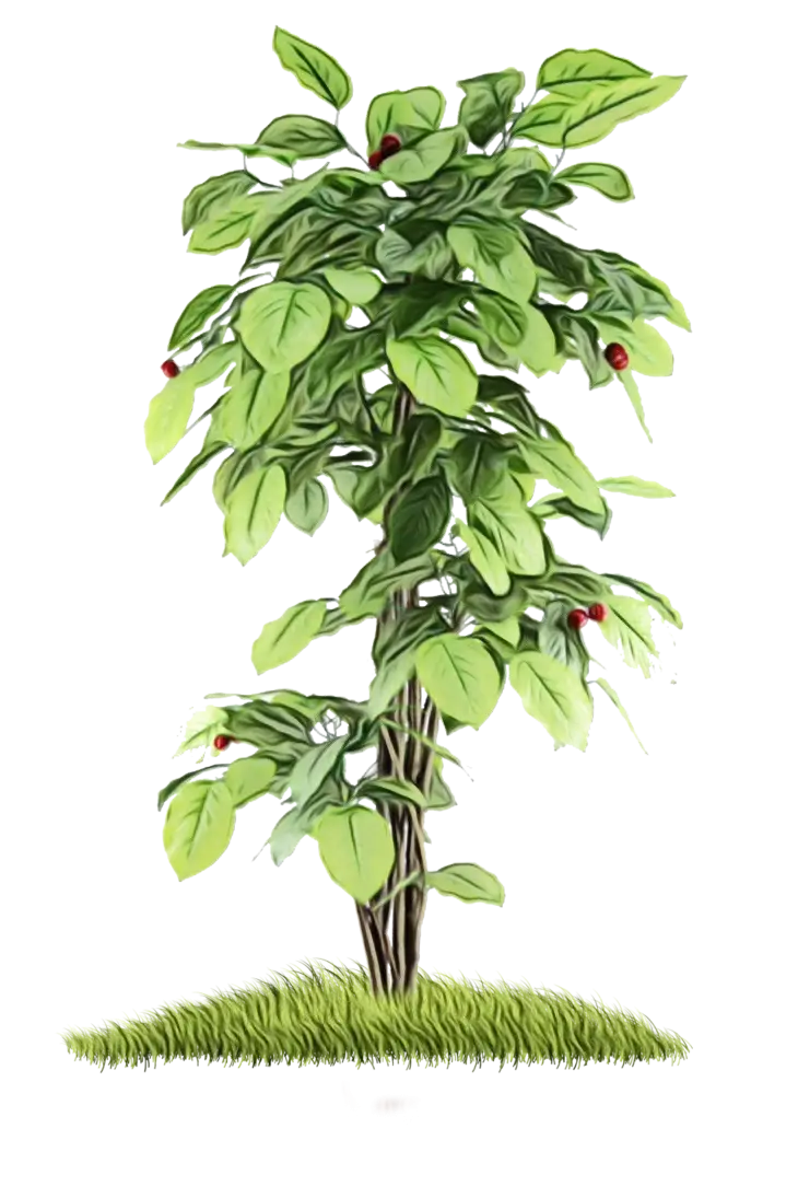
Green Tree with Red Fruits and Grass -

Pink Lotus Bud Flower -

Green Vine Leaves -
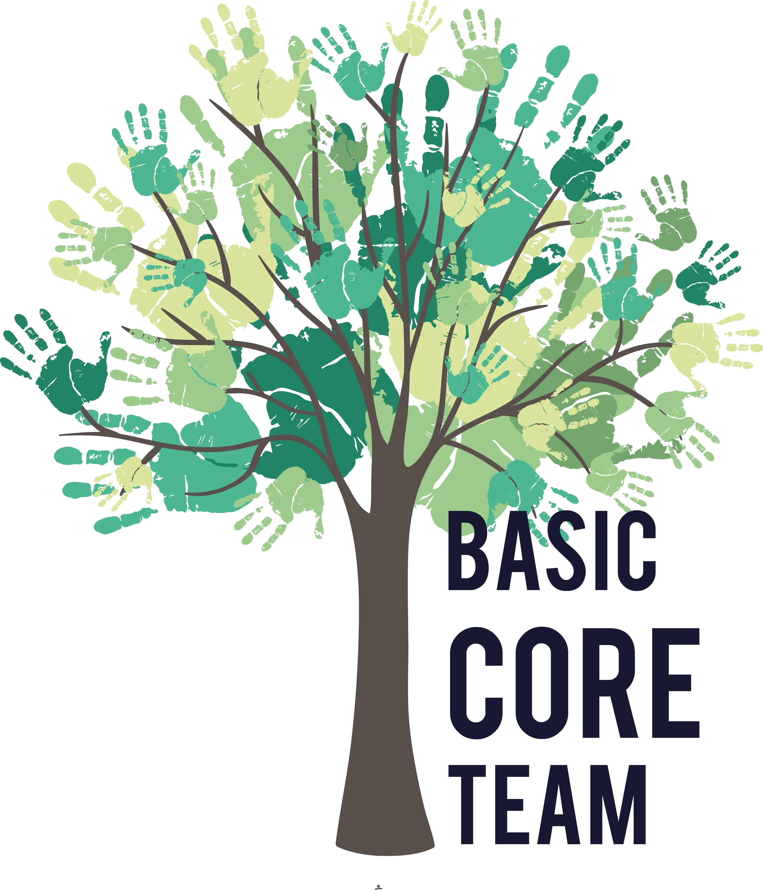
Tree with Handprints for Team Collaboration -

Circle Pie Chart Icon -

Bull Market Symbol -
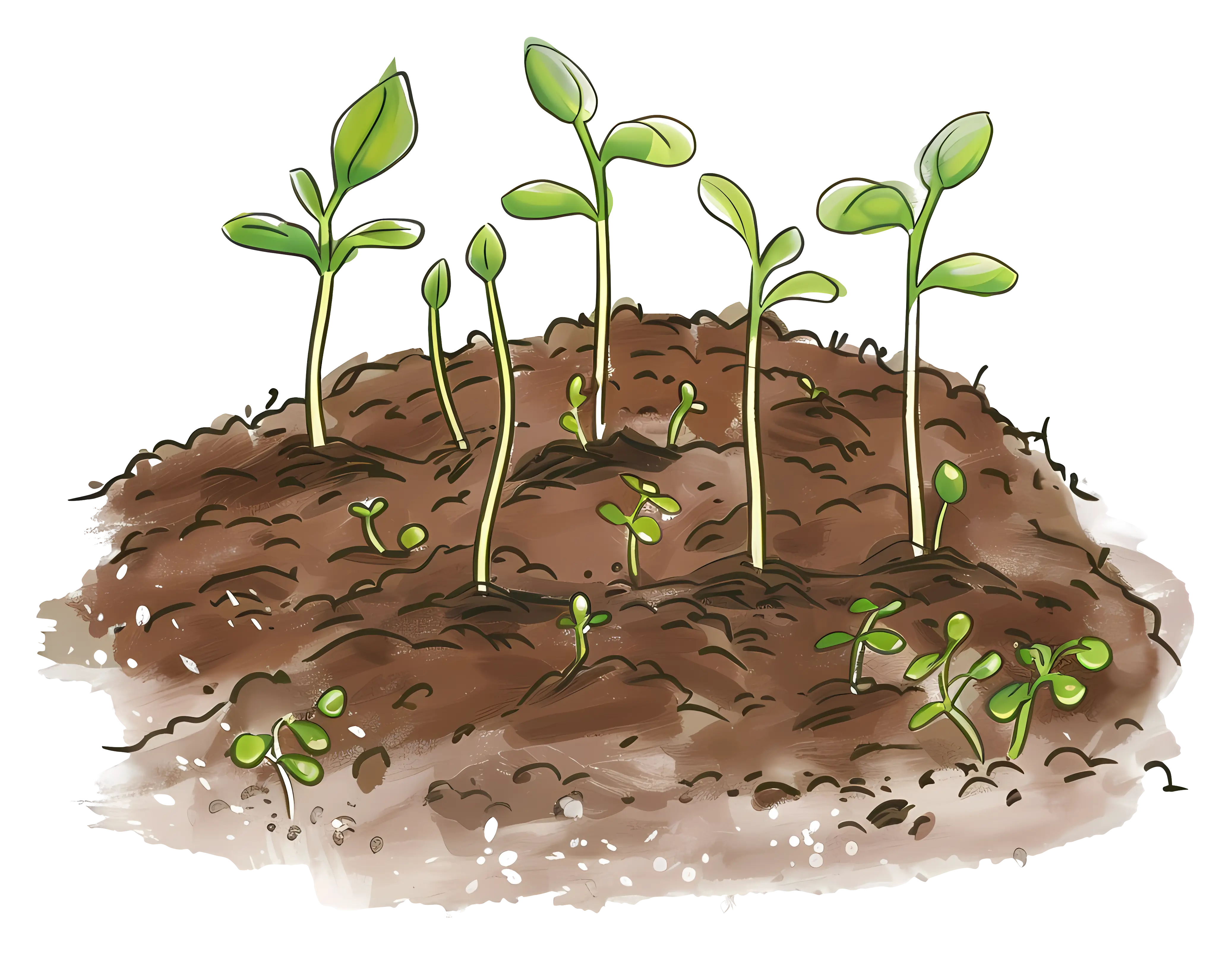
Young Seedlings in Soil -

Book Icon with Blue Background -

Pie Chart Representation -
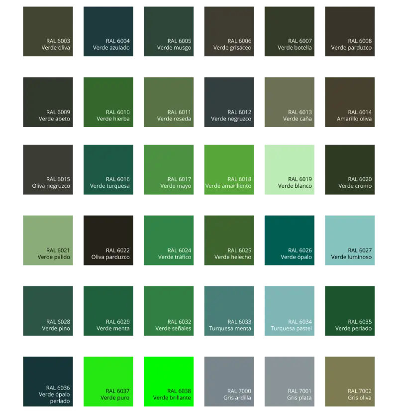
Green Color Palette Chart -

Clipboard Illustration with Financial Chart for Data Analysis -

Happy Teacher's Day Celebration -

New Year Greeting Card -

Black Silhouette of Potted Plant -

Illustrated Hand Holding a Nurtured Green Plant -

Running Towards 2025 -

Man Holding Large Coin with Stack of Coins