
Declining Graph for Data Analysis
This conceptual image depicts three progressively taller blue bars, commonly used to represent an increasing data trend or growth. Superimposed is a bold red arrow, sharply curving downwards and pointing towards the smallest, initial bar. This visual metaphor effectively conveys the concept of a dataset declining to a previous baseline, reaching a new low, or undergoing a significant reduction or reset in its value. It's particularly relevant for data analysis contexts where a fall in metrics, a return to an original state, or the initiation of a new cycle after a downturn needs to be highlighted.
data - analysis - decline - trend - metrics - reset
This image only for personal use, png & jpg filesize may vary
You Might Like
-

Team with Growth Graph Illustration -

Forever 21 Brand Logo -

Icon of KPI Dashboard with Graph and Person -

Zigzag Down Arrow Icon for Decline Representation -

Magnifying Glass with Blue Lens -
Yellow Ethernet Cable for Network Connections -

Bar Chart with Upward Arrow -
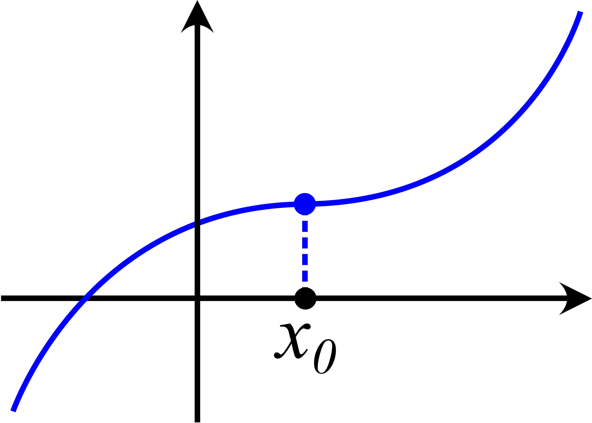
Graph Plot with Blue Curve Illustration -

Search Growth Icon -
Illustration of Growth Chart with Upward Arrow -
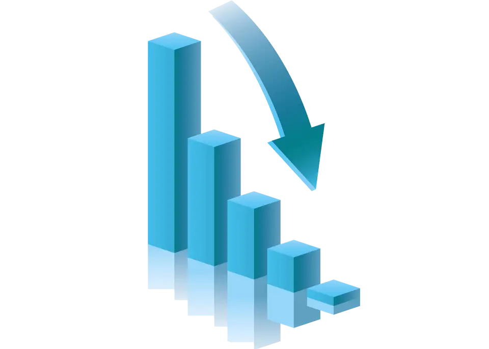
Blue Declining Bar Graph with Arrow -

Business Icons Set for Digital Workflows -

Circle Pie Chart Icon -

Bull Market Symbol -

Document Processing Cycle -

Medical Cloud Symbol -

Declining Chart Illustration -

Artificial Intelligence Laptop Interface Illustration -
Internal Hard Disk for Computer Storage -

Book Icon with Blue Background -
Pie Chart Representation -

Magnifying Glass on Document Icon -

Digital Devices with Graph -

Clipboard Illustration with Financial Chart for Data Analysis -

Magnifying Glass with Graph Illustration -

Internal Computer Hard Disk Drive -

Network Globe Icon -
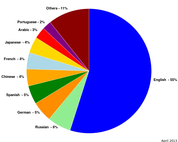
Colorful Statistical Pie Chart -

Advanced Network Switch Equipment -

Database and Key Icon Representing Security