You Might Like
-

Simple Credit Card Icon -
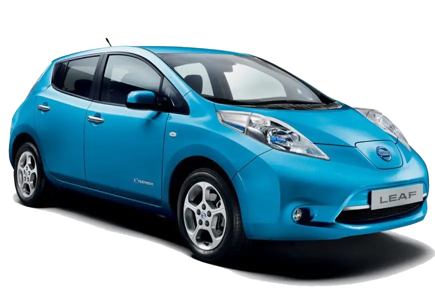
Blue Eco-Friendly Electric Car -

Green Leafy Frame -

Transparent Background Design -

Digital Connector with Binary Code -

Black Compass Star Icon for Navigation -

Popcorn Bucket -

Fresh Coconut Halves for Tropical Essence -

White Cloud Blur Graphic Element -

Blue Spiral Pattern Design -

Happy Birthday to a Crazy Cat Lady Card -

Green Train Cartoon Illustration -

Stylized Black Cat Illustration -

Colorful Peace Sign -

Mid-Century Wooden Table -

Black and White Envelopes for Mailing -

Blue Play Button Icon -

Black and White Flower Outline Design -
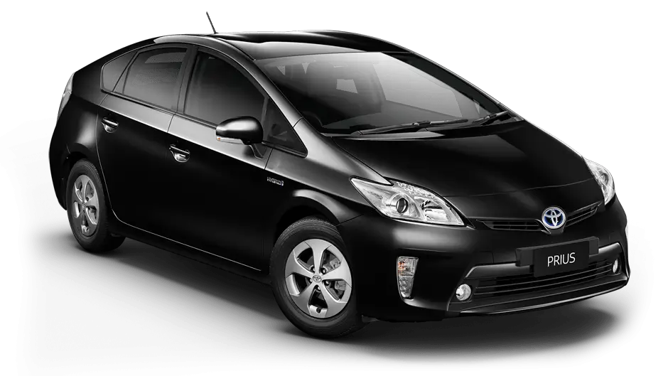
Modern Black Sedan Car for Urban Driving -

Artistic Black Goat Illustration with Horns -

Russian Flag -

Gift Box Silhouette with Ribbon -

Checkmark Symbol Inside a Circle -

Telkom Indonesia Official Logo -

Black Wave Symbol -

Cute Cartoon Dolphin Illustration -

Soccer Ball and Shoe Illustration -

Nets Basketball Team Logo -

Bright Corn Cob Illustration -

Hand Swipe Gesture Icon for Interface Navigation