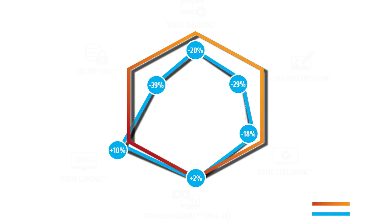
Hexagonal Data Chart
This is a hexagonal radar chart, often called a spider chart, used for visualizing and comparing multiple data points. It presents six different metrics, each with a corresponding percentage change, ranging from positive values like +10% and +2% to negative changes such as -20%, -29%, -39%, and -18%. The chart overlays two distinct datasets, clearly differentiated by an orange line and a blue line as indicated in the legend. This type of graph is effective for quickly assessing performance across various categories and understanding relative strengths or weaknesses.
data - chart - hexagon - radar - comparison - percentages - analysis - metrics - visualization
This image only for personal use, png & jpg filesize may vary
You Might Like
-
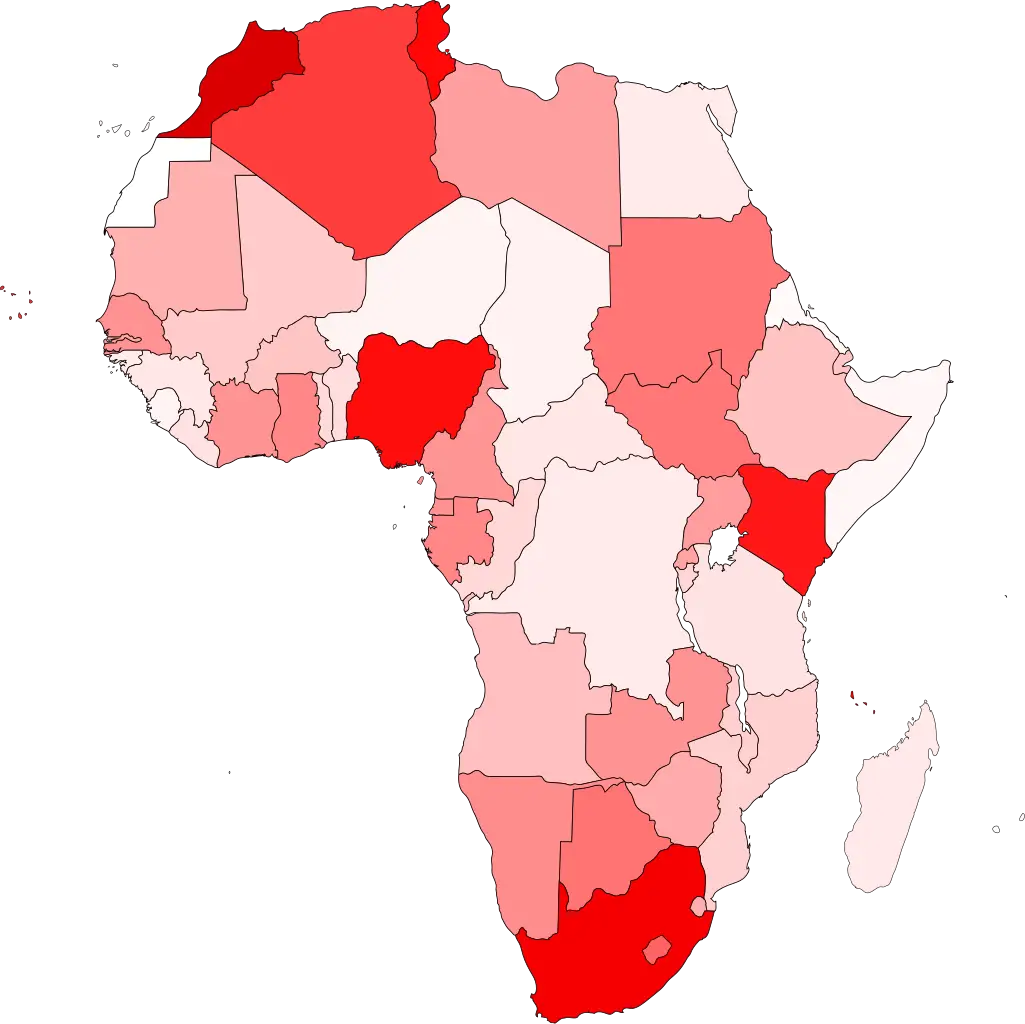
Colored Regional Map of Africa -

Team with Growth Graph Illustration -

Organizational Structure Chart -
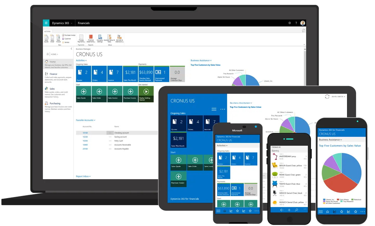
Various Devices Displaying Software -

Complete Blue World Map -

Icon of KPI Dashboard with Graph and Person -

Magnifying Glass with Blue Lens -
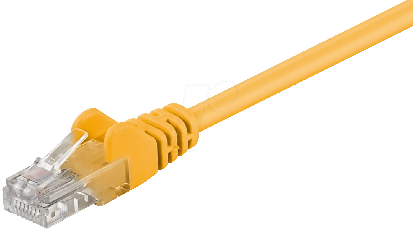
Yellow Ethernet Cable for Network Connections -

Bar Chart with Upward Arrow -
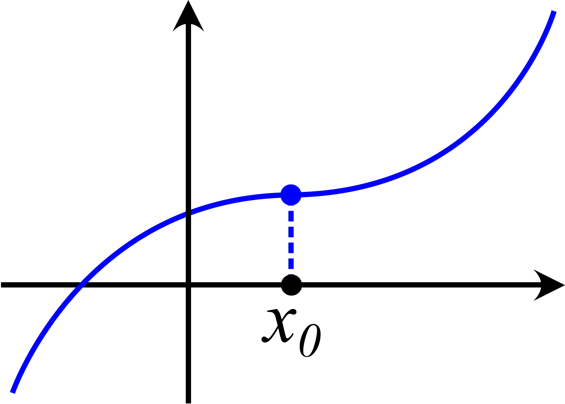
Graph Plot with Blue Curve Illustration -
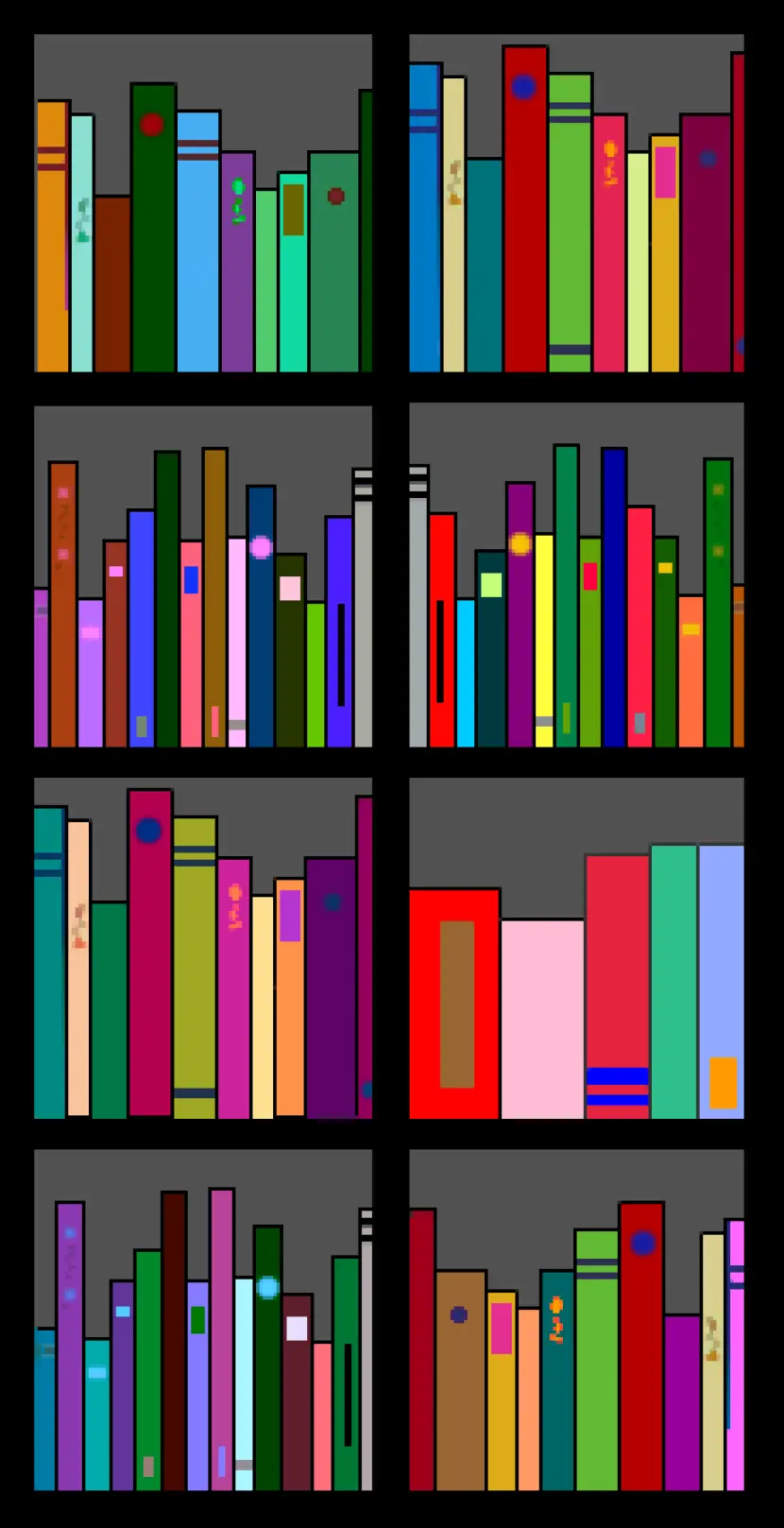
Colorful Bookshelf -
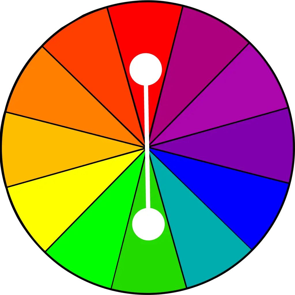
Color Wheel for Artistic Inspiration -

Search Growth Icon -
Illustration of Growth Chart with Upward Arrow -

Business Icons Set for Digital Workflows -

Circle Pie Chart Icon -

Bull Market Symbol -

Polygon Shapes in Abstract Black Design -
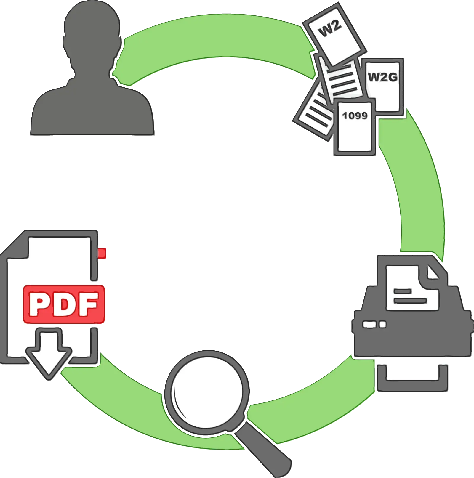
Document Processing Cycle -

Medical Cloud Symbol -

Artificial Intelligence Laptop Interface Illustration -
Internal Hard Disk for Computer Storage -

Book Icon with Blue Background -
Pie Chart Representation -

Magnifying Glass on Document Icon -
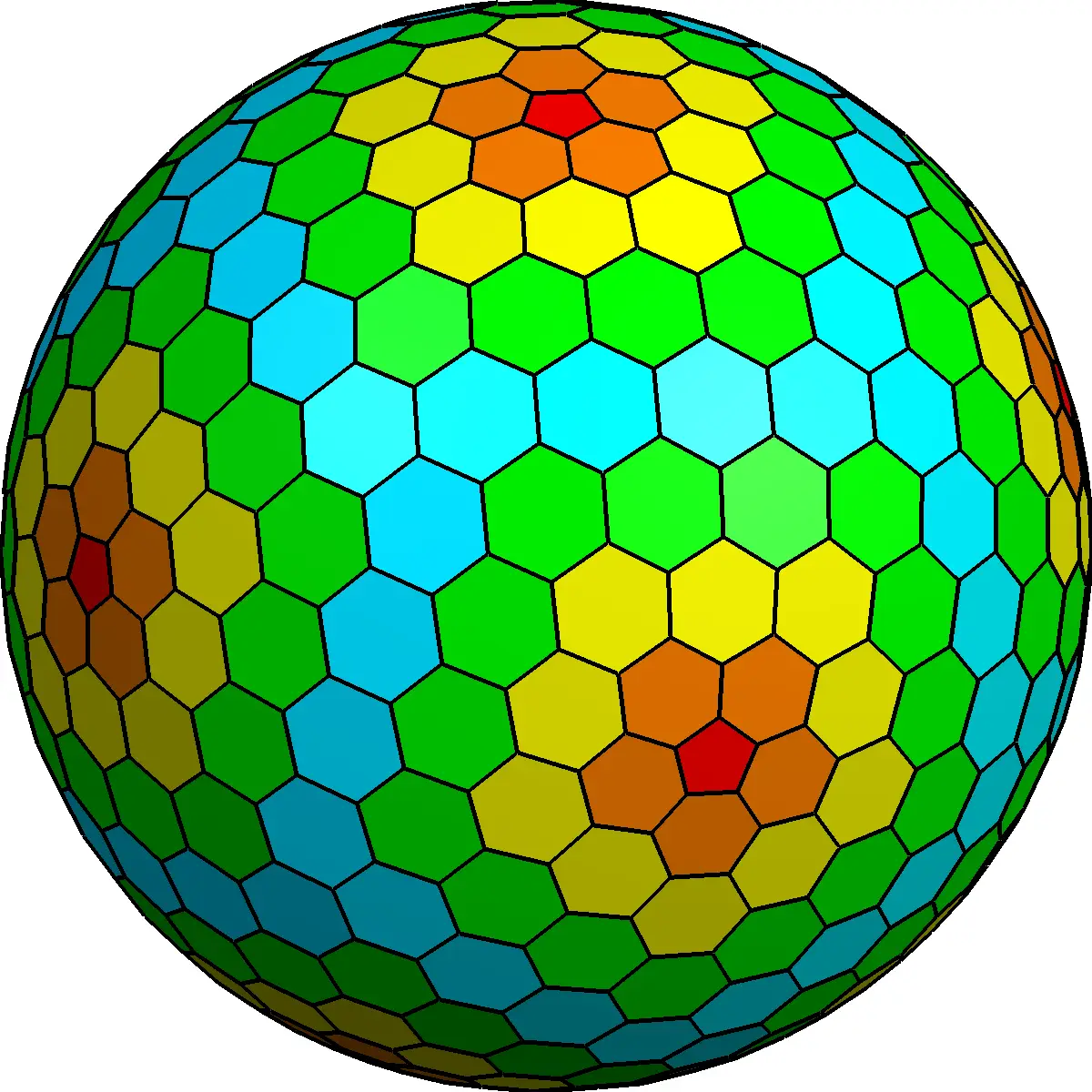
Colorful Hexagonal Sphere -
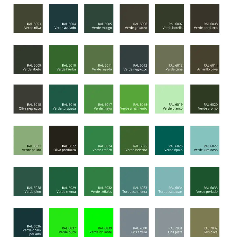
Green Color Palette Chart -

Digital Devices with Graph -

Clipboard Illustration with Financial Chart for Data Analysis -
Magnifying Glass with Graph Illustration