
You Might Like
-

Simple Credit Card Icon -
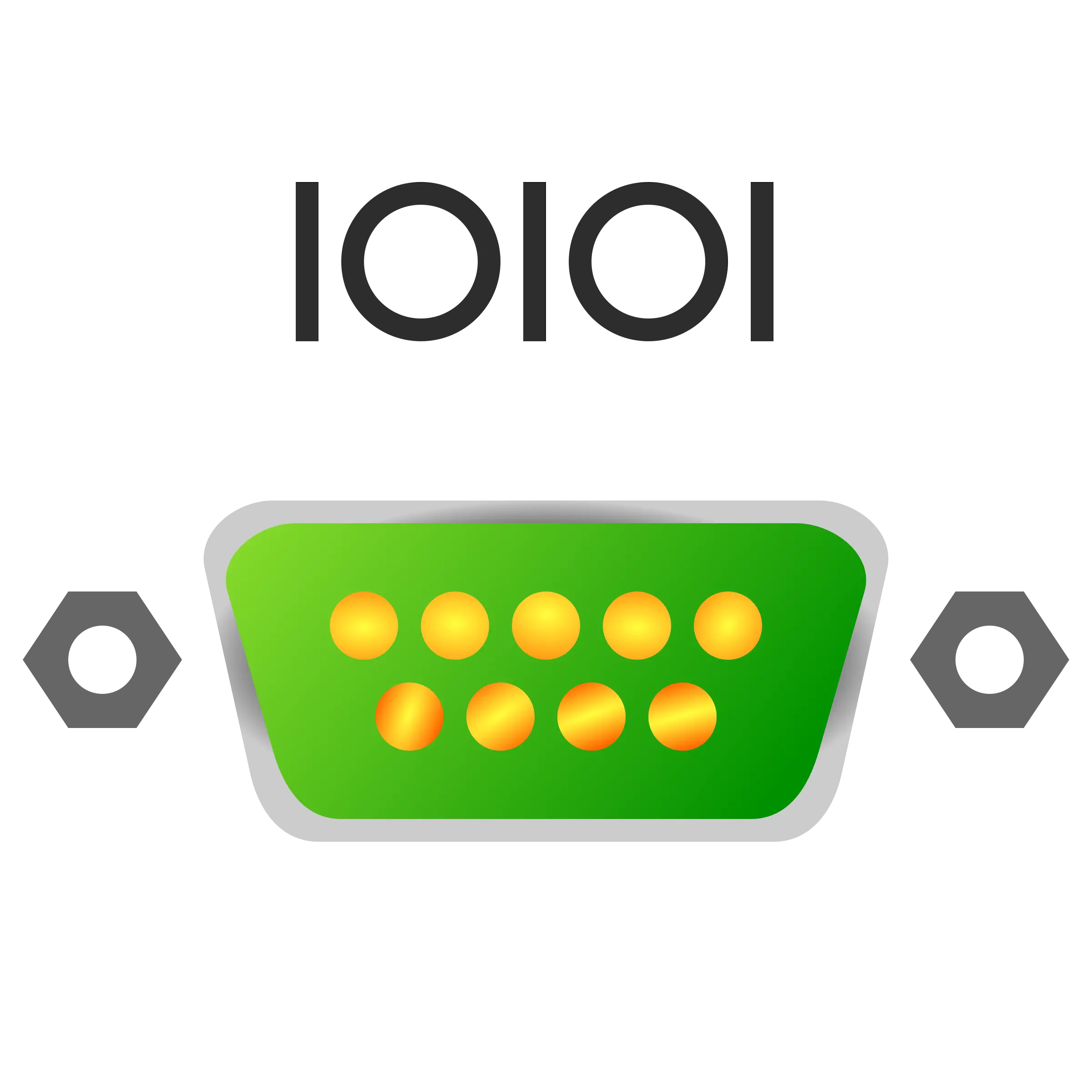
Digital Connector with Binary Code -

Blue Play Button Icon -

Hand Swipe Gesture Icon for Interface Navigation -
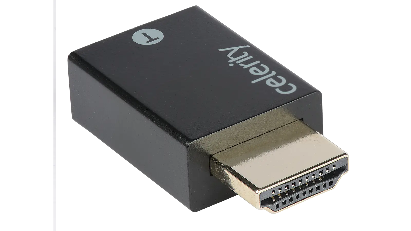
Black HDMI Adapter -

Black Smartphone Icon Design -
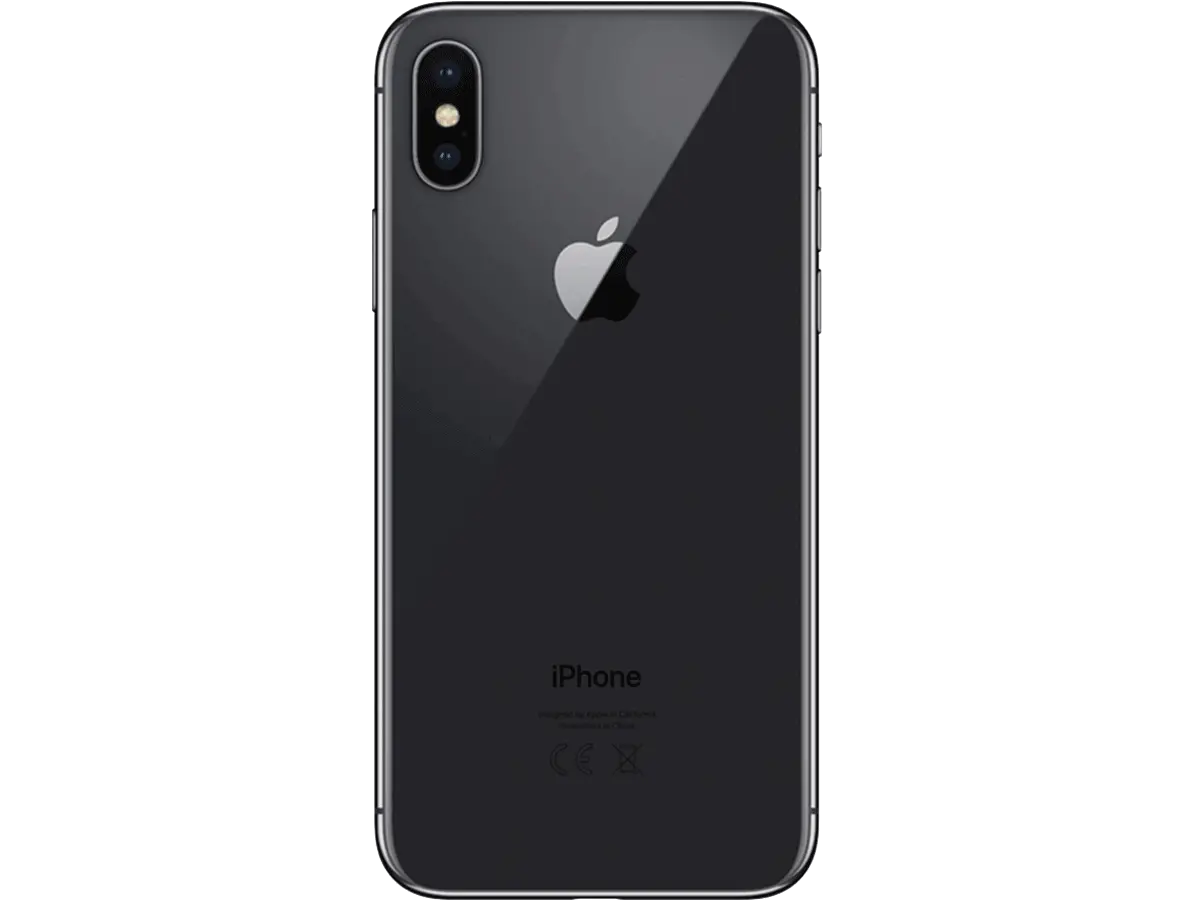
Black Smartphone Back View Design -
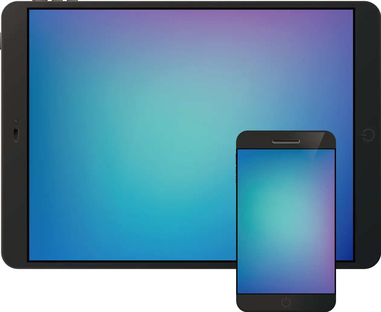
Tablet and Smartphone Technology -

Blue Game Controller Icon -

Purple Phone Call Icon with Notification -

Computer Tower with Phone Icon -

Phone Symbol for Communication -

Hamburger Menu Icon for Navigation -

Chat Bubble with Lightning Icon Design -

Businessman in a Suit Checking Phone -
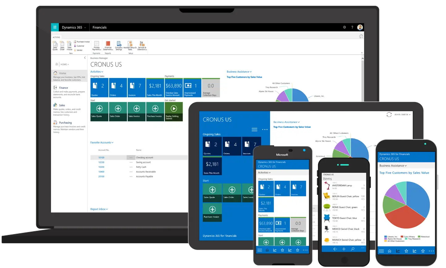
Various Devices Displaying Software -
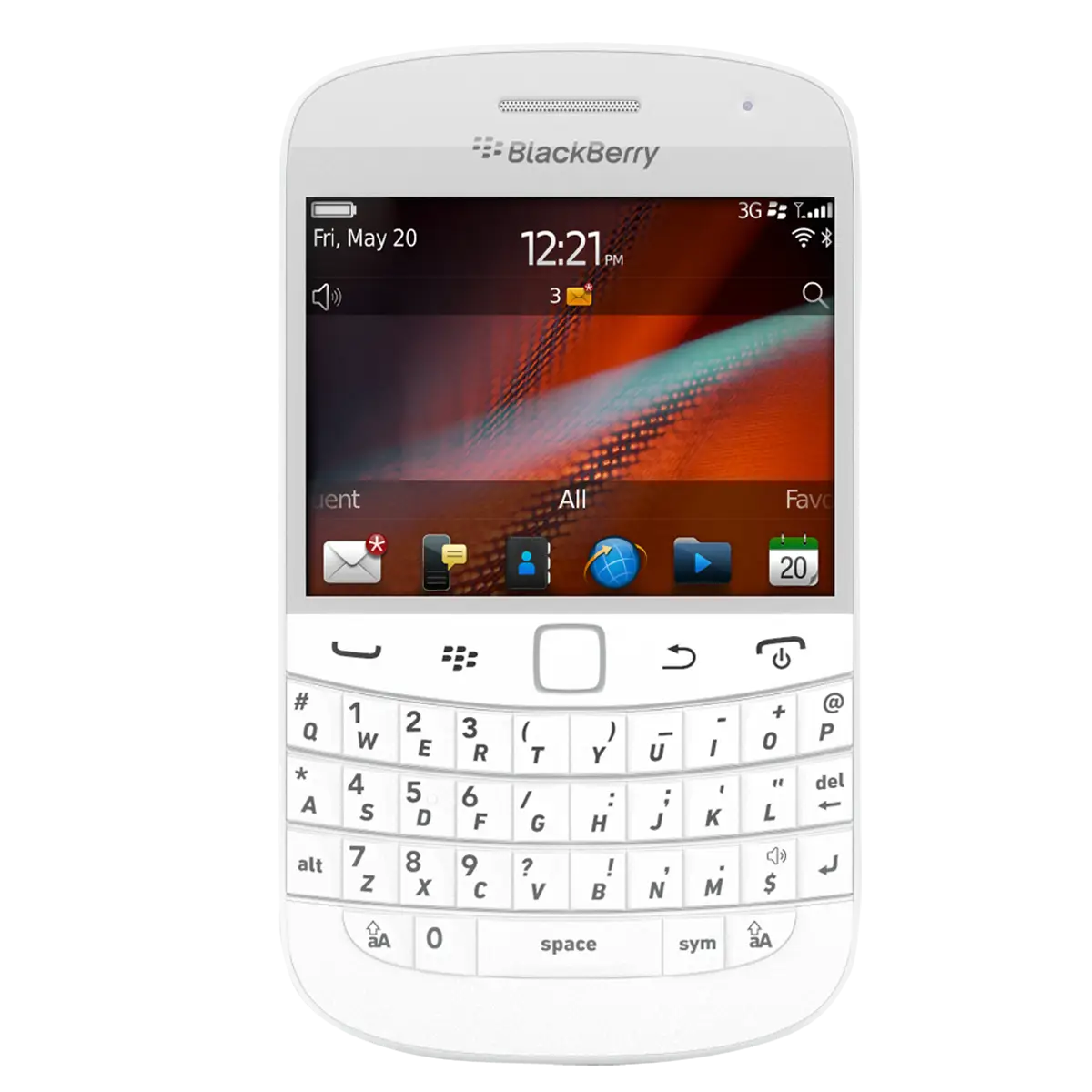
White BlackBerry Phone with Keyboard -

Black Speech Bubble Icon for Communication -

Power Button Icon in Bold Black -

Cartoon Figure Holding Tablet -
Modern Smartphone with Blank Screen -

Smartphone Outline Icon Illustration -

YouTube Subscribe Button -

Right Arrow Calendar Icon -
Black Smartphone Frame with Screen Template -
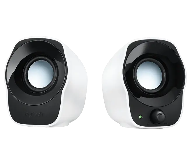
Compact Speakers for Clear Audio Experience -

Black Envelope Icon Representation -

Black Hand Pointing Gesture Icon -

Black Target with Arrow Symbol -
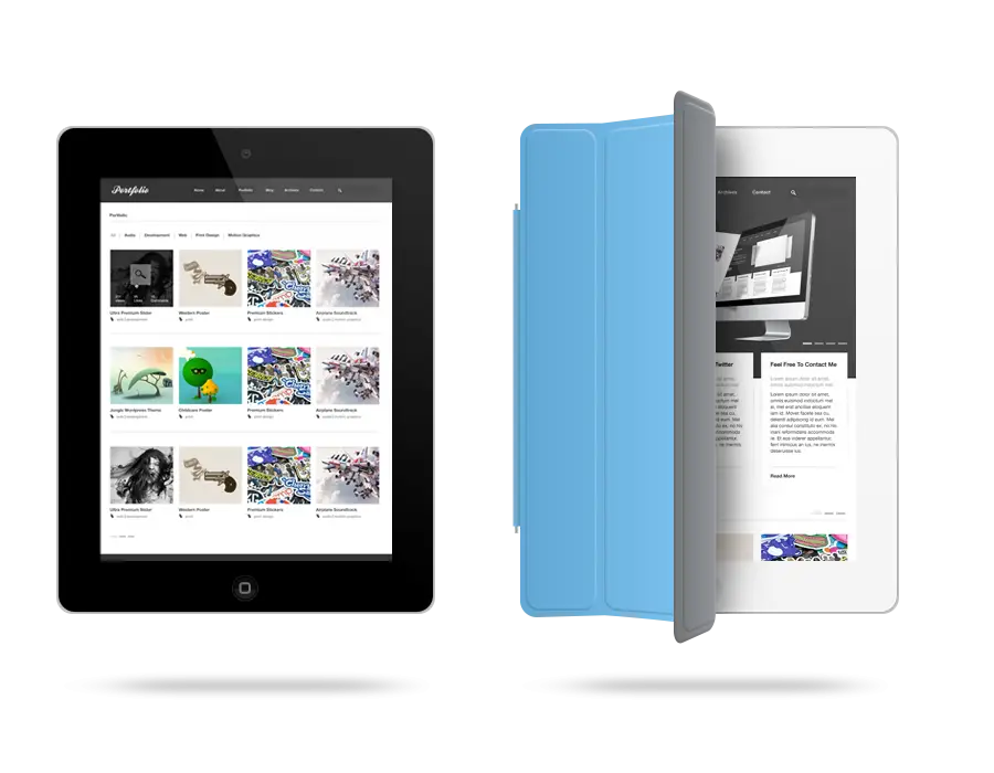
Modern Tablet with Cover