You Might Like
-

Organizational Structure Chart -

Zigzag Down Arrow Icon for Decline Representation -

Inclusive Transgender Gender Symbol -

Bar Chart with Upward Arrow -

Stack of Hay Bales in Agricultural Setting -

Blue Declining Bar Graph with Arrow -

Circle Pie Chart Icon -

Declining Chart Illustration -

Book Icon with Blue Background -

Pie Chart Representation -
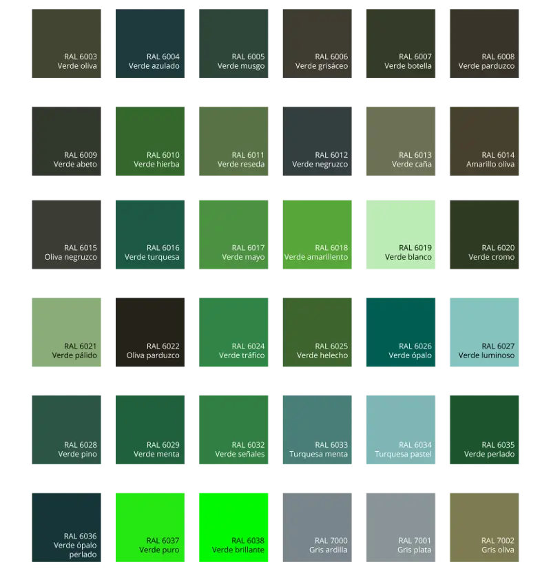
Green Color Palette Chart -

Clipboard Illustration with Financial Chart for Data Analysis -

Magnifying Glass with Graph Illustration -

Black Male Gender Symbol -

Male and Female Gender Symbols -

Black Abstract Pyramid Illustration -

Green Flowchart Diagram -

Colorful Bar Graph Illustration -
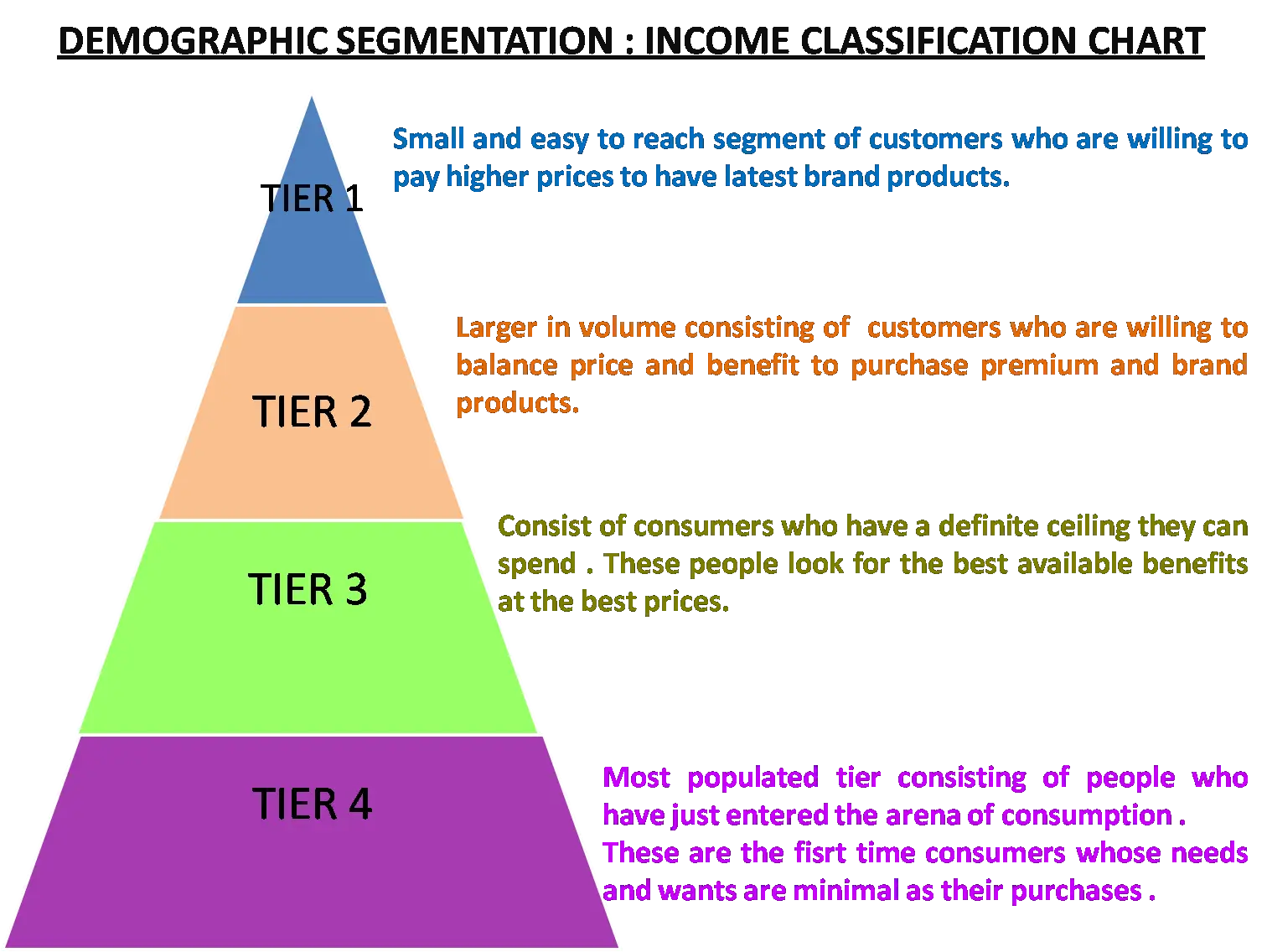
Demographic Segmentation Income Chart -

Upward Arrow on Graph -

Colorful Infographic for Data Presentation -
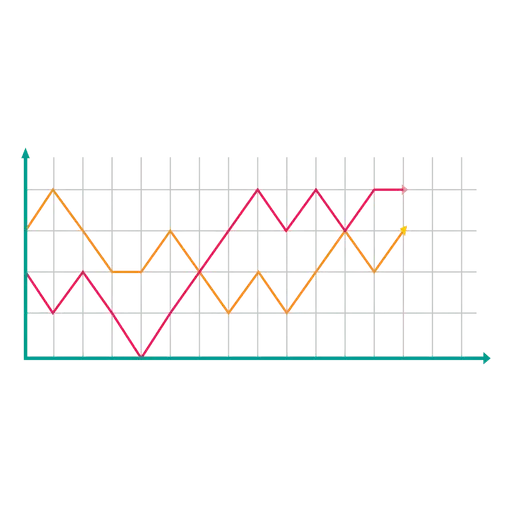
Line Graph for Data Visualization -

Workspace Setup with Chart and Desk -

Ancient Mayan Step Pyramid Illustration -
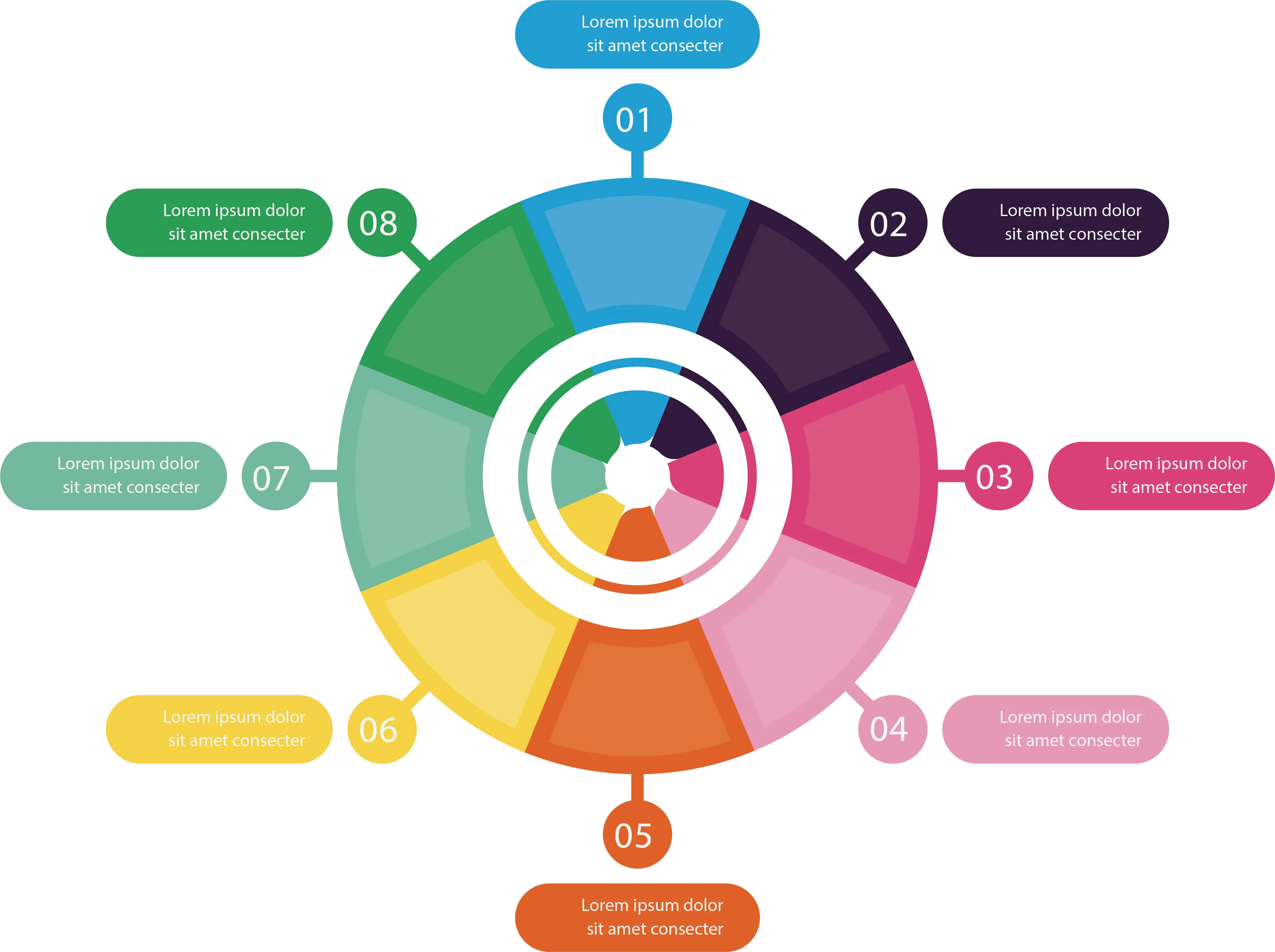
Colorful Infographic Chart -

Blue and Red Gender Symbols Illustration -

Female Gender Symbol Icon in Minimalist Design -

Colorful Circular Chart -

Bar Chart Icon for Data Analysis -

Red Downward Arrow Crashing