You Might Like
-
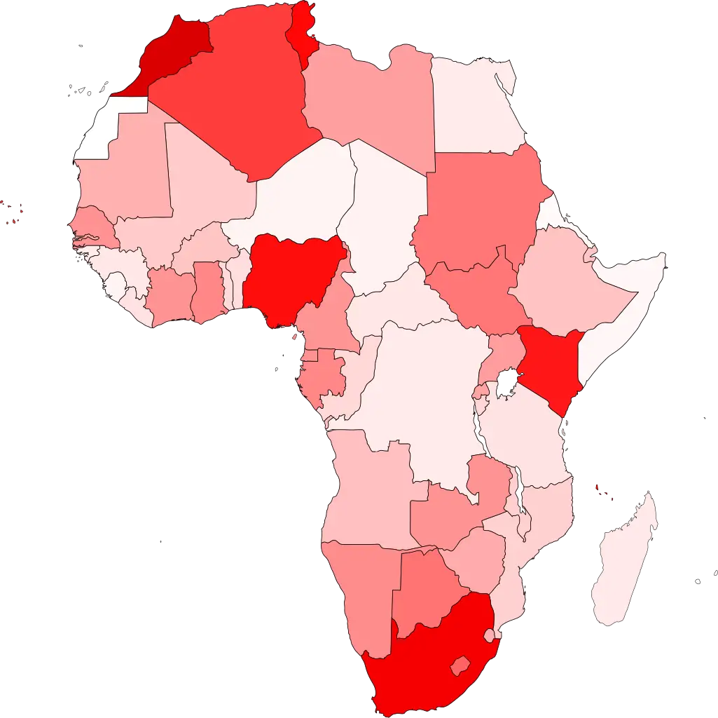
Colored Regional Map of Africa -

Merry Christmas Holiday Card -
Purple Lion Crest with Crown -

Applying Purple Nail Polish -

Purple Crescent Moon on Clear Background -

Team with Growth Graph Illustration -

Organizational Structure Chart -

Cute Purple Cartoon Caterpillar -

Purple Cartoon Octopus with Big Eyes -
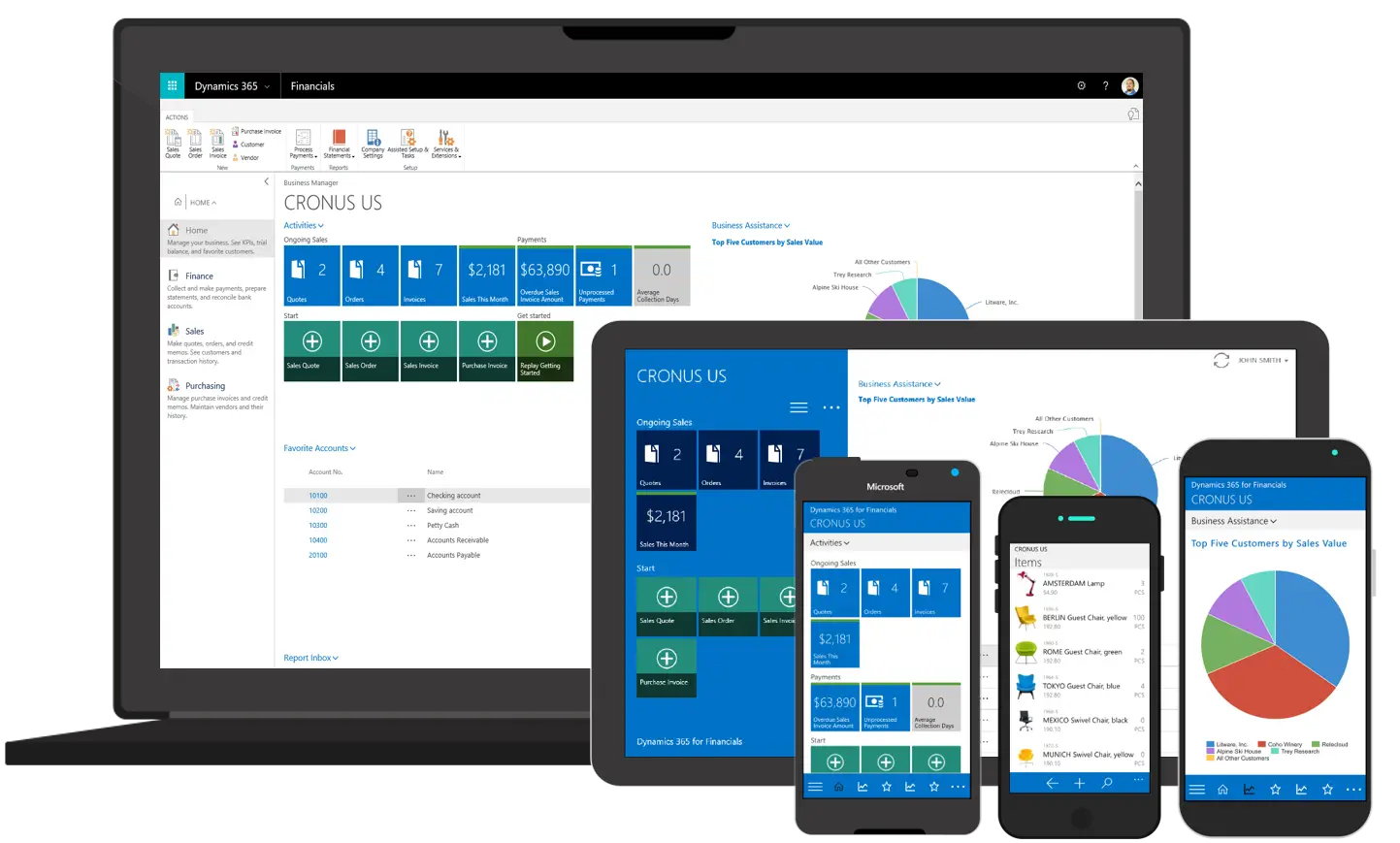
Various Devices Displaying Software -

Purple and White Striped Umbrella -

Twitch Logo with Reflection Effect -

Complete Blue World Map -

Boy in Purple Hoodie Making a Gesture -

Icon of KPI Dashboard with Graph and Person -

Glittery Purple Heart Symbol -

Lavender Flower Bouquet Illustration -

Zigzag Down Arrow Icon for Decline Representation -

Purple Tufted Chaise Lounge for Luxury Décor -

Purple Curved Right Arrow -

Blooming Wisteria with Leaves -

Funny Purple Eggplant Character -

Purple Rounded Scissors for Crafting -

Yellow Ethernet Cable for Network Connections -

Bar Chart with Upward Arrow -

Purple Flower Hanging Basket Decoration -
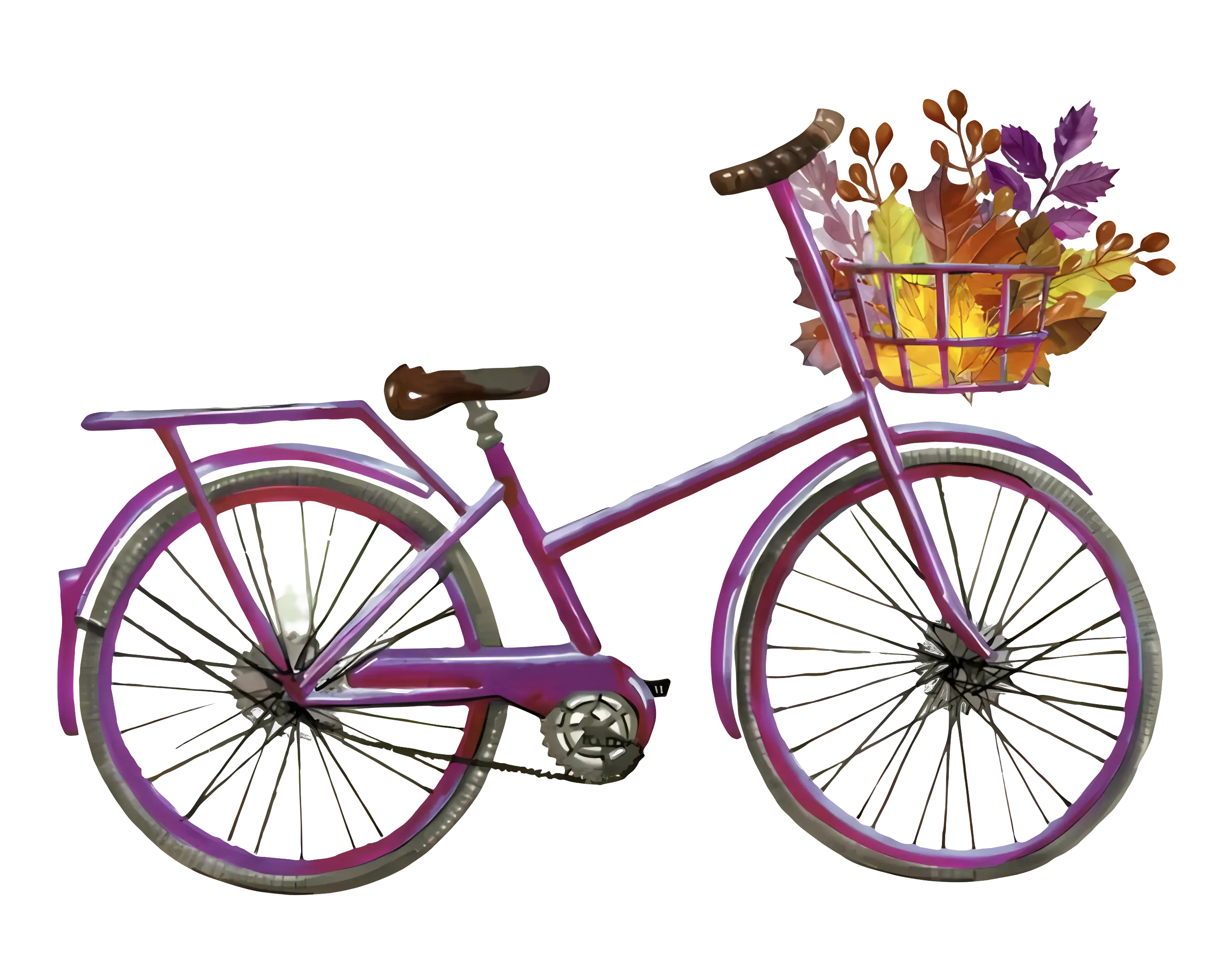
Purple Bicycle with Autumn Leaves in Basket -
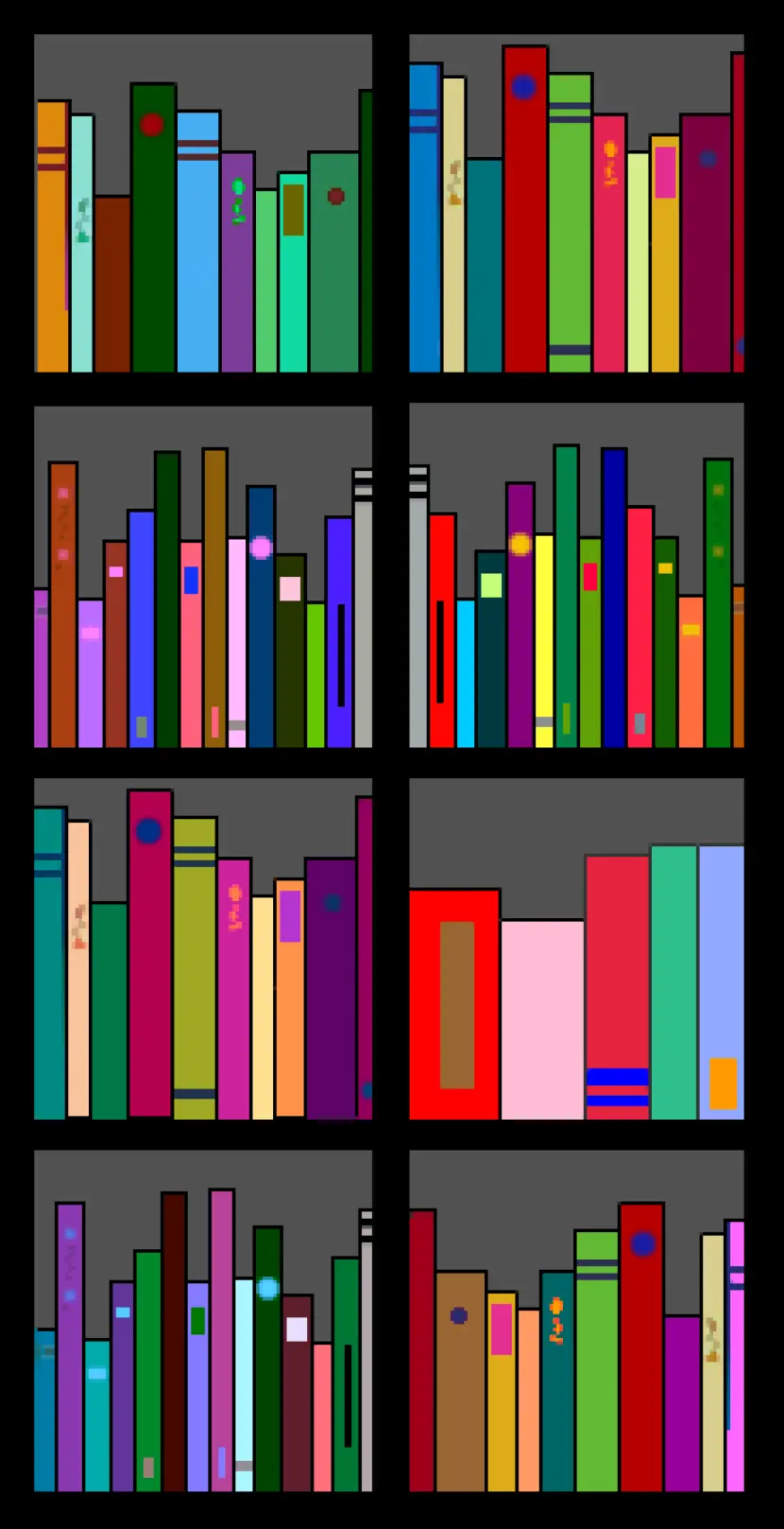
Colorful Bookshelf -
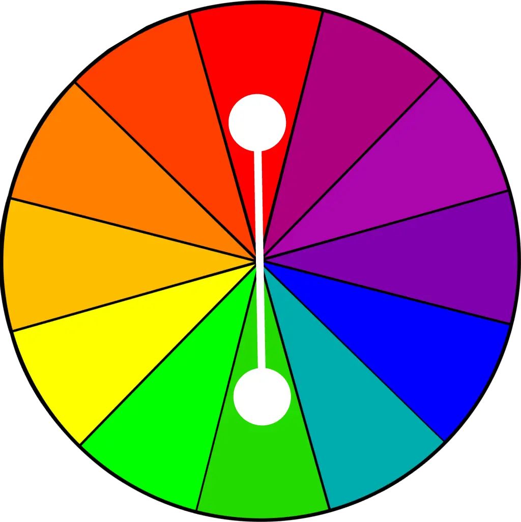
Color Wheel for Artistic Inspiration -

Vintage Lantern with Candle