
You Might Like
-
Popchips Potato Sea Salt -
Red Sharps Biohazard Container -
Fresh Coconut Halves for Tropical Essence -
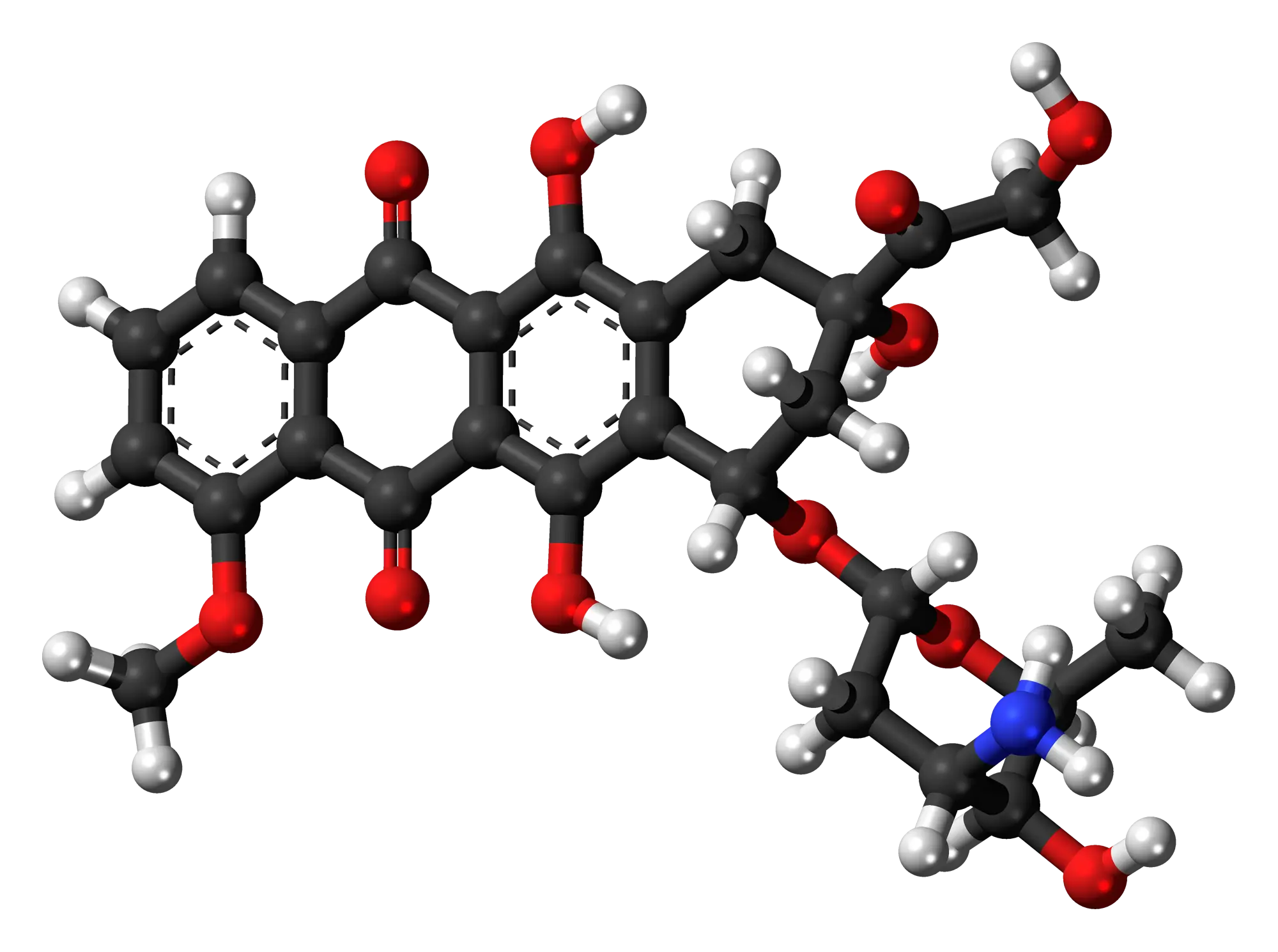
Chemical Molecule Structure Illustration -
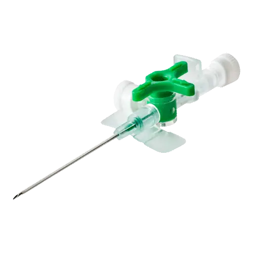
Medical IV Catheter for Injection -
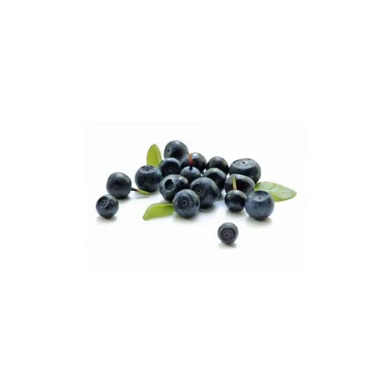
Fresh Blueberries Cluster with Leaf Accents -
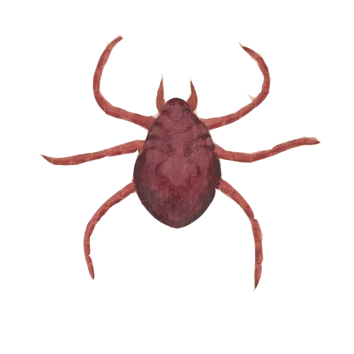
Brown Tick Illustration -

Cartoon Doctor with Stethoscope Illustration -
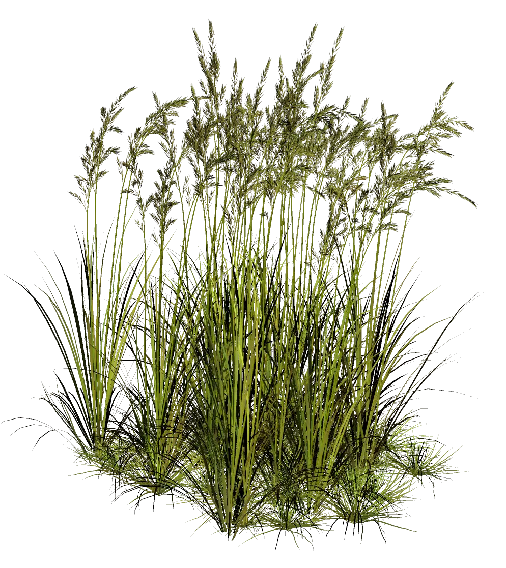
Tall Green Grass with Wild Stalks -

Syringe and Medicine Vial Icon -
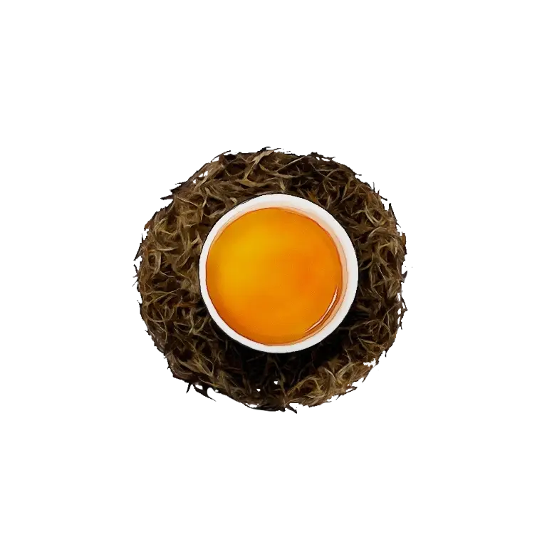
Tea Cup with Dark Tea and Loose Leaves -
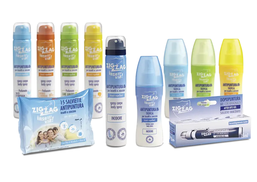
Insect Repellent Product Range -

Botanical Floral Wreath with Green Leaves and Flowers -
Lavender Wreath with Soft Greenery -
Orange Icon for Fresh Veggies Day -

Lavender Flower Bouquet Illustration -
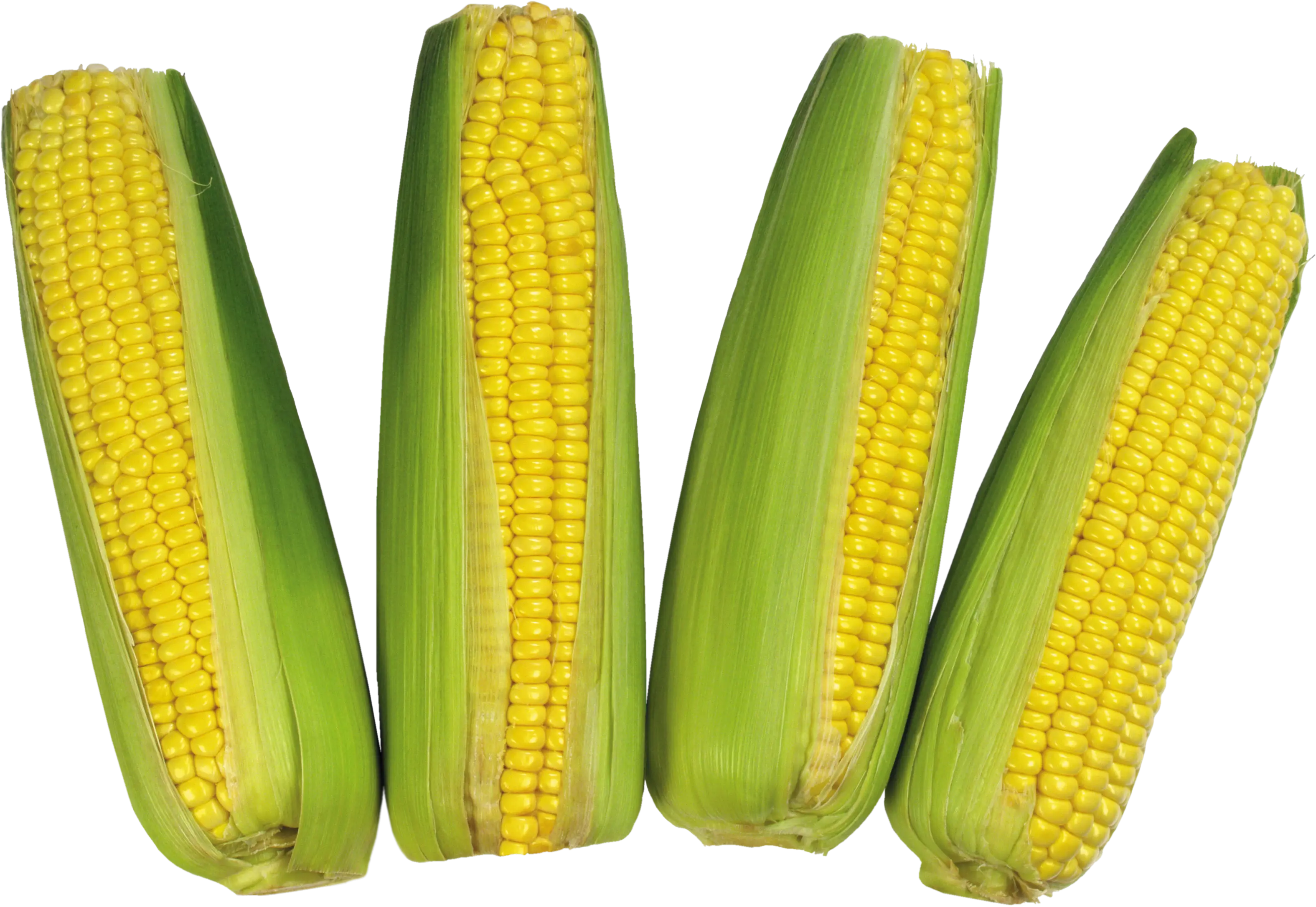
Fresh Corn with Green Husks Illustration -
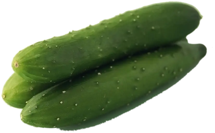
Fresh Green Cucumbers on Display -

Eco-Friendly Nuclear Power Plant Symbol -
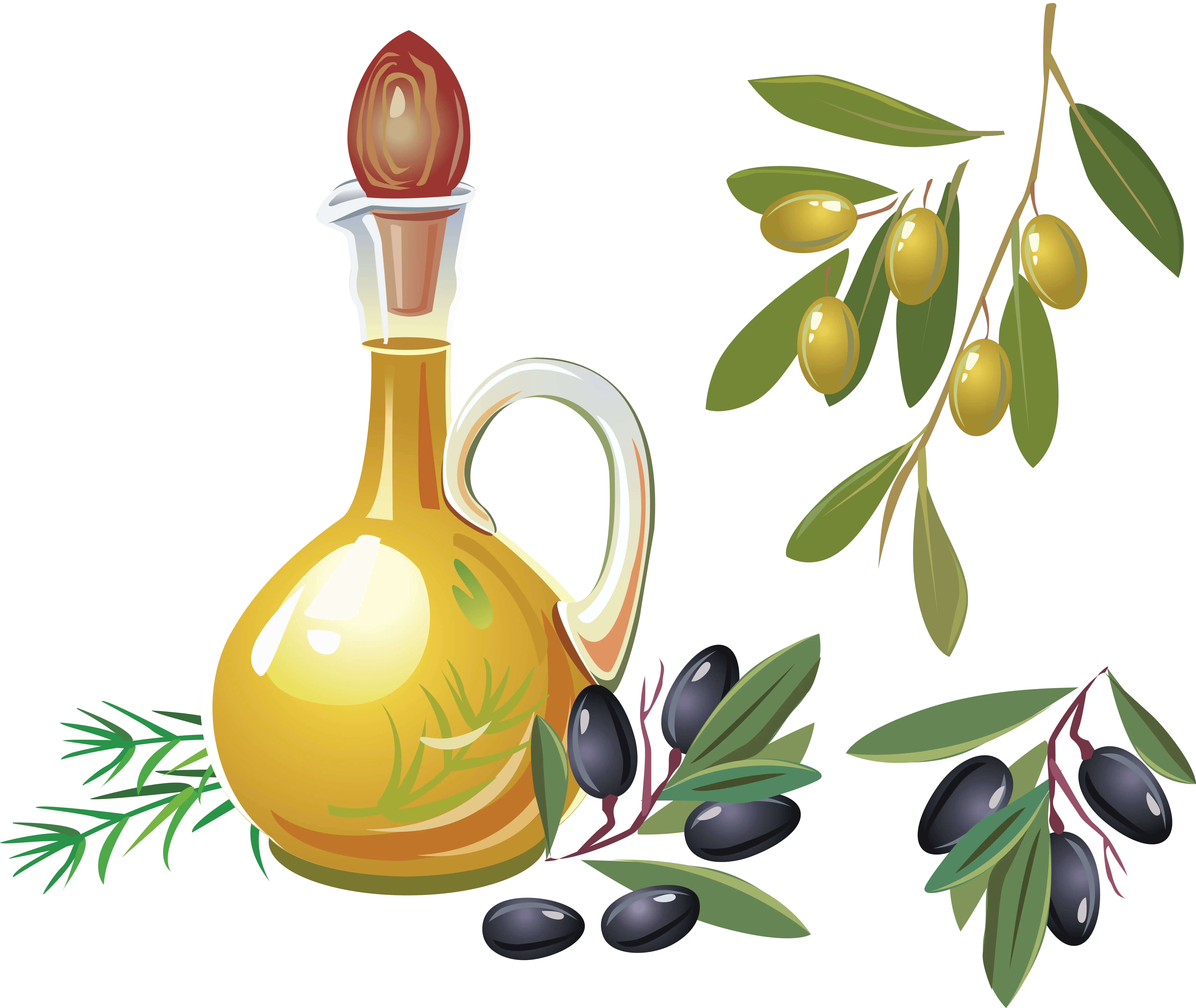
Golden Olive Oil Bottle with Fresh Olives -
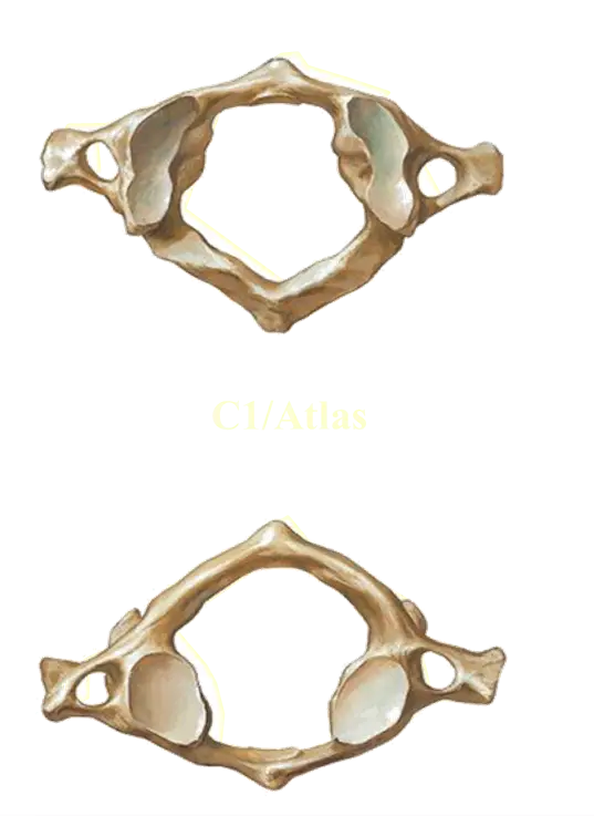
Atlas Vertebra Anatomy -

Dental Logo Design -
Soft White Feather with Gentle Appearance -

Beautiful Woman's Face with a Smile -

Infographic Pencil with Data Elements -
Fresh Red Currants on a Green Stem -
Colorful Capsules and a Tablet Illustration -

Thermometer Symbol Icon -
Fresh Garlic Bulb with Clove -
Pile of Pistachio Nuts