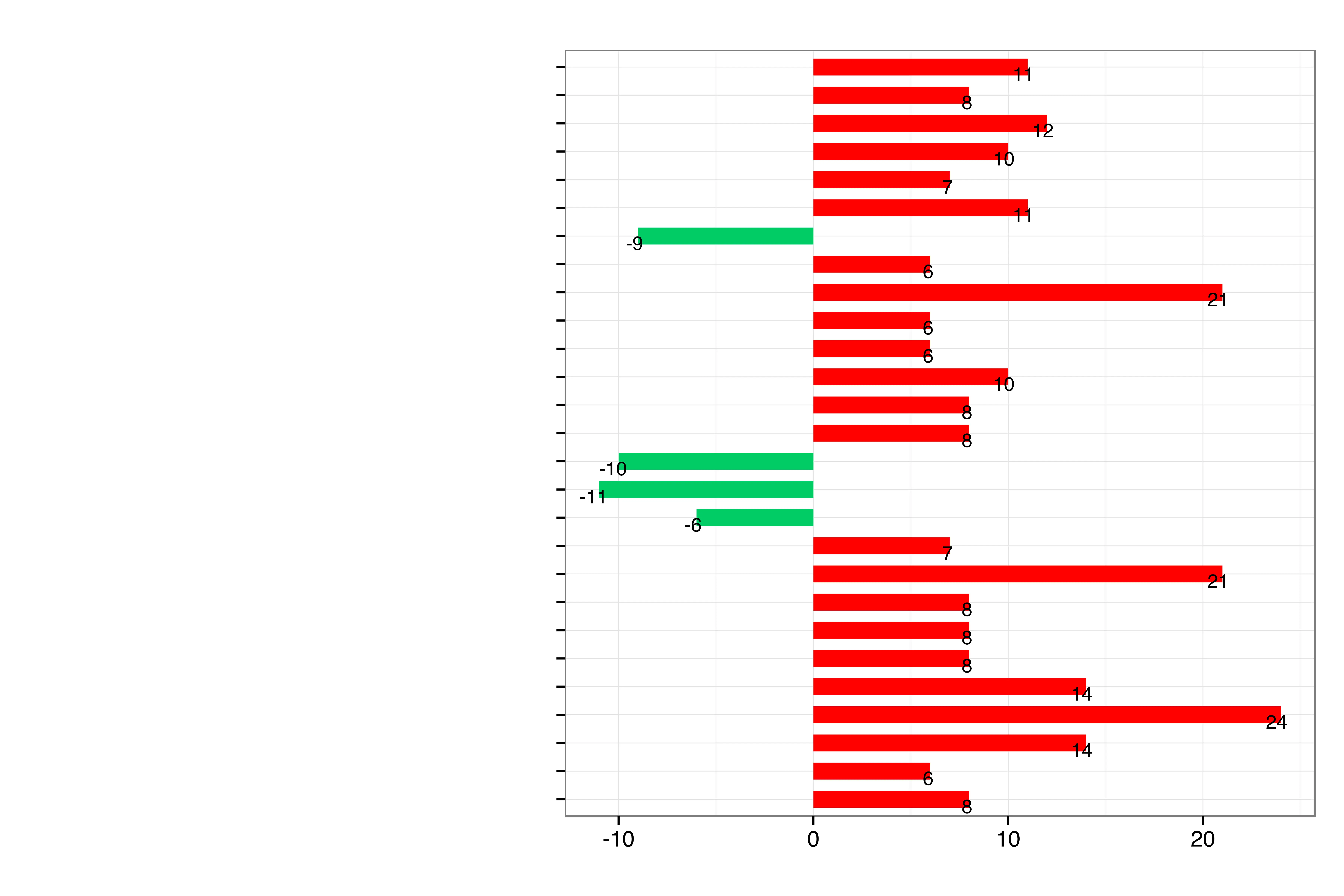
Red and Green Bar Chart
This bar chart visually represents data using both red and green bars, extending horizontally from a central vertical axis. The red bars indicate positive values, with their lengths corresponding to the numbers labeled on them, such as 8, 10, 12, 14, 21, and 24. Conversely, the green bars depict negative values, shown with labels like -9, -10, -11, and -6. The chart provides a clear, at-a-glance comparison of data points, distinguishing between increases and decreases or favorable and unfavorable outcomes.
bar chart - data visualization - red bars - green bars - positive values - negative values - analytics
This image only for personal use, png & jpg filesize may vary
You Might Like
-

Team with Growth Graph Illustration -
Business Strategy Icons -
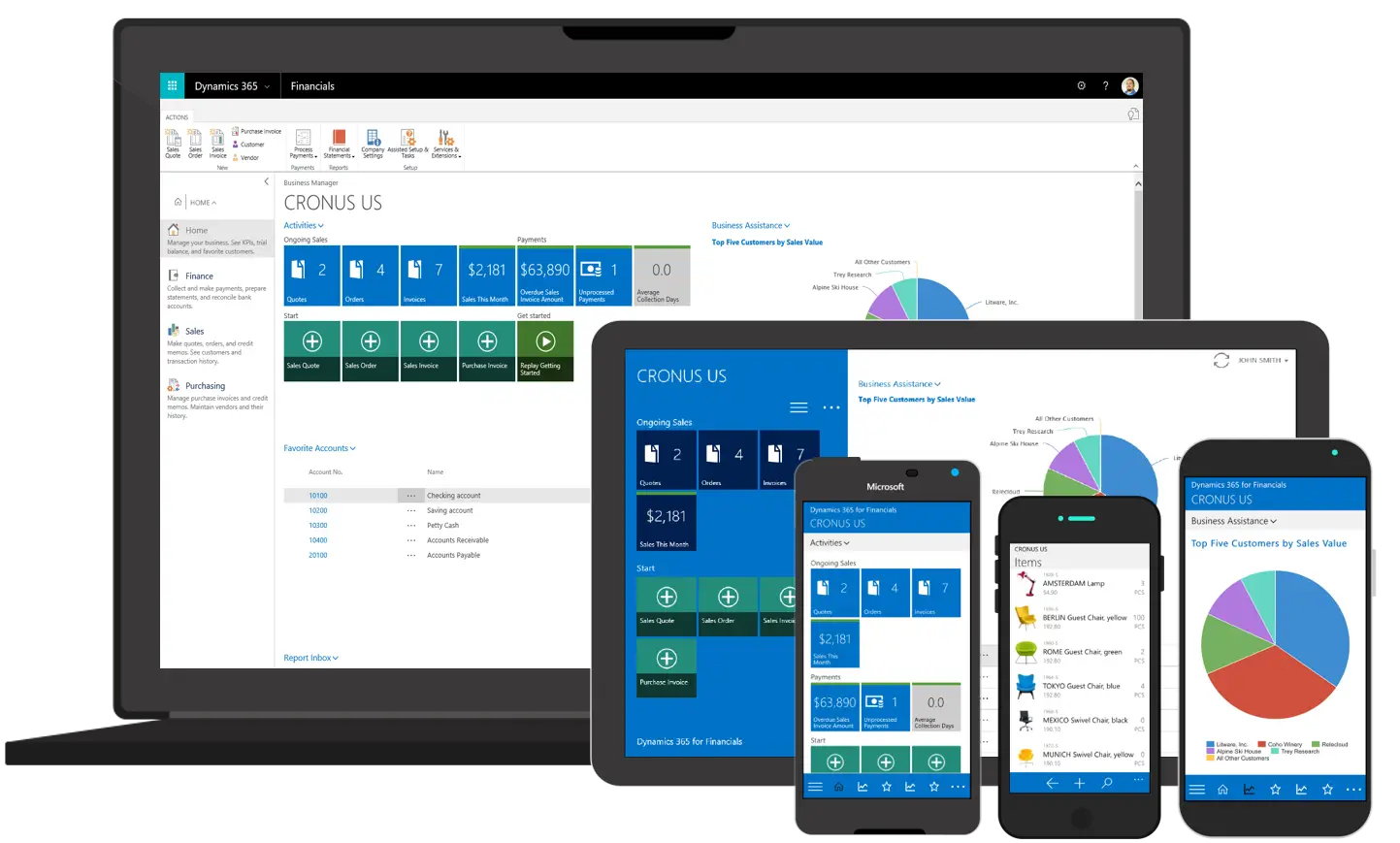
Various Devices Displaying Software -

Icon of KPI Dashboard with Graph and Person -
Zigzag Down Arrow Icon for Decline Representation -

Presentation Board with Graph for Business Concepts -
Bar Chart with Upward Arrow -
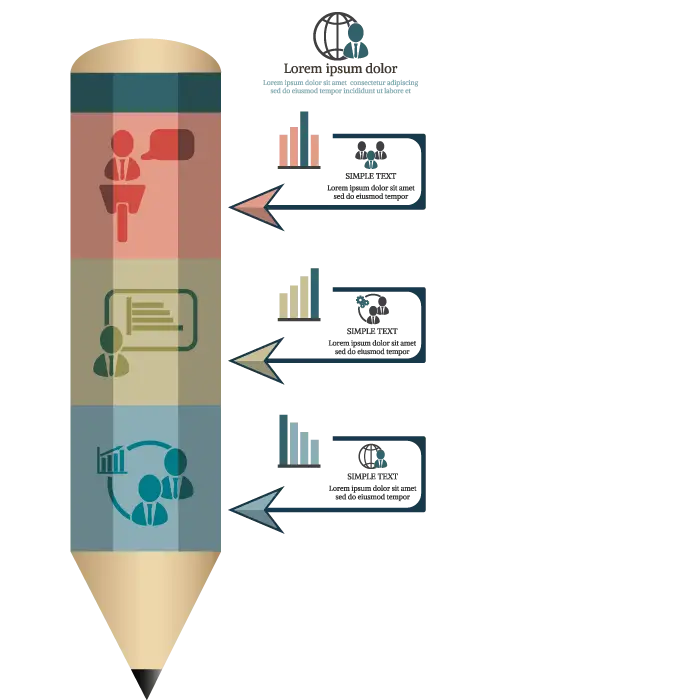
Infographic Pencil with Data Elements -

Search Growth Icon -
Illustration of Growth Chart with Upward Arrow -

SEO Concept with Magnifying Glass and Computer -
Blue Declining Bar Graph with Arrow -
Business Icons Set for Digital Workflows -

Declining Chart Illustration -

Light Bulb with Globe and Analytics -

Digital Devices with Graph -

Clipboard Illustration with Financial Chart for Data Analysis -
Magnifying Glass with Graph Illustration -

McKinsey Global Institute Logo -
Calculator and Chart Icon for Data Analysis -
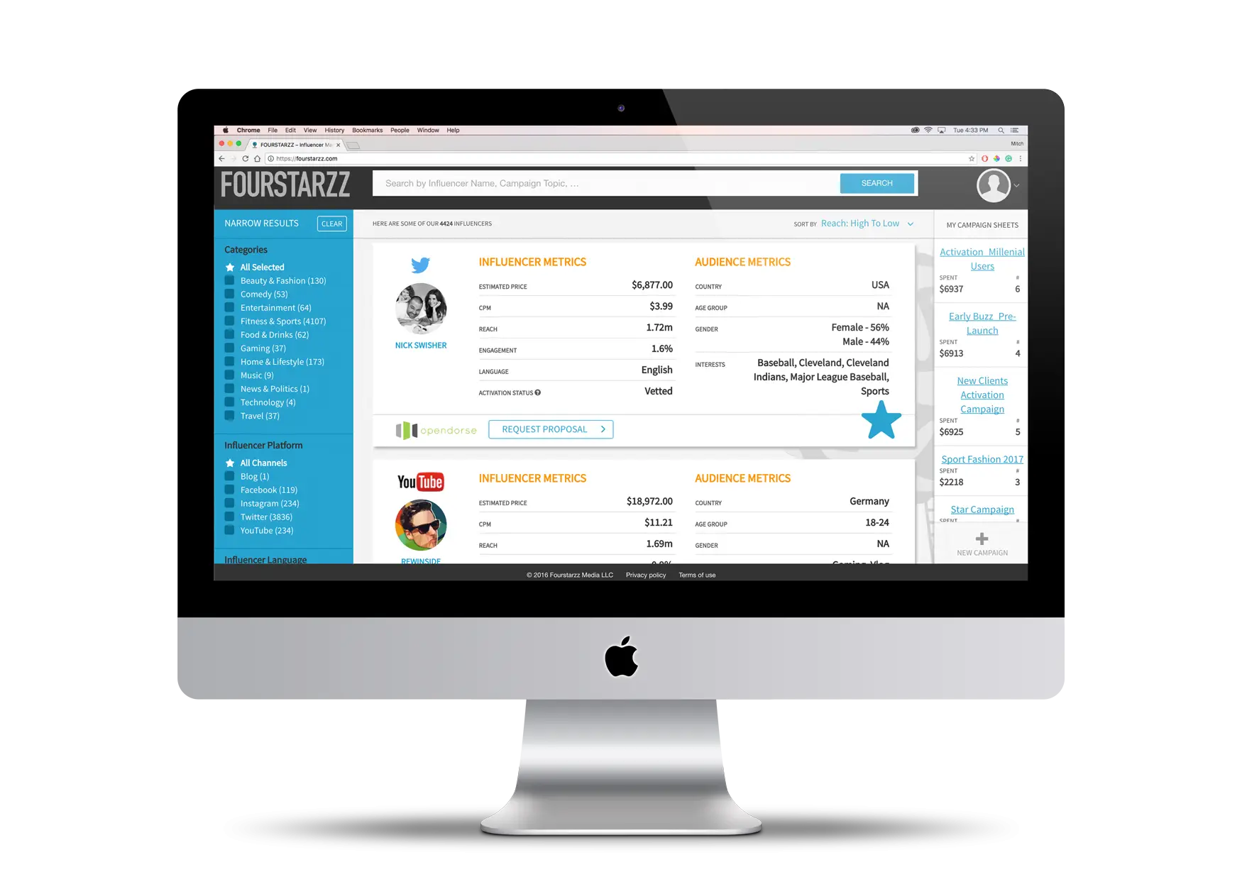
Computer Screen with Interface -

Person in Wheelchair Analyzing Data -

Upward Arrow on Graph -
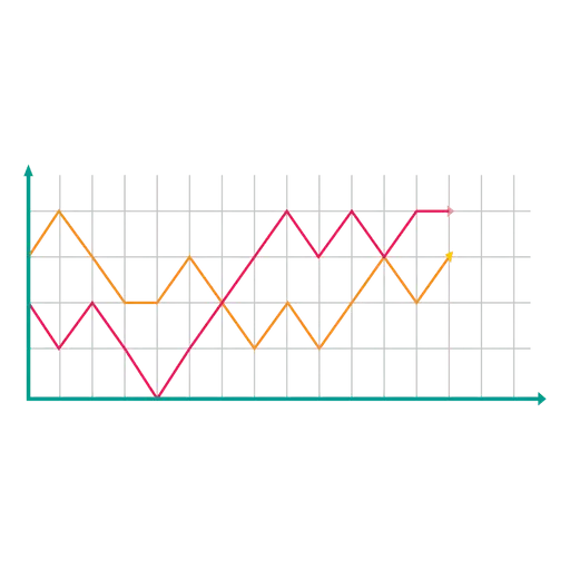
Line Graph for Data Visualization -
Mobile Data Analysis Graph -

Clipboard and Calculator Icon -

Professional Team Meeting with Presentation -

Data Analysis Infographic Design -
House Statistics Icon for Real Estate Analytics -
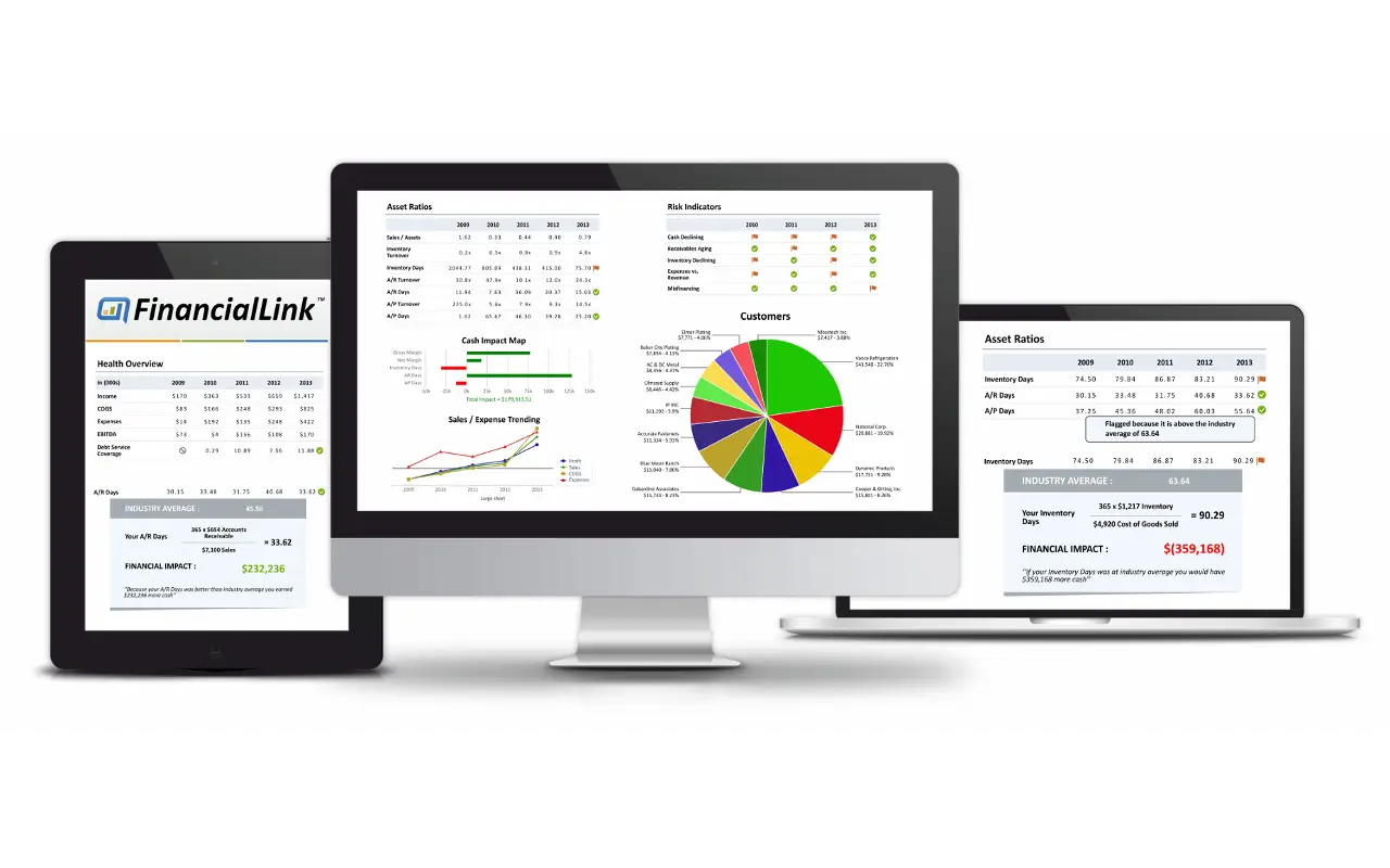
Financial Dashboard on Multiple Devices