
You Might Like
-
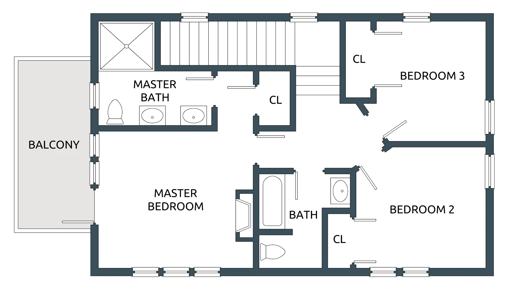
House Floor Plan with Three Bedrooms -

Black Smartphone Icon Design -
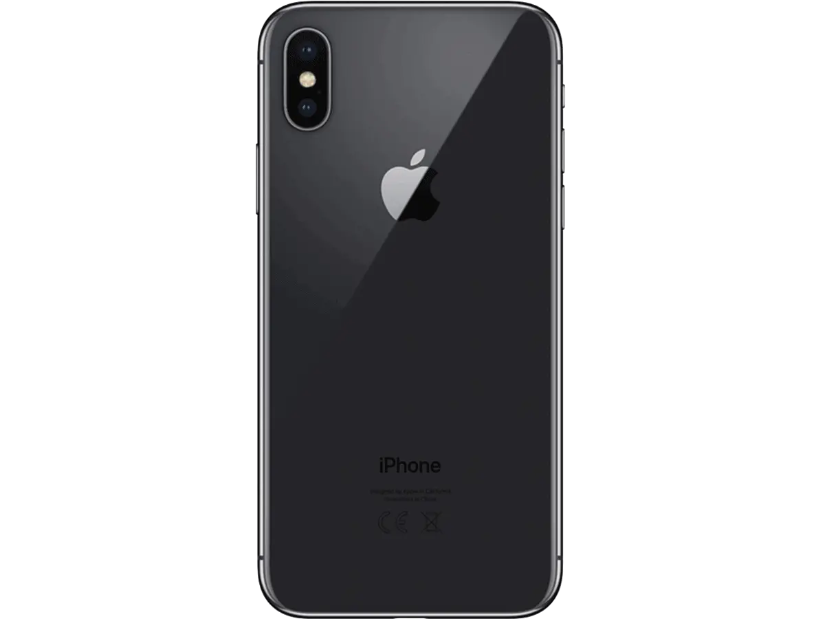
Black Smartphone Back View Design -
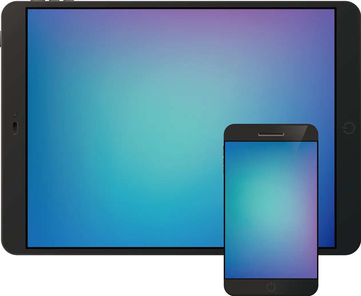
Tablet and Smartphone Technology -

Transparent Background Grid -

Purple Phone Call Icon with Notification -

Cartoon Ghost with Boo Sign -
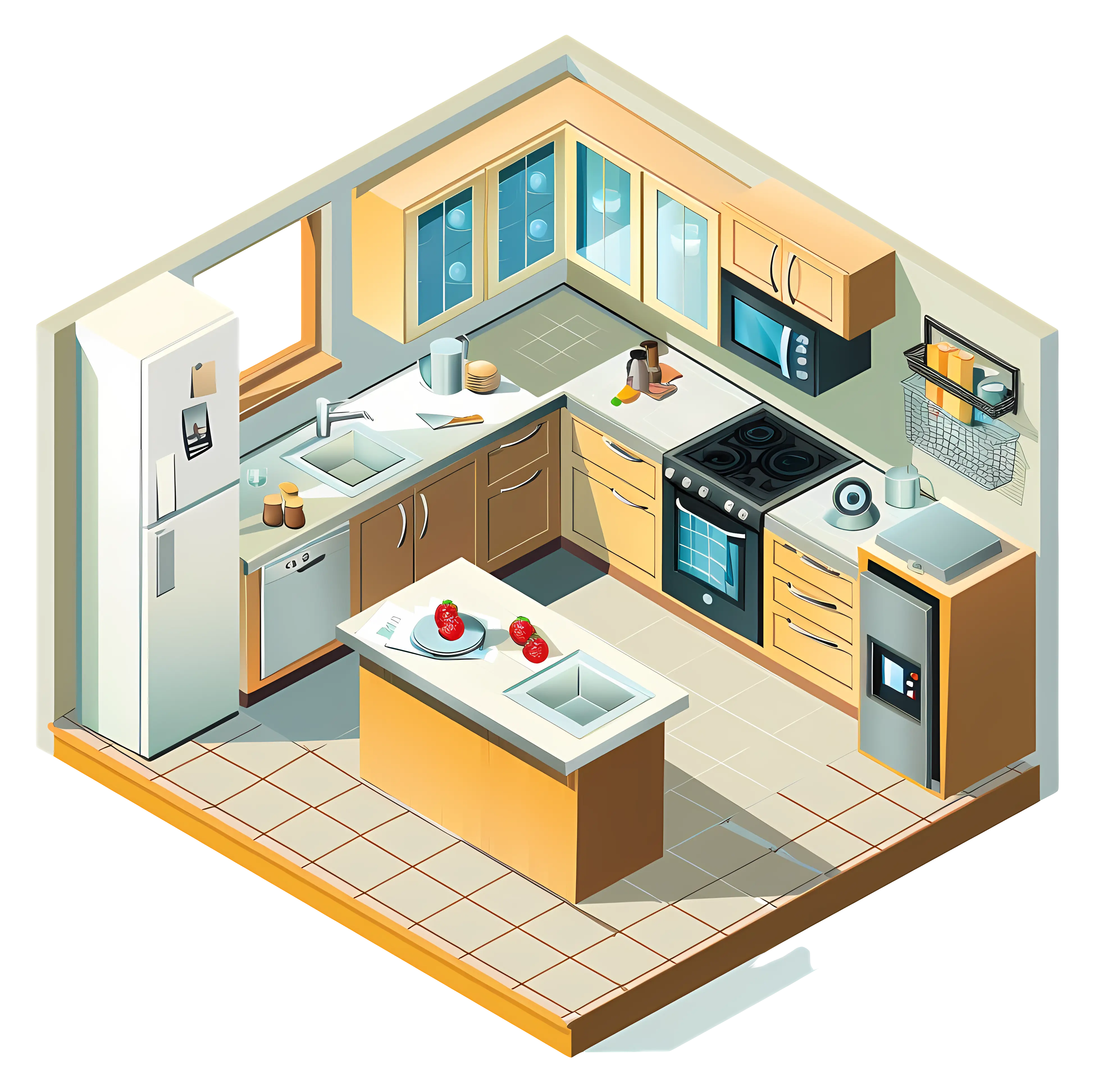
Isometric Illustration of a Modern Kitchen Layout -

Computer Tower with Phone Icon -

Hamburger Menu Icon for Navigation -

Businessman in a Suit Checking Phone -
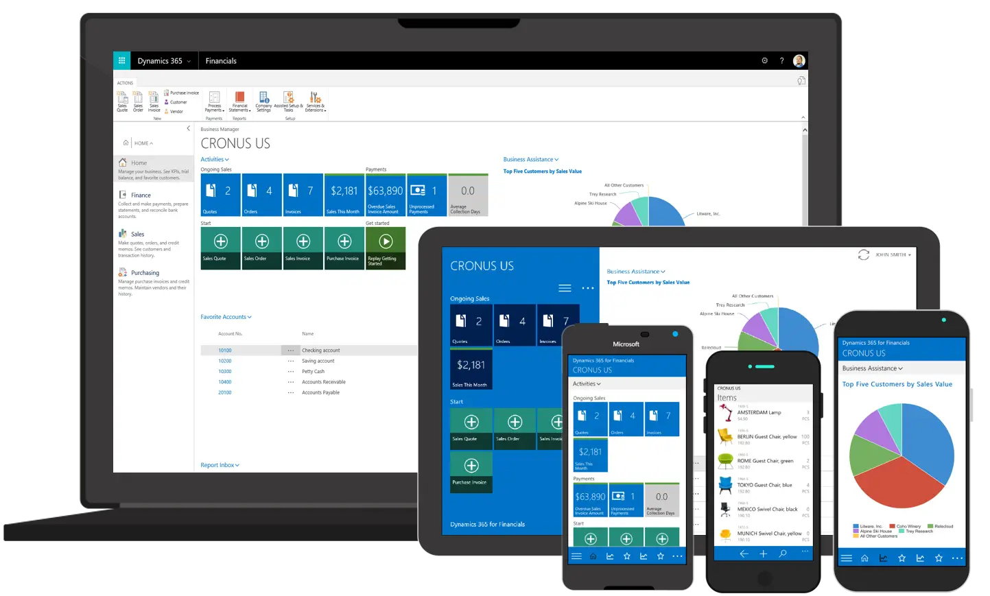
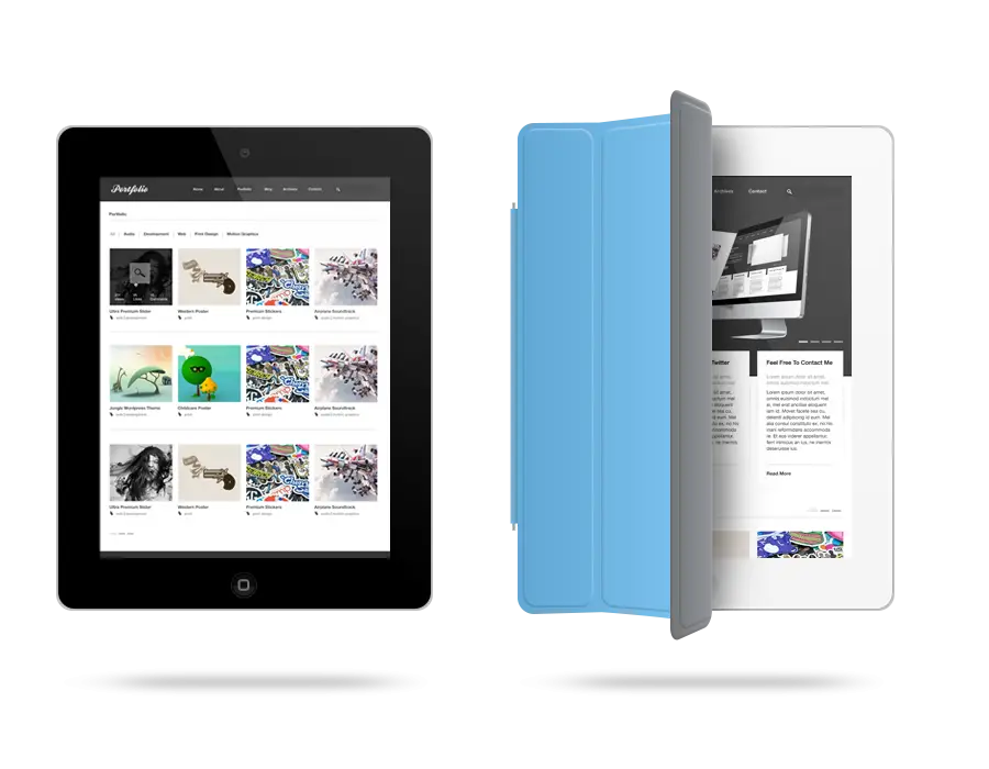
Various Devices Displaying Software -
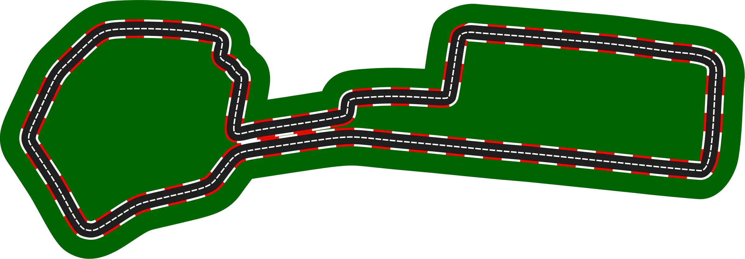
Race Track Circuit -
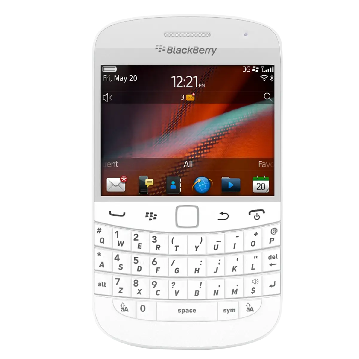
White BlackBerry Phone with Keyboard -
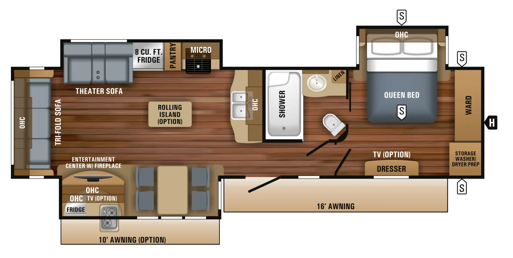
Floor Plan Layout for Home Construction -

Professional Tan Leather Briefcase -

Cartoon Figure Holding Tablet -
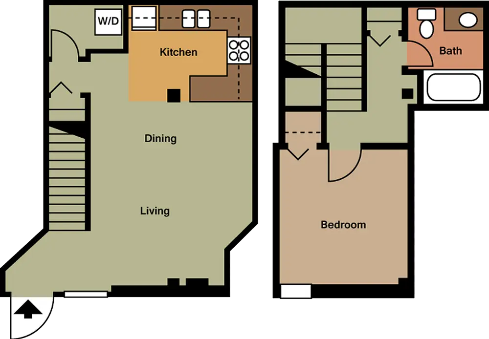
Apartment Floor Plan Design -
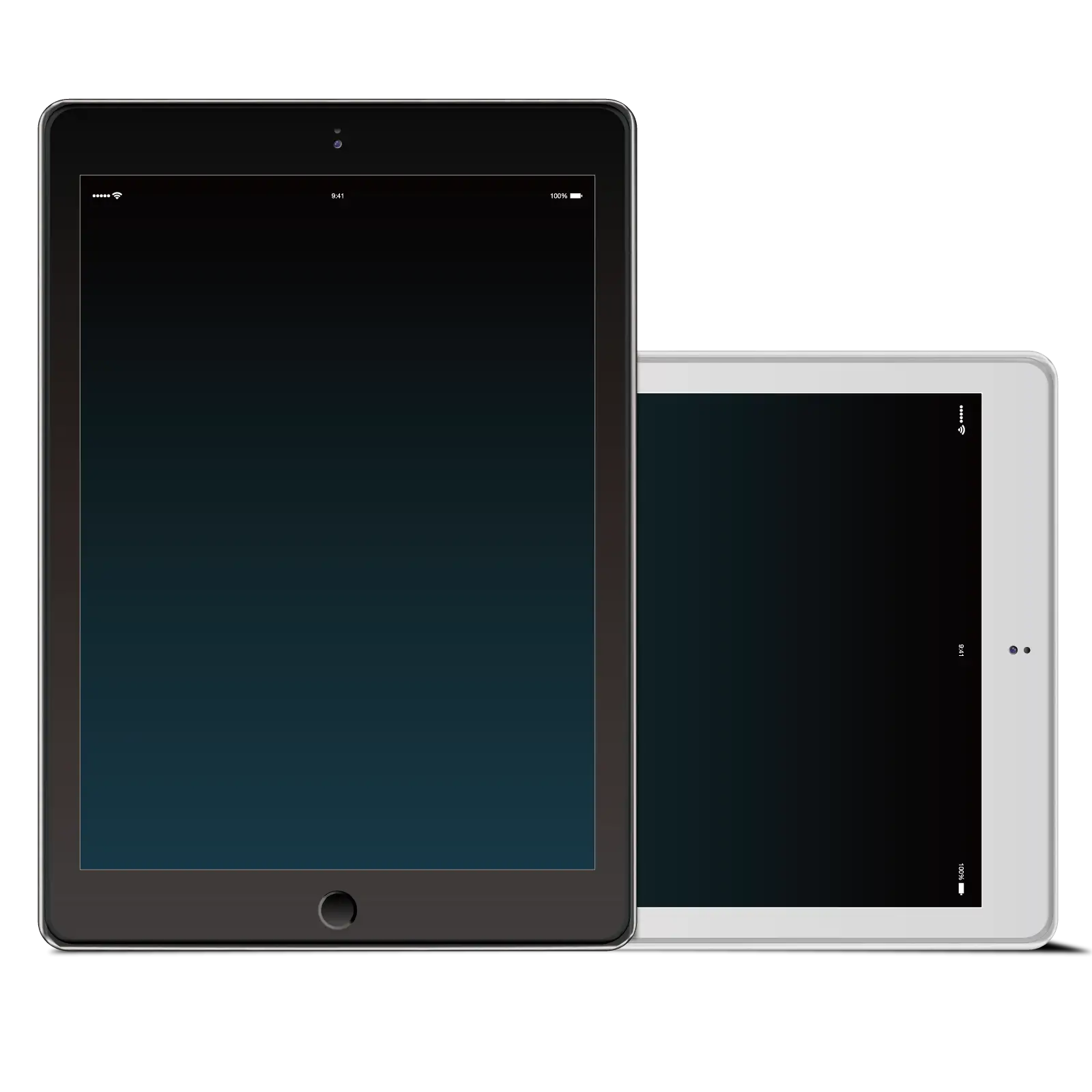
White Digital Tablet with Sleek Design -
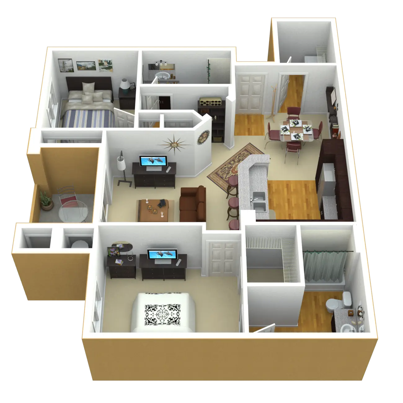
3D Apartment Layout Design -
Modern Smartphone with Blank Screen -

Smartphone Outline Icon Illustration -
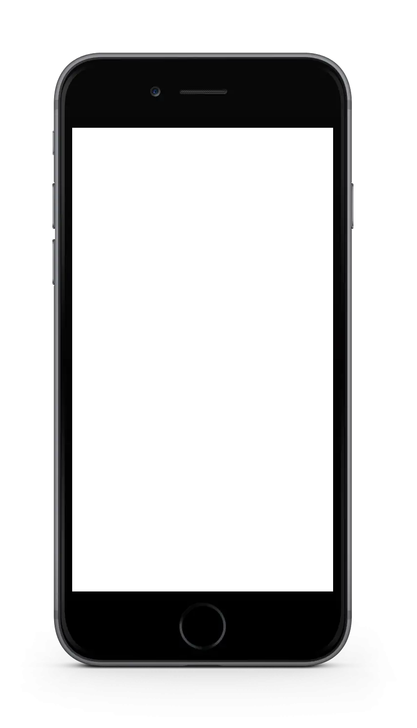
Black Smartphone Frame with Screen Template -
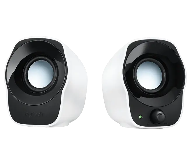
Compact Speakers for Clear Audio Experience -
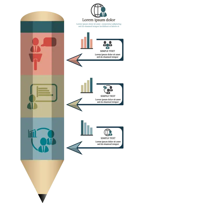
Infographic Pencil with Data Elements -
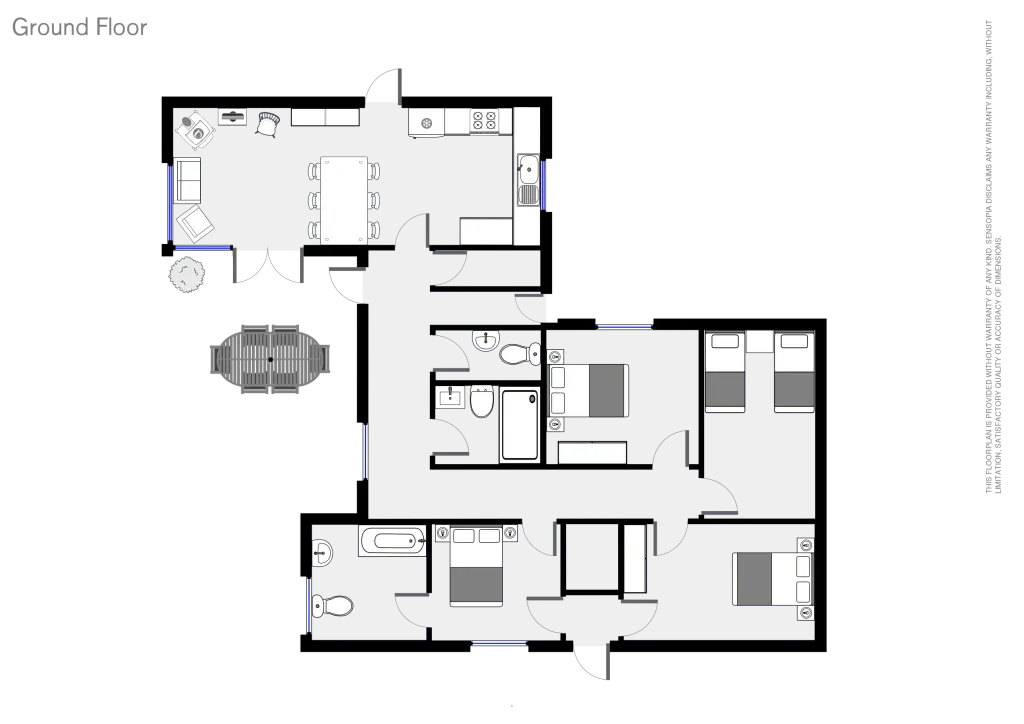
Ground Floor Plan Diagram Illustration -
Modern Tablet with Cover -
Black and White Tablet Device Icon -
Yellow List Icon for UI Design -
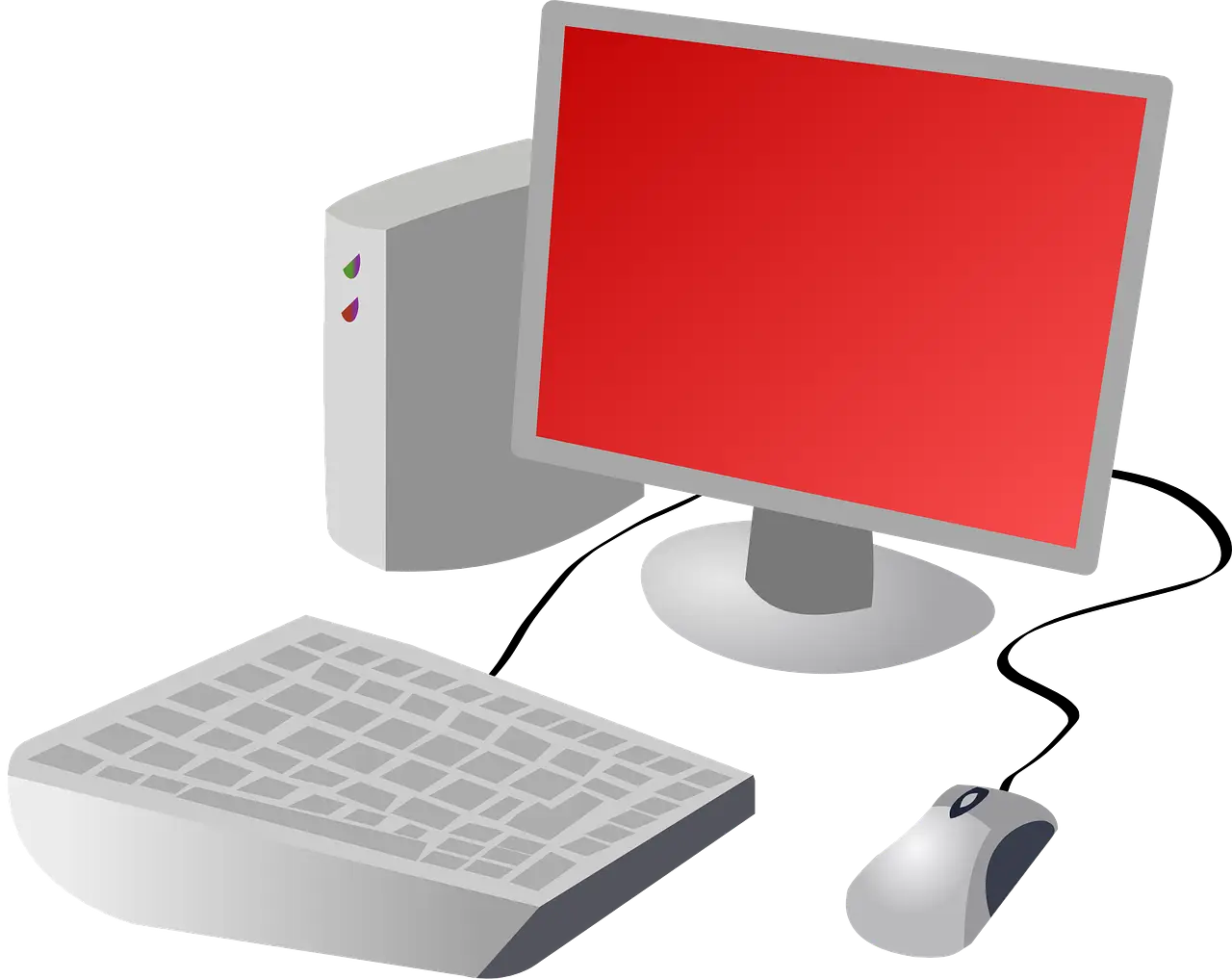
Desktop Computer Set with Red Screen