
You Might Like
-
Digital Connector with Binary Code -

Blue Play Button Icon -
Telkom Indonesia Official Logo -
Windows Logo on Blue Background -
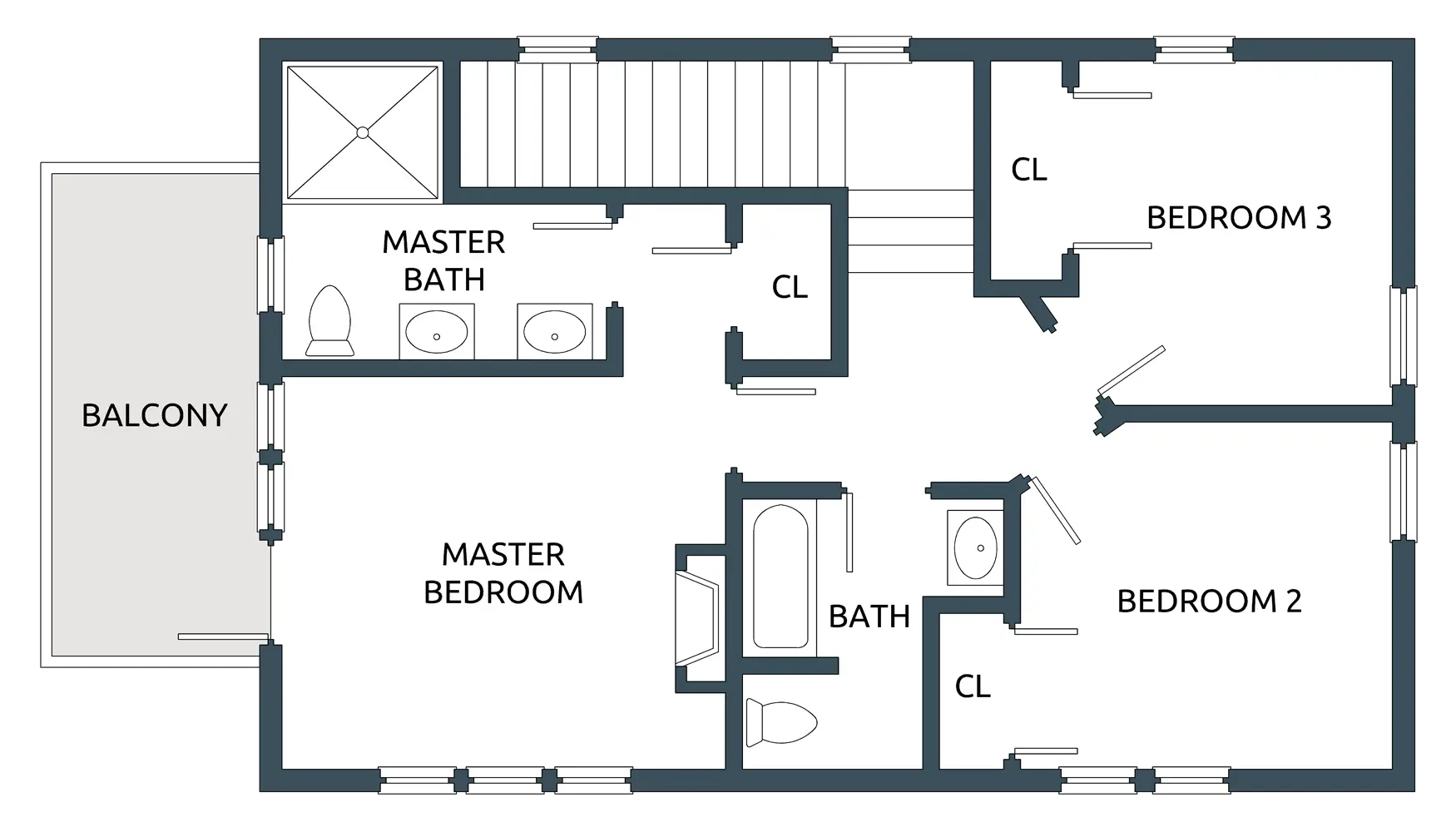
House Floor Plan with Three Bedrooms -

Blue Microsoft Edge Logo -

Blue Globe Network Icon -

Black Smartphone Icon Design -

Red Adobe Logo -

Yellow Happy Emoji Face -
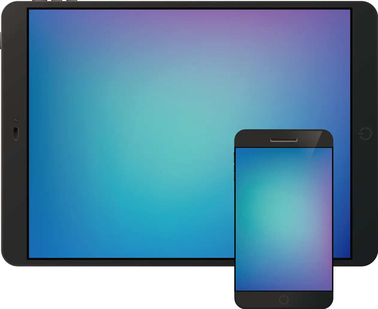
Tablet and Smartphone Technology -
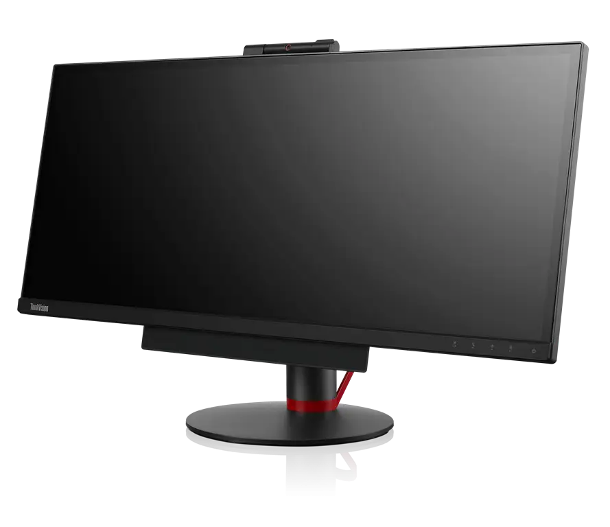
Modern Ultrawide Computer Monitor Display -
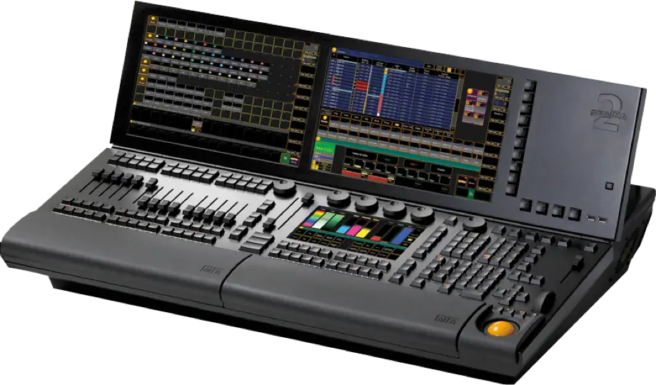
Professional Lighting Console for Stage Performance -

Blue Game Controller Icon -

Transparent Background Grid -

Fierce Bear Head Illustration -

Magical Cartoon Unicorn Head with Pink Mane -

Isometric Illustration of a Modern Kitchen Layout -
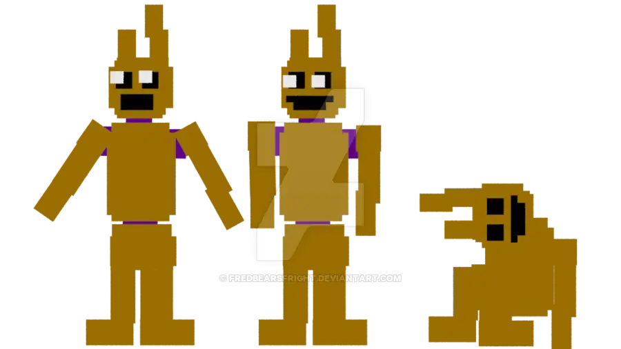
Pixelated Game Characters -

Phone Symbol for Communication -

Secure Laptop with Padlock Icon -

Chat Bubble with Lightning Icon Design -

Laughing Emoji with Tears of Joy -
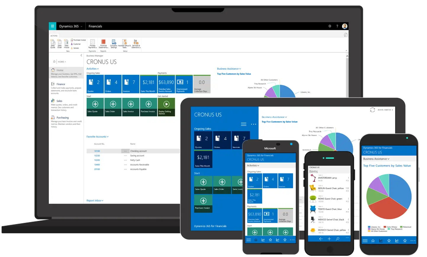
Various Devices Displaying Software -

Yellow Smiley with Shoes -
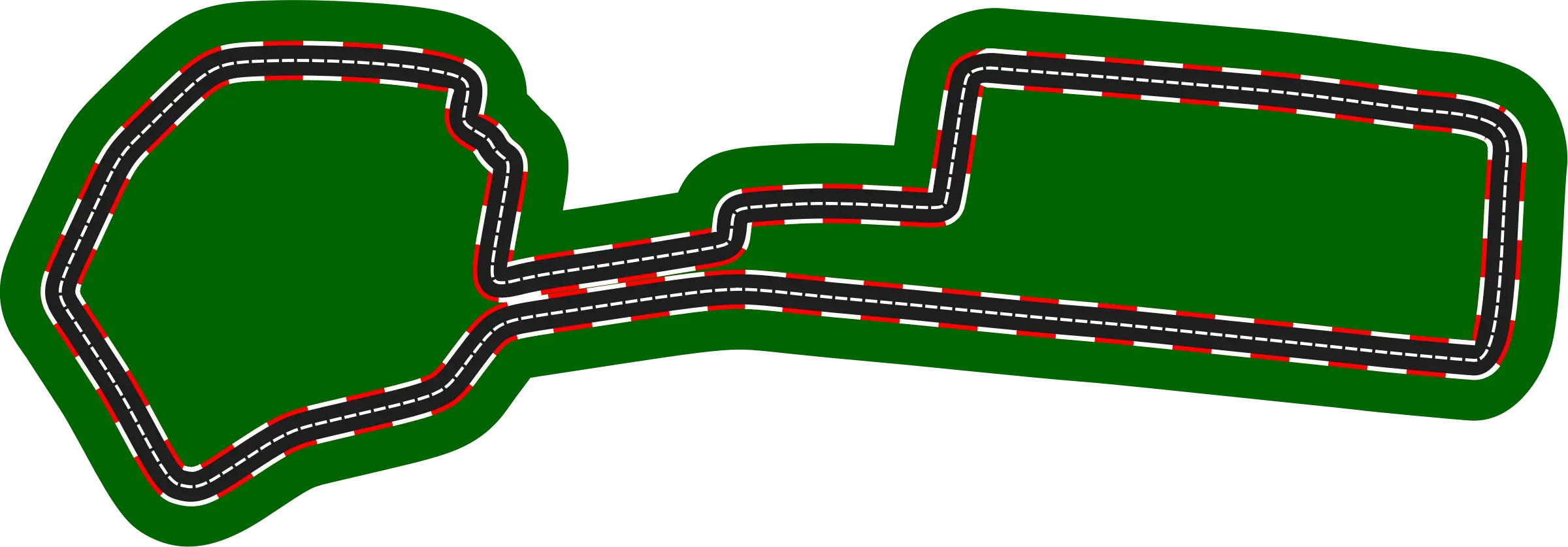
Race Track Circuit -

Drooling Emoji with Red Eyes -

Futuristic Robot Head -
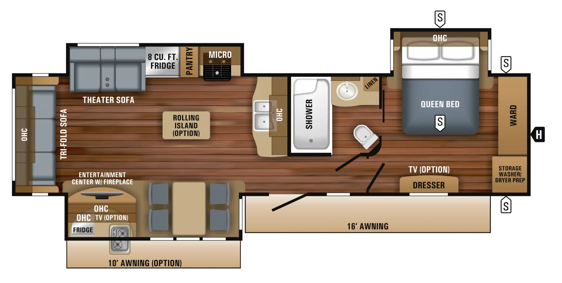
Floor Plan Layout for Home Construction -

Twitch Logo with Reflection Effect