You Might Like
-
Blue Eco-Friendly Electric Car -
Digital Connector with Binary Code -

Blue Play Button Icon -

Cartoon Character on Toilet -
Telkom Indonesia Official Logo -
Windows Logo on Blue Background -
Sleek Fighter Jet in Flight -

Blue Microsoft Edge Logo -
Collaboration in Programming with Computer Illustration -

Blue Globe Network Icon -

Black Smartphone Icon Design -

Red Adobe Logo -

Yellow Happy Emoji Face -
High-Definition Security Surveillance Camera -
Black Smartphone Back View Design -
Tablet and Smartphone Technology -
Adobe Flash Logo -
Professional Lighting Console for Stage Performance -

Blue Game Controller Icon -

Transparent Background Grid -
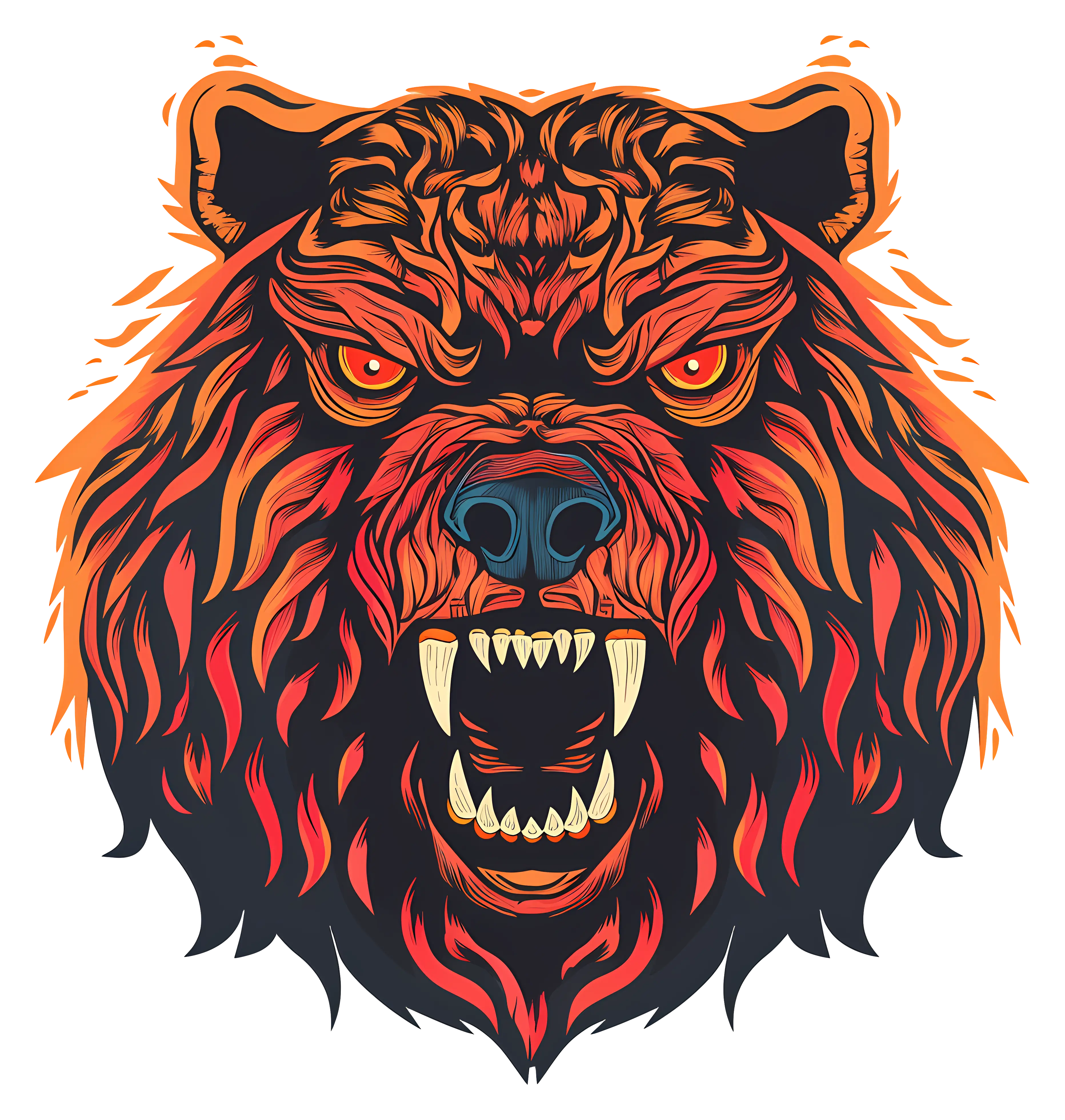
Fierce Bear Head Illustration -

Satellite Dish Icon -

Magical Cartoon Unicorn Head with Pink Mane -
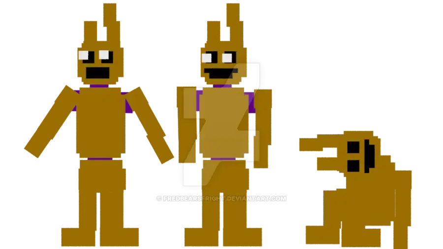
Pixelated Game Characters -
Computer Tower with Phone Icon -

Online Learning with Computer and Mouse -
Phone Symbol for Communication -

Secure Laptop with Padlock Icon -
Free WiFi Area Logo -

Chat Bubble with Lightning Icon Design