
Responsive Web Design Concept
This illustration effectively captures the essence of responsive web design, demonstrating how a single website effortlessly adjusts its layout and presentation across various screen sizes. From a large desktop monitor to a compact laptop and a mobile phone, the content intelligently reorganizes itself to provide a consistent and optimal viewing experience for any user. The accompanying clouds, some with gears, subtly suggest the underlying cloud infrastructure and intelligent systems that power this adaptive capability.
responsive design - web development - multi device - cloud services - digital experience - technology
This image only for personal use, png & jpg filesize may vary
You Might Like
-

Blue Eco-Friendly Electric Car -

Digital Connector with Binary Code -

Cartoon Character on Toilet -

Telkom Indonesia Official Logo -

Sleek Fighter Jet in Flight -

Blue Microsoft Edge Logo -

Collaboration in Programming with Computer Illustration -

Blue Globe Network Icon -

Black Smartphone Icon Design -

Red Adobe Logo -

High-Definition Security Surveillance Camera -

Black Smartphone Back View Design -
Tablet and Smartphone Technology -

Adobe Flash Logo -

Blue Game Controller Icon -

Satellite Dish Icon -

Computer Tower with Phone Icon -

Online Learning with Computer and Mouse -

Secure Laptop with Padlock Icon -

Free WiFi Area Logo -

Security Camera Icon -
Blue Walkie-Talkie Communication Device -

Businessman in a Suit Checking Phone -

Smart Home Control System with Temperature Display -
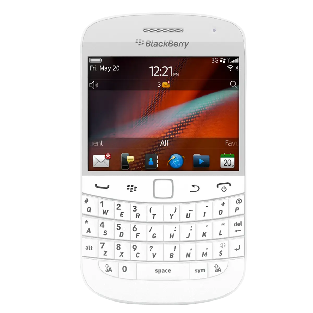
White BlackBerry Phone with Keyboard -

Innovative Light Bulb Illustration -

Futuristic Robot Head -

Power Button Icon in Bold Black -

Motorola Black and White Logo -

Cartoon Figure Holding Tablet