
You Might Like
-

Cute Owl with Glasses -

Digital Connector with Binary Code -

Popcorn Bucket -
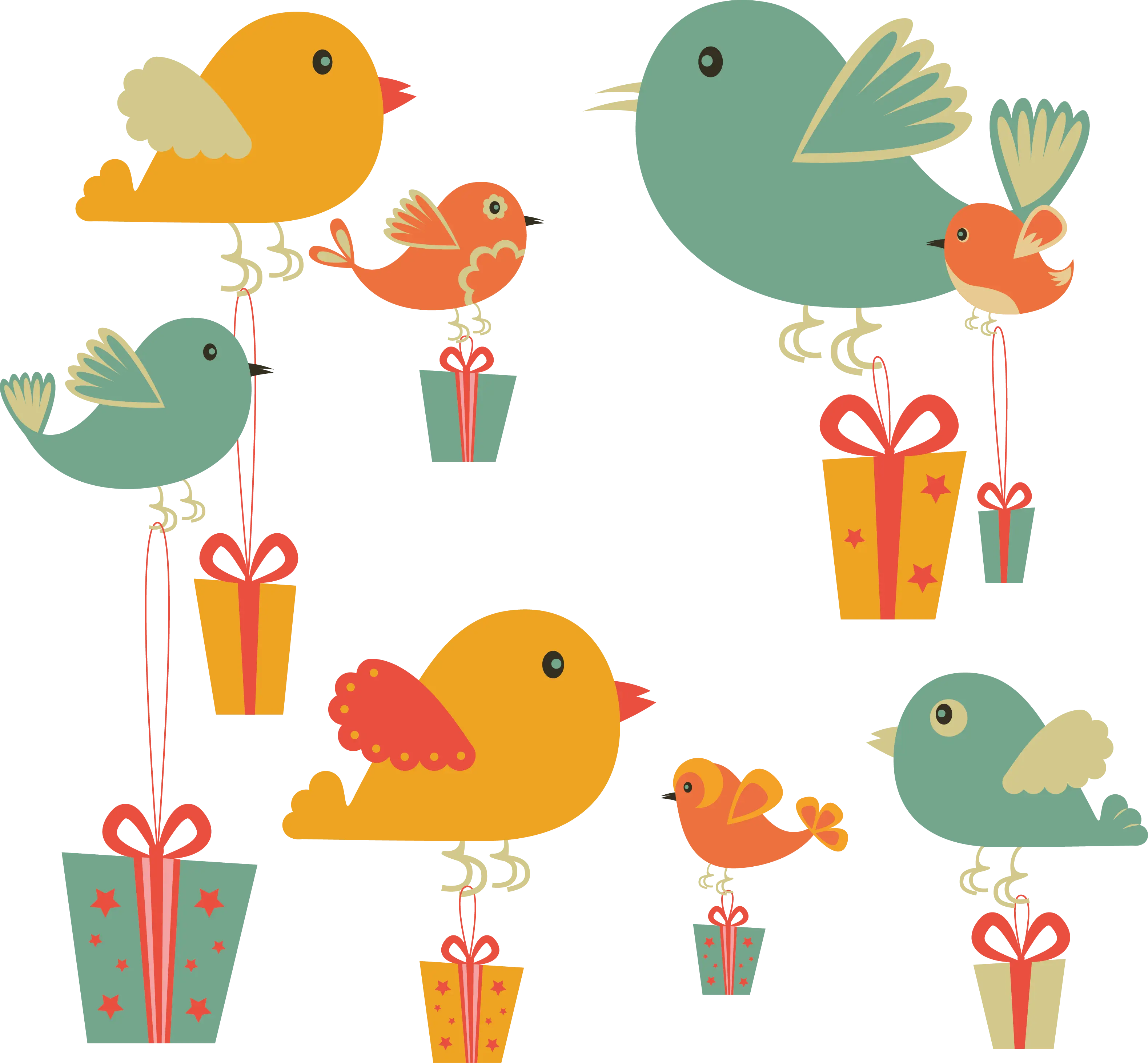
Colorful Birds with Gifts -
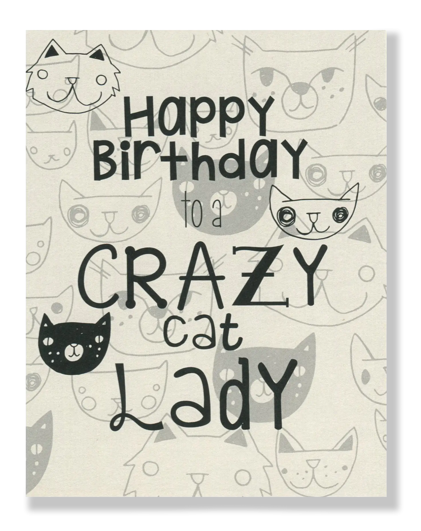
Happy Birthday to a Crazy Cat Lady Card -
Green Train Cartoon Illustration -
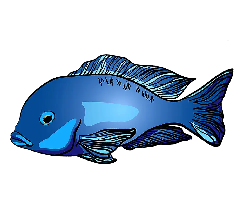
Blue Fish Graphic Illustration -
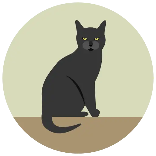
Stylized Black Cat Illustration -
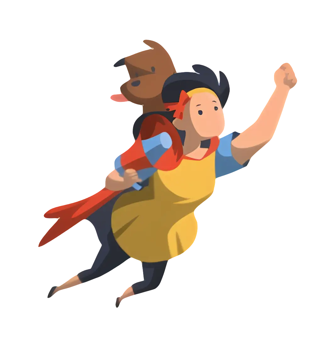
Superhero Woman Flying -

Outline of a Sitting Dog -

Blue Play Button Icon -

Black and White Flower Outline Design -
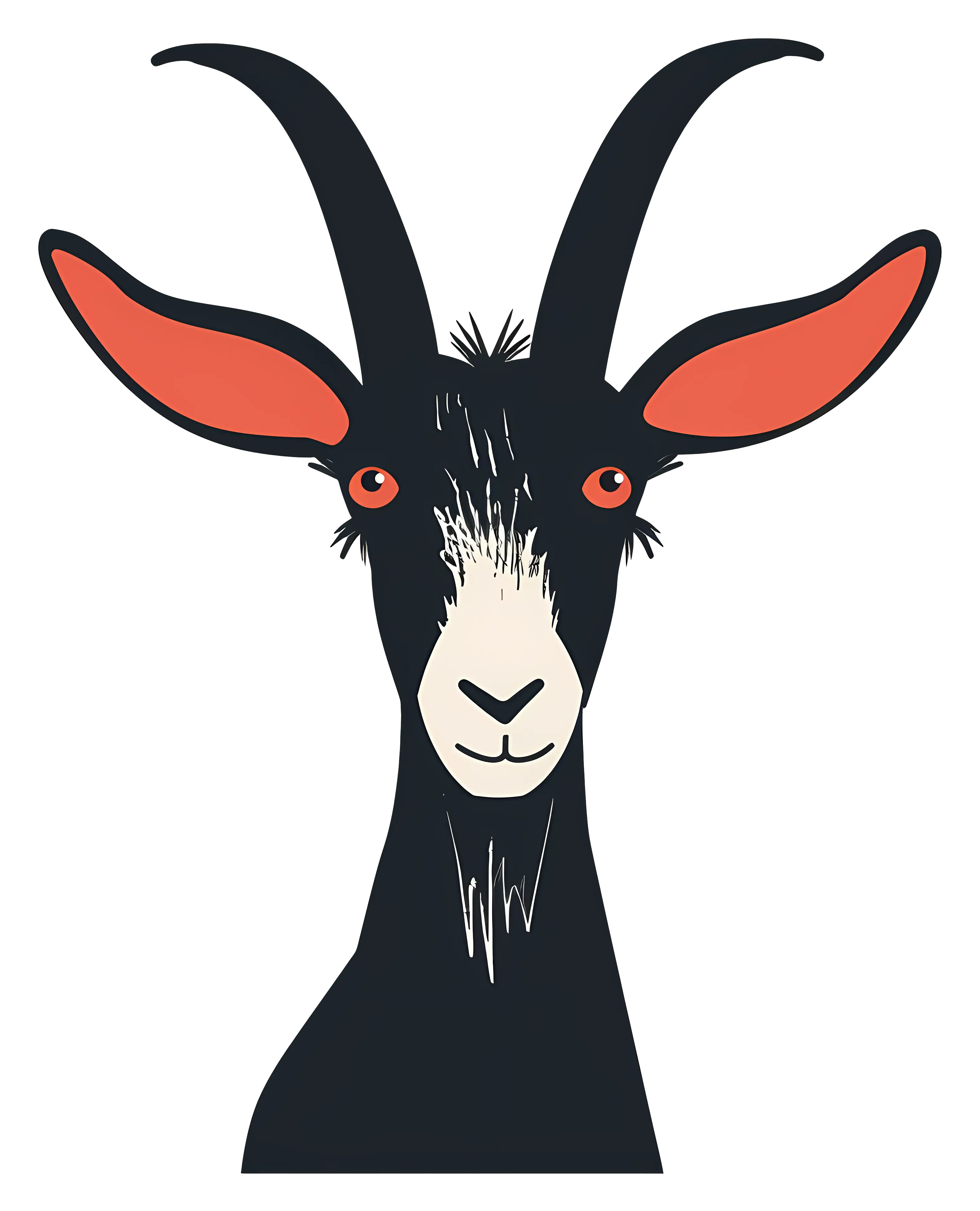
Artistic Black Goat Illustration with Horns -
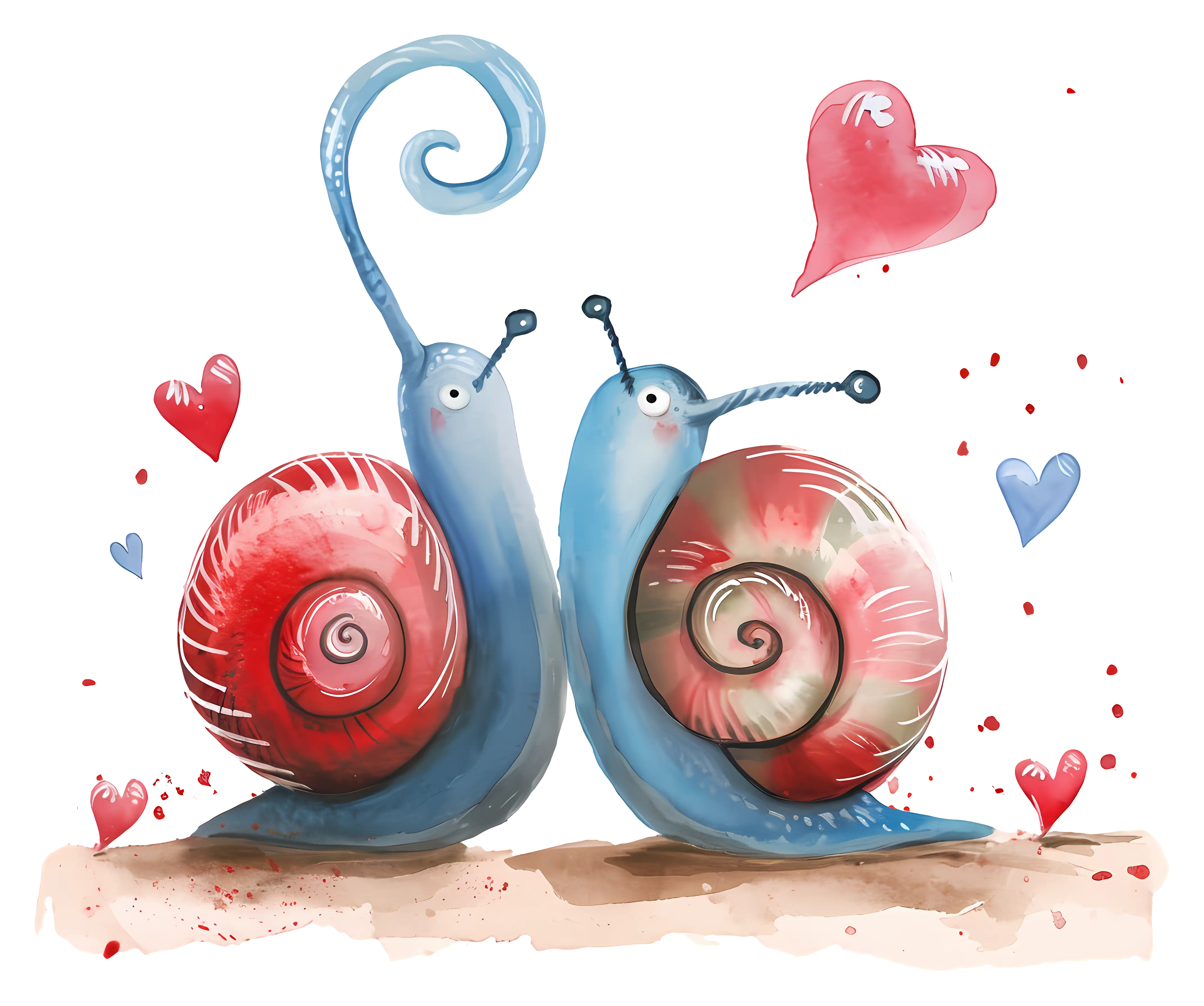
Romantic Watercolor Snails with Hearts -
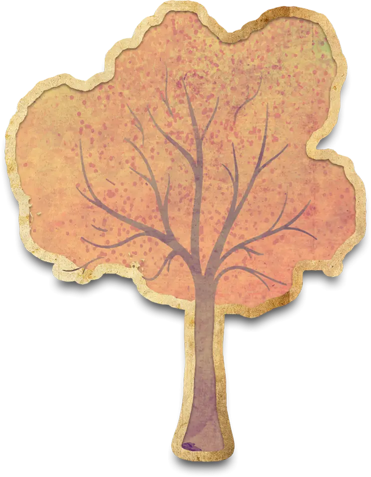
Autumn Tree Illustration -
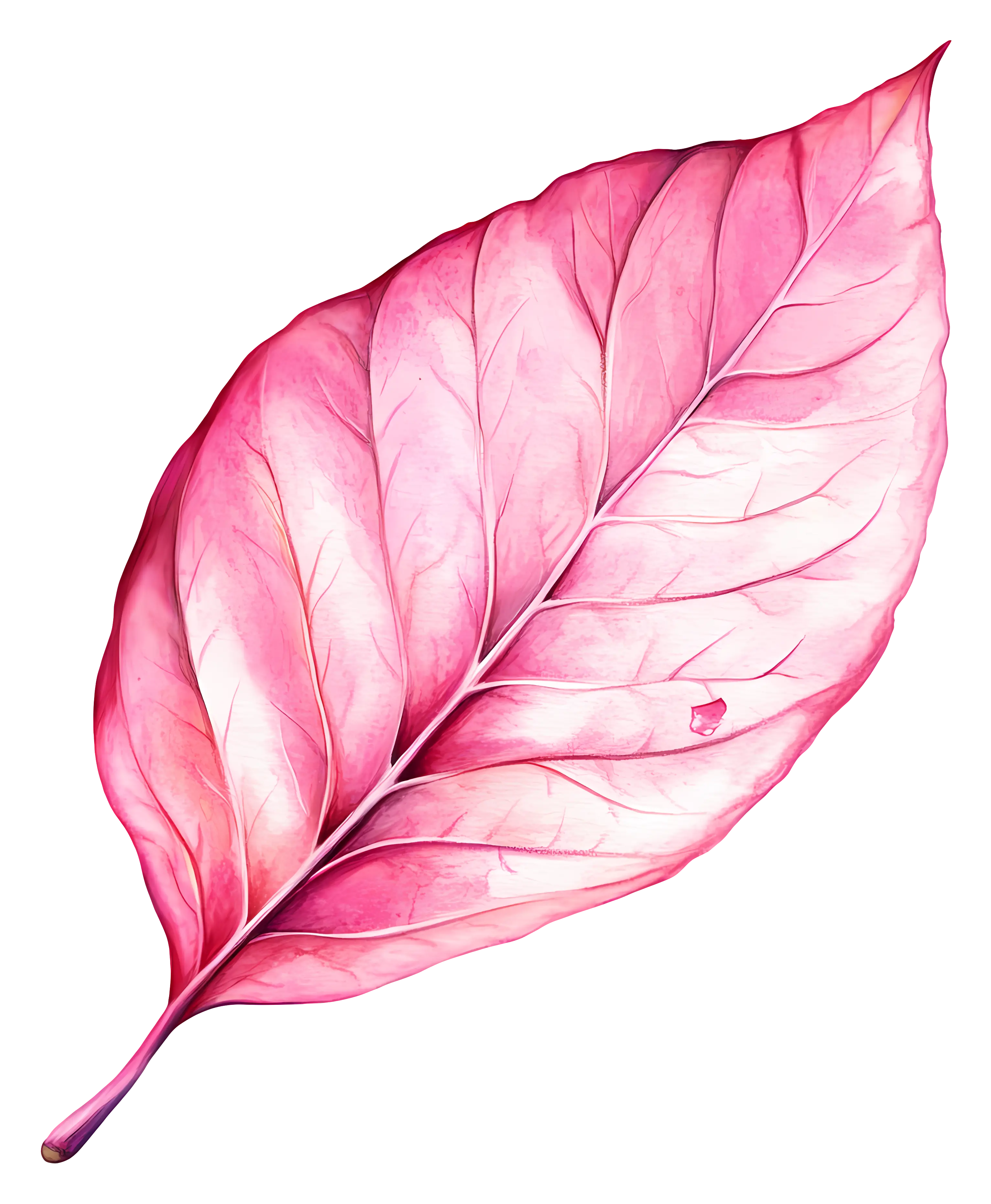
Pink Leaf Illustration -
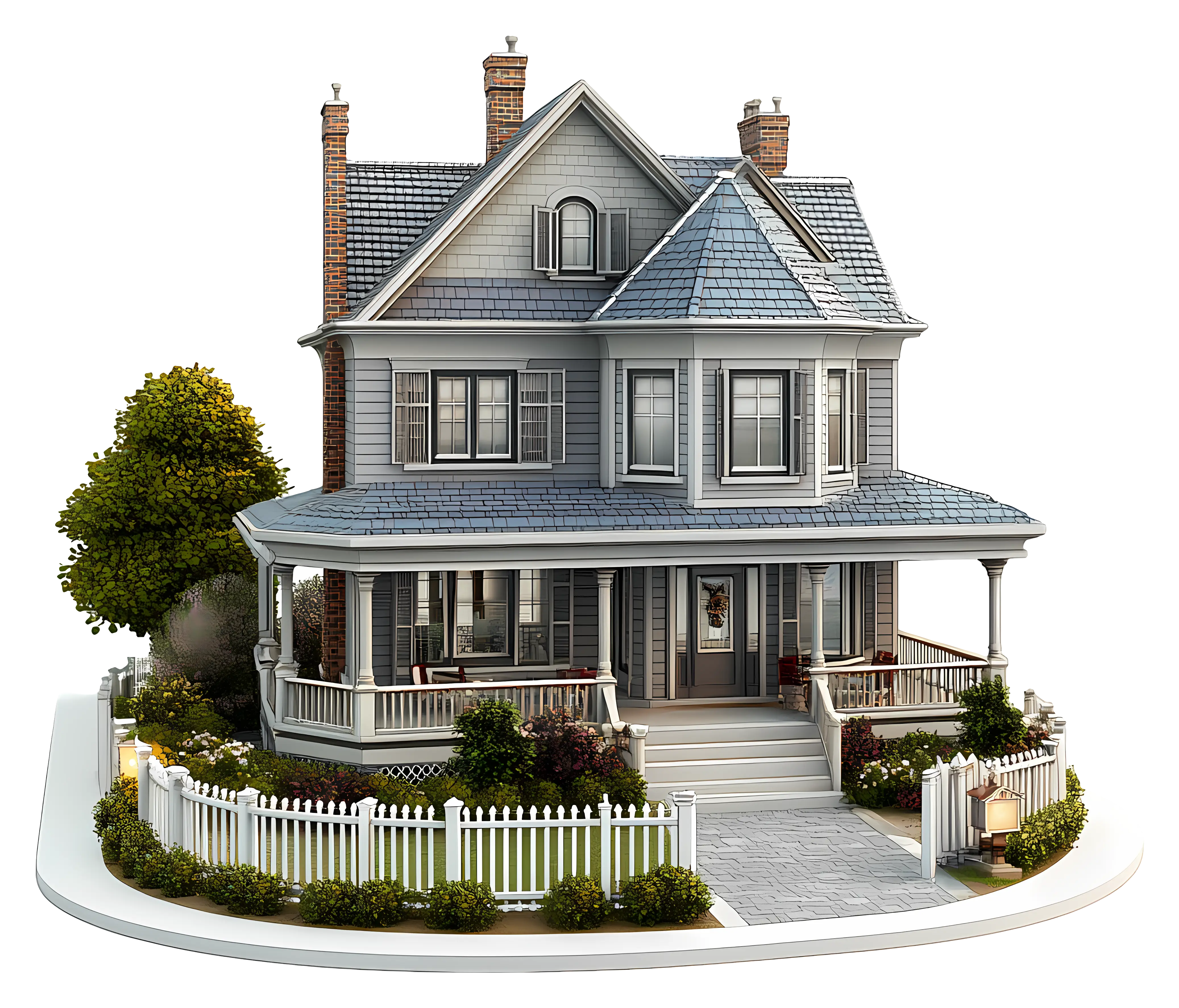
Charming House with Garden Illustration -
Telkom Indonesia Official Logo -
Cute Cartoon Dolphin Illustration -

Soccer Ball and Shoe Illustration -
Bright Corn Cob Illustration -
Windows Logo on Blue Background -
Stack of Blankets with Dog -

Colorful Stack of Books with Decorative Leaves -
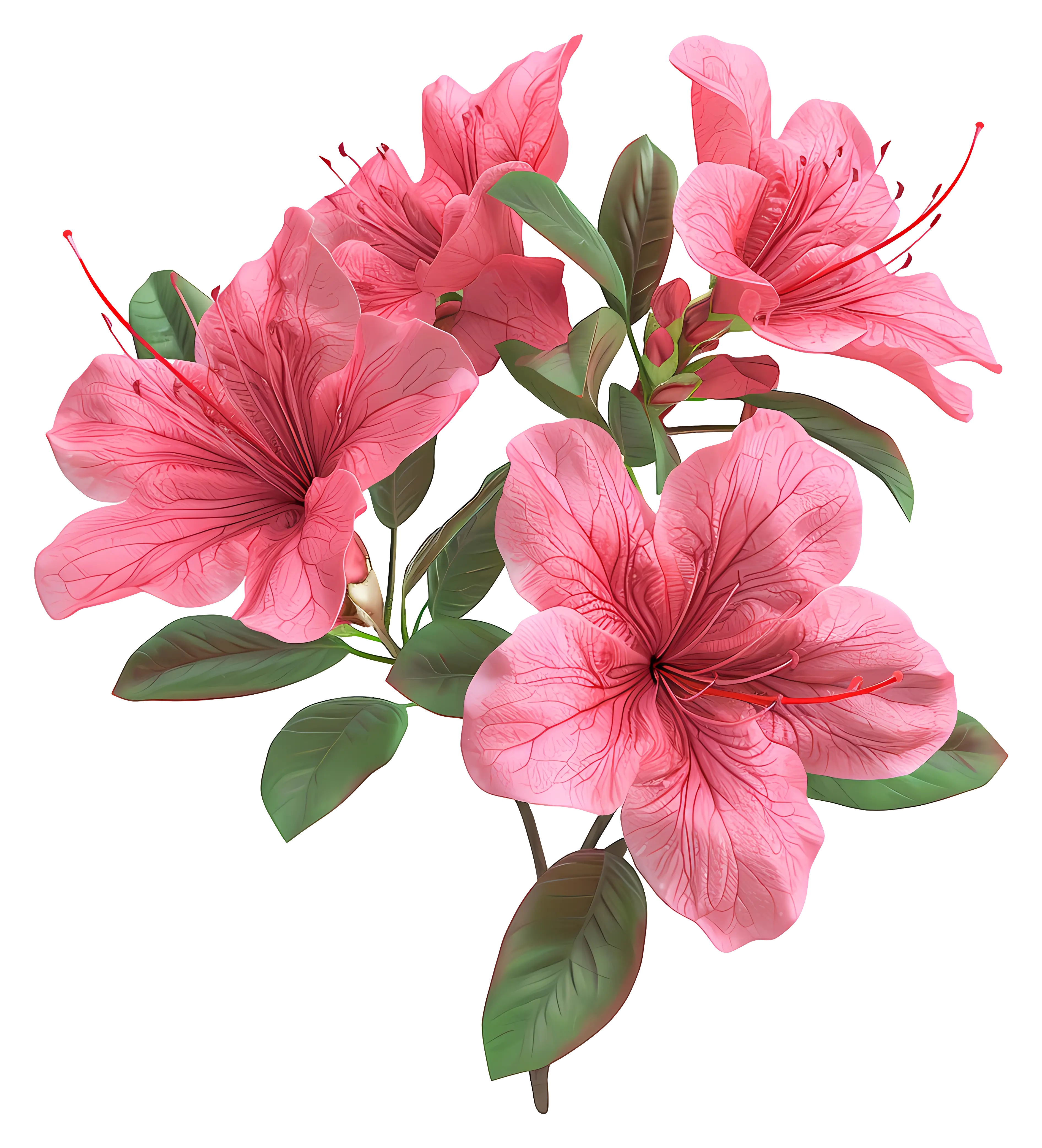
Pink Flowers with Leaves Design -

Golden Crown Illustration -

Skull and Crossbones Symbol Illustration -
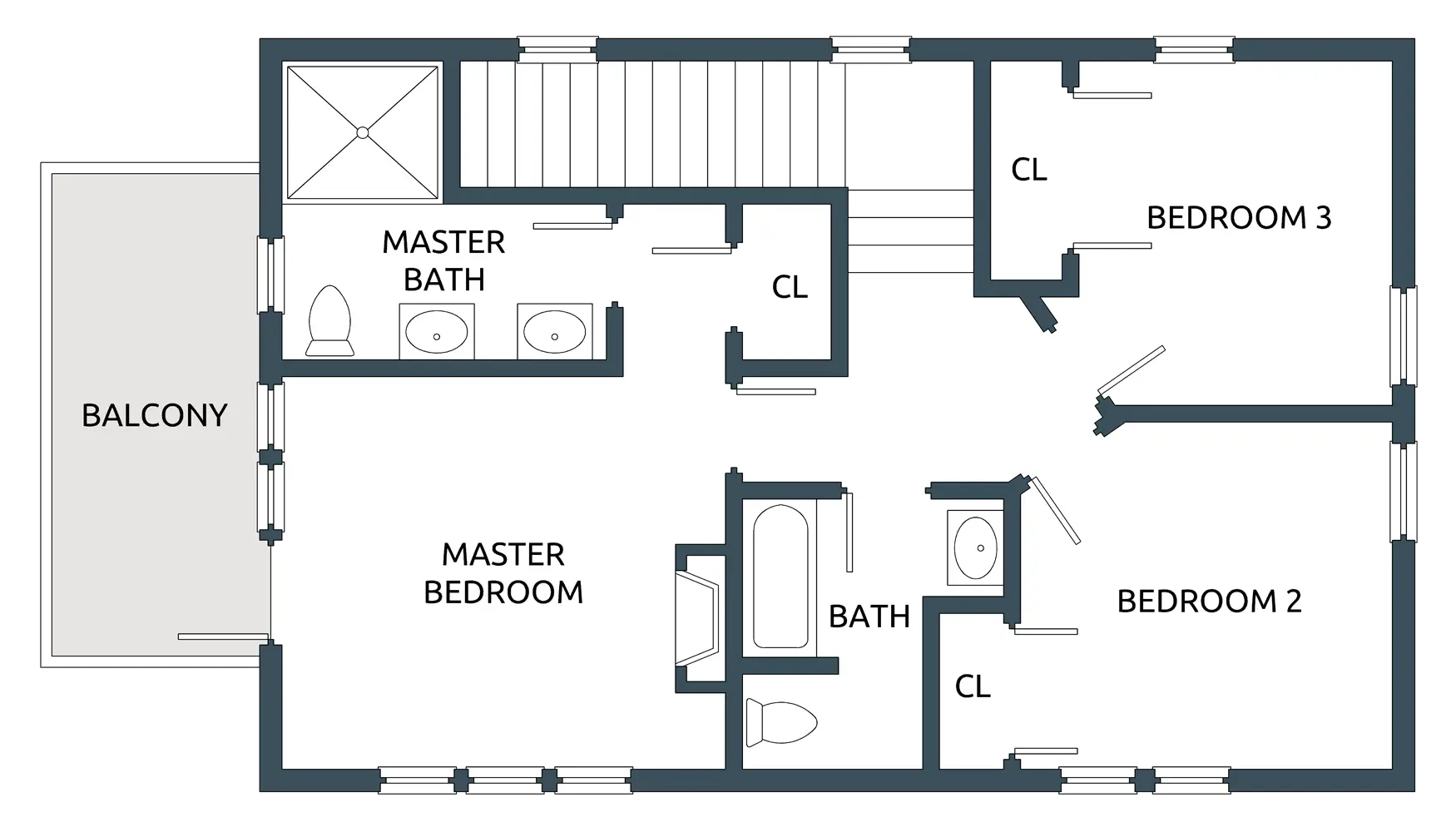
House Floor Plan with Three Bedrooms -

Pixel Art Devil Cat with Trident -
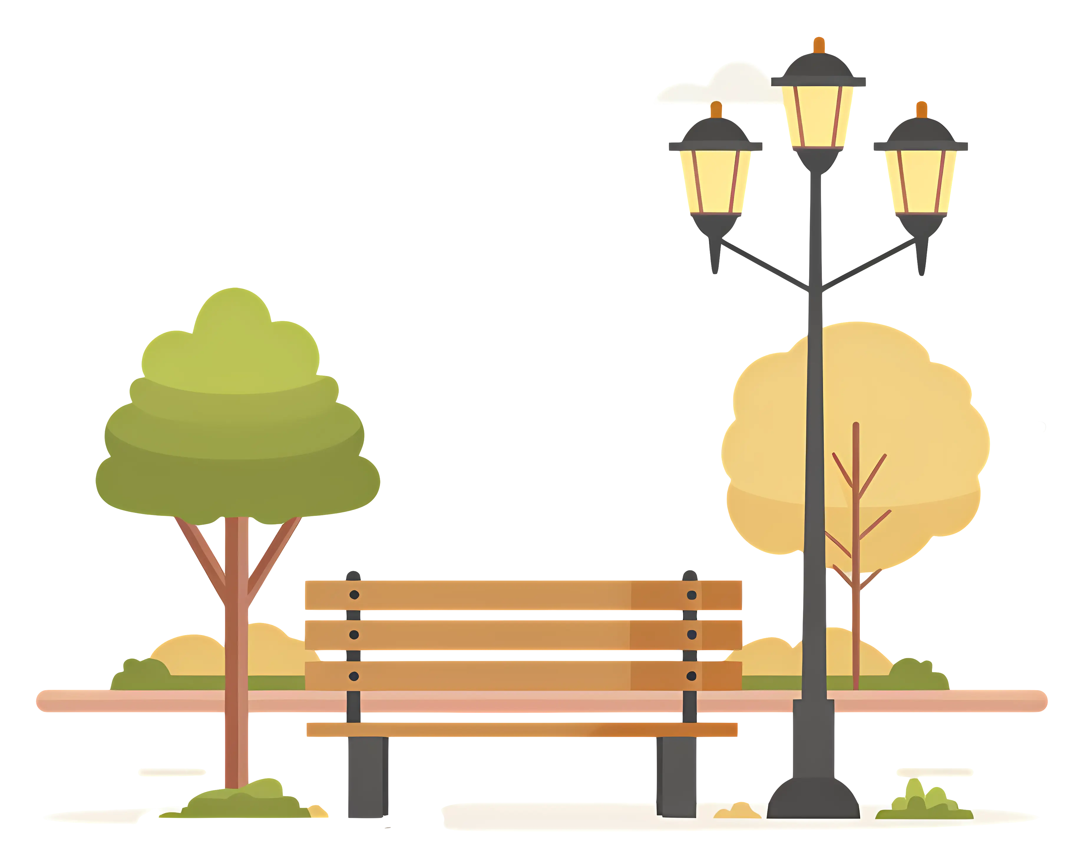
Park Bench with Lamp Post and Trees in the Background