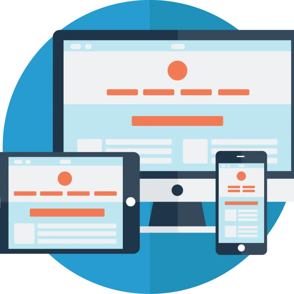
Responsive Website Design Across Devices
An illustrative graphic showing a responsive website layout adapting across different devices including desktop monitor, tablet, and smartphone, highlighting the importance of flexible and adaptive web design in modern digital communication.
responsive - webdesign - mobile - adaptive - interface - digital - screens - layout
This image only for personal use, png & jpg filesize may vary
You Might Like
-

Simple Credit Card Icon -

Digital Connector with Binary Code -

Blue Play Button Icon -

Telkom Indonesia Official Logo -

Hand Swipe Gesture Icon for Interface Navigation -

Windows Logo on Blue Background -
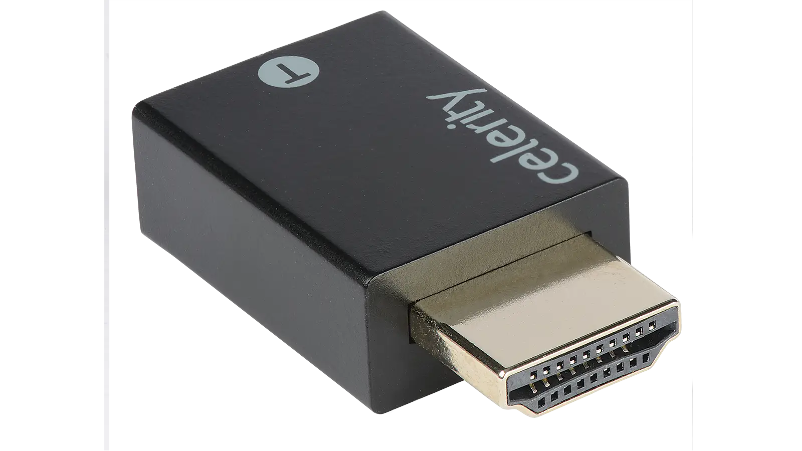
Black HDMI Adapter -
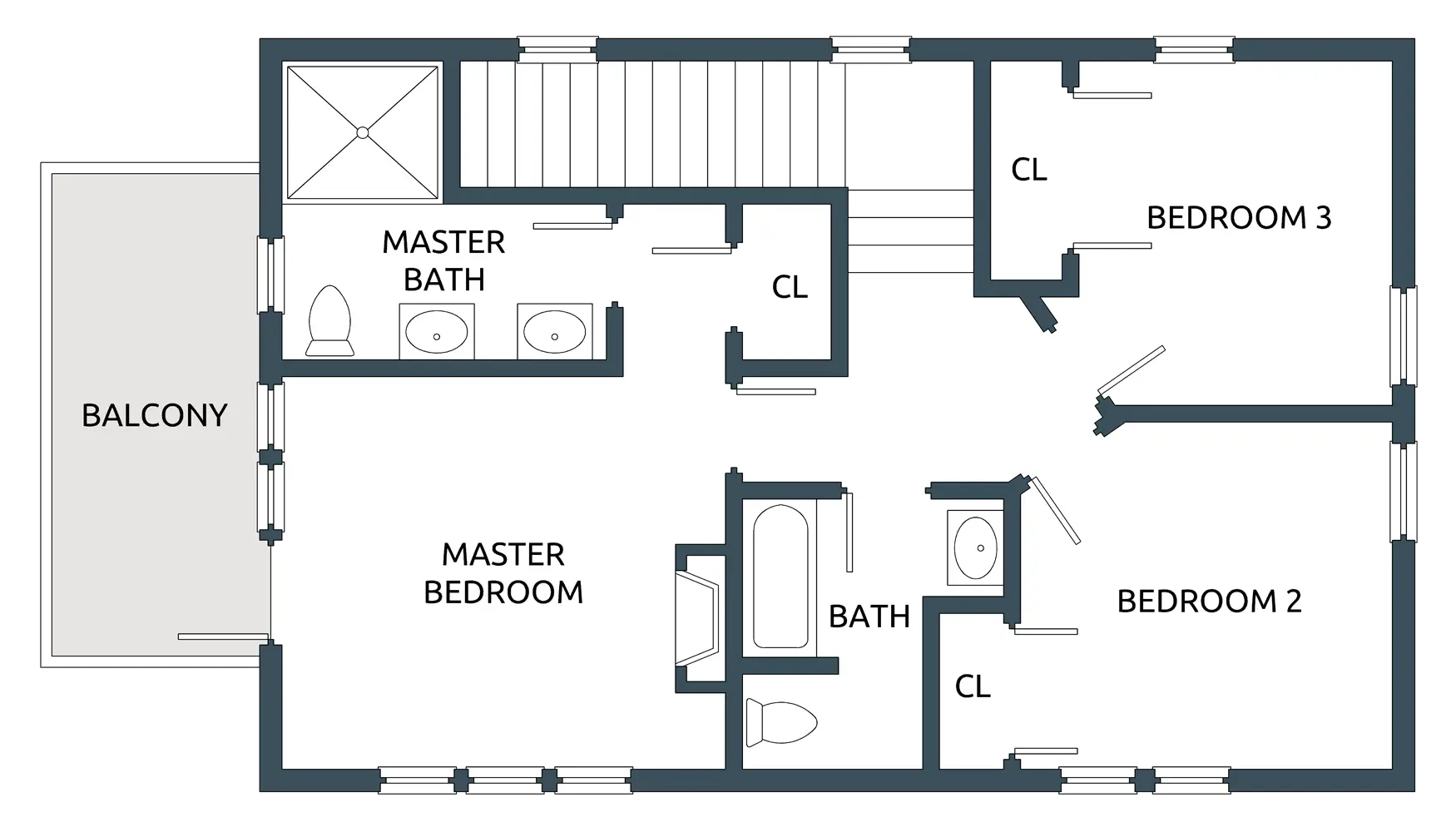
House Floor Plan with Three Bedrooms -

Blue Microsoft Edge Logo -

Blue Globe Network Icon -

Black Smartphone Icon Design -

Red Adobe Logo -

Yellow Happy Emoji Face -
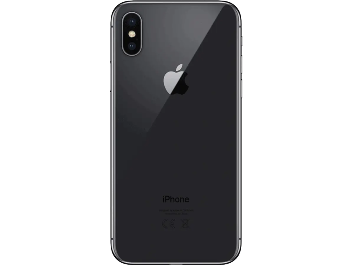
Black Smartphone Back View Design -
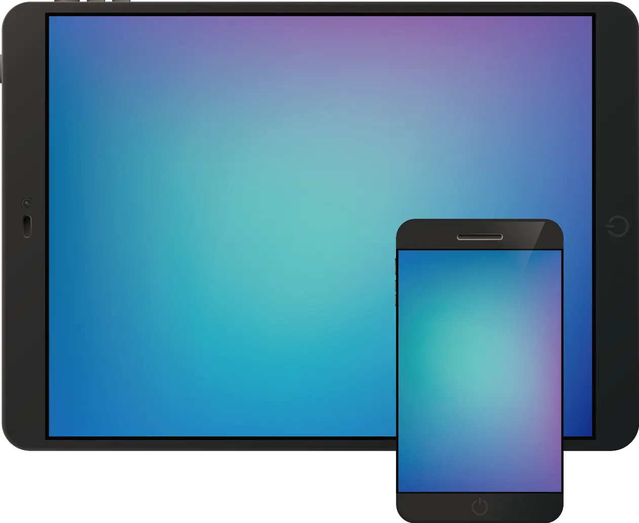
Tablet and Smartphone Technology -

Professional Lighting Console for Stage Performance -

Blue Game Controller Icon -

Transparent Background Grid -

Fierce Bear Head Illustration -

Purple Phone Call Icon with Notification -

Magical Cartoon Unicorn Head with Pink Mane -

Isometric Illustration of a Modern Kitchen Layout -

Pixelated Game Characters -

Phone Symbol for Communication -

Hamburger Menu Icon for Navigation -

Secure Laptop with Padlock Icon -

Chat Bubble with Lightning Icon Design -

Laughing Emoji with Tears of Joy -

Businessman in a Suit Checking Phone -
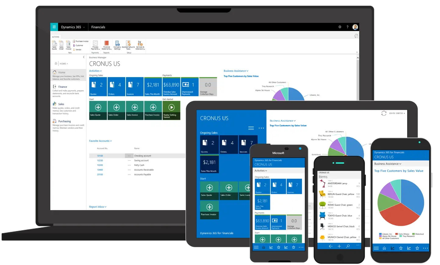
Various Devices Displaying Software