You Might Like
-
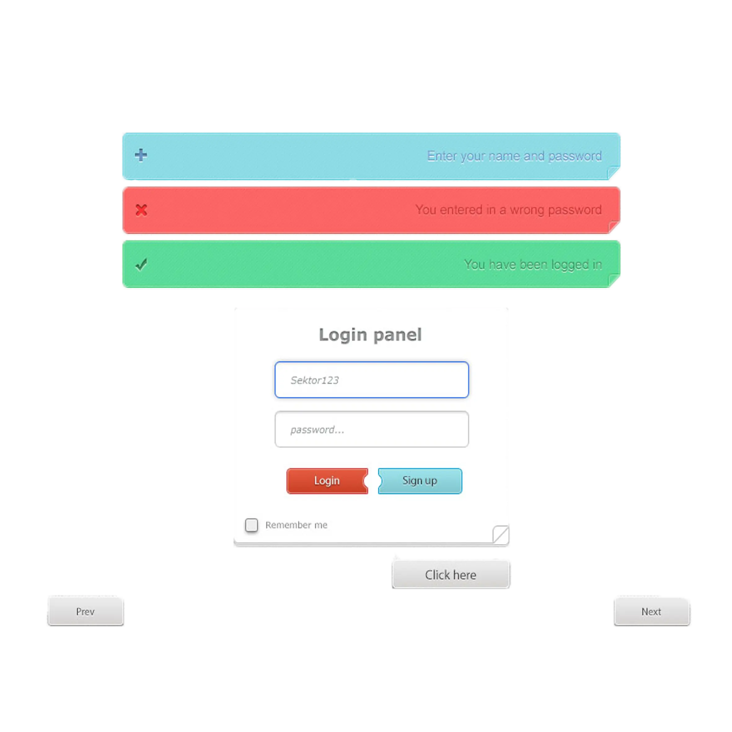
Web Login Panel Design -
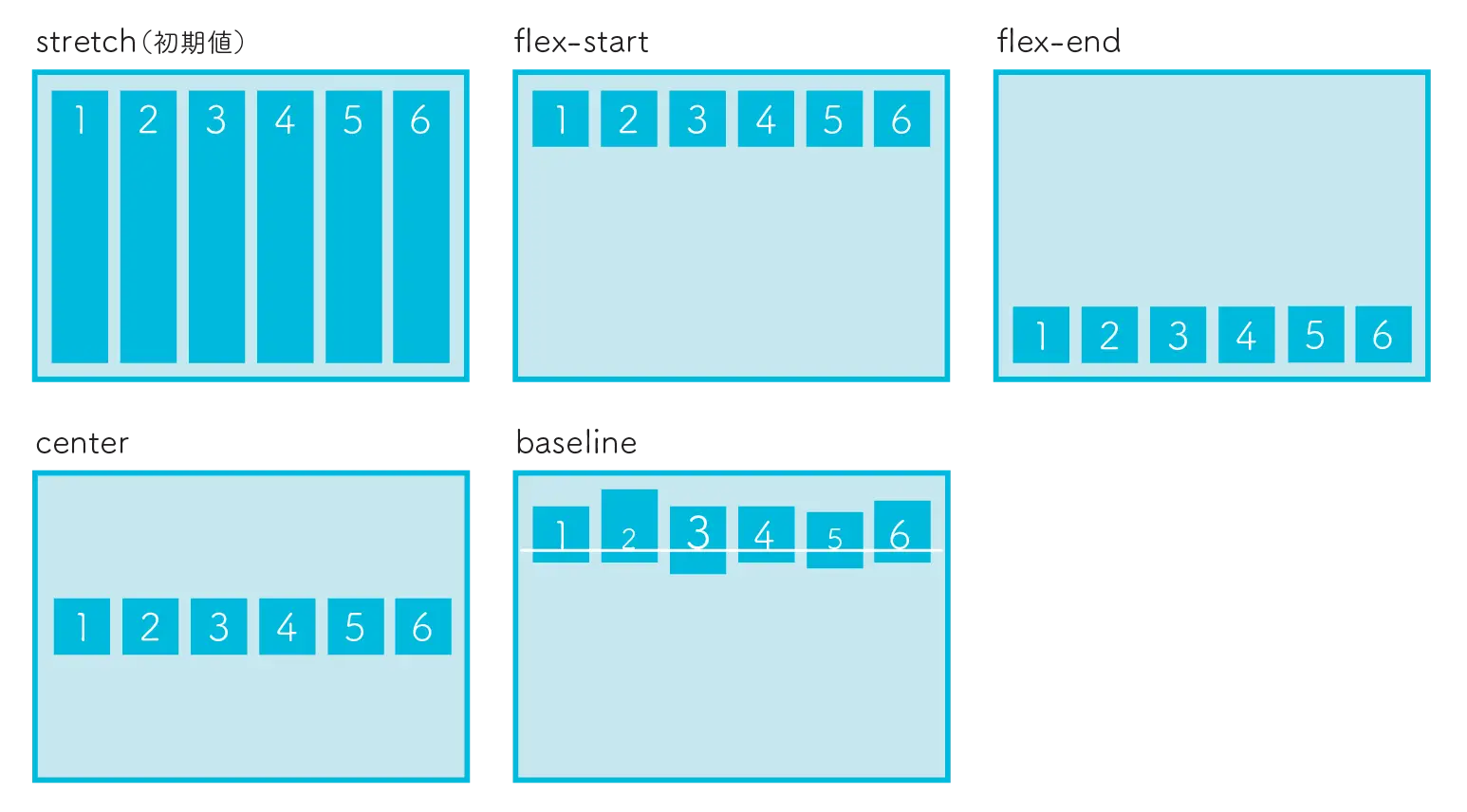
CSS Flexbox Layout Examples -

User Profile Icon with Data List -

Tablet and Smartphone Icon in Blue Outline -

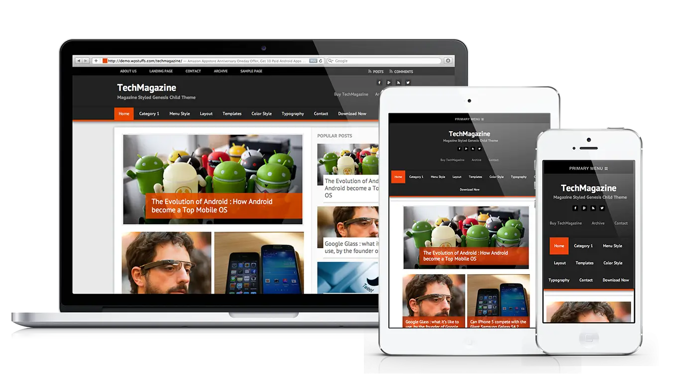
Digital Devices Layout for Technology Presentation -

Purple Redux Logo for Web Development Context -

JavaScript Logo in Green -
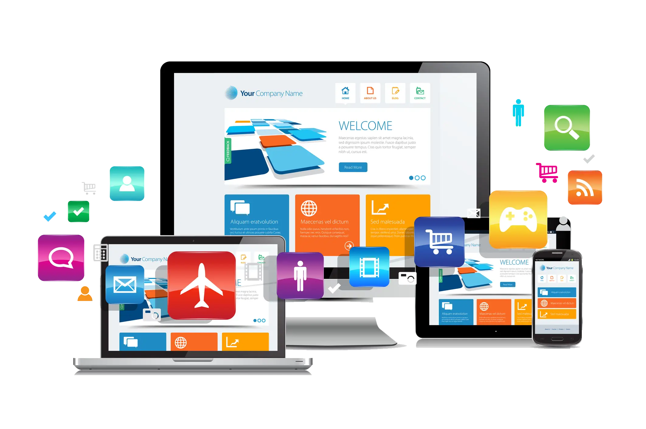
Responsive Devices Display Concept -
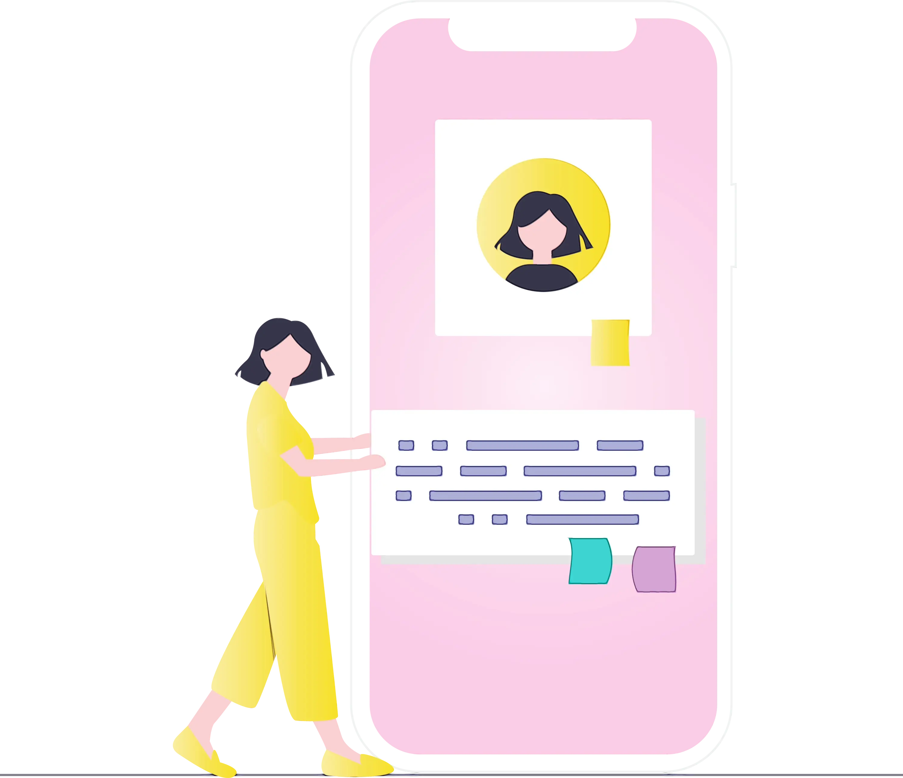
Illustration of Woman Interacting with Mobile Application -

Assorted Smartphones -

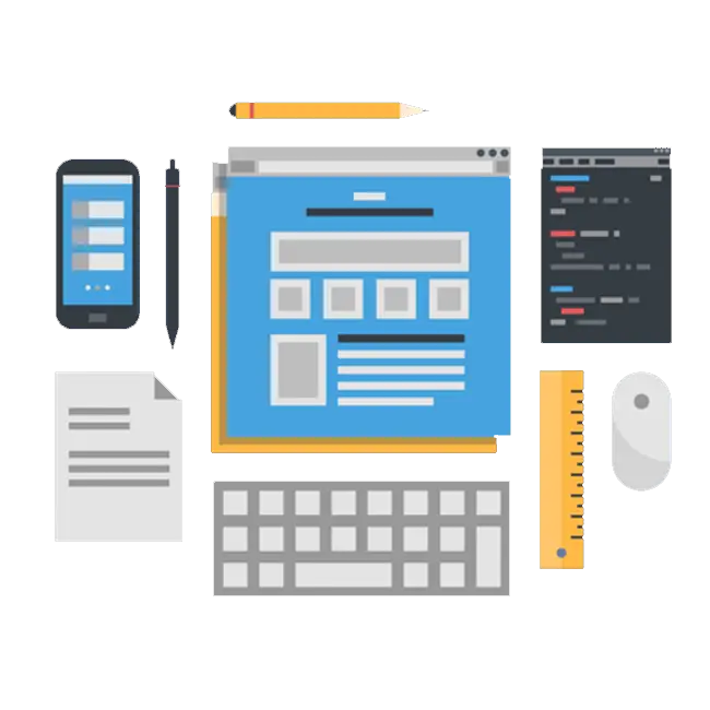
Web Development Tools and Devices -
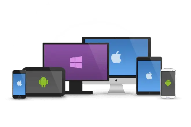
Devices with Apple, Android, and Windows Logos -
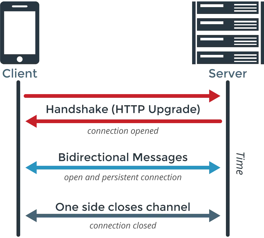
WebSocket Communication Diagram -
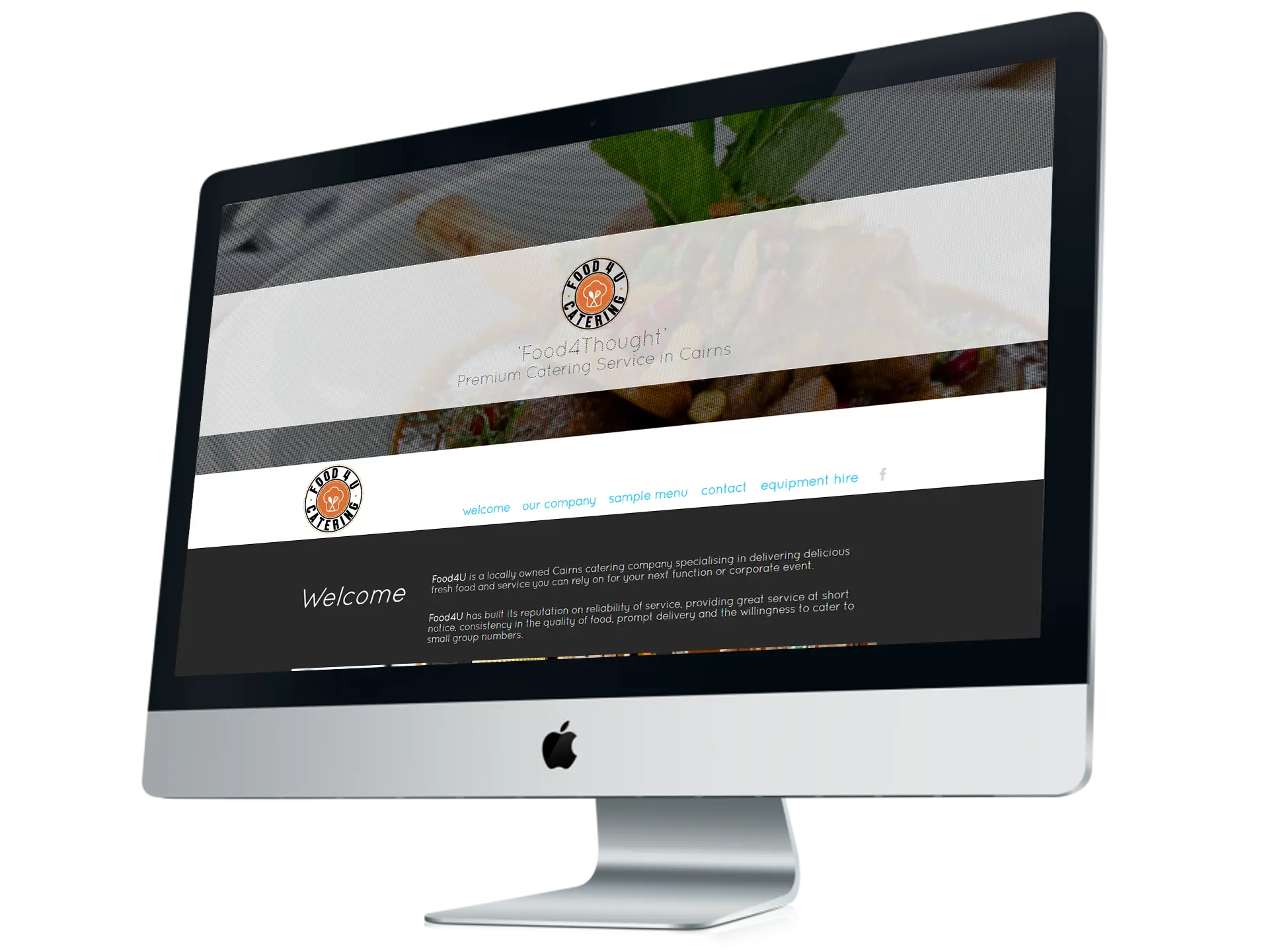
Desktop Computer Monitor -

Social Media Icons and Devices Illustration -

Three Horizontal Line Menu Icon -
Web Design Tools and Digital Elements for Website Development -

Left Arrow for Navigation -
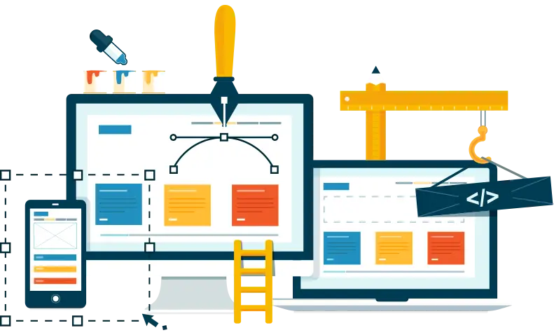
Creative Illustration of Web Design and Development Tools -
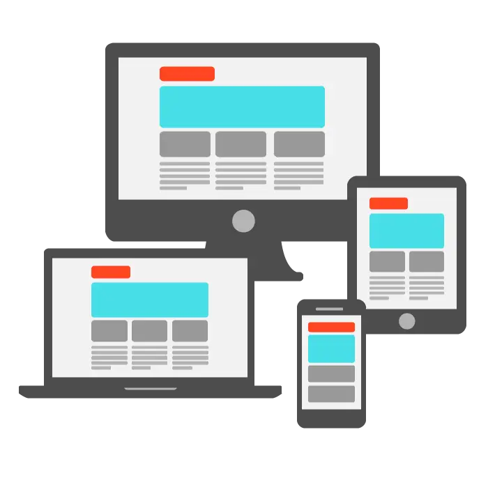
Responsive Web Interface on Digital Devices -
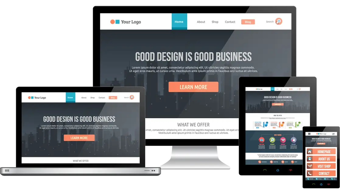
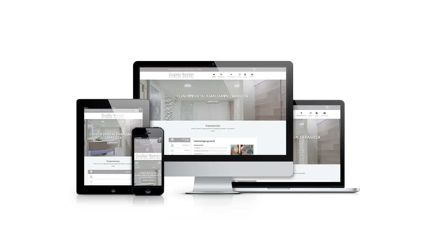
Responsive Web Design on Multiple Devices -
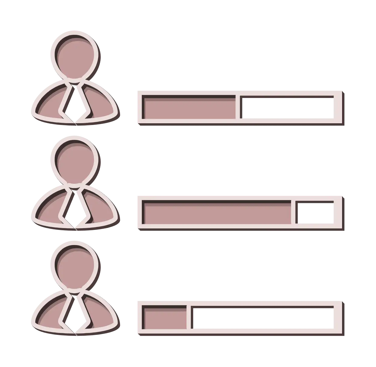
User Progress Bars in UI Design -
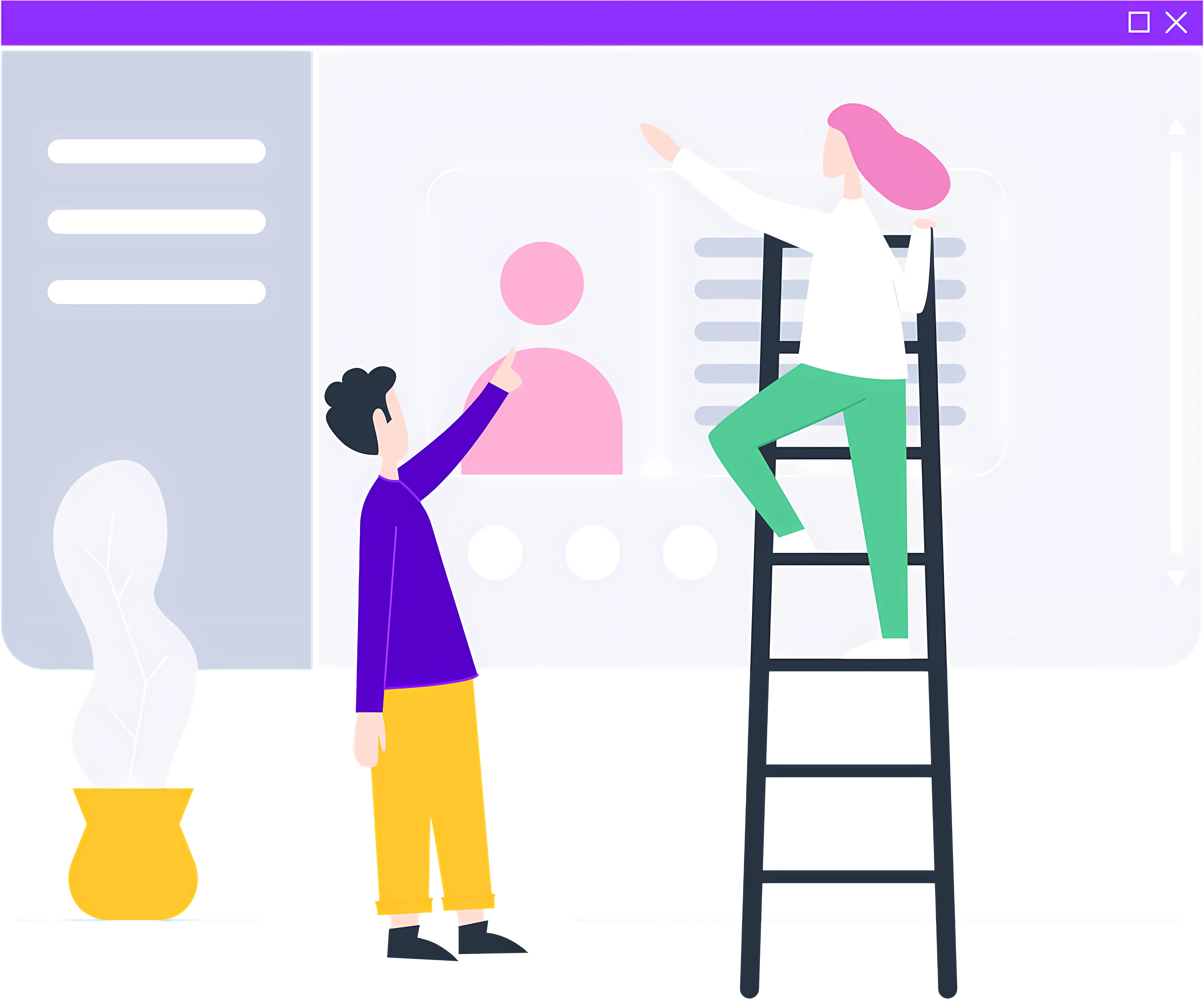
People Using Ladder -
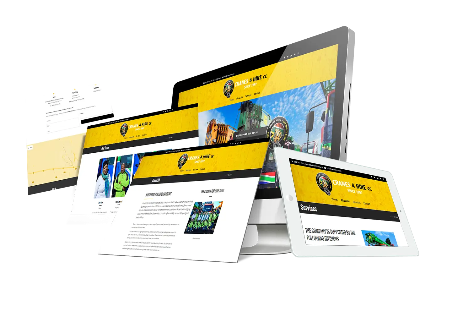
Responsive Web Design on Multiple Devices -

Switch Icon for Interface -
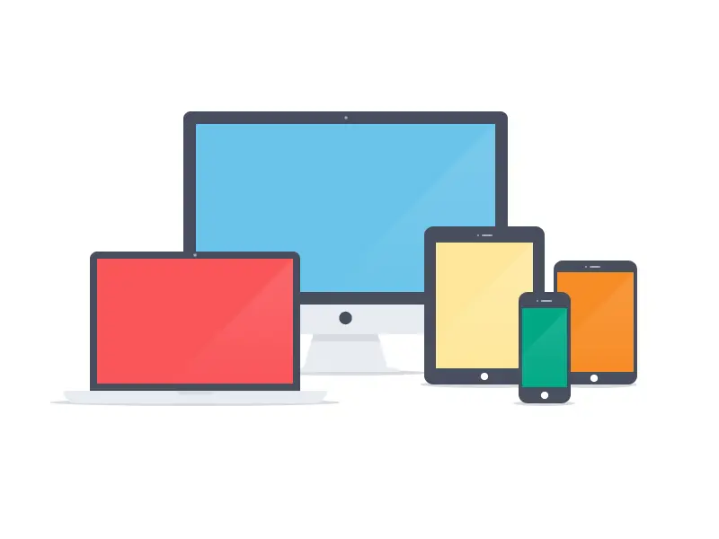
Various Electronic Devices Illustration -

Website Development Services -

CSS3 Logo -
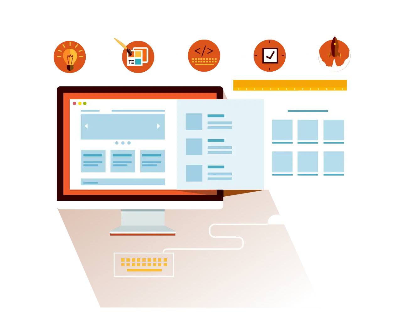
Illustration of Web Design Process -
Device Screens Displaying Digital Icons