You Might Like
-

Simple Credit Card Icon -

Black Money Bag Icon with Dollar Sign -
Hand Holding Credit Card -
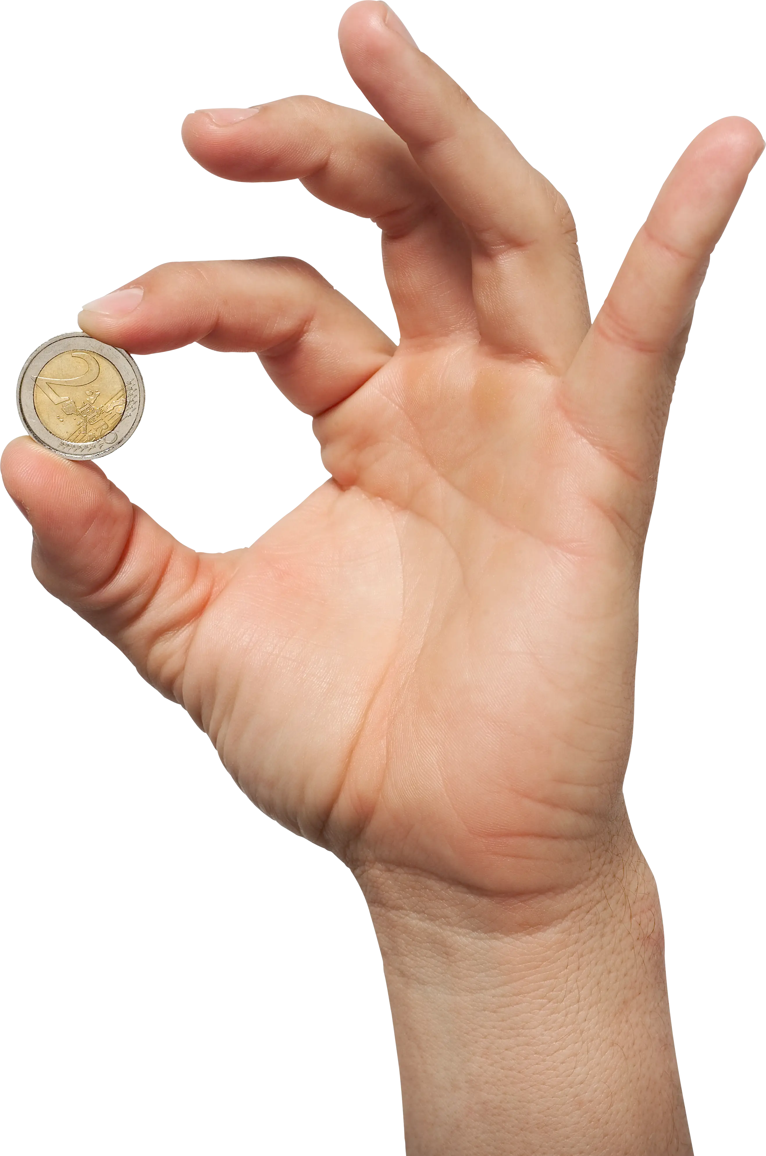
Hand Holding a Coin -
Ziraat Sigorta Insurance Logo -

Dollar Sign Made of Pills -

Presentation Board with Graph for Business Concepts -

Golden Bitcoin Cryptocurrency Coin -

Dollar Sign with Circular Arrows -

Lipa na M-Pesa Paybill Number -
10g Suisse Fine Gold Bar -
Money Bag with Downward Arrows Illustration -
Person Icon with Dollar Sign -

Naira Currency Symbol -

Dollar Symbol Icon in Black Outline -

Yen Sign on Price Tag in Blue Neon Style -
Bull Market Symbol -

House with Dollar Sign Symbol -
Check and Pen Icon for Financial Transactions -

Declining Chart Illustration -
Gold Australian Dollar Currency Symbol -

Dollar Sign Icon Representing Finance -
National Bank Logo with Red Flag -

Hand Receiving Money Icon -

Cartoon Businessman Holding Bitcoin -

Excited Cartoon Man with Dollar Sign Glasses -

Clipboard Illustration with Financial Chart for Data Analysis -

Simple Icon of Dollar Sign in a Circle -

Stack of Dollar Coins -
Modern Cash Register Machine with Receipt