You Might Like
-
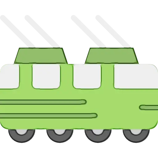
Green Train Cartoon Illustration -
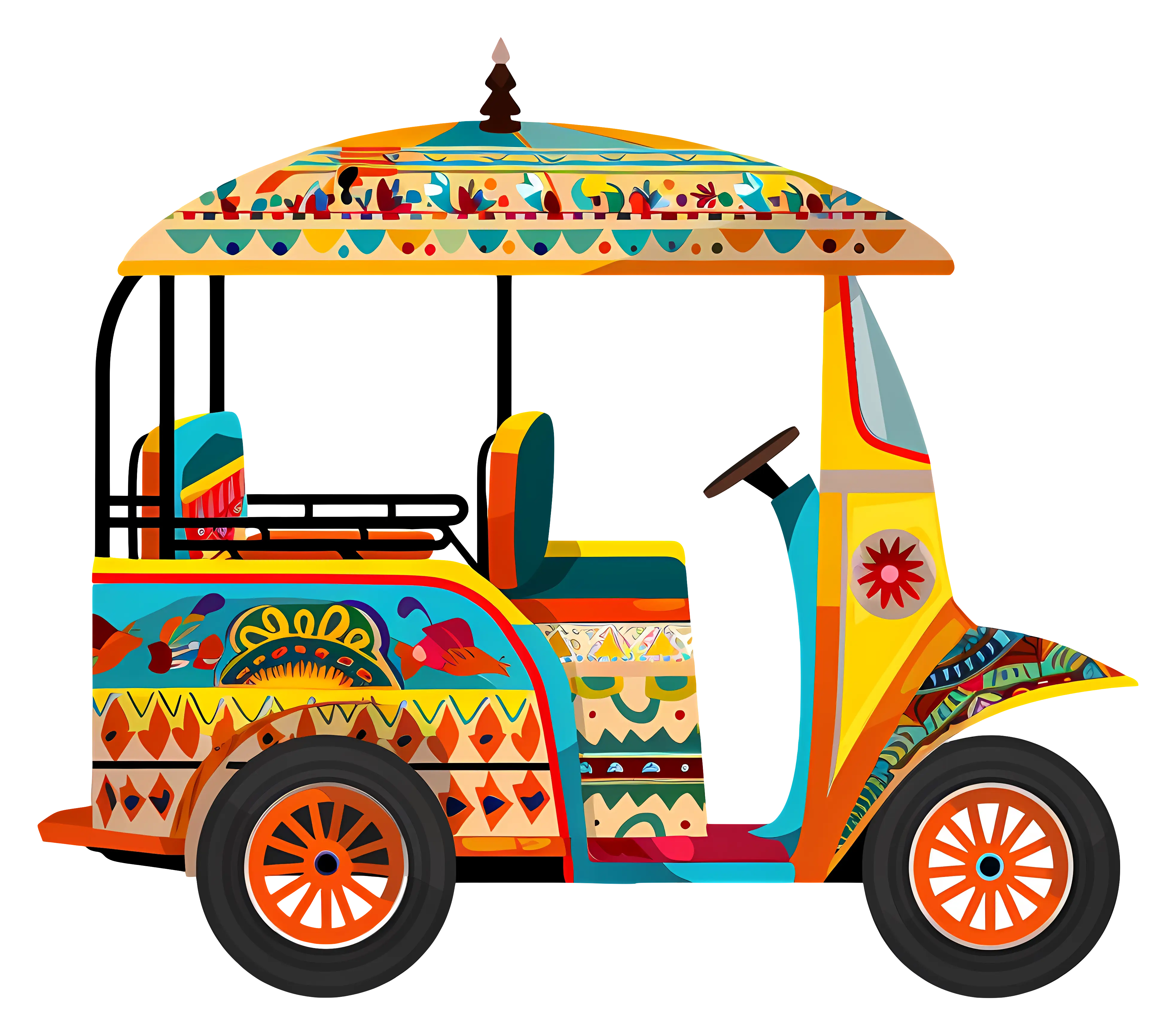
Decorated Colorful Tuk-Tuk Vehicle -

Airplane in Flight over the Sky -
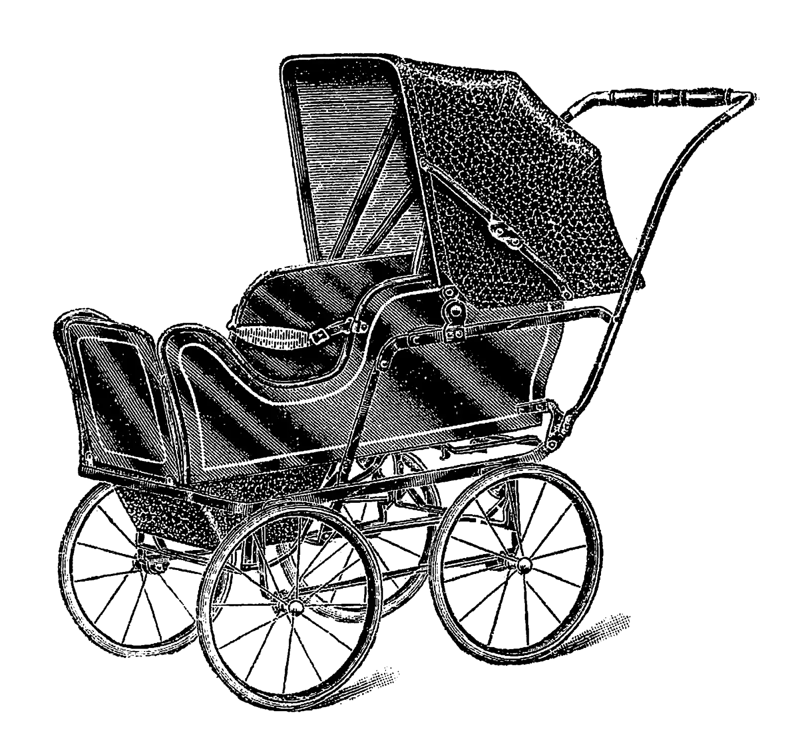
Antique Baby Stroller in Black and White -
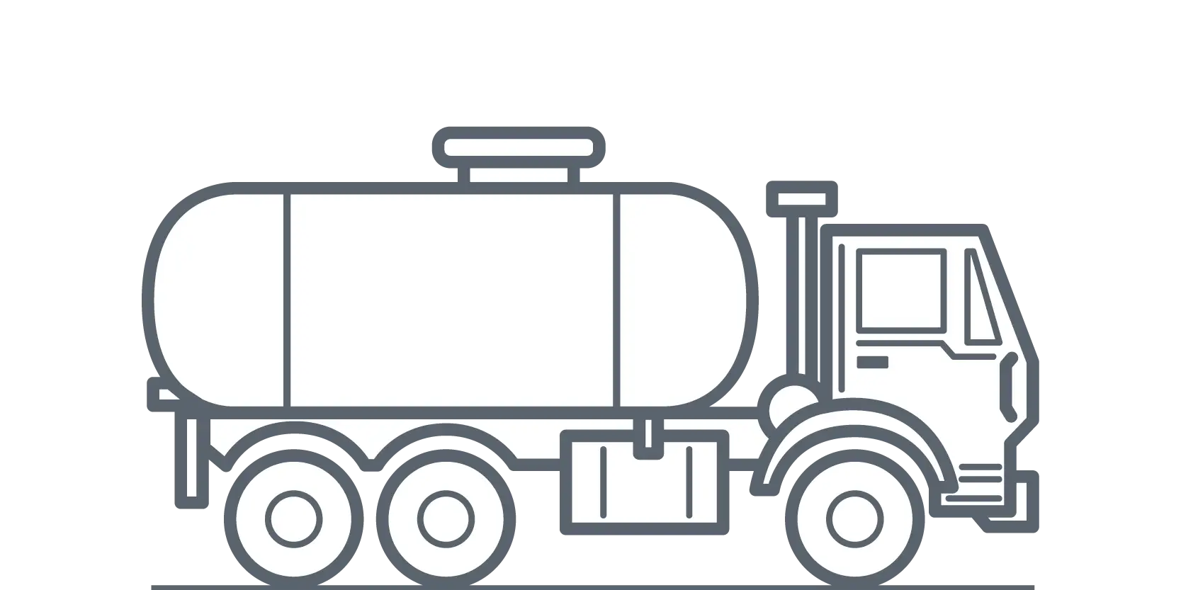
Tanker Truck Illustration in Outline Style -

Blue Globe Model for Geography Learning -
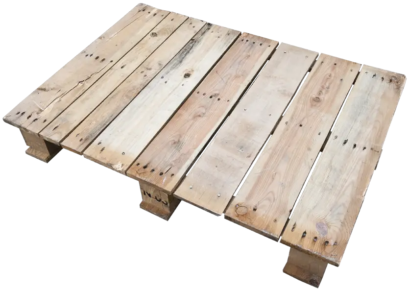
Wooden Pallet For Storage and Shipping -
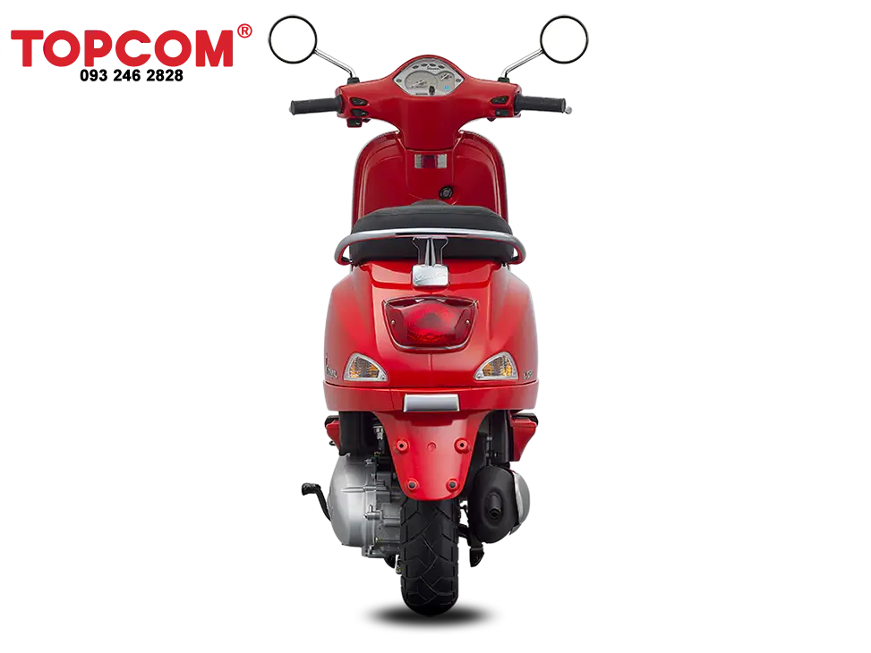
Red Electric Scooter -

Line Art Delivery Vehicle Illustration -
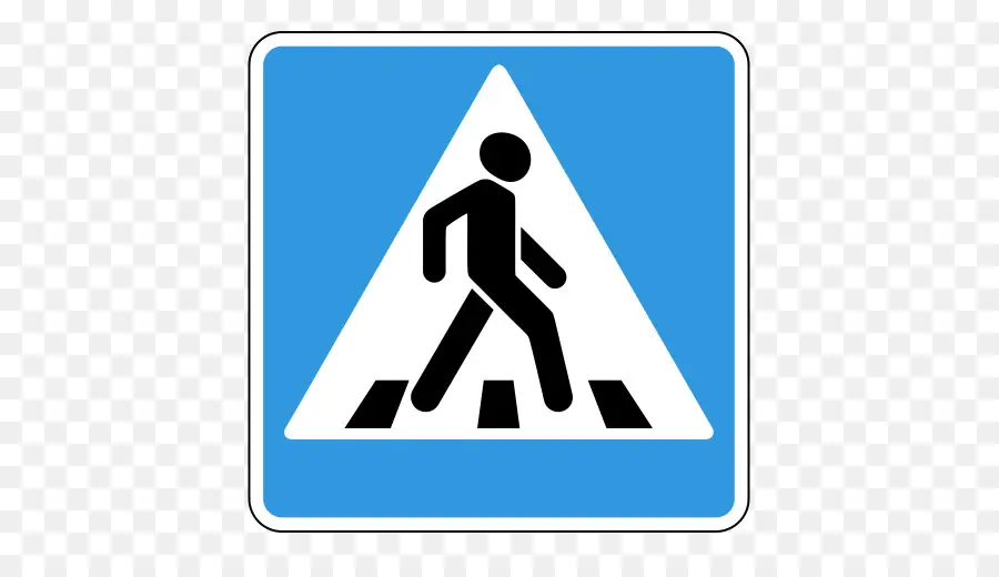
Pedestrian Crossing Road Sign Design -
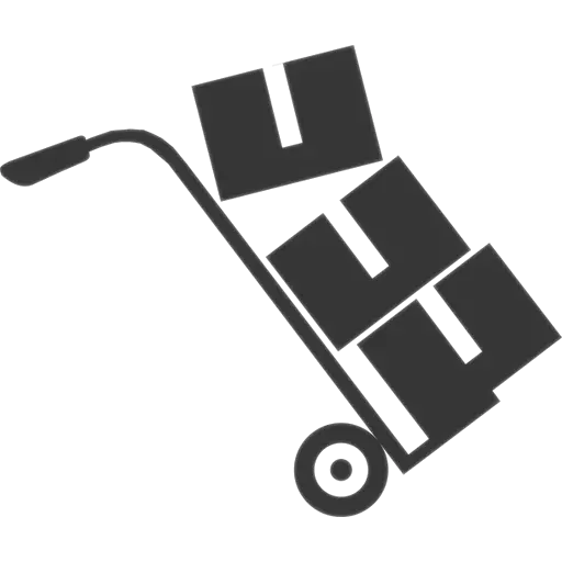
Hand Truck with Boxes for Easy Transport -
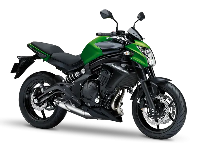
Green and Black Urban Motorcycle for Daily Commutes -

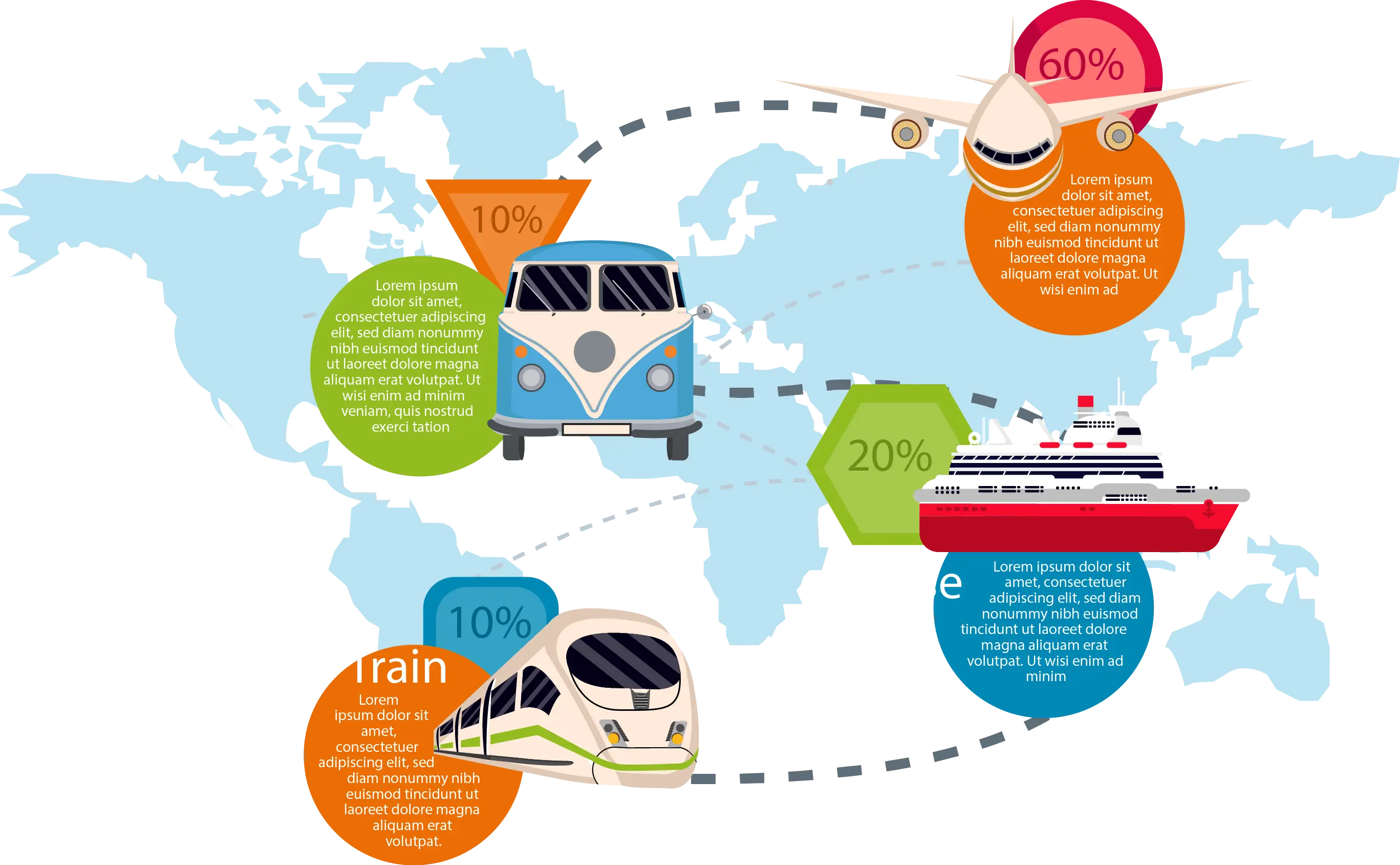
Transportation Logistics with Global Shipment -
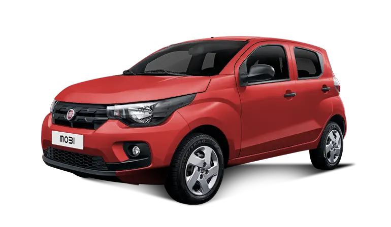
Red Compact Modern Car for Everyday Use -
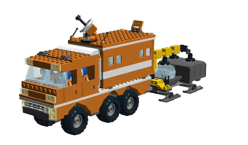
Lego Construction Truck -

Infographic Pencil with Data Elements -

Red Stop Traffic Sign -

Cardboard Box with Tape Illustration -
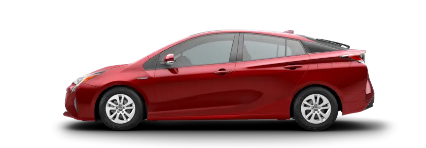
Red Car with Stylish Design -
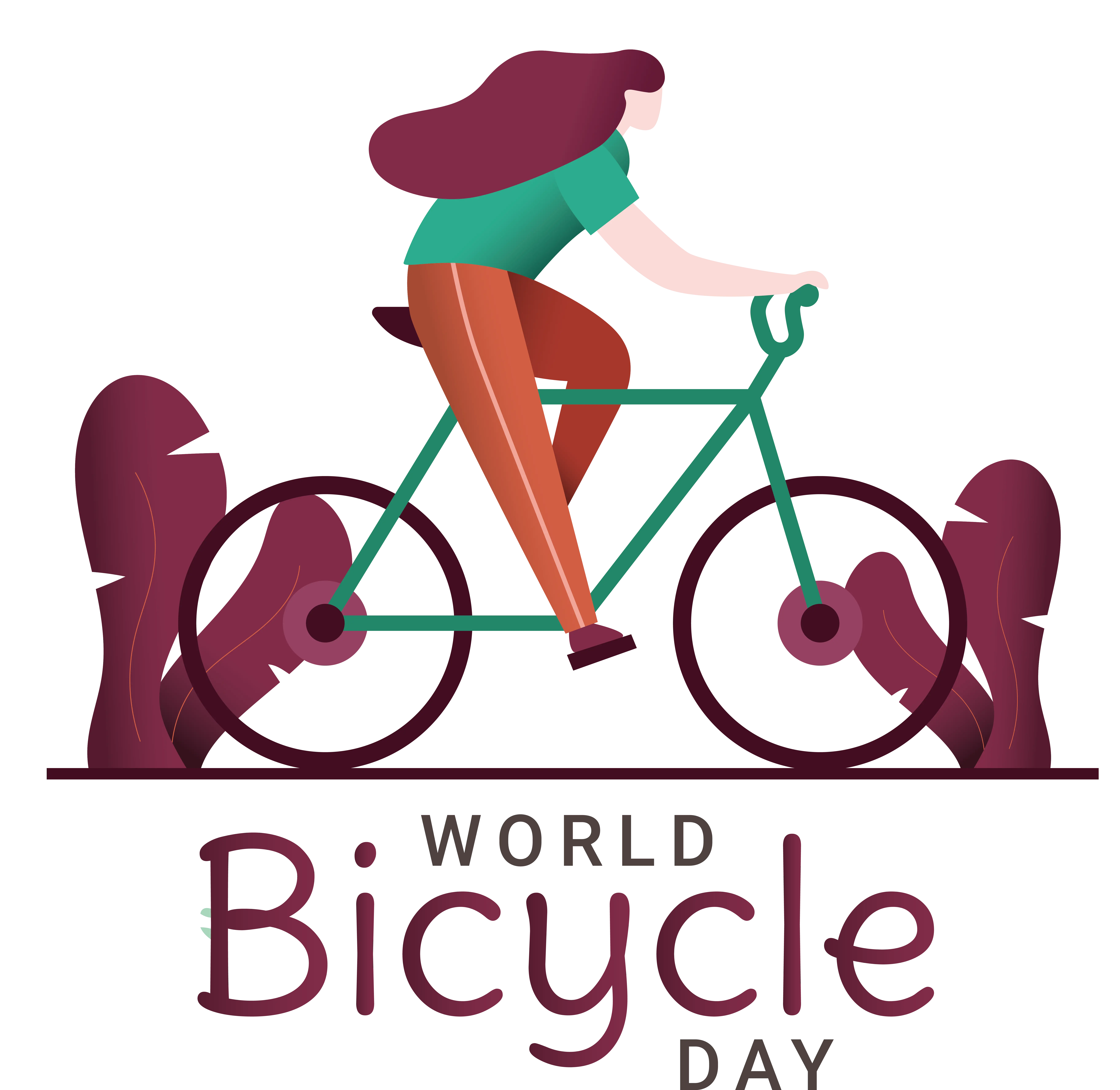
Cyclist on Bicycle for World Bicycle Day Celebrations -
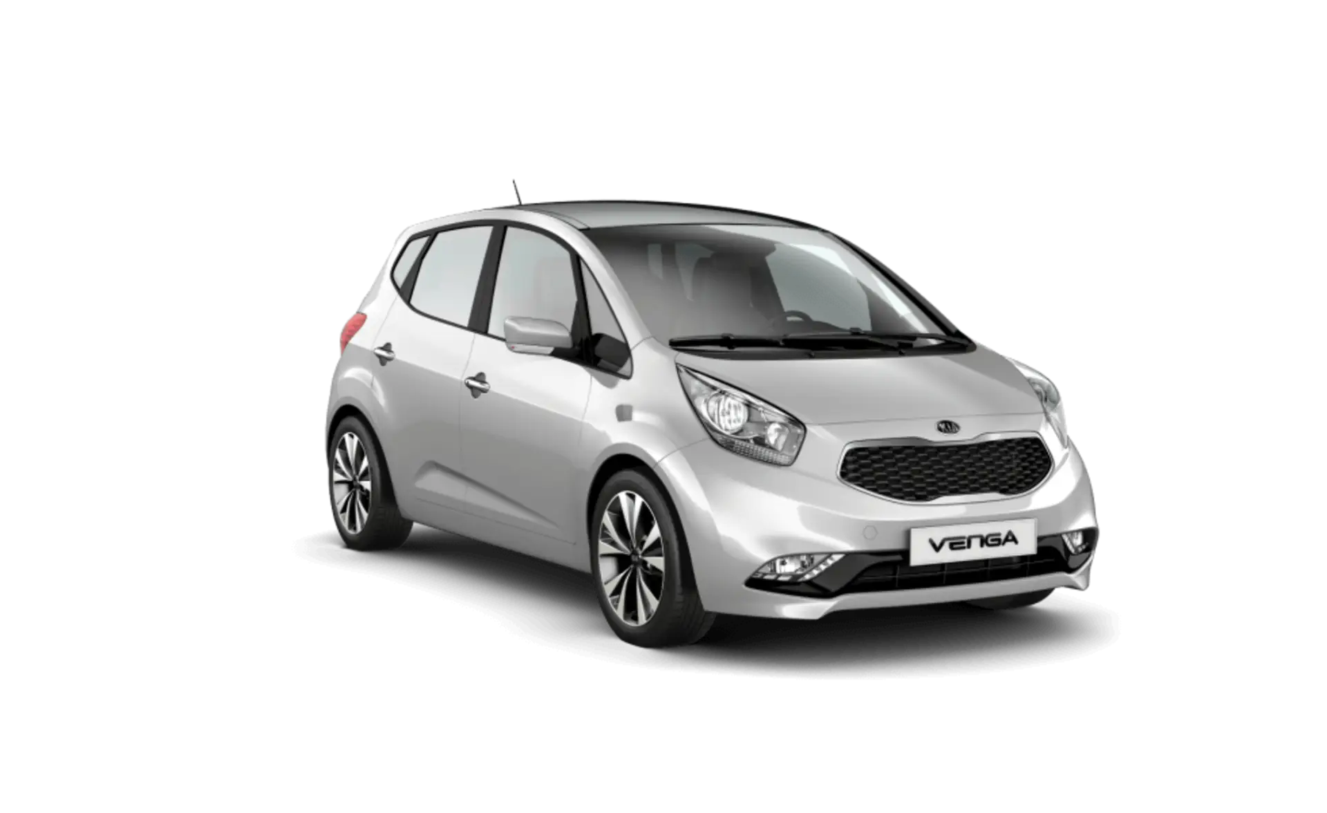
Silver Compact Hatchback Car -
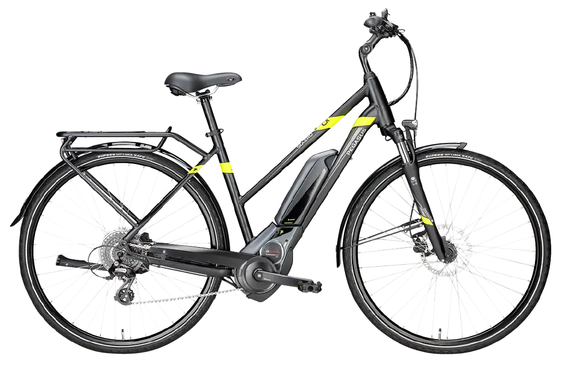
Black Electric Bike with Modern Design -

Set of Car Parts Icons -
Black UTV for Off-Road Adventures -
Simple Red Bus Illustration -
Truck Outline Icon Illustration -

Silhouette Globe Design with Continental Map -

Circle Pie Chart Icon -

Binary World Map -

Airplane in Flight