You Might Like
-
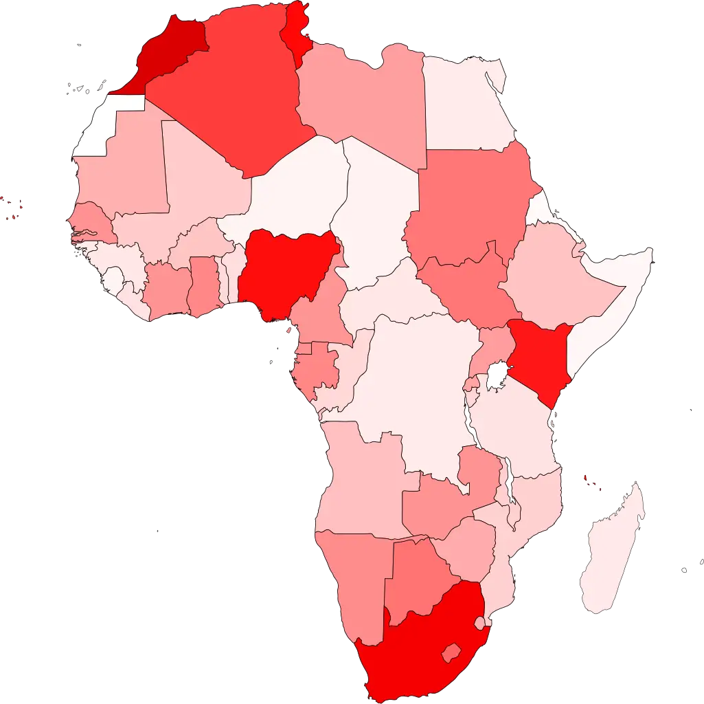
Colored Regional Map of Africa -

Colorful Peace Sign -

Light-Up Decorative Stars for Holiday Season -
Colorful Party Decorations with Confetti and Banners -
Colorful Bag of Lollipops -
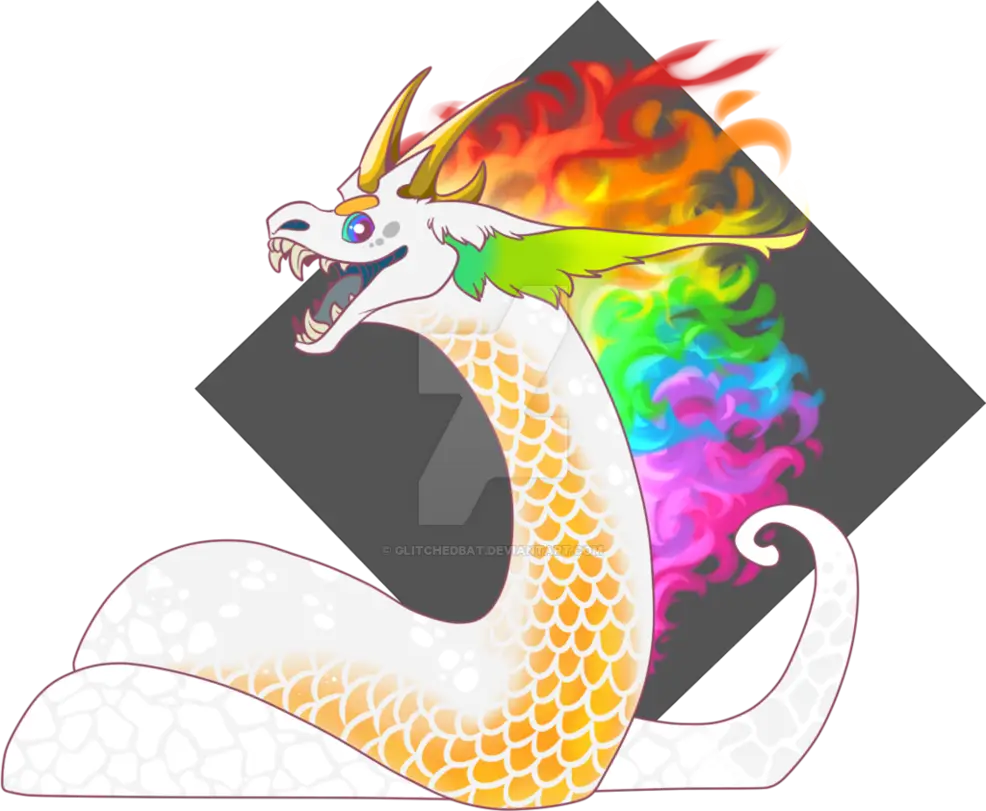
Colorful Rainbow Dragon Illustration -

Colorful Unicorn in Fantasy Style -

Colorful Summer Shorts -
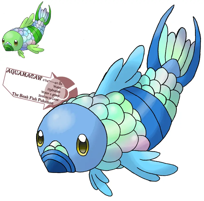
Colorful Cartoon Fish Illustration -
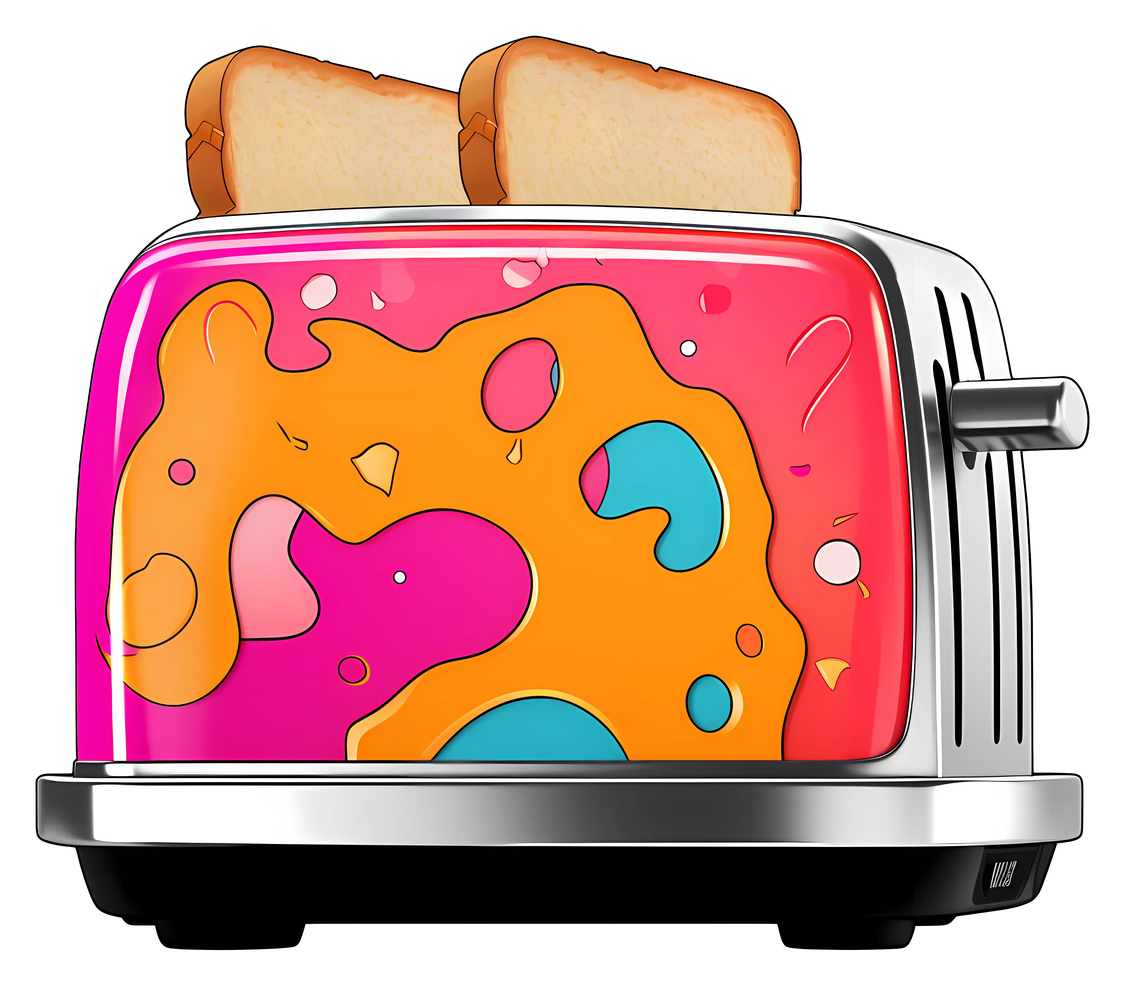
Colorful Toaster with Toast -
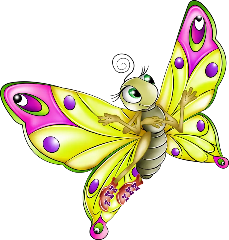
Yellow Cartoon Butterfly with Large Eyes -

Organizational Structure Chart -

Colorful Lollipop with Swirl Design -
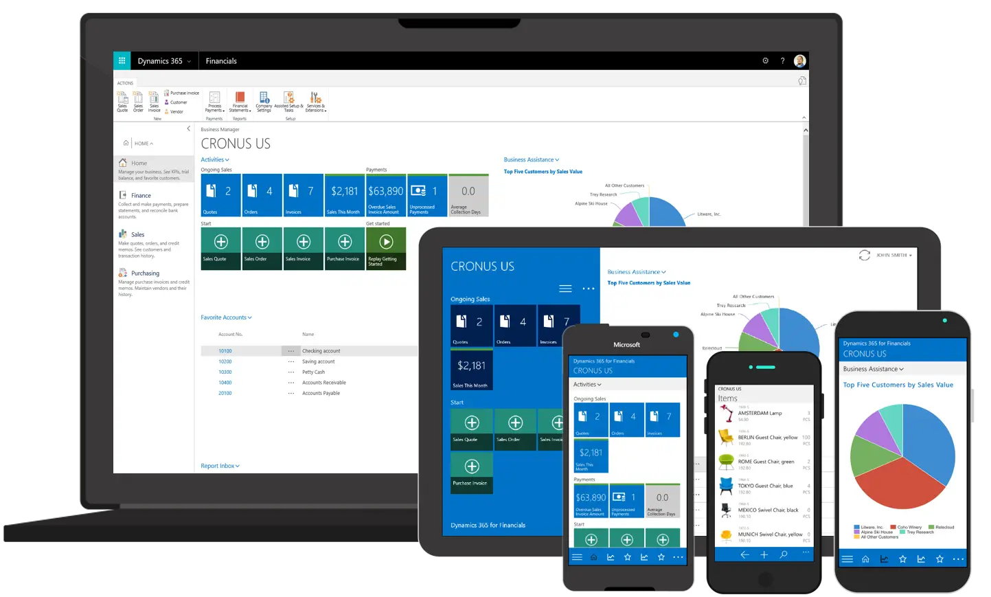
Various Devices Displaying Software -
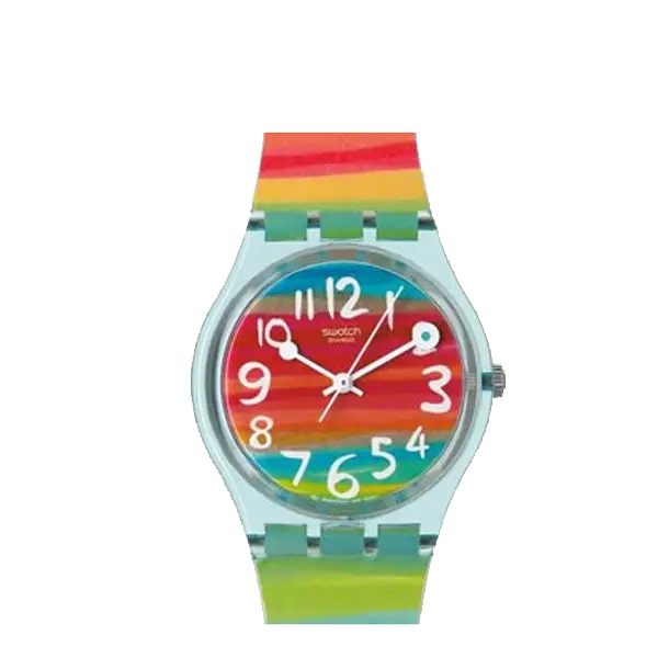
Colorful Rainbow Wristwatch -

Colorful Inflatable Beach Ball -

Complete Blue World Map -
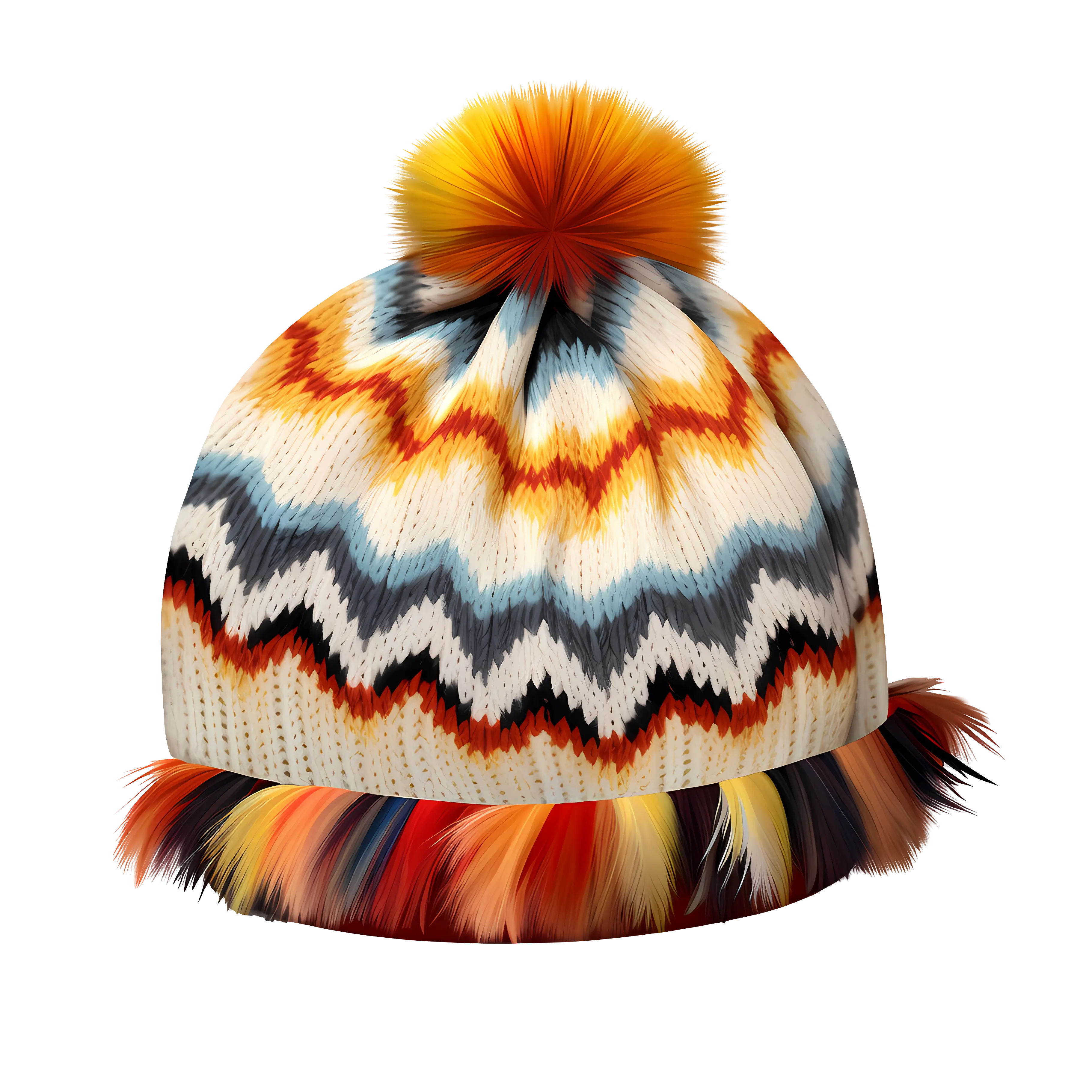
Colorful Knitted Winter Hat -

Icon of KPI Dashboard with Graph and Person -
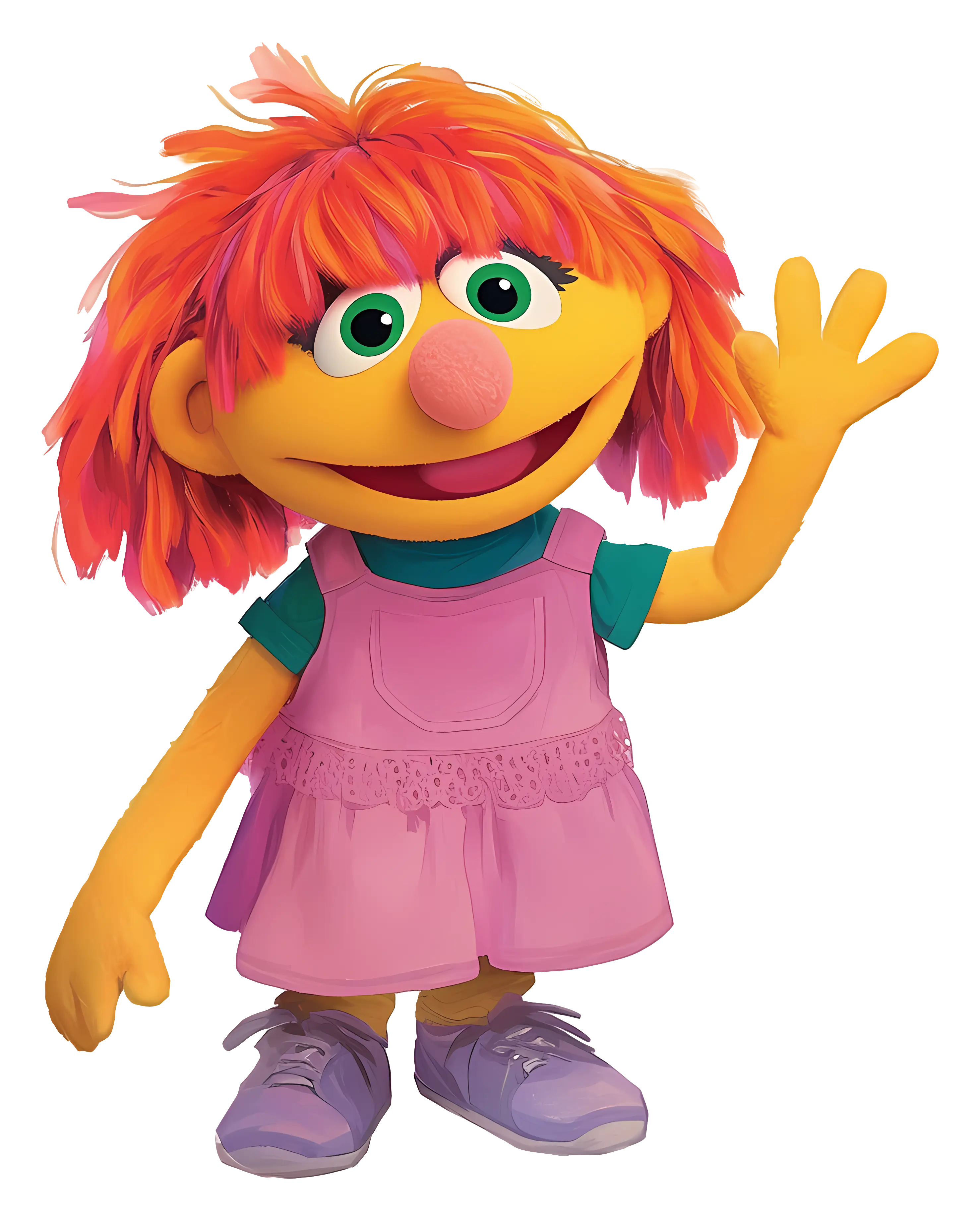
Friendly Yellow Puppet Character Waving Illustration -
Bright and colorful theme of fruits and vegetables -
Vegetable Salad Bowl and Fresh Wrap -
Colorful Assortment of Fresh Fruits -
Colorful Baby Onesie Design -
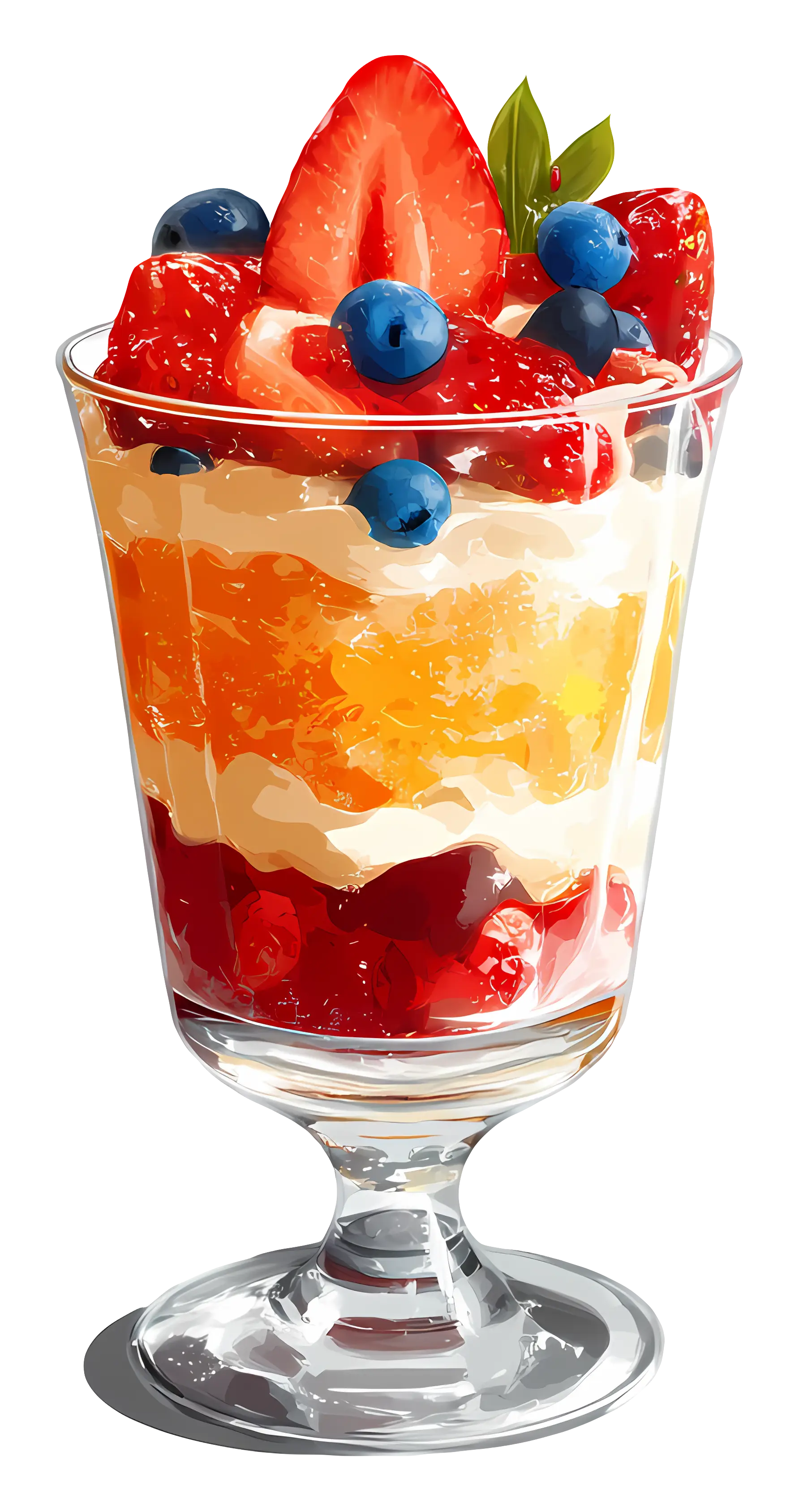
Fruit Parfait with Berries -

Decorative Party Hat with Stripes -
Cartoon Style Pineapple Illustration -
Purple Cartoon Butterfly with Fancy Wings -
Multicolored Umbrella for Weather Protection -

Bar Chart with Upward Arrow