
You Might Like
-

LinkedIn Professional Networking Platform Logo -

Modern Office Conference Phone System -

Team with Growth Graph Illustration -

Business Strategy Icons -

Online Learning with Computer and Mouse -
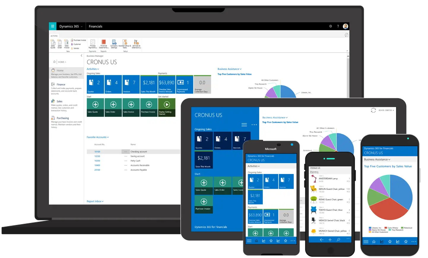
Various Devices Displaying Software -

Open Signboard Icon for Business Representation -

Professional Tan Leather Briefcase -

Projector Screen for Presentations -

Icon of KPI Dashboard with Graph and Person -

Thumbs Up Gesture -

Zigzag Down Arrow Icon for Decline Representation -

Presentation Board with Graph for Business Concepts -

Businesswoman in Professional Suit -

Bar Chart with Upward Arrow -

Infographic Pencil with Data Elements -

Man in Black Suit -

Group of Professional Businesspeople in Formal Attire -

Dinner Plate with Candle -

Customer Service Representative Wearing Headset -

Search Growth Icon -

Illustration of Growth Chart with Upward Arrow -
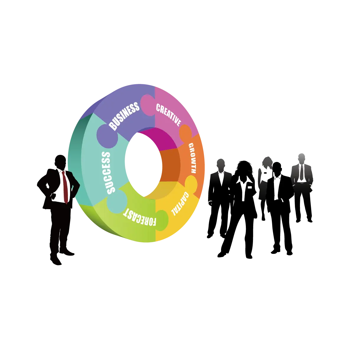
Business People with Circular Chart -

Smiling Woman with Curly Hair -

SEO Concept with Magnifying Glass and Computer -
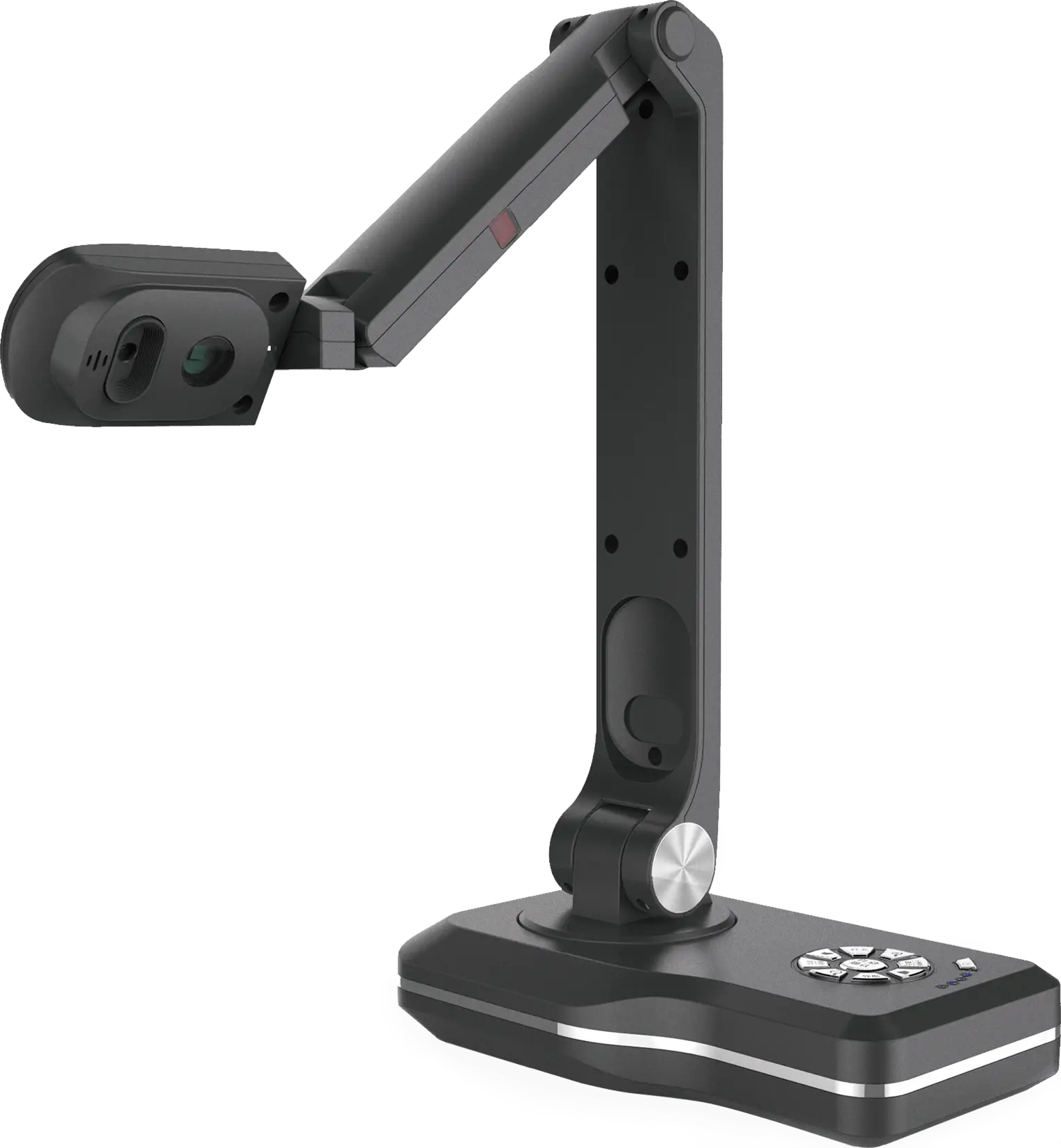
Modern Document Camera -

Blue Declining Bar Graph with Arrow -

Black Handshake Icon -

Business Icons Set for Digital Workflows -

Circle Pie Chart Icon