You Might Like
-
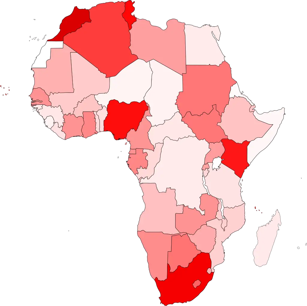
Colored Regional Map of Africa -

Team with Growth Graph Illustration -
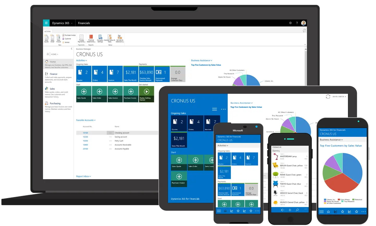
Various Devices Displaying Software -

Complete Blue World Map -

Icon of KPI Dashboard with Graph and Person -

Dollar Sign Made of Pills -

Magnifying Glass with Blue Lens -

Yellow Ethernet Cable for Network Connections -

Bar Chart with Upward Arrow -

Infographic Pencil with Data Elements -

Graph Plot with Blue Curve Illustration -
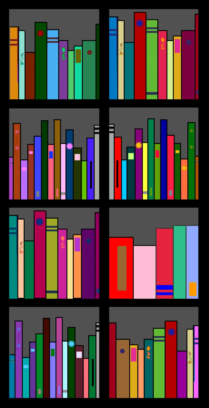
Colorful Bookshelf -
Color Wheel for Artistic Inspiration -

Search Growth Icon -

Illustration of Growth Chart with Upward Arrow -

Money Bag with Downward Arrows Illustration -

Naira Currency Symbol -

Blue Declining Bar Graph with Arrow -

Business Icons Set for Digital Workflows -

Circle Pie Chart Icon -

Bull Market Symbol -

Document Processing Cycle -

Medical Cloud Symbol -

Artificial Intelligence Laptop Interface Illustration -

Internal Hard Disk for Computer Storage -

Book Icon with Blue Background -

34,046 CPS Appointments Text -

Pie Chart Representation -

Magnifying Glass on Document Icon -

Digital Devices with Graph