You Might Like
-

Organizational Structure Chart -

Online Learning with Computer and Mouse -

Projector Screen for Presentations -

Presentation Board with Graph for Business Concepts -

Bar Chart with Upward Arrow -

Infographic Pencil with Data Elements -

Dinner Plate with Candle -

Stack of Hay Bales in Agricultural Setting -
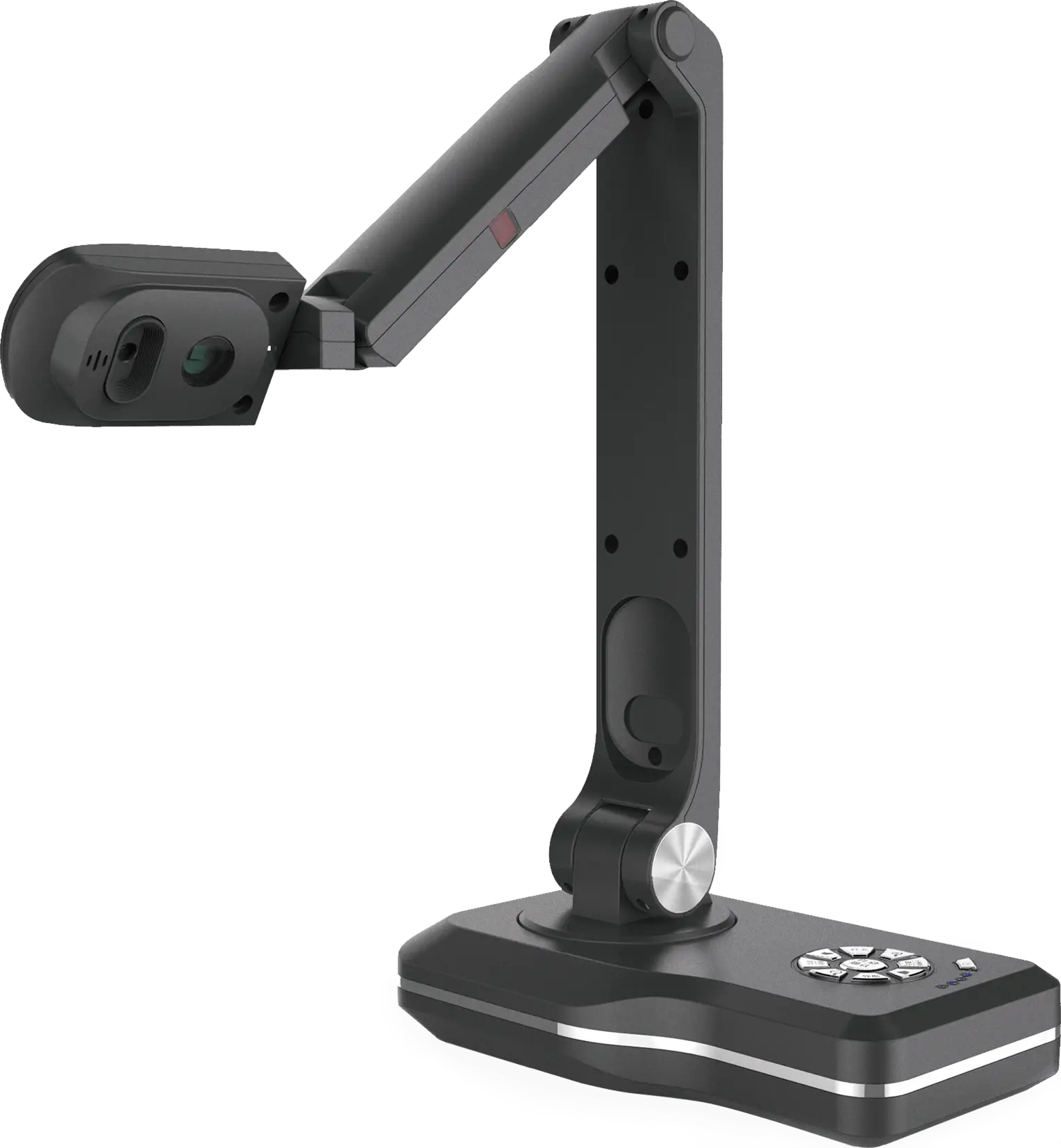
Modern Document Camera -

Circle Pie Chart Icon -
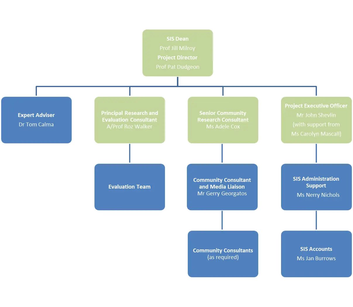
Organizational Flowchart Diagram -

Book Icon with Blue Background -

Pie Chart Representation -
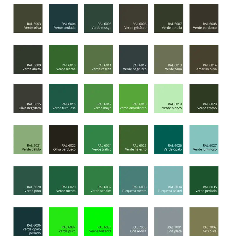
Green Color Palette Chart -

Clipboard Illustration with Financial Chart for Data Analysis -

Timeline Infographic Design -
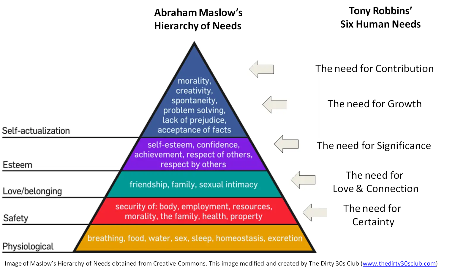
Maslow's Hierarchy of Needs Diagram -

Presenter with Board and Pointer -
Black Abstract Pyramid Illustration -

Green Flowchart Diagram -
White Projector for Multimedia and Presentations -

Colorful Bar Graph Illustration -

Upward Arrow on Graph -
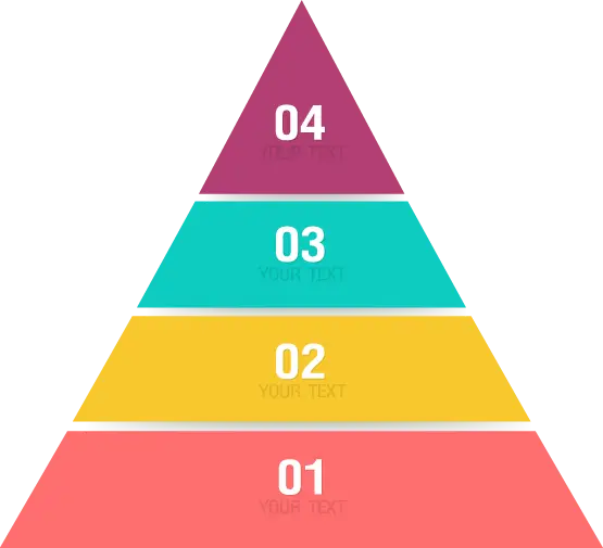
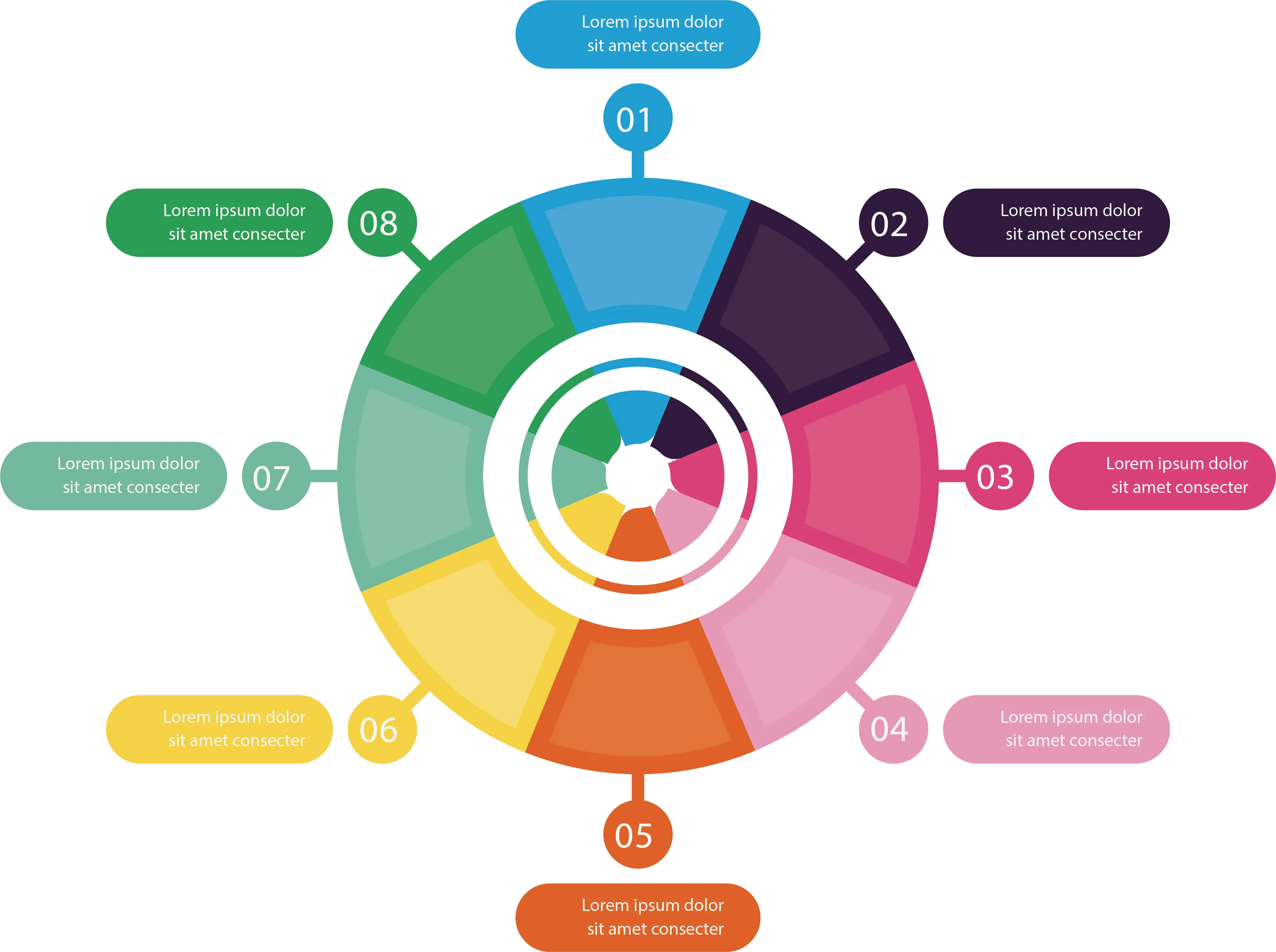
Colorful Infographic for Data Presentation -

Computer Network Diagram -
Colorful Infographic Data Visualization -

Workspace Setup with Chart and Desk -
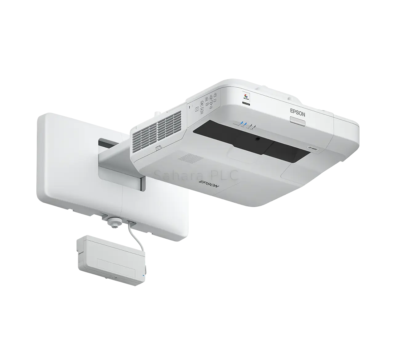
High-Tech Ceiling Projector -

Ancient Mayan Step Pyramid Illustration -
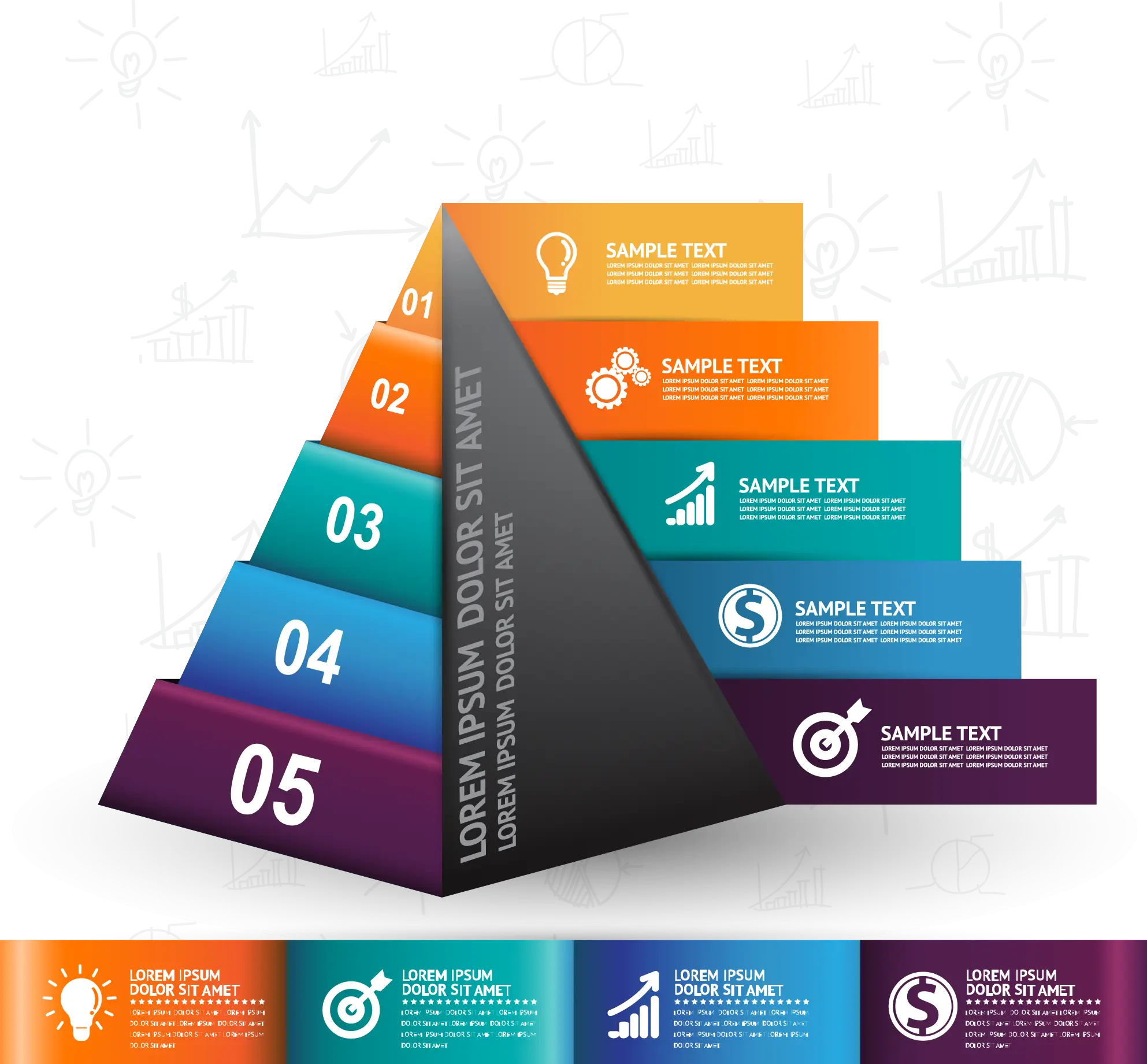
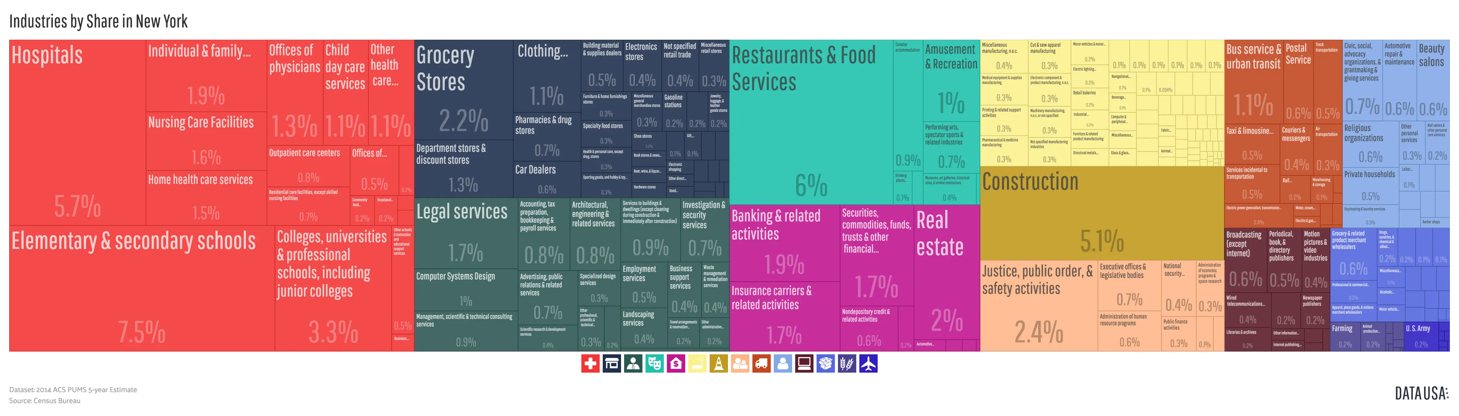
Colorful Infographic Chart