You Might Like
-
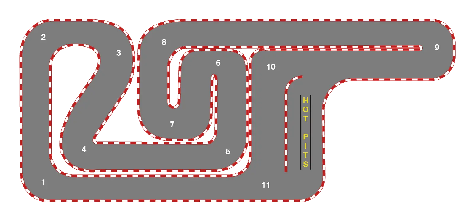
Race Track Layout -
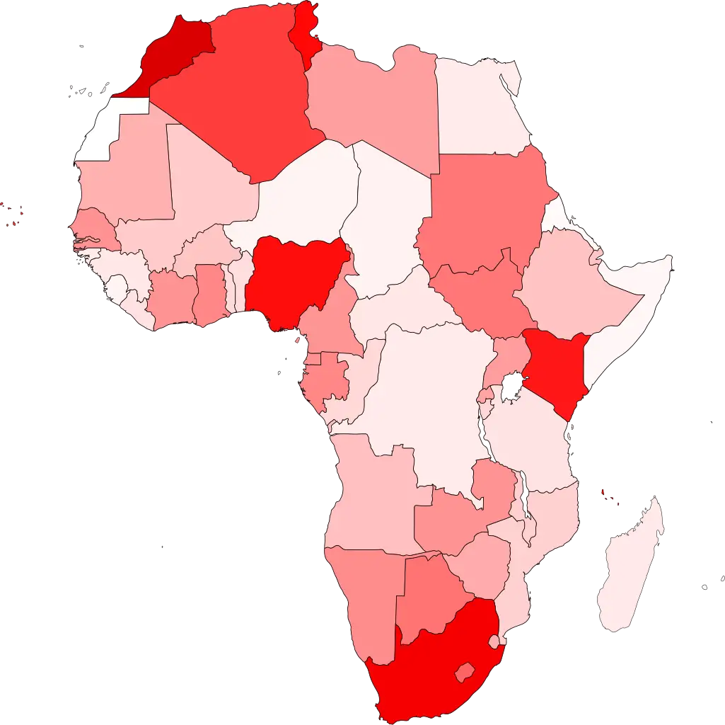
Colored Regional Map of Africa -

Organizational Structure Chart -

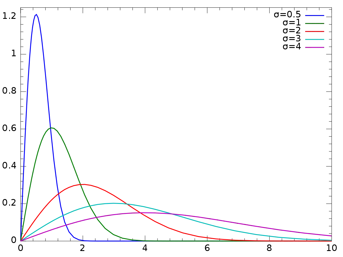
Mathematical Geometry and Graph Concepts -
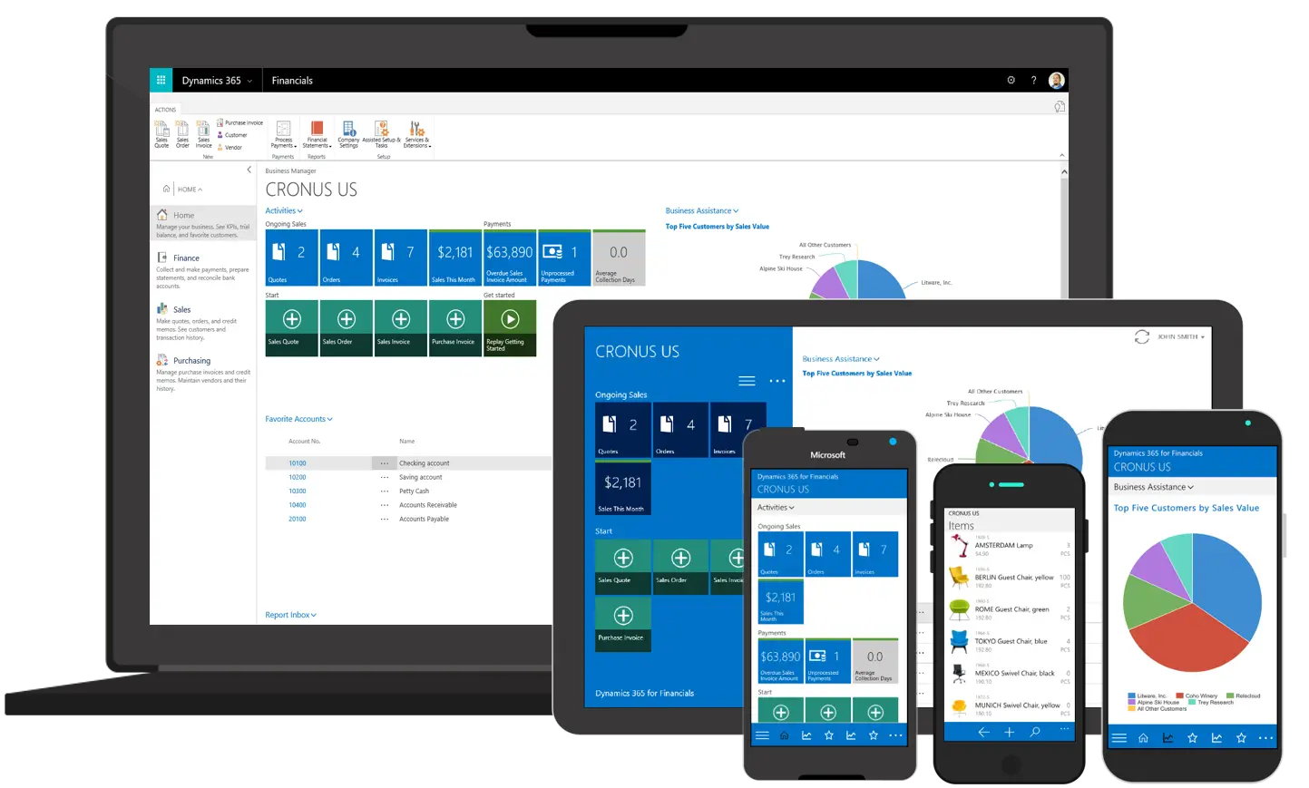
Various Devices Displaying Software -

Complete Blue World Map -

Icon of KPI Dashboard with Graph and Person -

Zigzag Down Arrow Icon for Decline Representation -

Bar Chart with Upward Arrow -

Infographic Pencil with Data Elements -
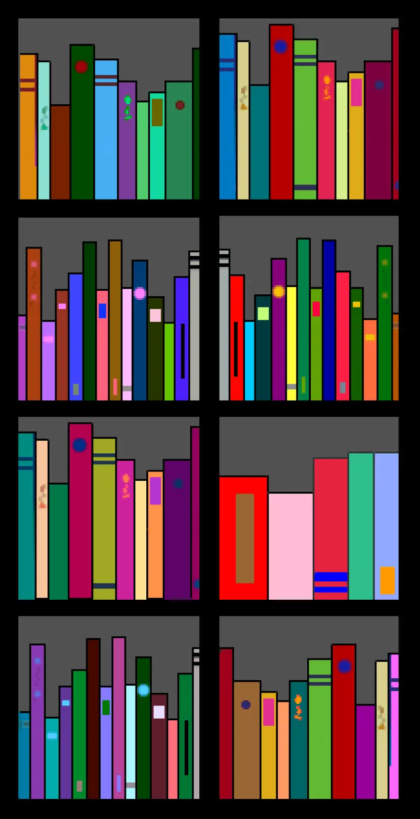
Colorful Bookshelf -
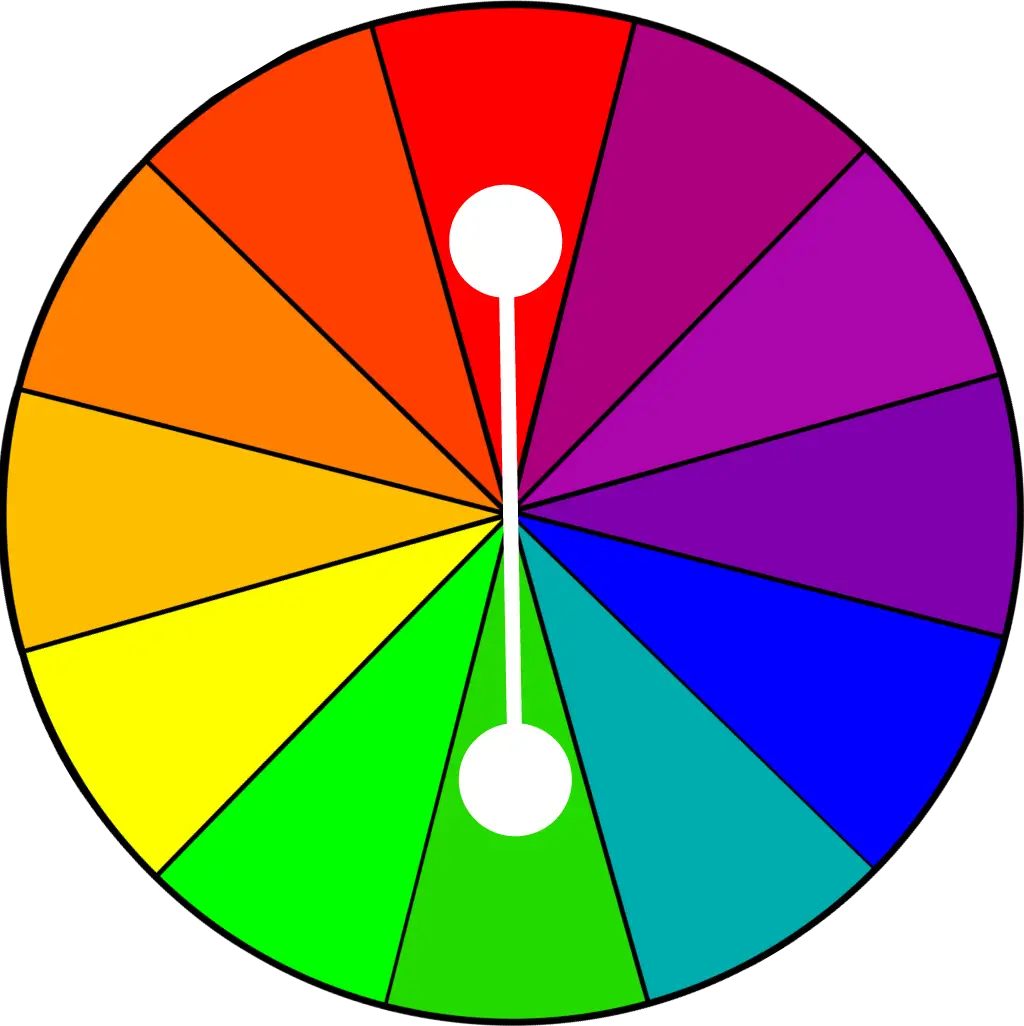
Color Wheel for Artistic Inspiration -

Search Growth Icon -

Illustration of Growth Chart with Upward Arrow -

Orange Curved Abstract Design -

Blue Declining Bar Graph with Arrow -

Circle Pie Chart Icon -

Decorative Swirls in Gold and White -

Declining Chart Illustration -

White Circular Swirl Design -

Book Icon with Blue Background -

34,046 CPS Appointments Text -

Pie Chart Representation -
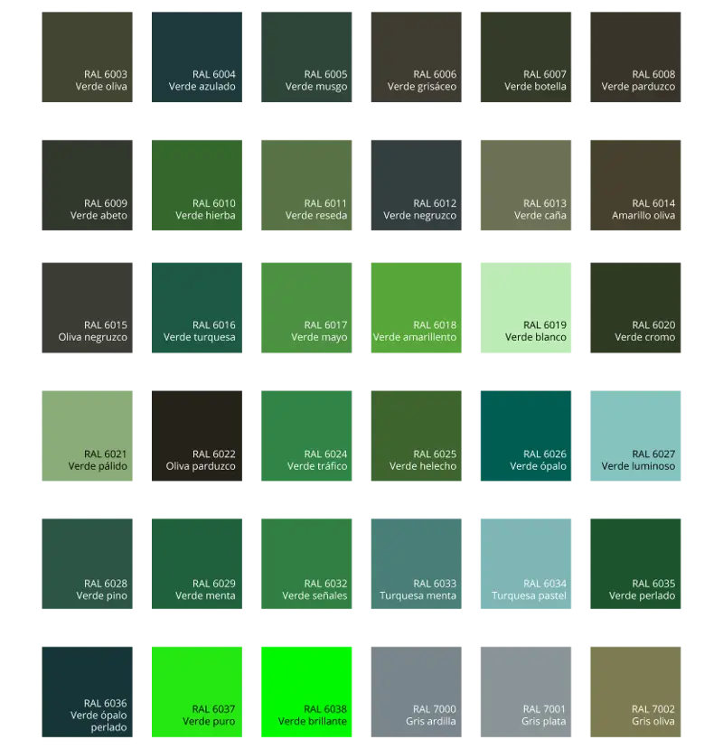
Green Color Palette Chart -

Clipboard Illustration with Financial Chart for Data Analysis -

Golden Light Swirl -

Magnifying Glass with Graph Illustration -

Unique White and Pink Rabbit Illustration -
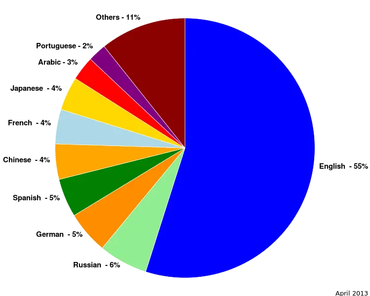
Colorful Statistical Pie Chart -

Colorful Patterned Sock