You Might Like
-
Blue Scale of Justice Illustration -

Dollar Sign Made of Pills -

Inclusive Transgender Gender Symbol -

International Women's Day Typography with Roses -

Money Bag with Downward Arrows Illustration -
Alabama Pride Flag in Rainbow Colors -
Red Balance Scale Symbol of Justice -

Naira Currency Symbol -

Happy Women's Day 8 March Banner -

Balance Scale Symbol for Justice -
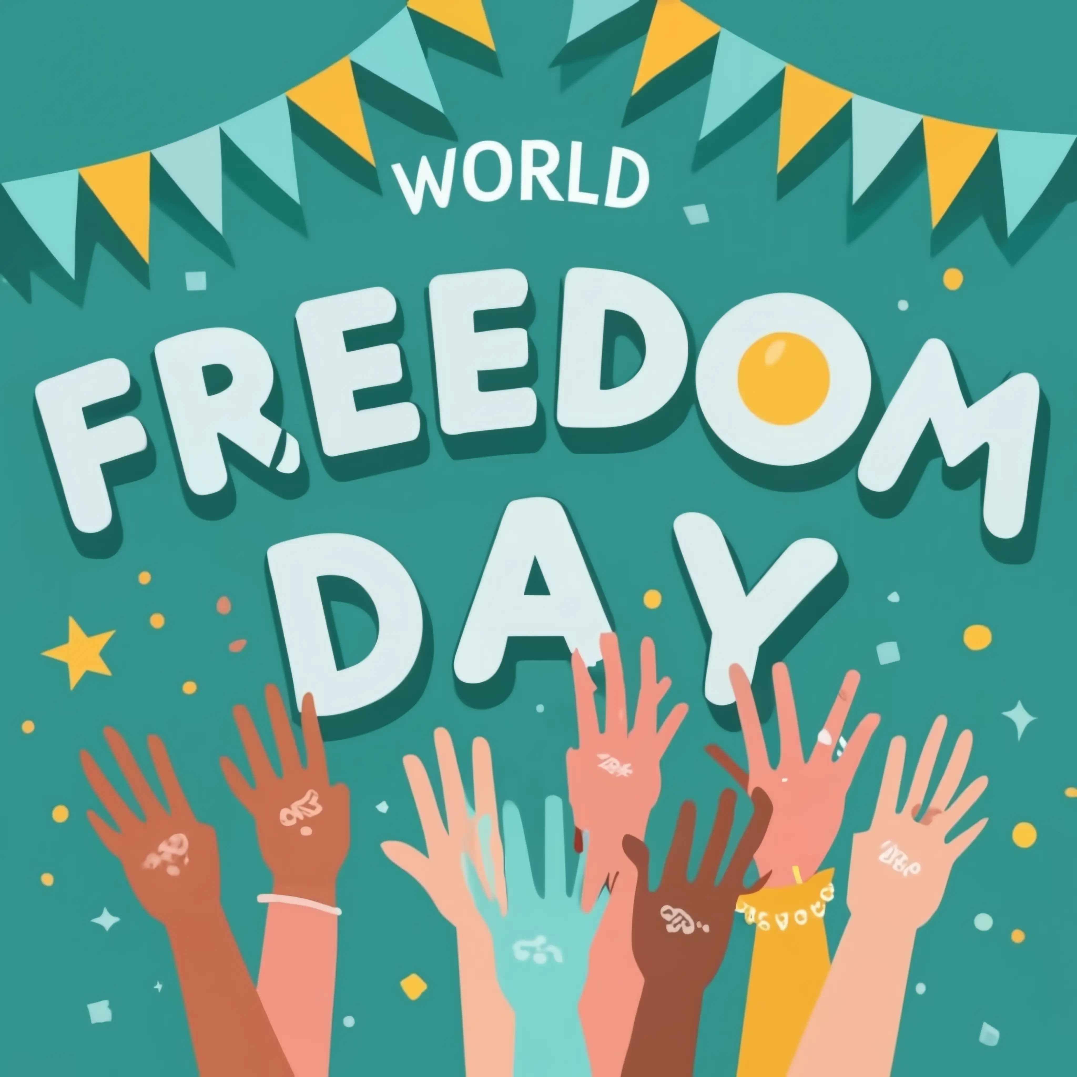
Celebration of World Freedom Day -

Blue Declining Bar Graph with Arrow -

Minimalist Equal Symbol Icon -
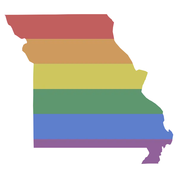
Missouri State Map with Rainbow Pride Overlay -
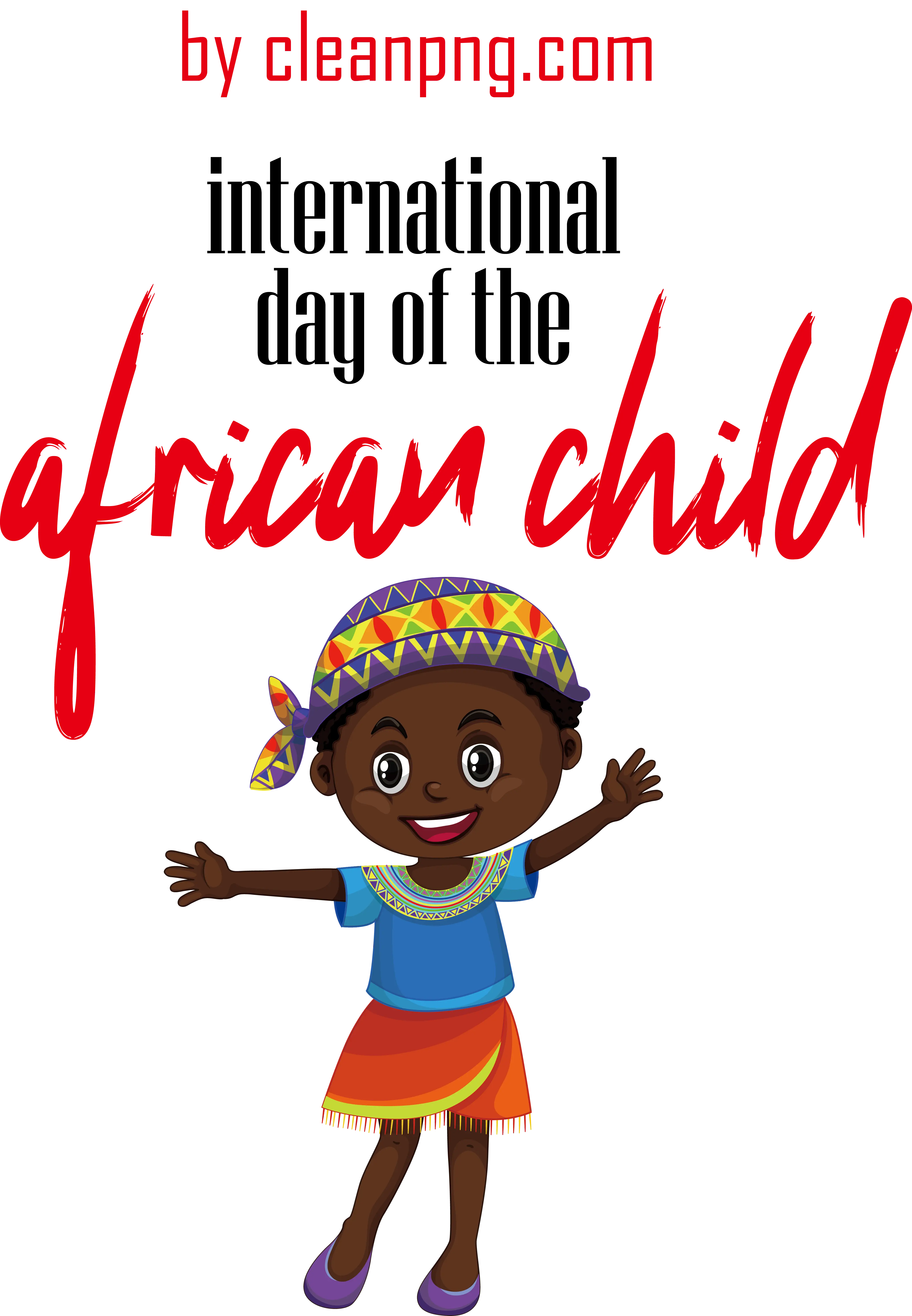
International Day of the African Child Illustration -

Balance Scale Icon Representing Justice -

March 8 Women's Day Design with Butterflies -
Red Justice Balance Scale Icon -
Scales of Justice Symbol Illustration -
Map of Denmark with Rainbow Colors -

Male and Female Gender Symbols -
Map of Bolivia with Rainbow Pride Colors -

Euro Symbol with Right Arrow -
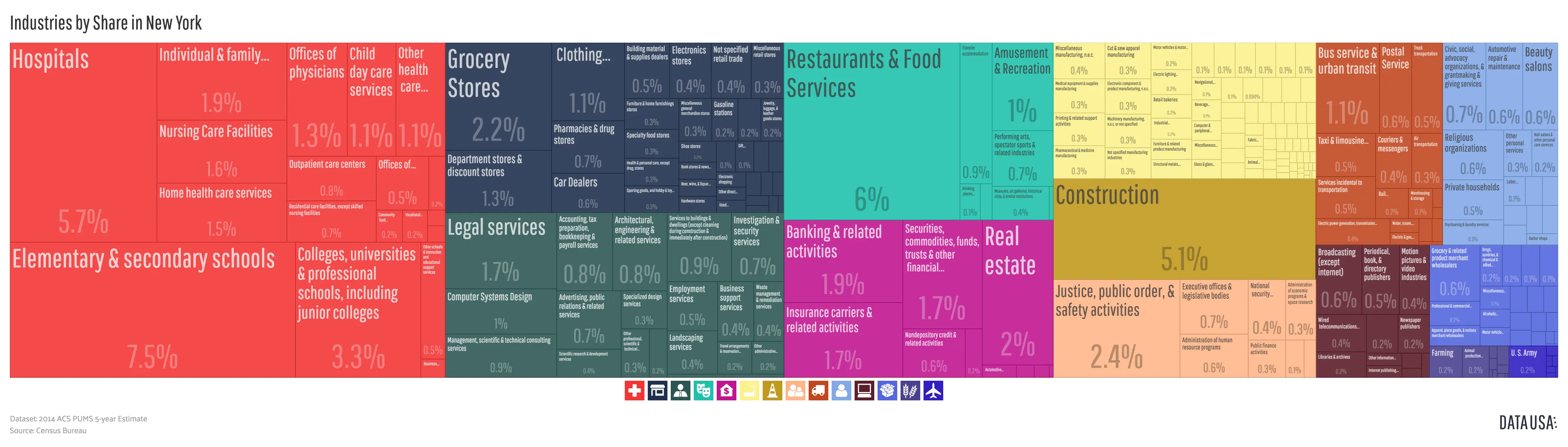
Colorful Infographic Data Visualization -
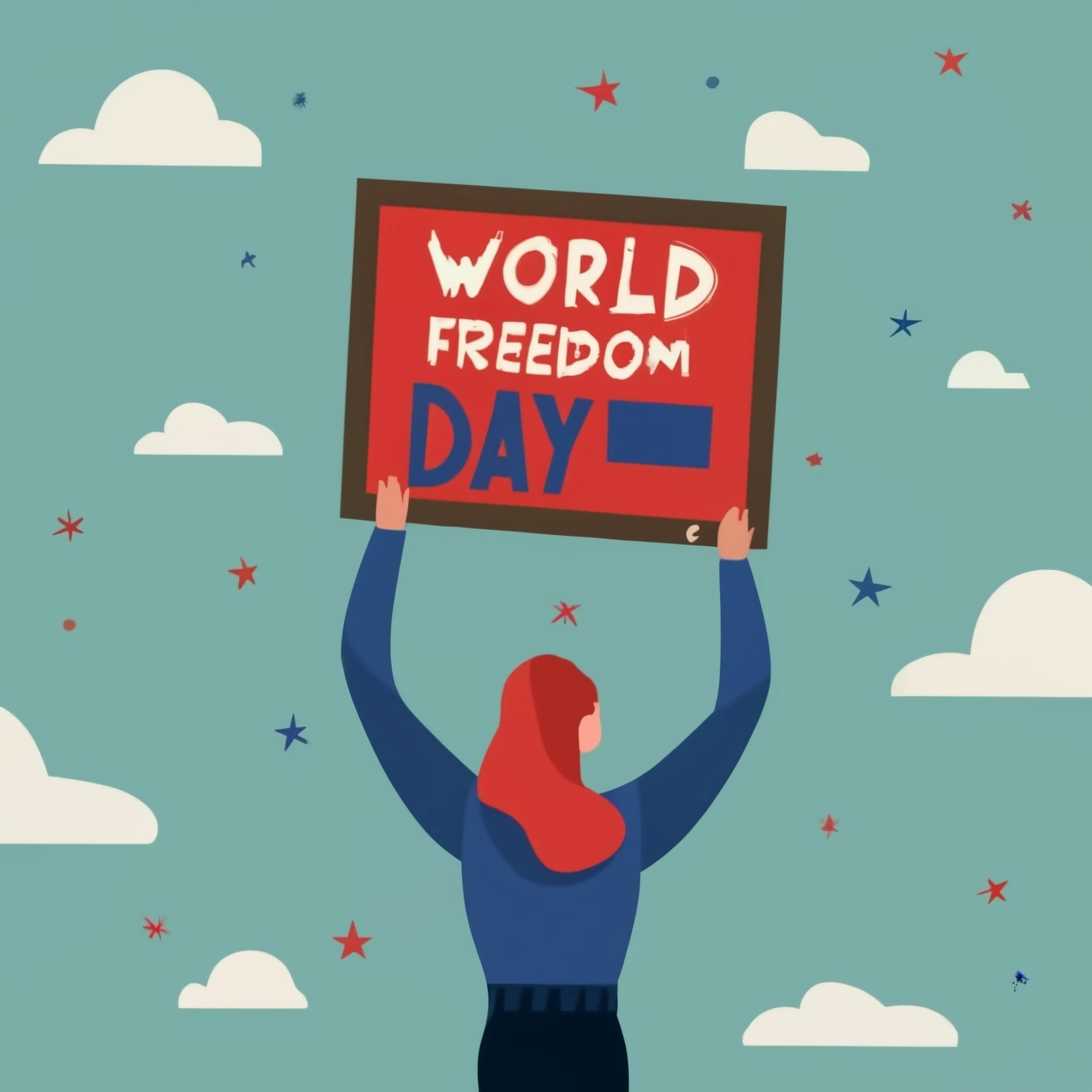
World Freedom Day Poster -

Blue and Red Gender Symbols Illustration -

Illustration of the Rainbow Pride Flag -

Child Illustration for International Day of the African Child -

Equality Quote with Scale -
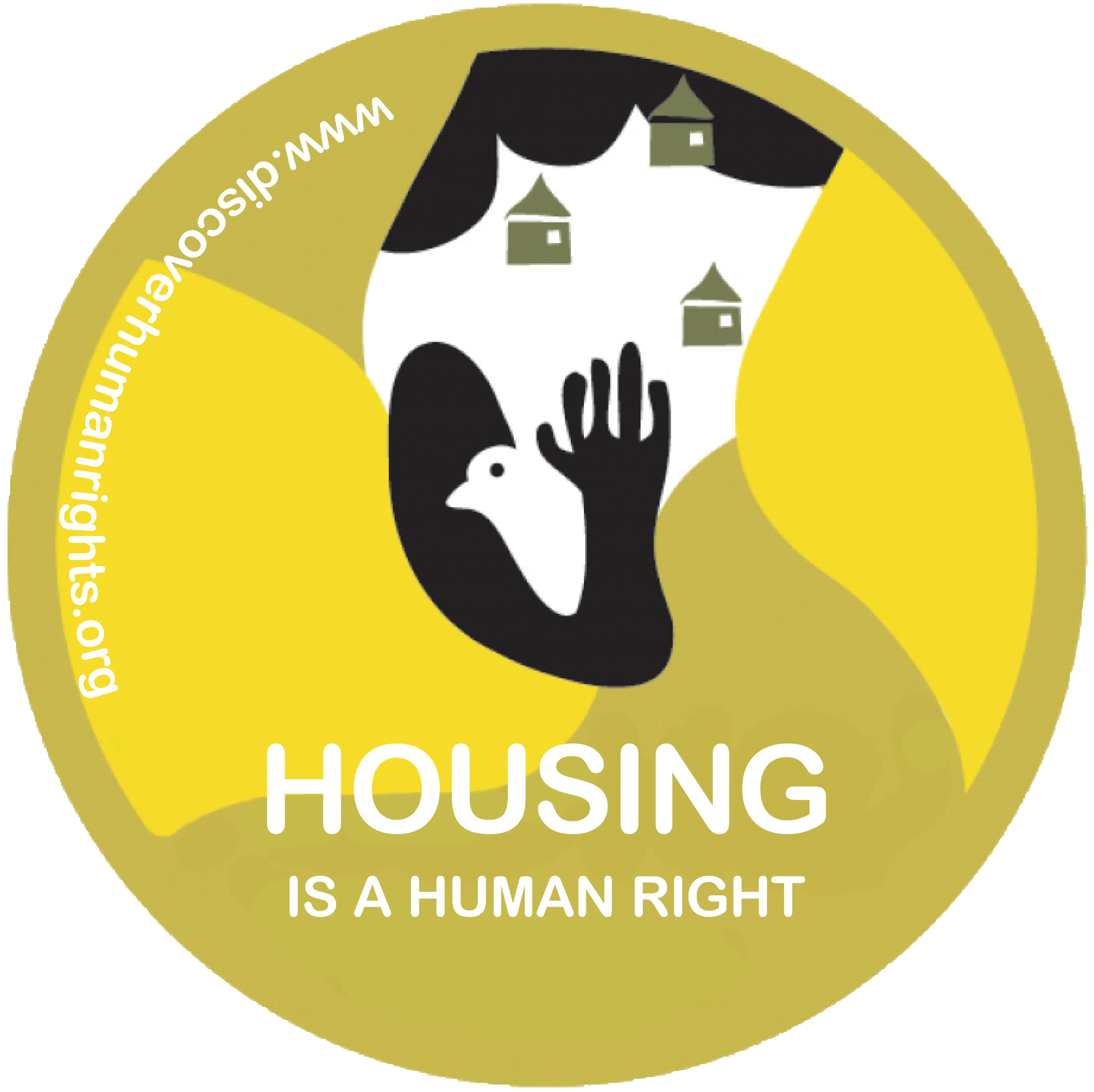
Housing is a Human Right Stamp