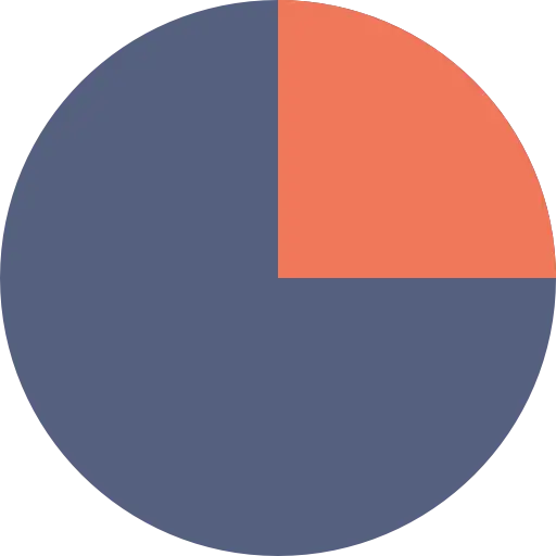
Pie Chart with Highlighted Segment for Analytics
This image features a clear and simple pie chart, effectively illustrating a breakdown of proportions. The majority of the circle, appearing as three-quarters of the whole, is depicted in a deep, muted blue-grey. A distinct segment, representing approximately one-quarter of the pie, is highlighted in a contrasting muted orange-red hue. This visual arrangement is a classic method for showcasing parts of a whole, commonly employed in business reports, statistical analysis, and any scenario requiring a quick understanding of proportional distribution or market share, making it highly relevant for data analytics.
pie chart - data - analytics - chart - proportion - segment - visual - breakdown - statistics
This image only for personal use, png & jpg filesize may vary
You Might Like
-

Pearl Ring Jewelry -

Team with Growth Graph Illustration -

Business Strategy Icons -

Organizational Structure Chart -

Various Devices Displaying Software -

Icon of KPI Dashboard with Graph and Person -

Zigzag Down Arrow Icon for Decline Representation -

Presentation Board with Graph for Business Concepts -

Yellow Ethernet Cable for Network Connections -

Bar Chart with Upward Arrow -
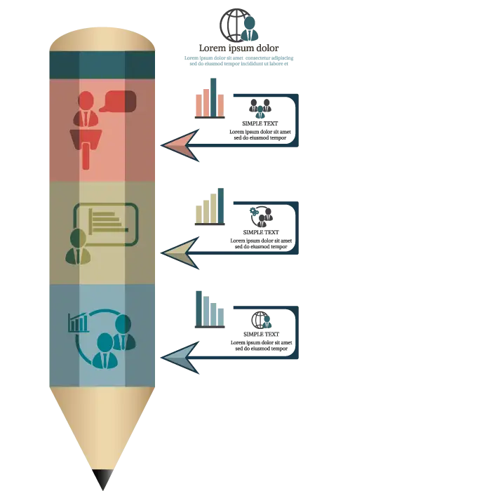
Infographic Pencil with Data Elements -

Search Growth Icon -

Illustration of Growth Chart with Upward Arrow -

SEO Concept with Magnifying Glass and Computer -

Blue Declining Bar Graph with Arrow -

Business Icons Set for Digital Workflows -

Circle Pie Chart Icon -

Bull Market Symbol -

Document Processing Cycle -

Medical Cloud Symbol -

Declining Chart Illustration -

Artificial Intelligence Laptop Interface Illustration -

Internal Hard Disk for Computer Storage -

Light Bulb with Globe and Analytics -

Book Icon with Blue Background -

34,046 CPS Appointments Text -
Pie Chart Representation -

Green Color Palette Chart -

Digital Devices with Graph -

Clipboard Illustration with Financial Chart for Data Analysis