
You Might Like
-

Right Arrow with Click Text -

Key Considerations Infographic -

Financial Dashboard on Multiple Devices -
Under Construction Warning Sign -

Antony Trivet Photography Logo -
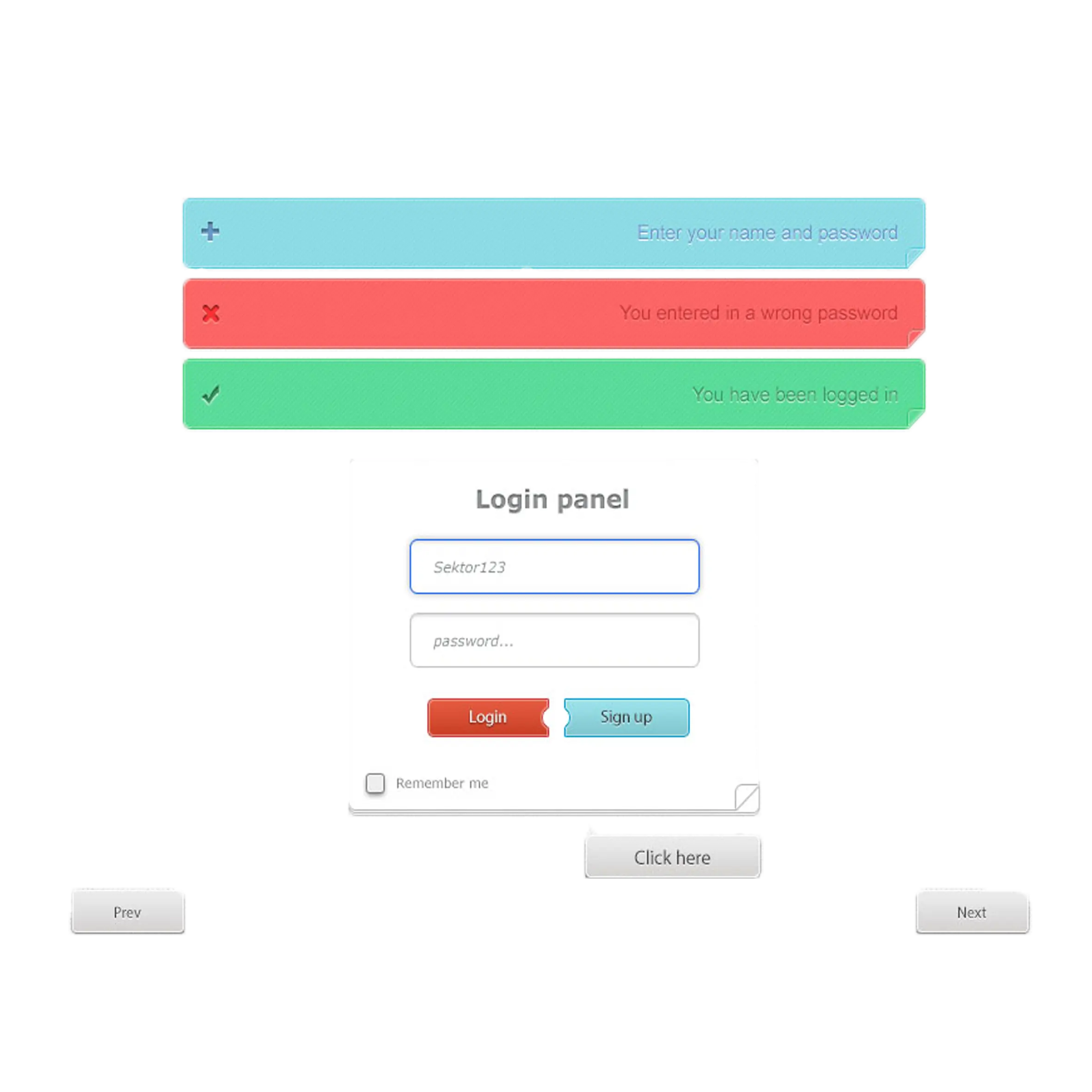
Web Login Panel Design -

Red Apply Now Button with White Text -

Web Design Concept with Tools and Code -
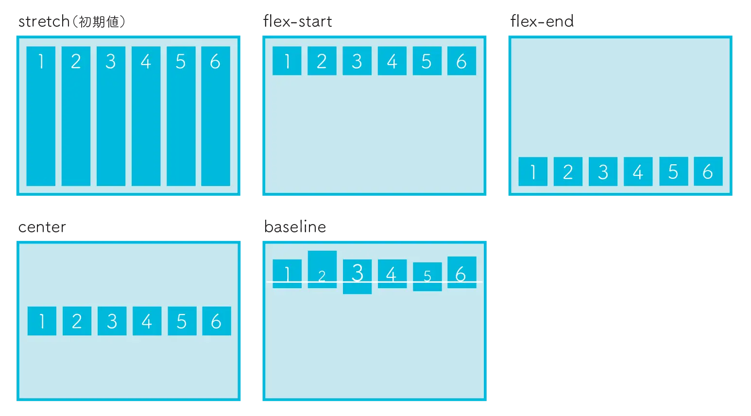
CSS Flexbox Layout Examples -
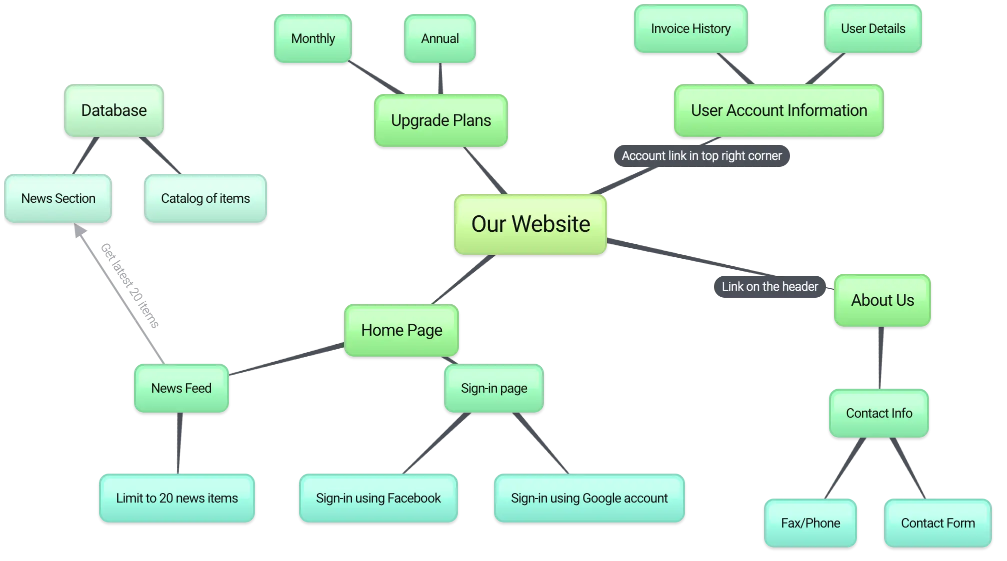
Website Sitemap Structure Diagram -

User Profile Icon with Data List -

Tablet and Smartphone Icon in Blue Outline -
Communication Icons Set -

Digital Devices Layout for Technology Presentation -

Under Construction Sign -

About Me Sign -
Wireless Keyboard Set with Stand -
Modern Laptop with Website Display -

Orange Shop Now Call to Action Button -

Responsive Website Displayed on Multiple Devices -
Under Construction Warning Sign -
Glossy Black and Brown Buttons -
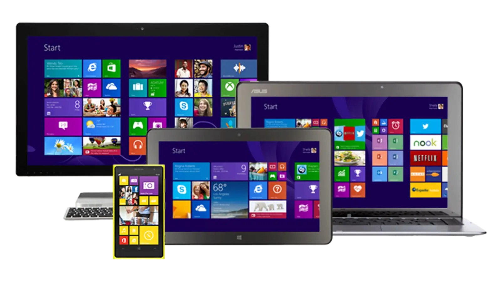
Multi-Screen Electronic Devices Setup -

Digital Data Analysis on Multiple Devices -

SSL Lock Icon for Web Security -

Set of Social Media Icons -

Digital Marketing Concept with Light Bulb -

Links and Sites Signpost -
Minimalist Simple Banners -

Web Design Tools