You Might Like
-
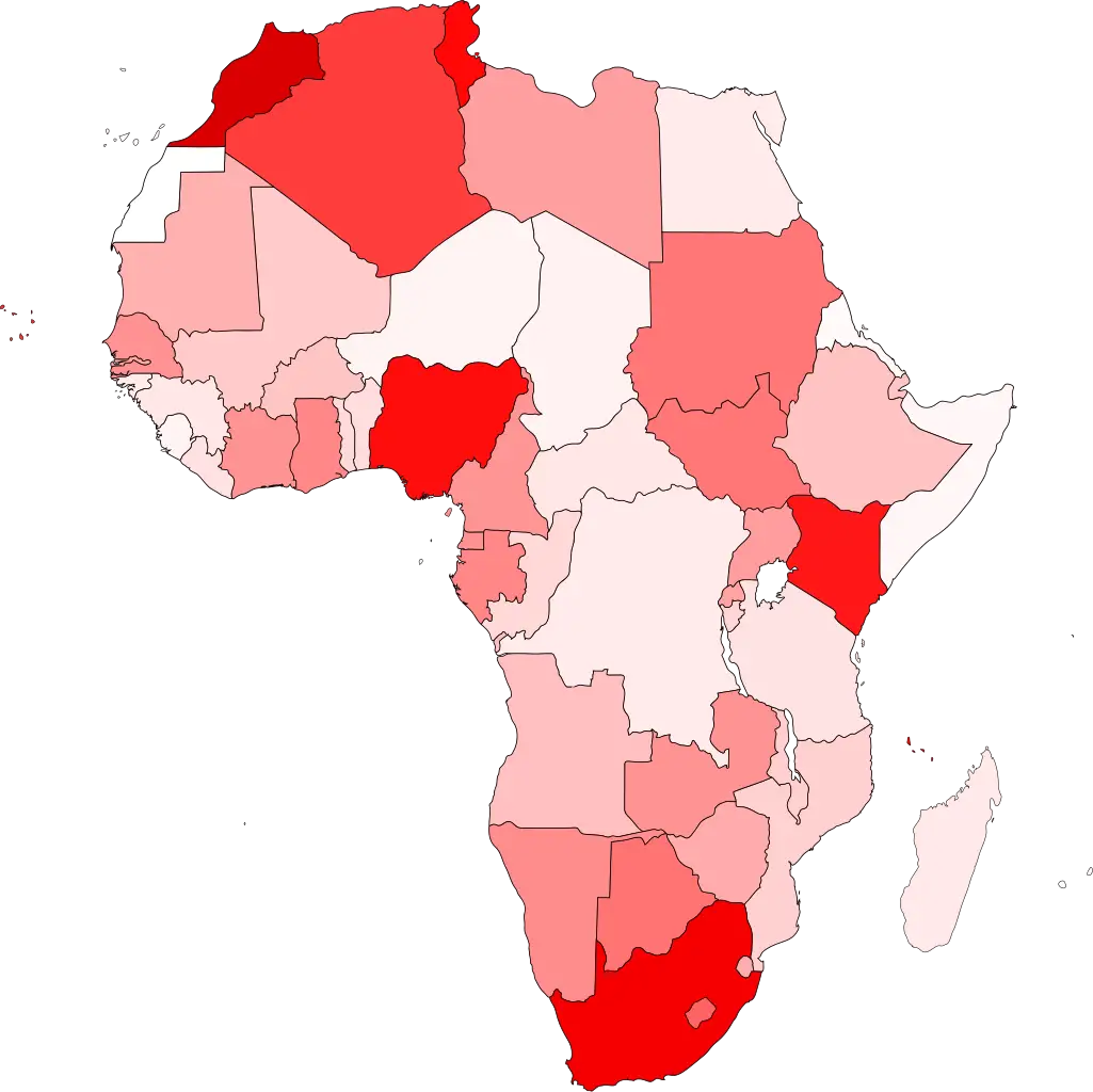
Colored Regional Map of Africa -

Blue Globe Network Icon -

Team with Growth Graph Illustration -

Blue Globe with Continents Illustration -

Blue Globe Model for Geography Learning -
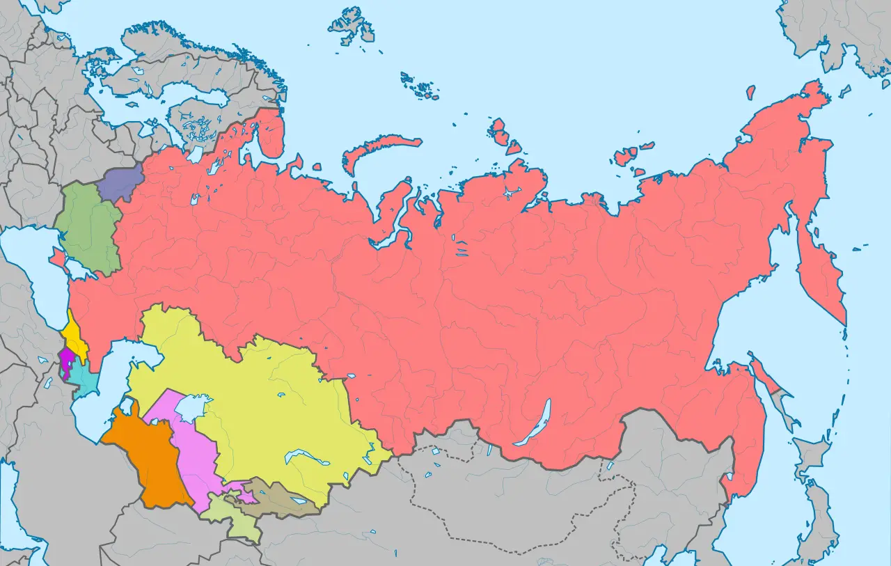
Map of the Soviet Union with Highlighted Regions -

Green Globe Icon Representing Sustainability -

Lions International Logo -
Complete Blue World Map -

Icon of KPI Dashboard with Graph and Person -

Transportation Logistics with Global Shipment -

Black Region Silhouette Map -

Yellow Ethernet Cable for Network Connections -

Bar Chart with Upward Arrow -
3D Globe Illustration of Earth Model -
Green Land Map Outline -

Search Growth Icon -
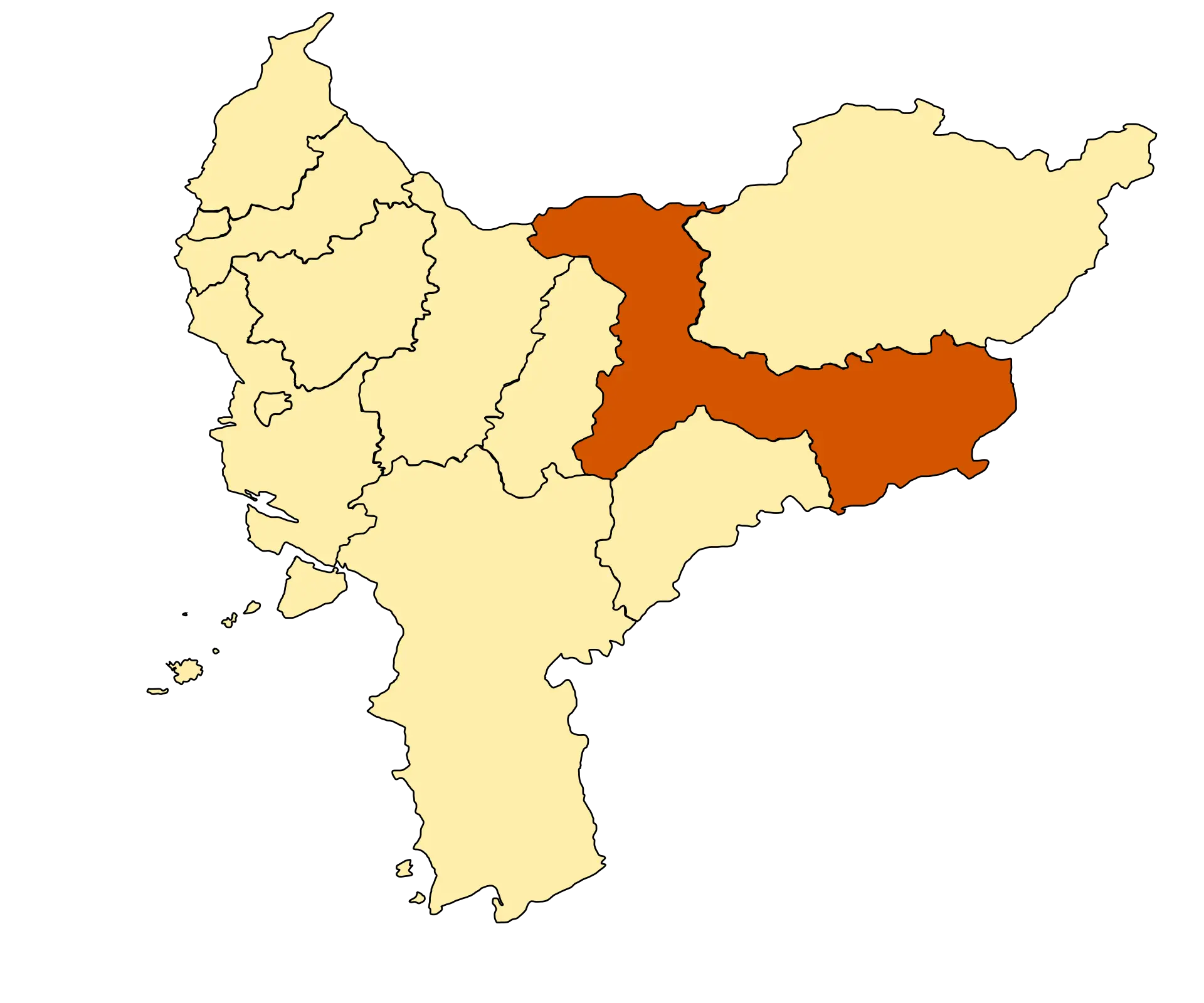
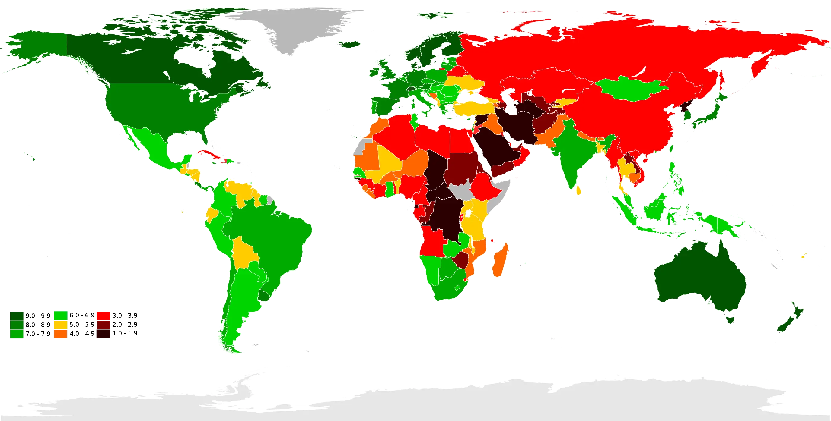
Map Highlighting Specific Regions -

Illustration of Growth Chart with Upward Arrow -
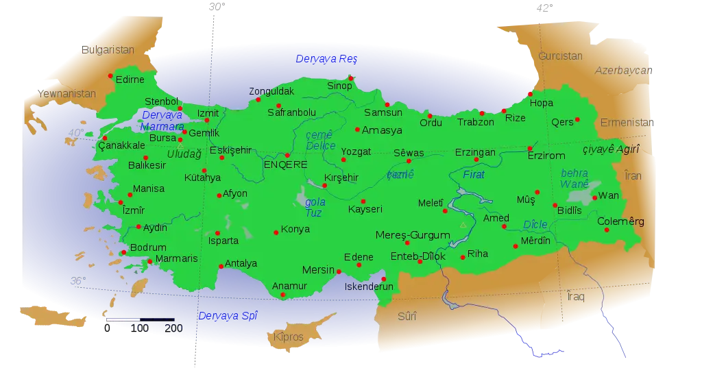
Map of Turkey with Major Cities and Regions -

Soviet Emblem with Red and Yellow Design -
Transparent World Map Design -

Blue Globe Icon for Global Connectivity -

Silhouette Globe Design with Continental Map -

Business Icons Set for Digital Workflows -

Circle Pie Chart Icon -
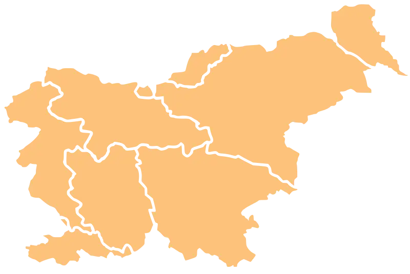
Map Outline of Slovenia -
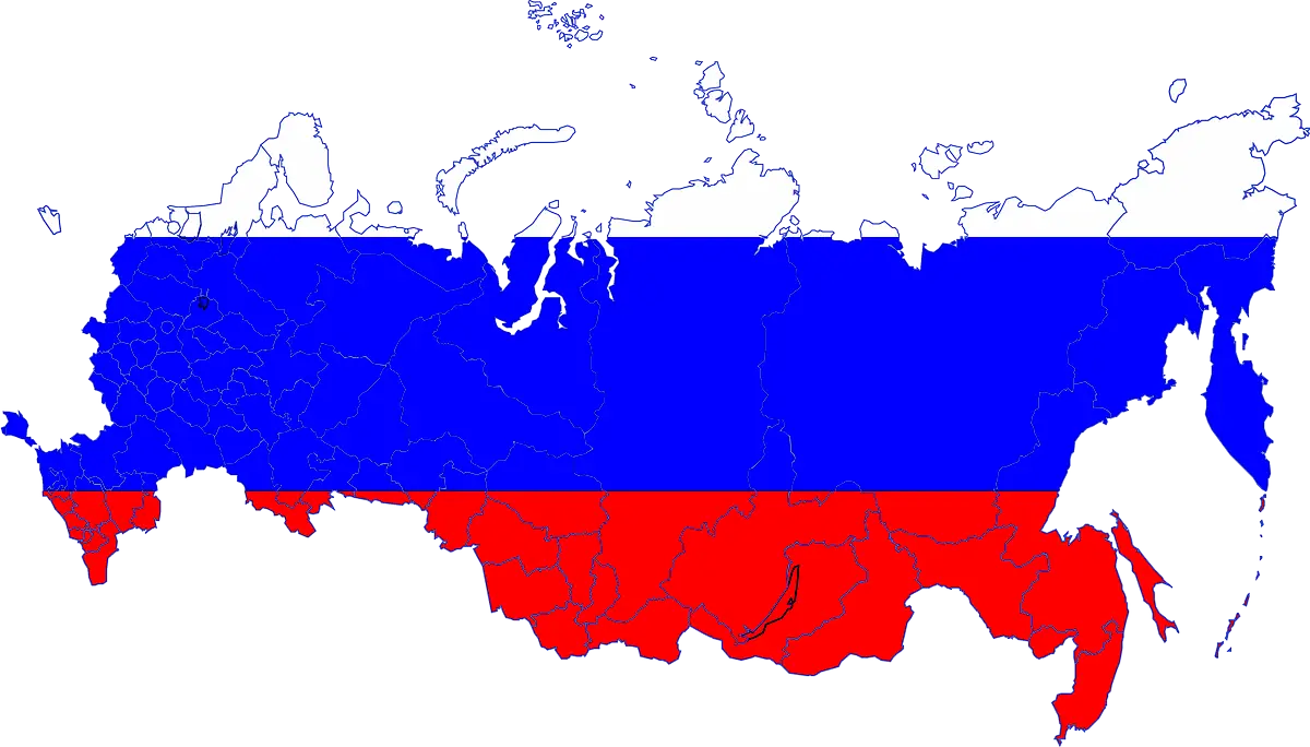
Map of Russia with Red, White, and Blue Flag Colors -

Bull Market Symbol -

Crossed USA and UK Flags for National Symbols