You Might Like
-

Radioactive Symbol Black and Metallic Logo -
Yellow Radioactive Warning Symbol -
Radiation Map of the World -

Radiation Sources Pie Chart Infographic -
Radiation Hazard Symbol -

Radiation Hazard Warning Symbol -

Radiation Hazard Symbol in Black -
Radiation Warning Shield -
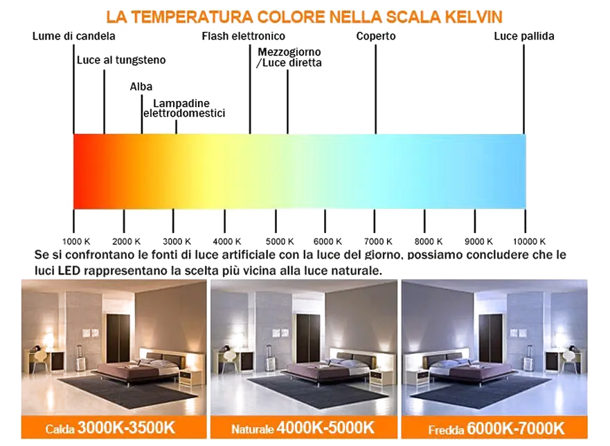
Color Temperature Scale in Kelvin -

Radiation Hazard Icon -
Radiation Warning Sign in Yellow Triangle -

Radiation Hazard Warning Sign -
Laser Warning Sign -
Radioactive Warning Icon -
Caution Radiation Risk Sign -

Black Radiation Warning Symbol Icon -
Radiation Hazard Safety Symbol -

Radiation Hazard Warning Symbol -
Gas Mask with Radiation Symbol -

Radioactive Symbol as Hazard Warning -
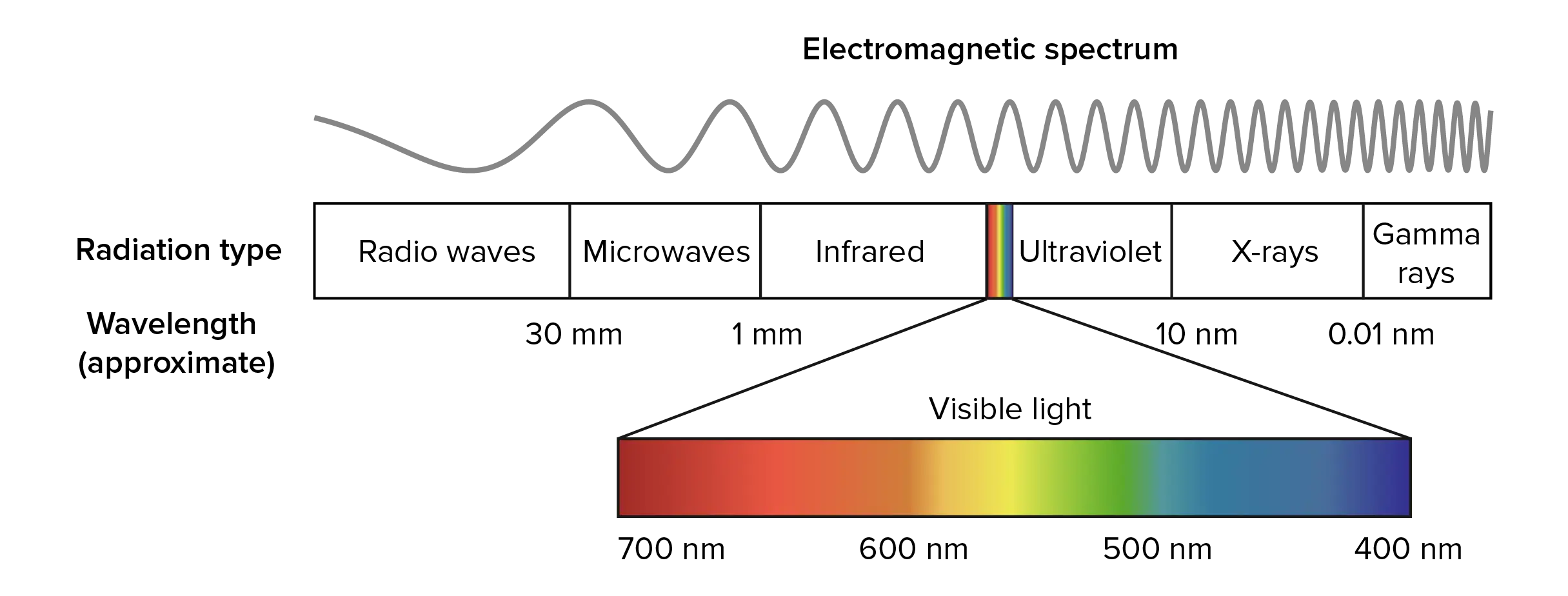
Diagram of Electromagnetic Spectrum -
Radiation Warning Symbol with Yellow Background -

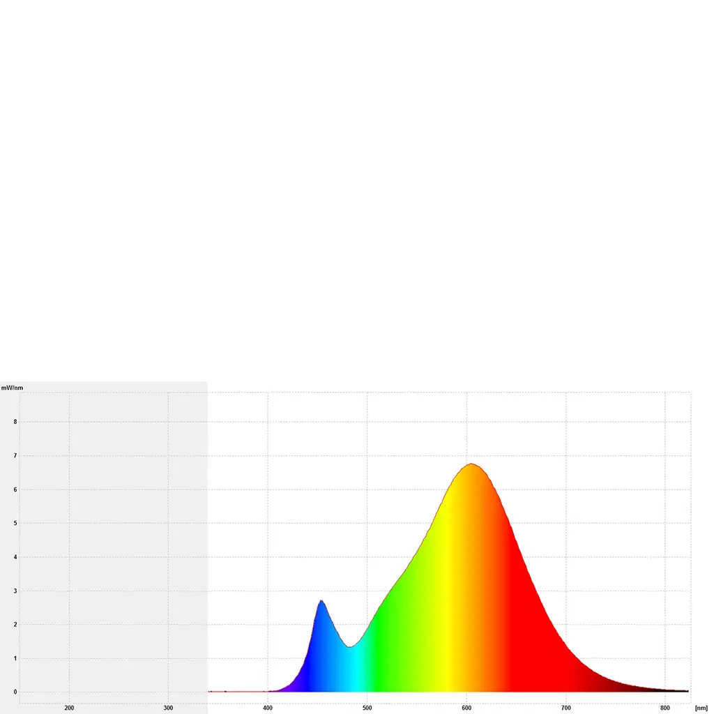
Energy-Efficient LED Tube Light for Illumination -
Radioactive Warning Symbol -
Nuclear Power Plant Icon -
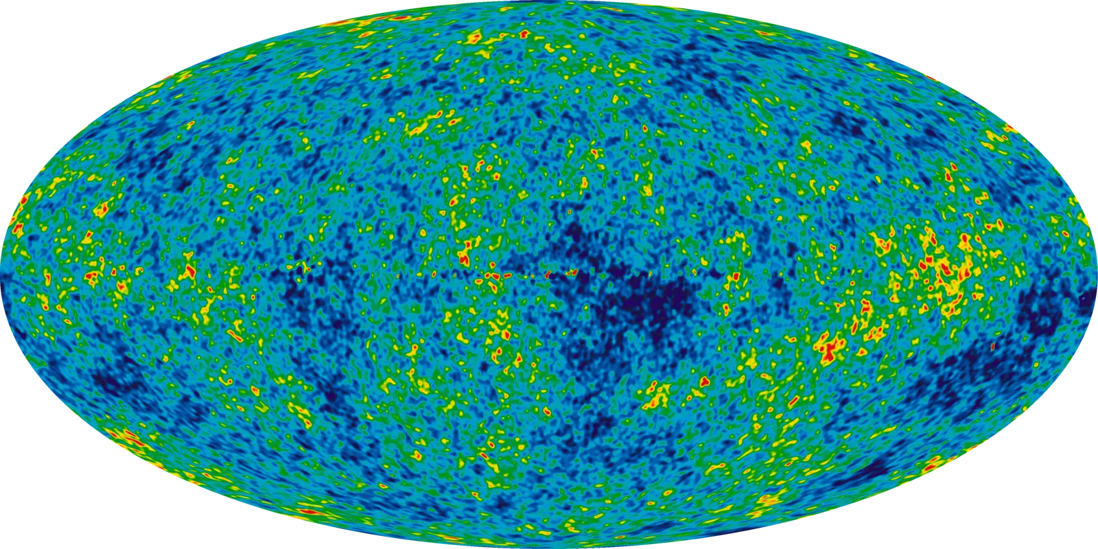
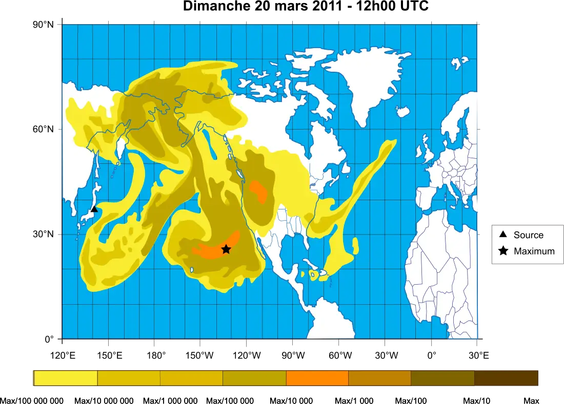
Cosmic Microwave Background Radiation Map -

Radiation Hazard Symbol -
Radiation Hazard Warning Icon in Orange -
Radiation Warning Symbol Design -
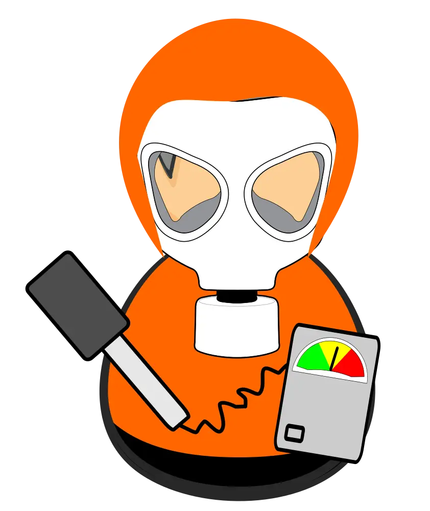
Hazmat Suit Person with Radiation Meter