You Might Like
-

Mathematical Geometry and Graph Concepts -

Zigzag Down Arrow Icon for Decline Representation -

Infographic Pencil with Data Elements -

Graph Plot with Blue Curve Illustration -

3D Coordinate System Illustration -

Blue Declining Bar Graph with Arrow -

Circle Pie Chart Icon -

Mathematical Formula Equation -

Traditional Abacus for Calculation and Learning -

Declining Chart Illustration -

34,046 CPS Appointments Text -

Pie Chart Representation -

Triangle Diagram for Geometric Representation -

Magnifying Glass with Graph Illustration -
Colorful Statistical Pie Chart -

Calculator and Chart Icon for Data Analysis -

Mathematical Network Diagram with Nodes and Lines -
Line Graph for Data Visualization -
Colorful Infographic Data Visualization -
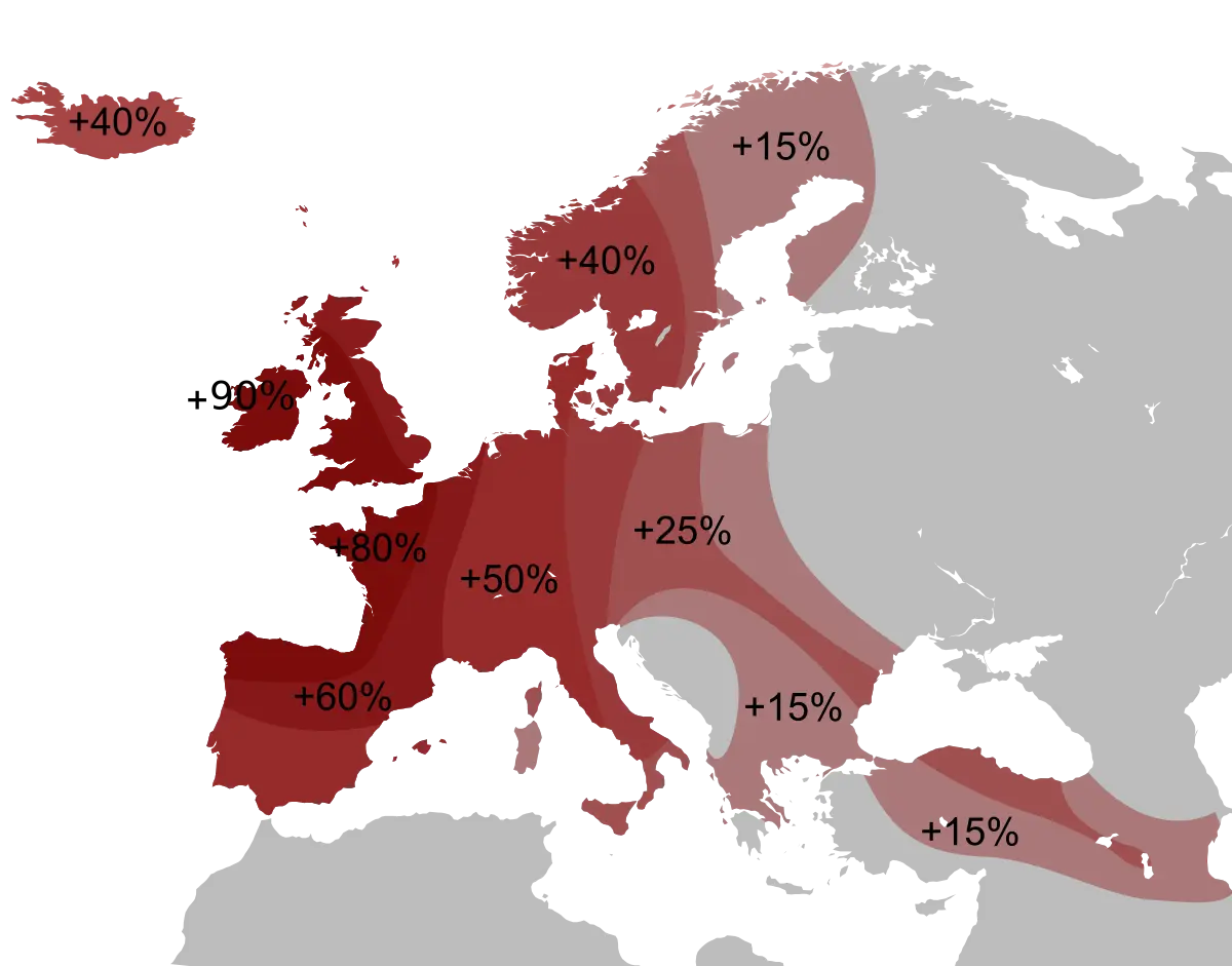
Percentage Map of Europe -

Bar Chart Icon for Data Analysis -

Hexagon Shape -
Geometric Circle with Points -

Red Downward Arrow Crashing -

Data Analysis Infographic Design -

House Statistics Icon for Real Estate Analytics -

Colorful Descending Bar Graph Illustration -

Tablet with Graphs and Data Analysis -

Data Analysis Icon -

Blue Upward Arrow with Bar Chart Icon