
You Might Like
-

Organizational Structure Chart -

Zigzag Down Arrow Icon for Decline Representation -

Transportation Logistics with Global Shipment -

Bar Chart with Upward Arrow -

Infographic Pencil with Data Elements -

Stack of Hay Bales in Agricultural Setting -

Blue Declining Bar Graph with Arrow -

Circle Pie Chart Icon -

Declining Chart Illustration -

Book Icon with Blue Background -

34,046 CPS Appointments Text -

Pie Chart Representation -
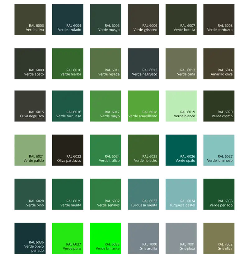
Green Color Palette Chart -

Clipboard Illustration with Financial Chart for Data Analysis -

Magnifying Glass with Graph Illustration -

HDMI Splitter Cable -
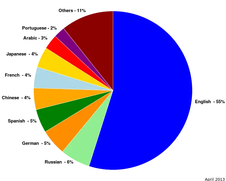
Colorful Statistical Pie Chart -

Young Living Essential Oils Logo -

Calculator and Chart Icon for Data Analysis -

Black Abstract Pyramid Illustration -

Green Flowchart Diagram -

Aviall A Boeing Company Logo -

Colorful Bar Graph Illustration -

Upward Arrow on Graph -

Colorful Infographic for Data Presentation -

Line Graph for Data Visualization -
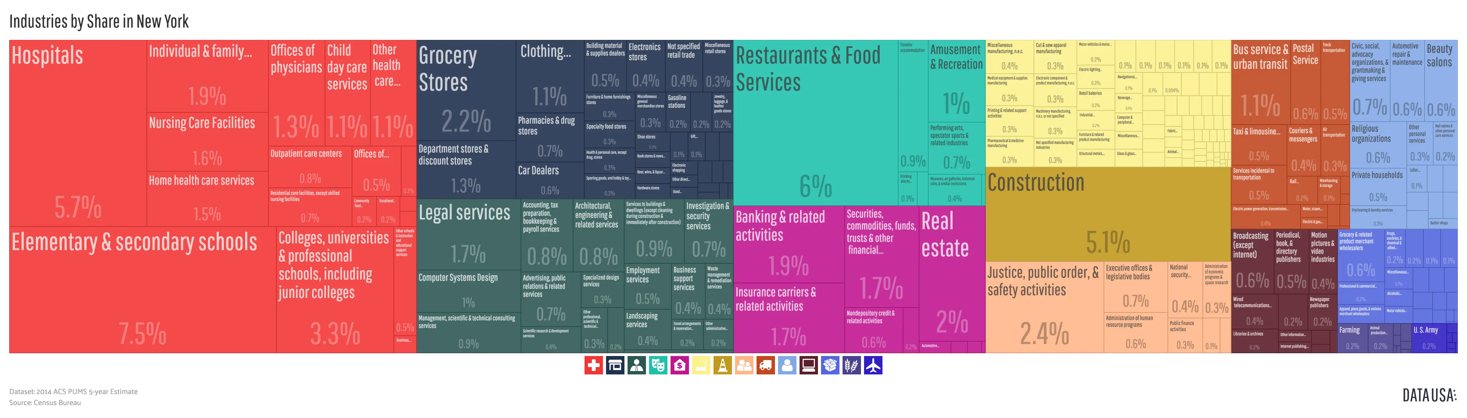
Colorful Infographic Data Visualization -

Workspace Setup with Chart and Desk -

Blue Logistics and Shipping Icons -

Ancient Mayan Step Pyramid Illustration