
You Might Like
-
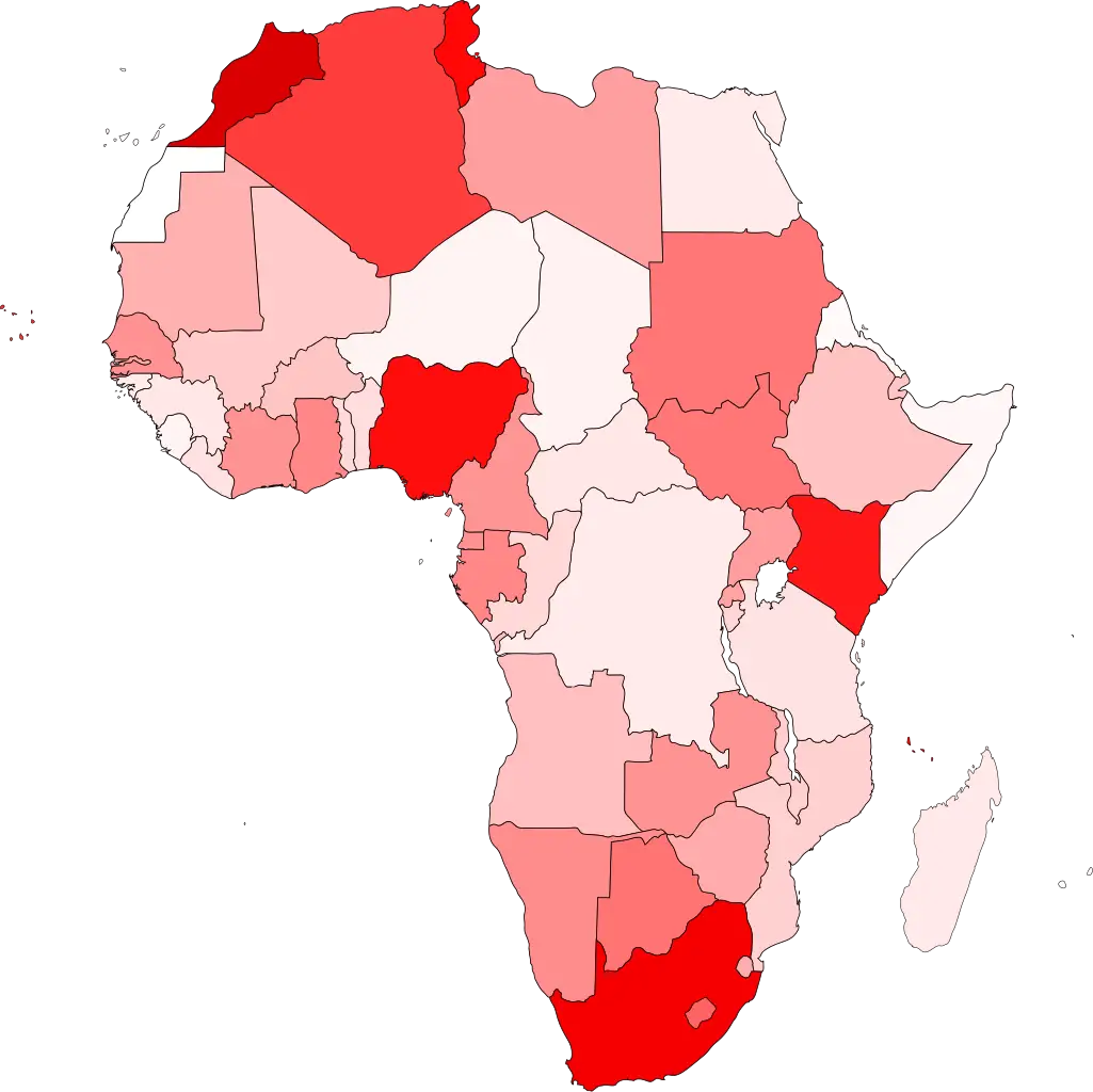
Colored Regional Map of Africa -

Blue Globe with Continents Illustration -

Blue Globe Model for Geography Learning -
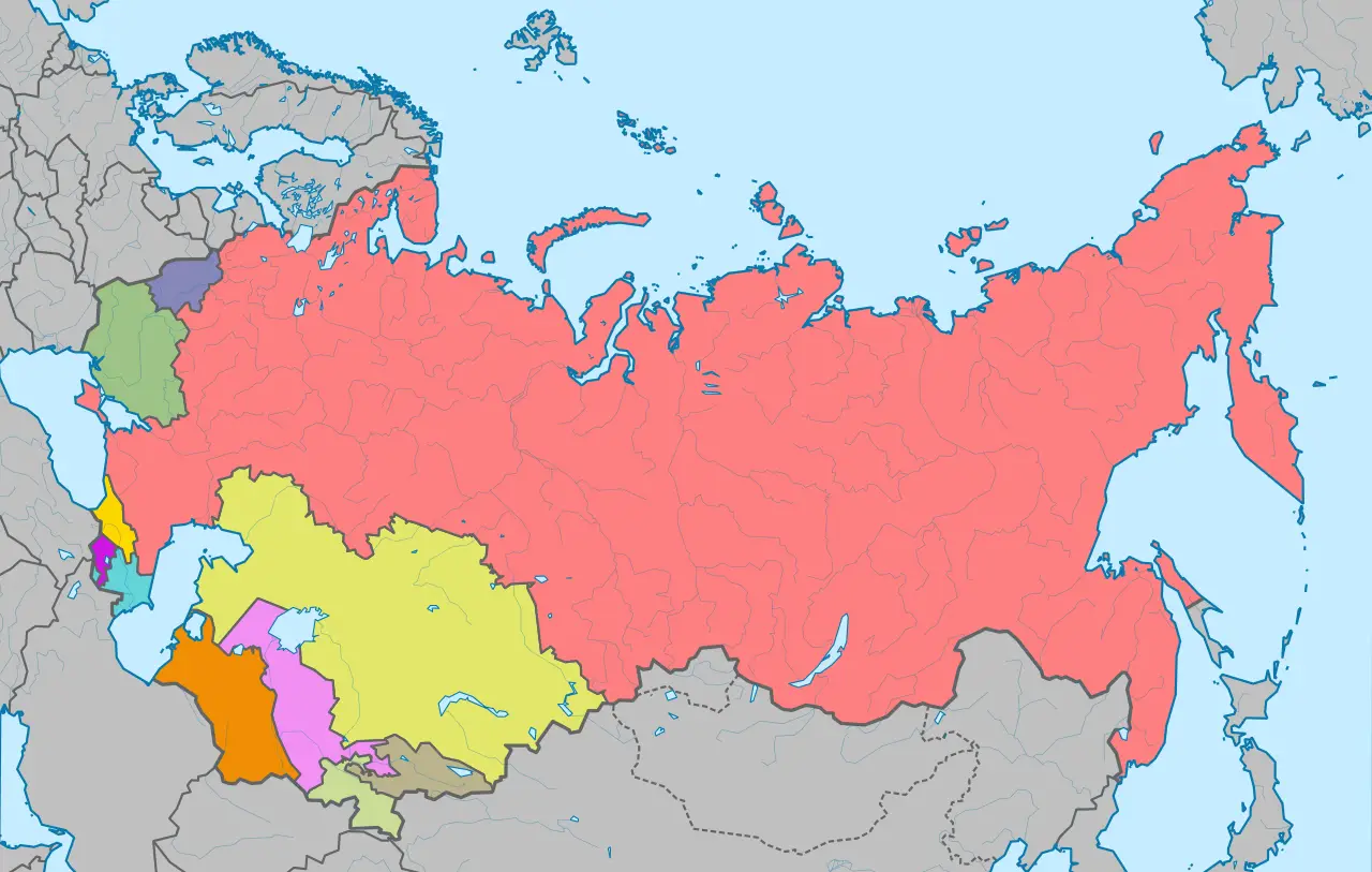
Map of the Soviet Union with Highlighted Regions -

Complete Blue World Map -

Black Region Silhouette Map -

Infographic Pencil with Data Elements -

3D Globe Illustration of Earth Model -

Green Land Map Outline -
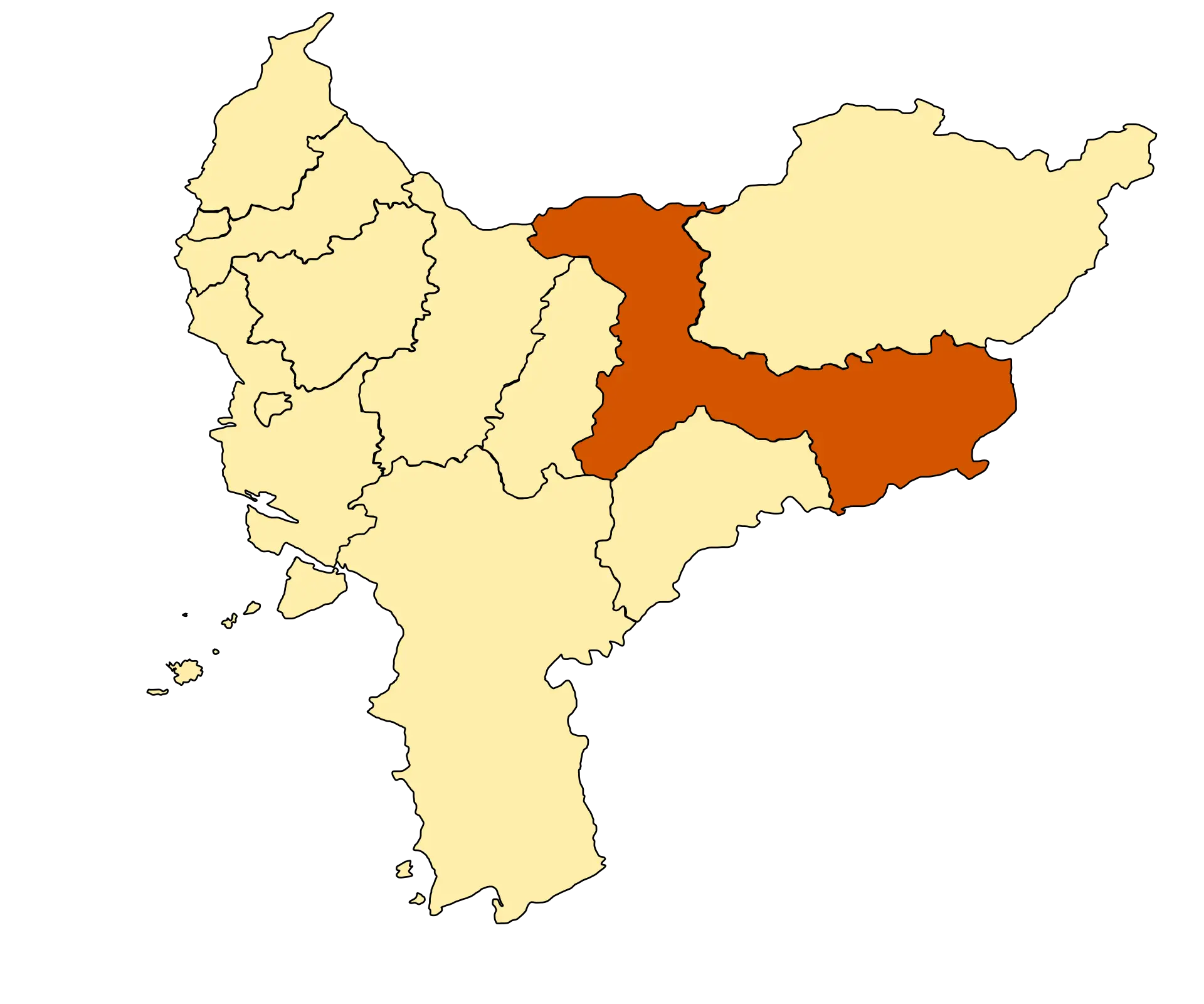
Map Highlighting Specific Regions -
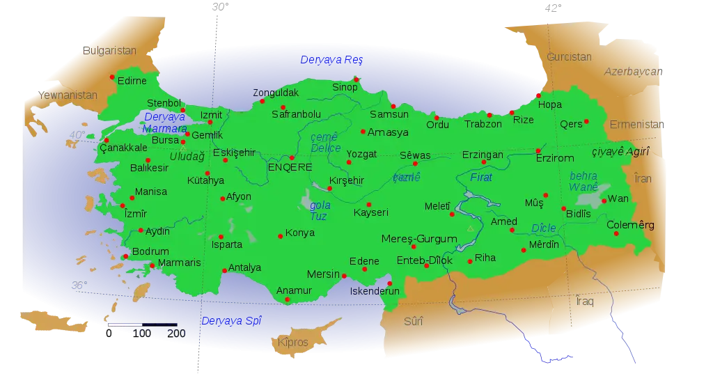
Map of Turkey with Major Cities and Regions -

Soviet Emblem with Red and Yellow Design -
Transparent World Map Design -

Silhouette Globe Design with Continental Map -

Blue Declining Bar Graph with Arrow -

Circle Pie Chart Icon -
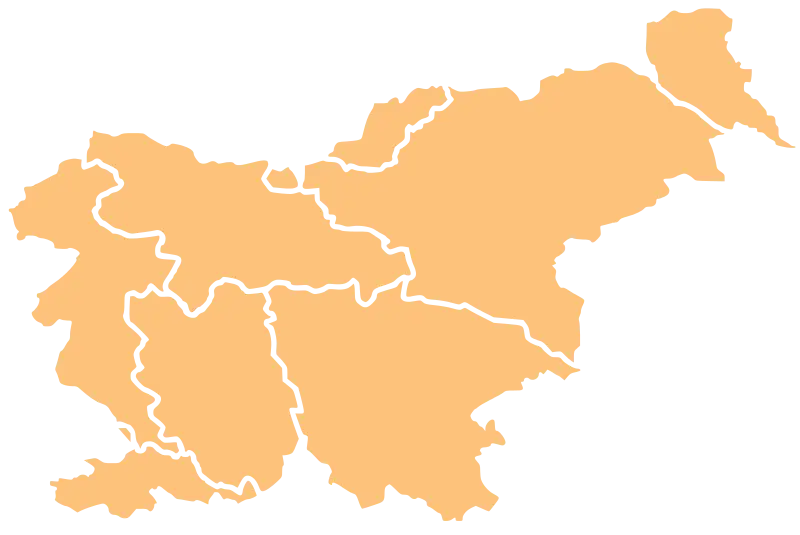
Map Outline of Slovenia -
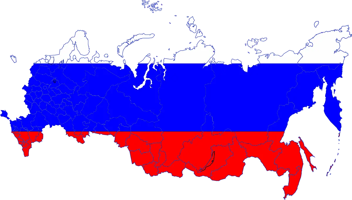
Map of Russia with Red, White, and Blue Flag Colors -

Map of Vietnam -
Gray Map Silhouette on Transparent Background -

Binary World Map -
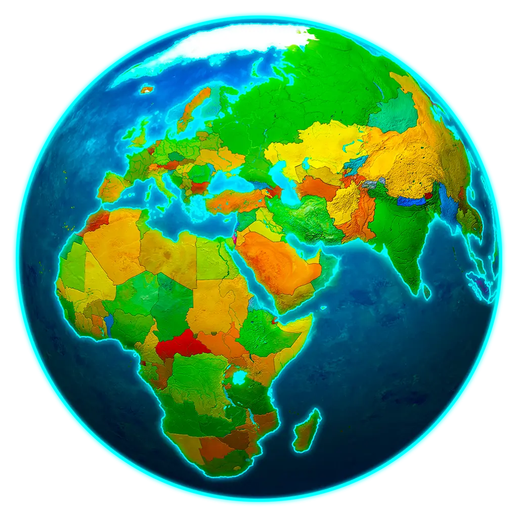
Colorful World Map Globe Representation -
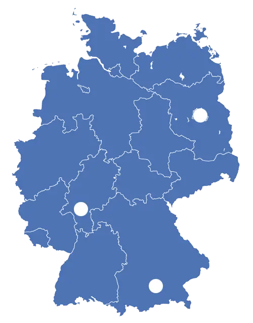
Blue Map of Germany with Regions -

Book Icon with Blue Background -

34,046 CPS Appointments Text -

Pie Chart Representation -

Classic Compass Rose Navigation Symbol -
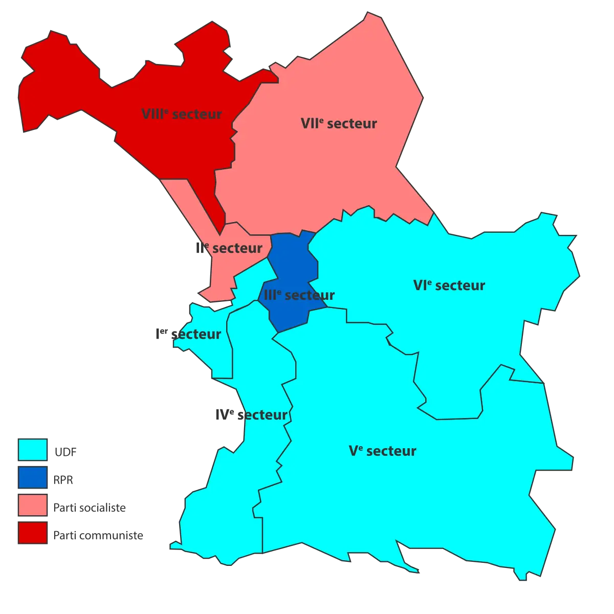
Political Map Displaying Regional Sectors -
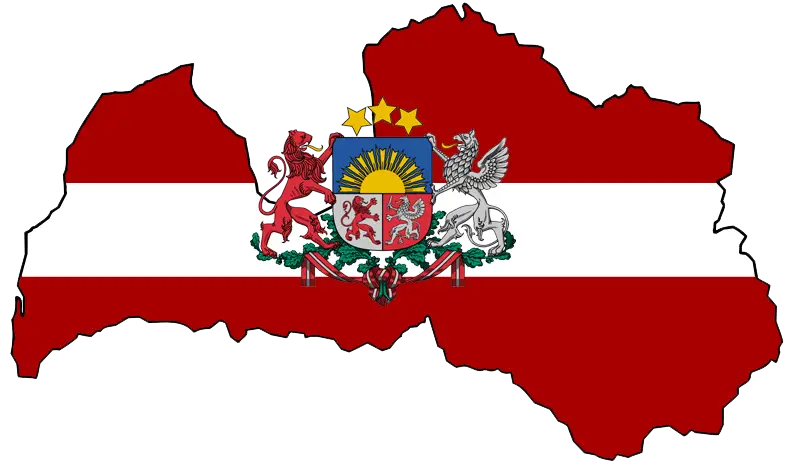
Latvian Map with Country Flag Integration -
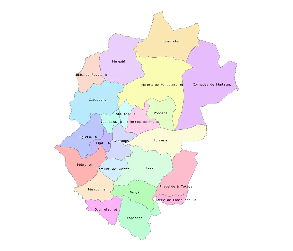
Color-Coded Map of Regional Divisions