You Might Like
-

Zigzag Down Arrow Icon for Decline Representation -

Infographic Pencil with Data Elements -

Blue Declining Bar Graph with Arrow -

Circle Pie Chart Icon -

Declining Chart Illustration -

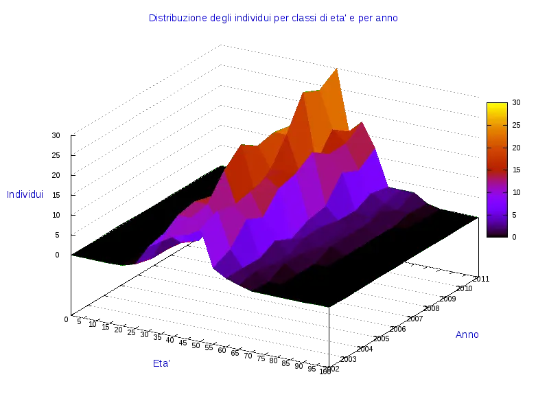
34,046 CPS Appointments Text -

Pie Chart Representation -

Magnifying Glass with Graph Illustration -
Colorful Statistical Pie Chart -

Calculator and Chart Icon for Data Analysis -

Exercise Equipment with Measurements -

Rectangular Field with Grid and Measurements -

Line Graph for Data Visualization -
Colorful Infographic Data Visualization -
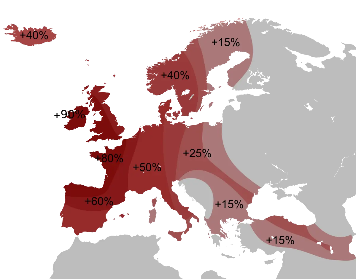
Percentage Map of Europe -

Bar Chart Icon for Data Analysis -

Red Downward Arrow Crashing -

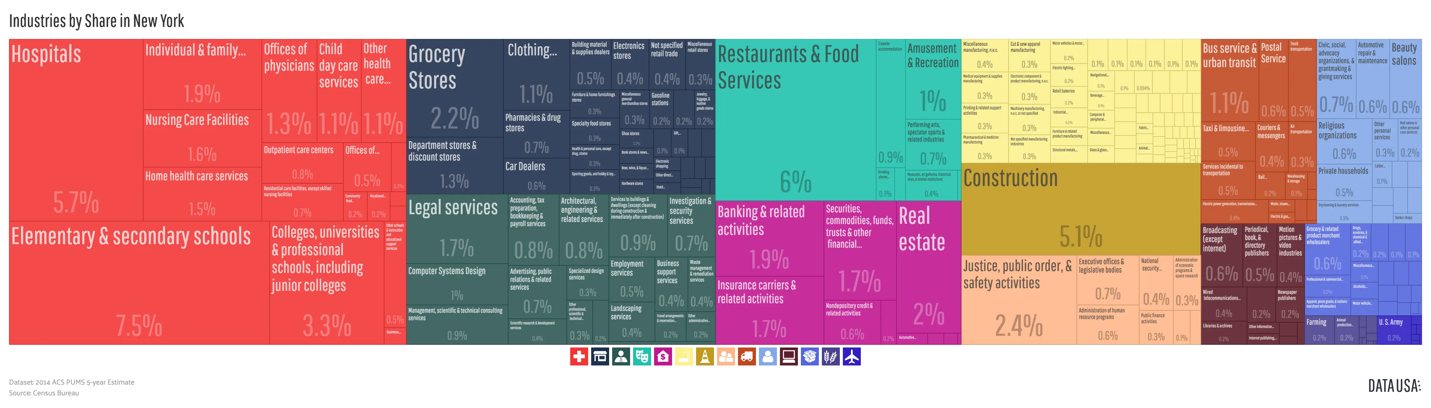
Data Analysis Infographic Design -

House Statistics Icon for Real Estate Analytics -

Colorful Descending Bar Graph Illustration -

Tablet with Graphs and Data Analysis -

Data Analysis Icon -

Blue Upward Arrow with Bar Chart Icon -

Graph with Local and Global Extrema -

Data Analysis Document with Magnifying Glass -
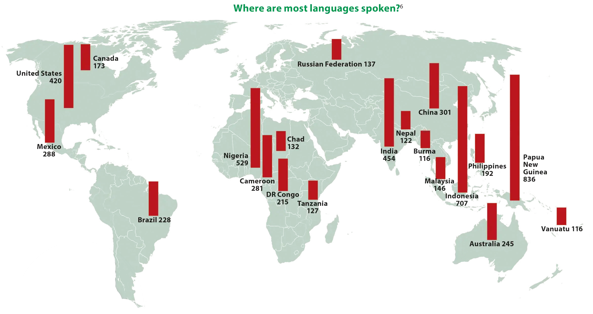
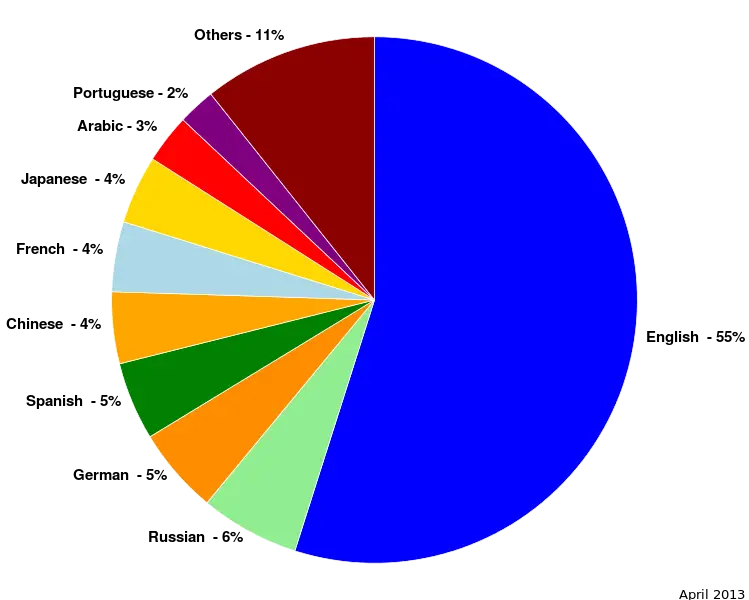
World Map Showing Language Distribution -

Upward Arrow on Bar Graph -

Soccer Field Diagram with Green Background -

Data Analysis Bar Chart on Monitor -

Blue and Gray Editable World Map