You Might Like
-

Blue Globe Model for Geography Learning -

Silhouette Globe Design with Continental Map -

Binary World Map -
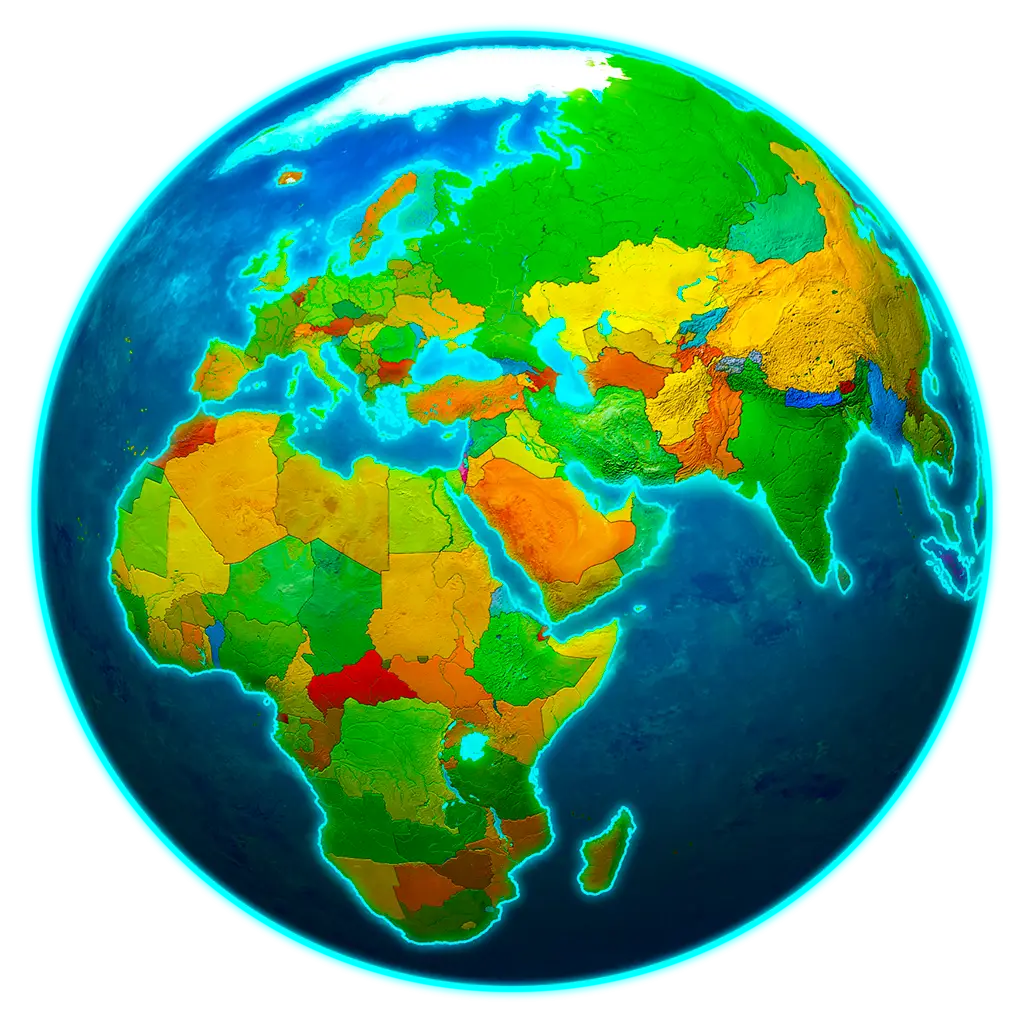
Colorful World Map Globe Representation -

Black and White Globe -
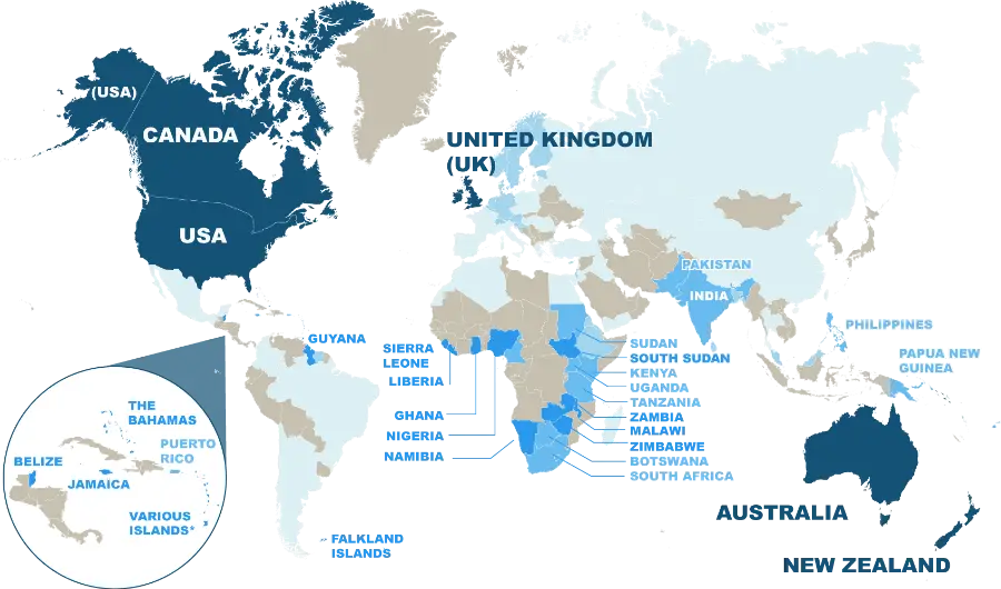
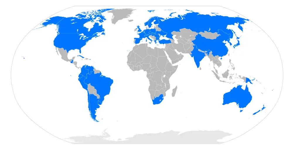
World Map Highlighting English-Speaking Countries -
World Globe Map Depicting Continents and Countries -
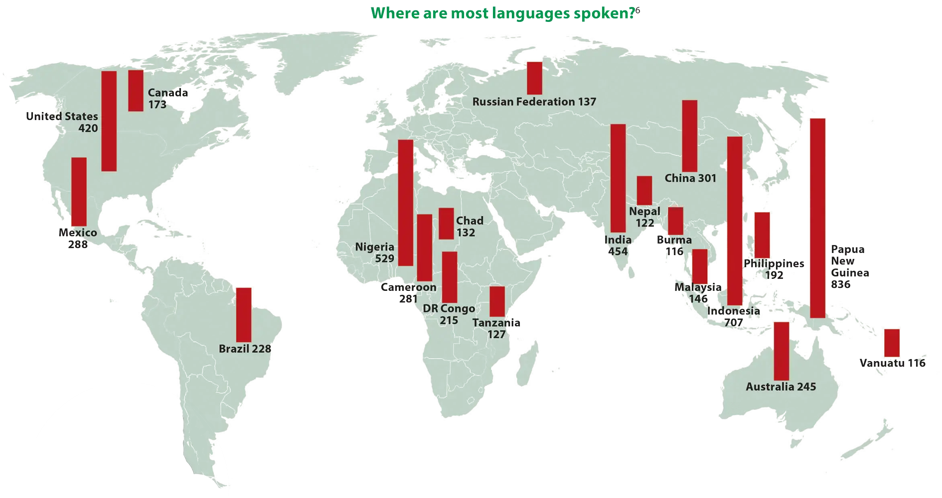
World Map Showing Language Distribution -
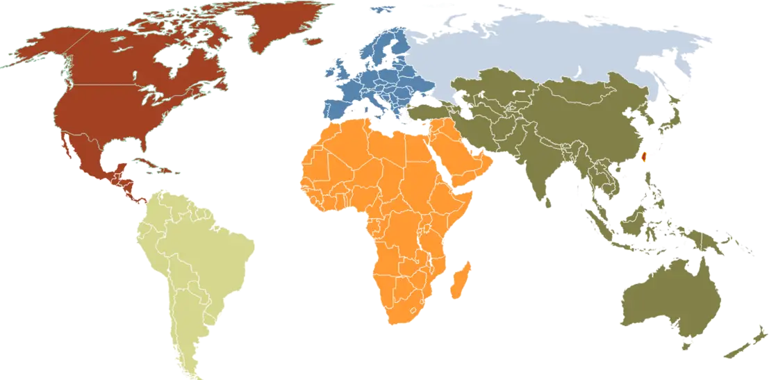
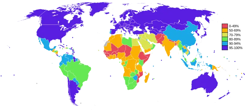
World Map with Colored Regions -
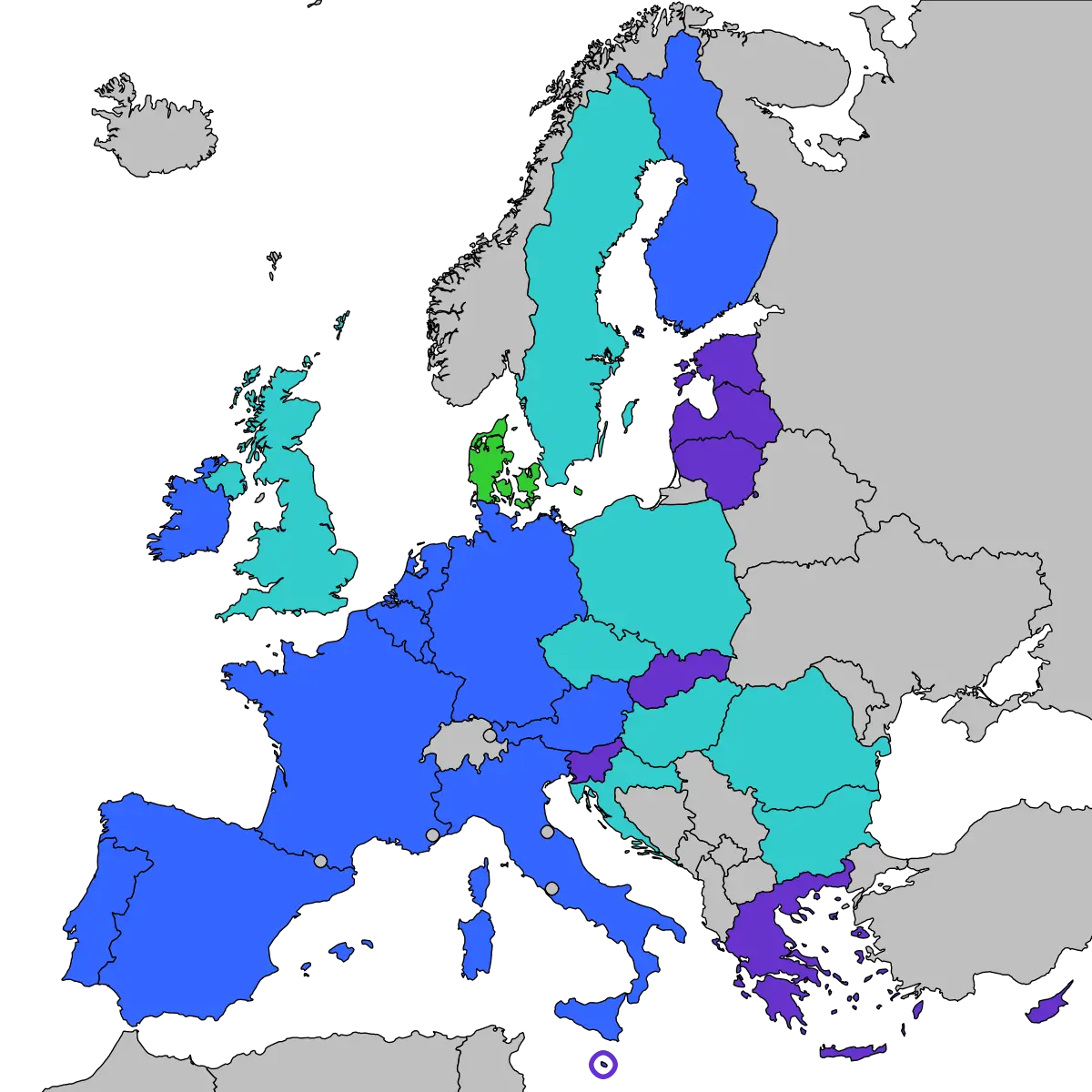
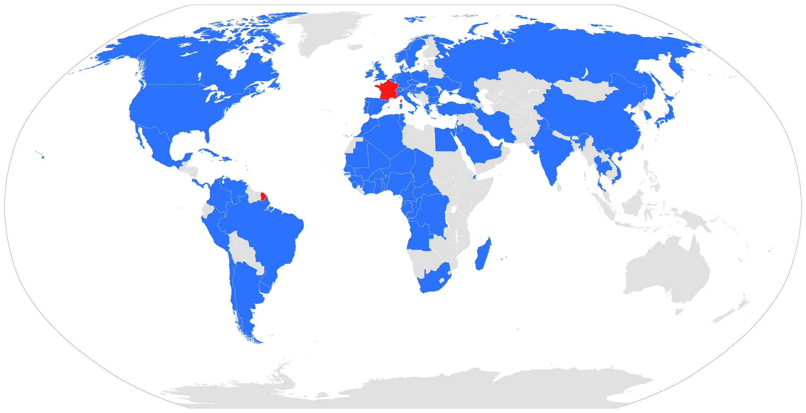
Map of Europe with Country Highlights -
Blue and Gray Editable World Map -
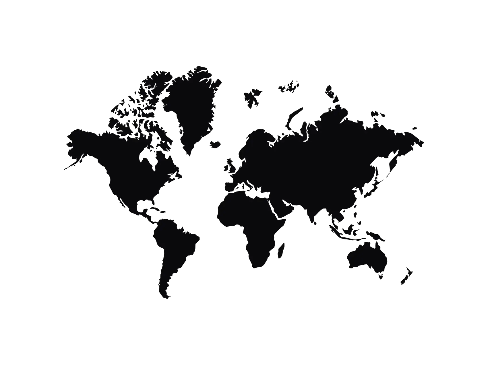
World Map Silhouette for Geographical Representation -
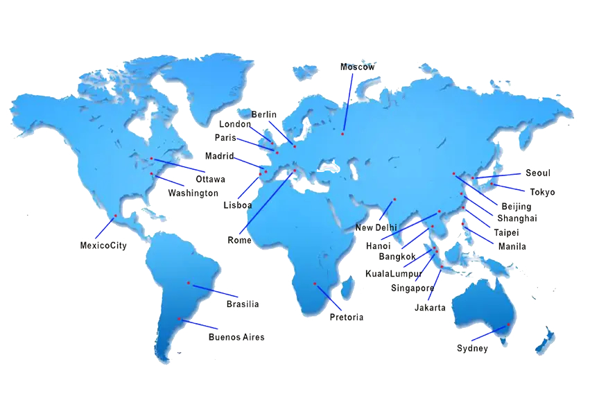
Labeled World Map with Key Cities -

Creative Chocolate Cake with World Map Design -
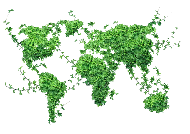
Green World Map Made of Plants -
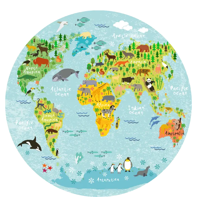
Illustrated Animal World Map for Education -
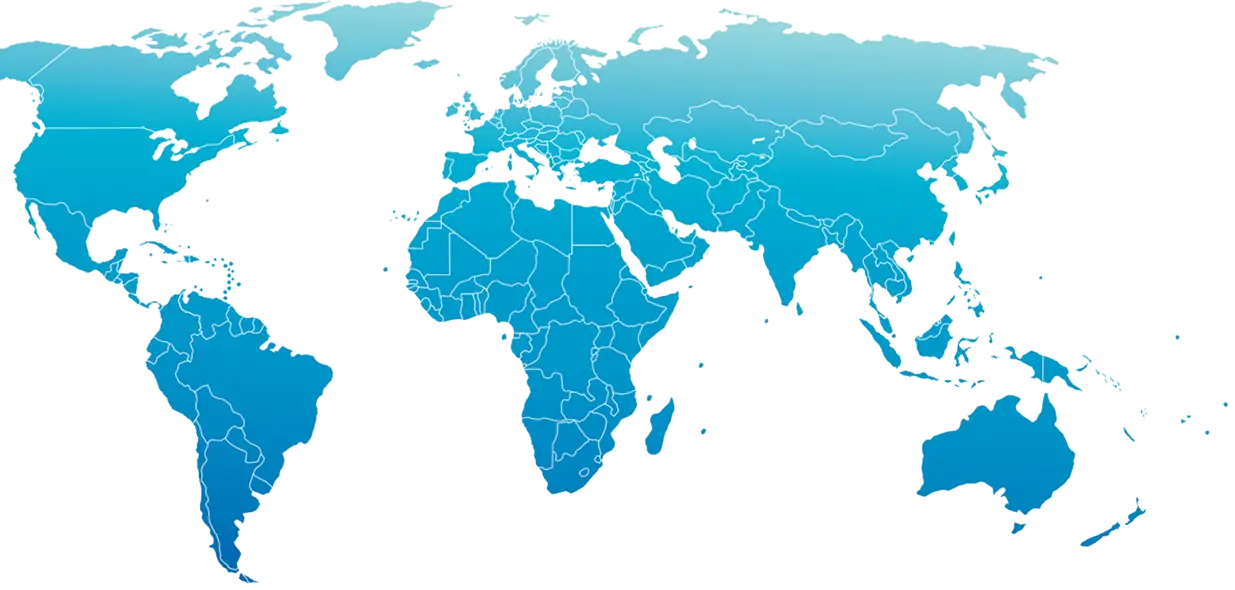
Blue World Map Illustration -
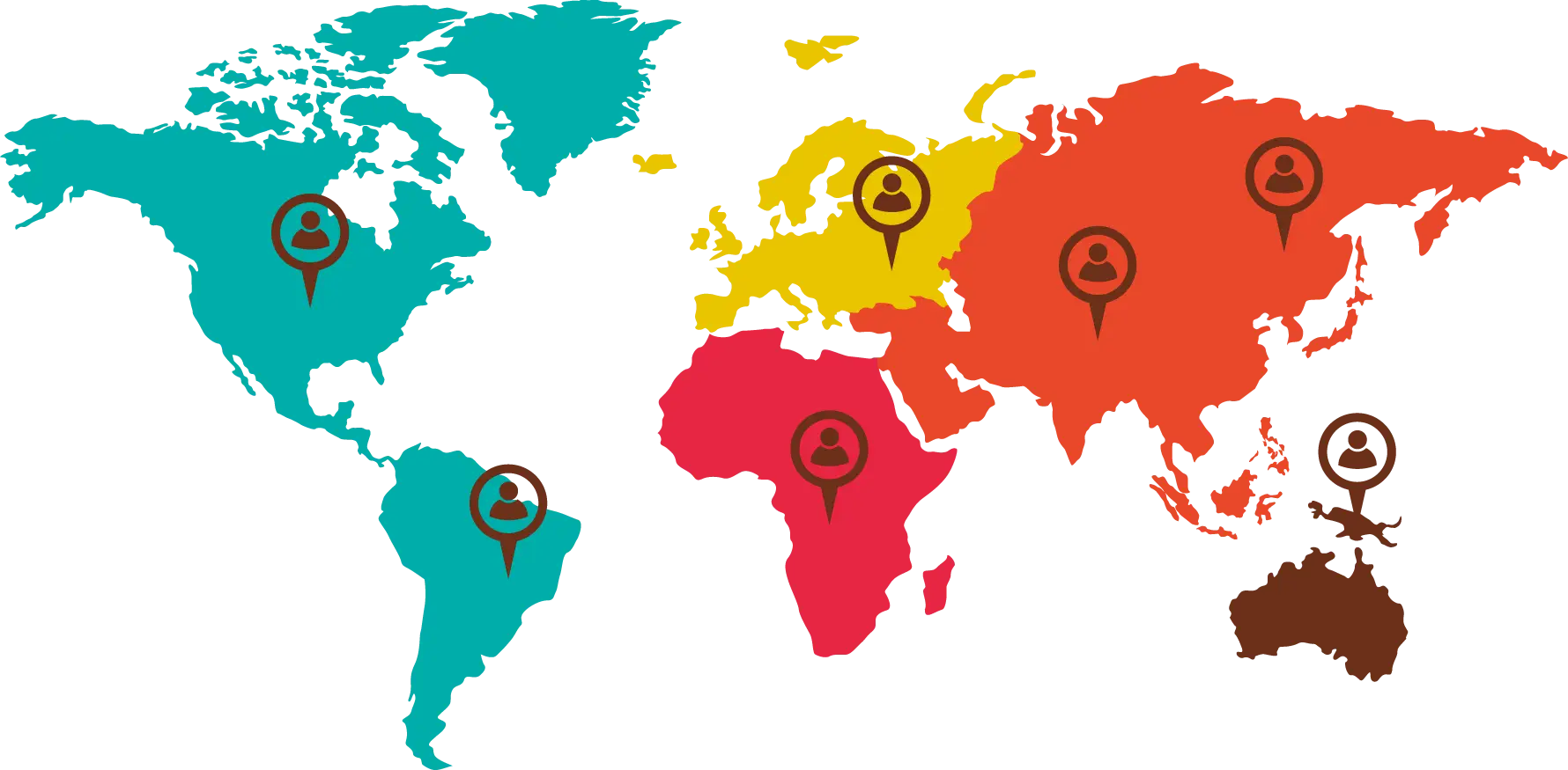
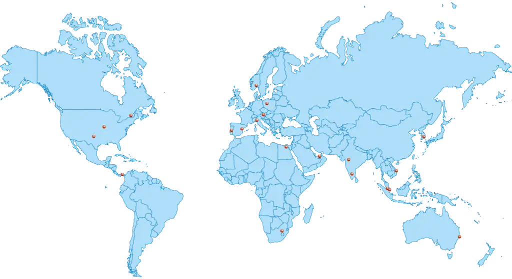
World Map with Location Markers -
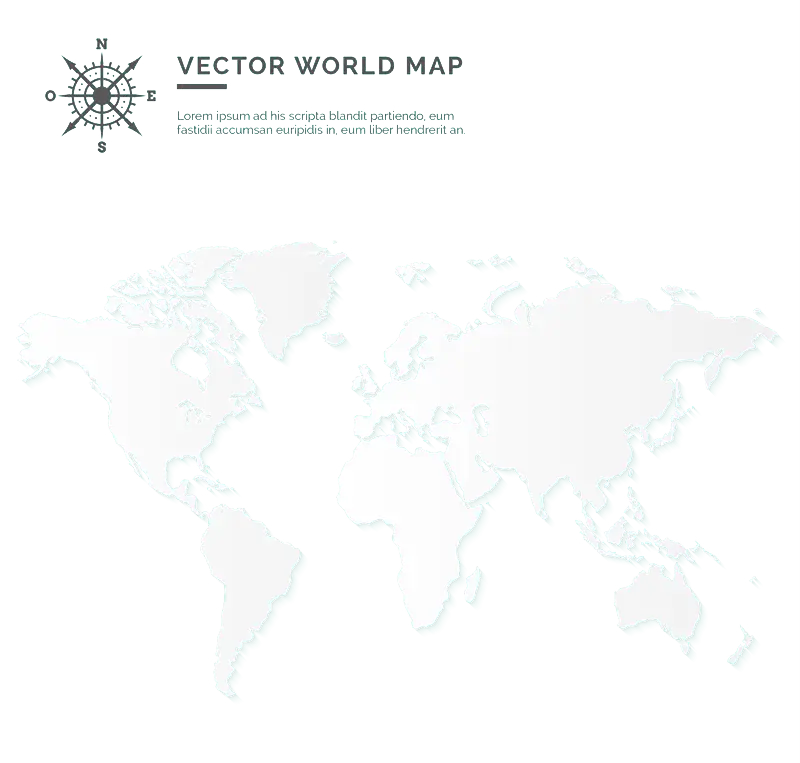
Transparent Vector World Map -
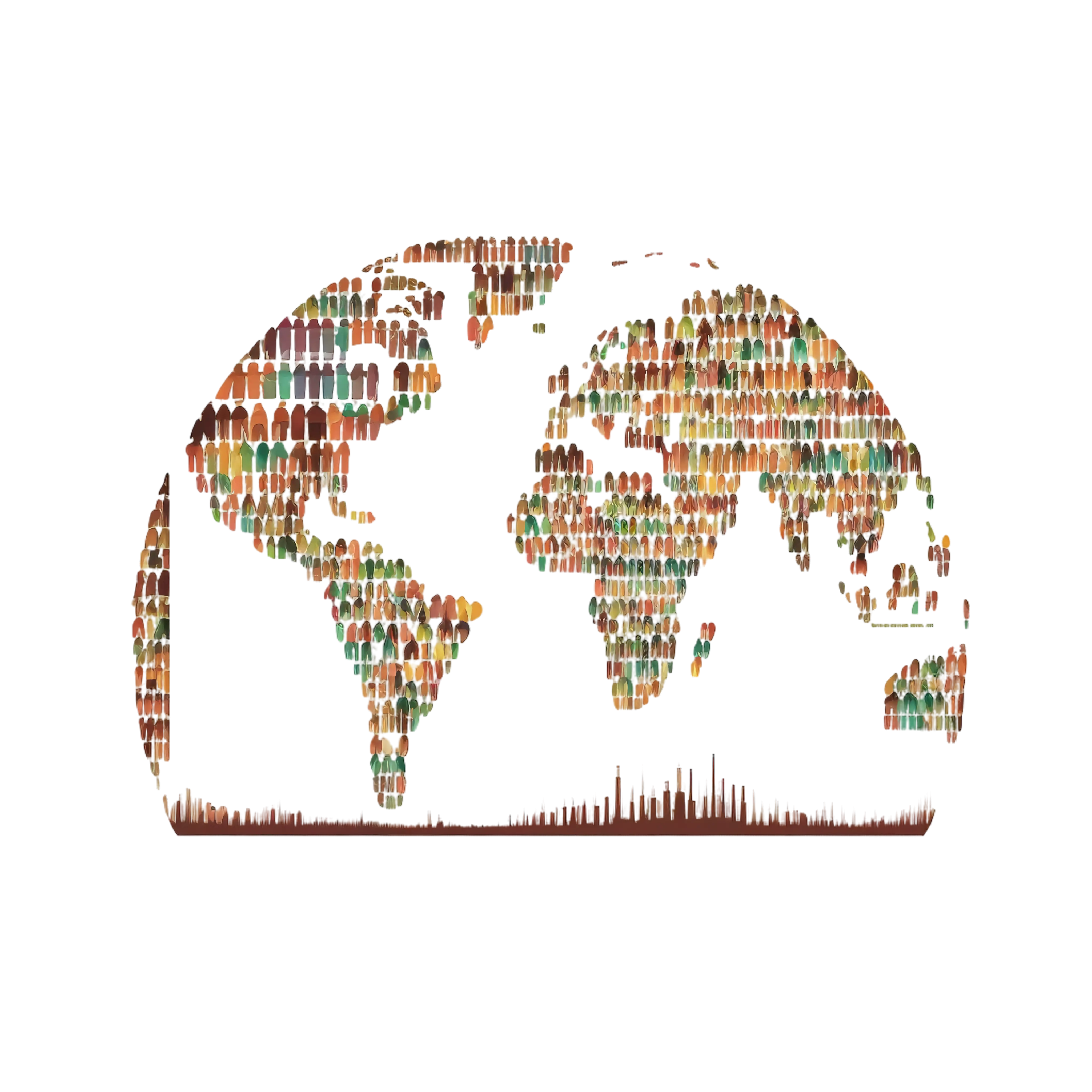
World Map Made of People -
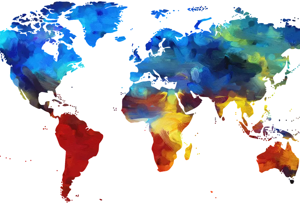
Colorful Watercolor World Map -

Black and Silver World Map Shield -
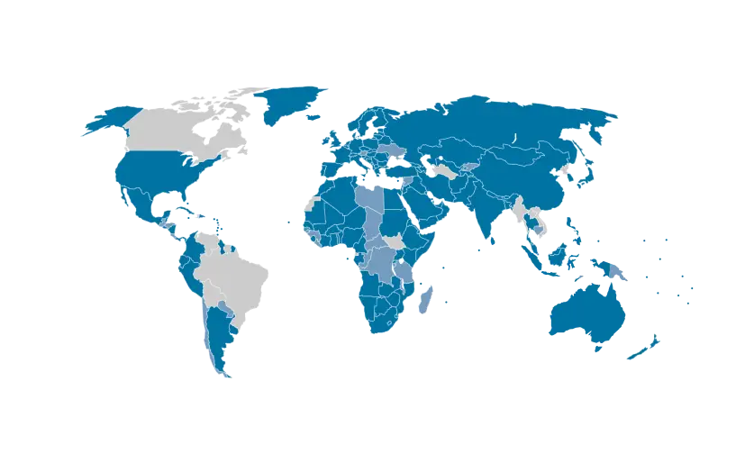
Global Map with Highlighted Regions -
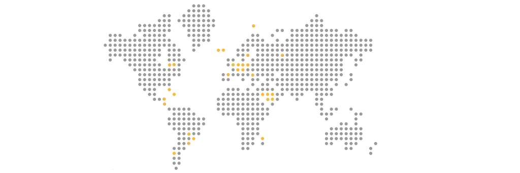
Dotted World Map Illustration -
Blue World Map for Geographical Representation -
Gray World Map Illustration -
Orange Globe -
World Map with Minimalist Gray Design -
Transparent World Map Illustration -
Blue and Grey World Map Illustration