
You Might Like
-

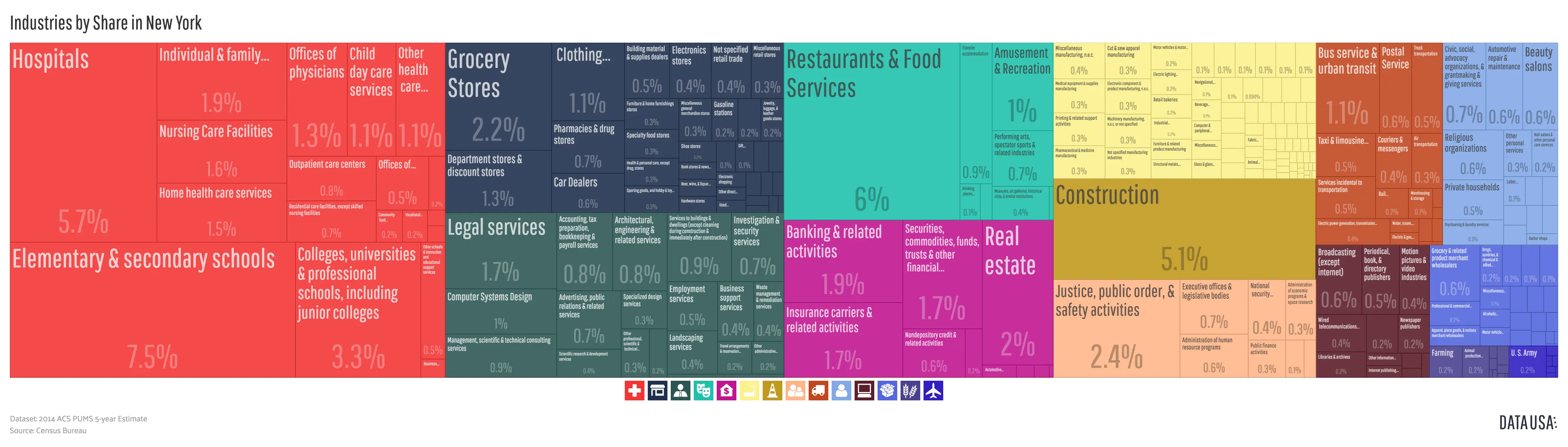
Organizational Structure Chart -

Bar Chart with Upward Arrow -

Infographic Pencil with Data Elements -

Blue Declining Bar Graph with Arrow -

Circle Pie Chart Icon -

Book Icon with Blue Background -

34,046 CPS Appointments Text -

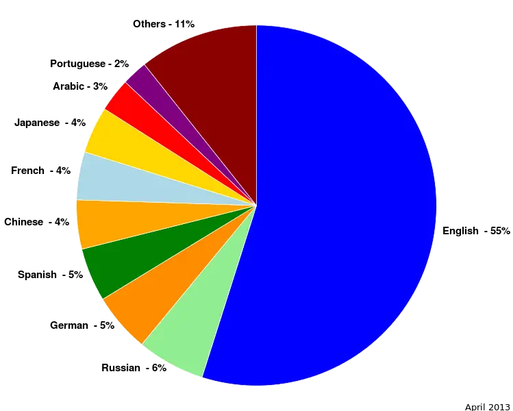
Pie Chart Representation -
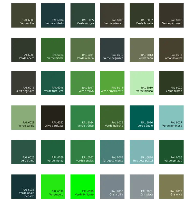
Green Color Palette Chart -

Clipboard Illustration with Financial Chart for Data Analysis -
Colorful Statistical Pie Chart -

Calculator and Chart Icon for Data Analysis -

Green Flowchart Diagram -

Colorful Bar Graph Illustration -

Upward Arrow on Graph -

Colorful Infographic for Data Presentation -

Line Graph for Data Visualization -
Colorful Infographic Data Visualization -

Workspace Setup with Chart and Desk -
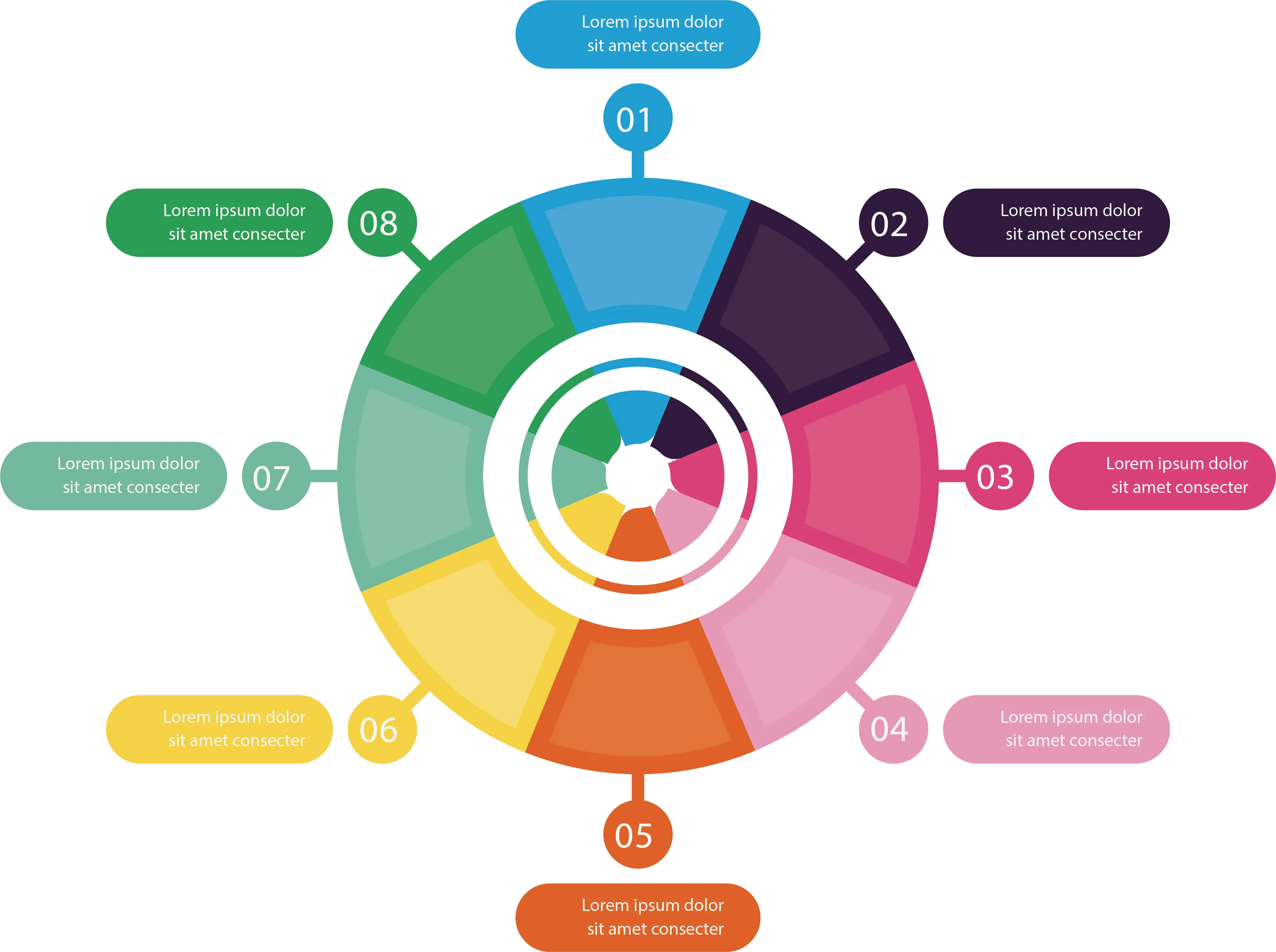
Colorful Infographic Chart -
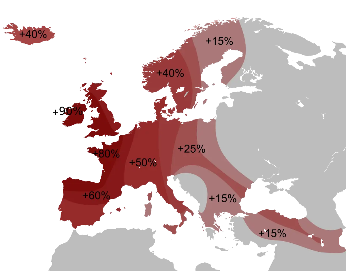
Percentage Map of Europe -

Colorful Circular Chart -

Bar Chart Icon for Data Analysis -

Data Analysis Infographic Design -
Nautical Chart of Samola and Vano -

House Statistics Icon for Real Estate Analytics -

Colorful Descending Bar Graph Illustration -

Tablet with Graphs and Data Analysis -

Data Analysis Icon -

Blue Upward Arrow with Bar Chart Icon