You Might Like
-

Dollar Sign Made of Pills -
Money Bag with Downward Arrows Illustration -

Naira Currency Symbol -

Blue Declining Bar Graph with Arrow -

Euro Symbol with Right Arrow -
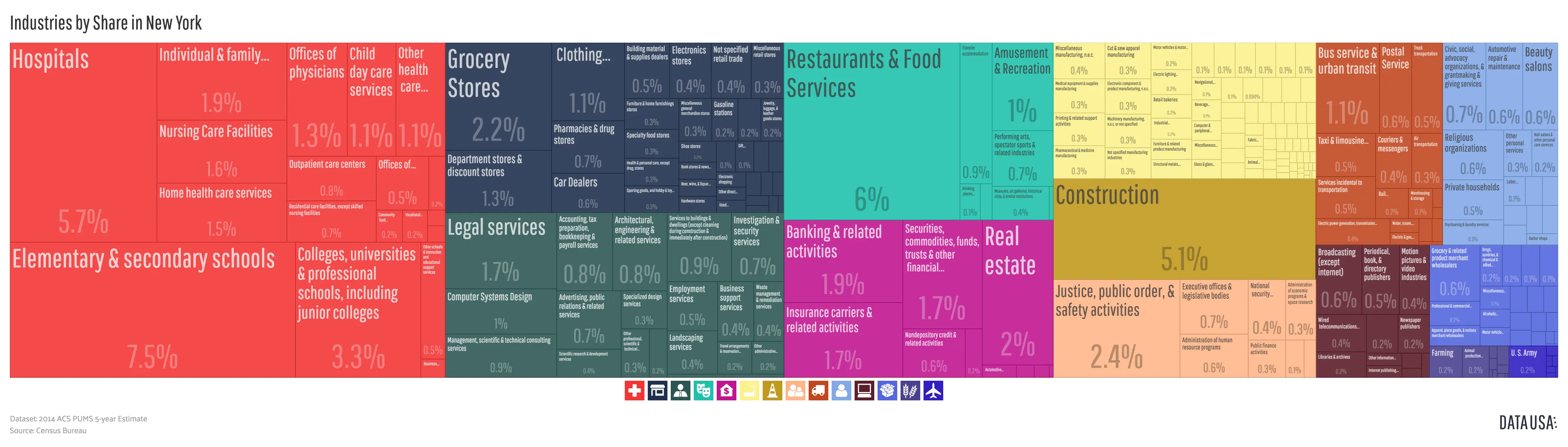
Colorful Infographic Data Visualization -

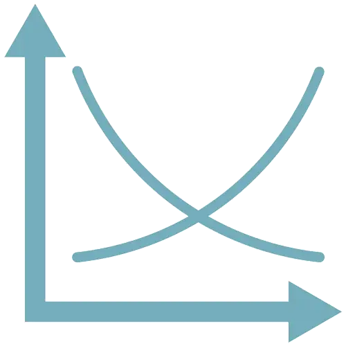
Microeconomics Graph with Curves -

Tightrope Walker with Stick -

Black Balance Scale Illustration -

Work-Life Balance Concept -
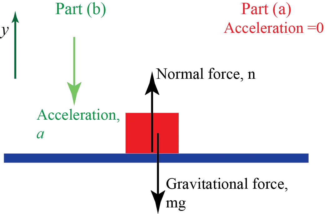
Physics Free Body Diagram with Forces -
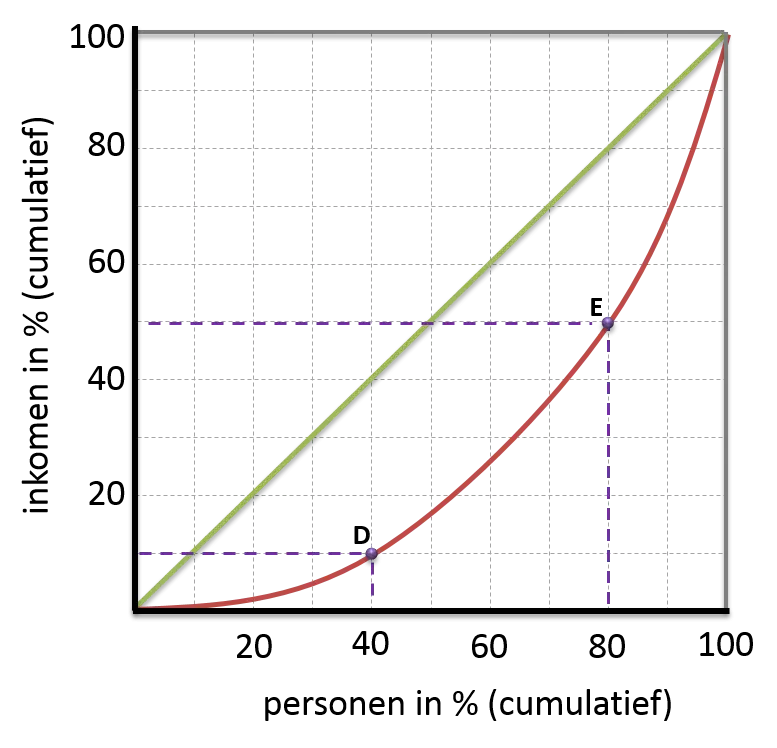
Lorenz Curve for Income Distribution -

Golden Balance Scale Illustration -
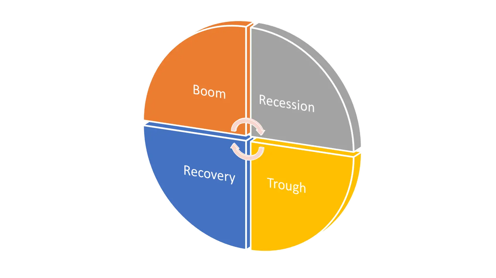
Economic Cycle Diagram -

Balance Scale with Bread and Apple -
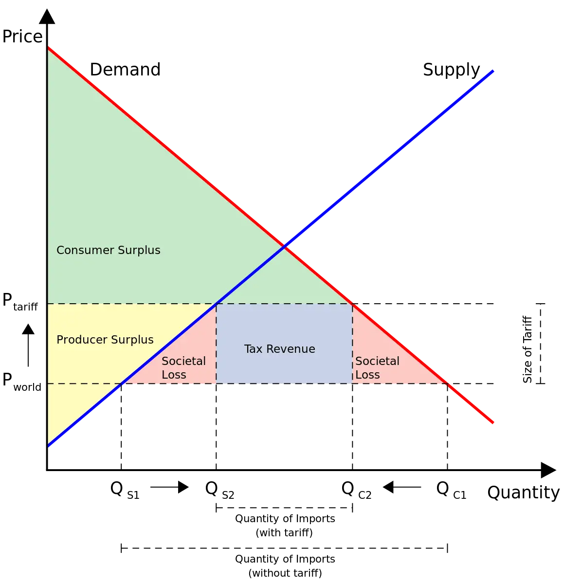
Supply and Demand Graph with Tariff -
Illustration of a Balance Scale for Justice -
Icons Set Representing Economic and Financial Concepts -

Balancing Brain and Heart Concept -

Network Design Decisions Diagram -

Figure Balancing on Orange Arrow -

Figure Balancing on a Seesaw with Dollar Sign -
Supply and Demand Graph for Economics Education -
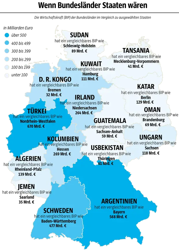
Germany Map with Economic Comparisons -

Black Round Speaker for Audio Output -

Black Balance Scales Graphic -
Canon Black Photo Printer with Output Sheet -
Balance Scale -

Yin Yang Symbol for Balance -
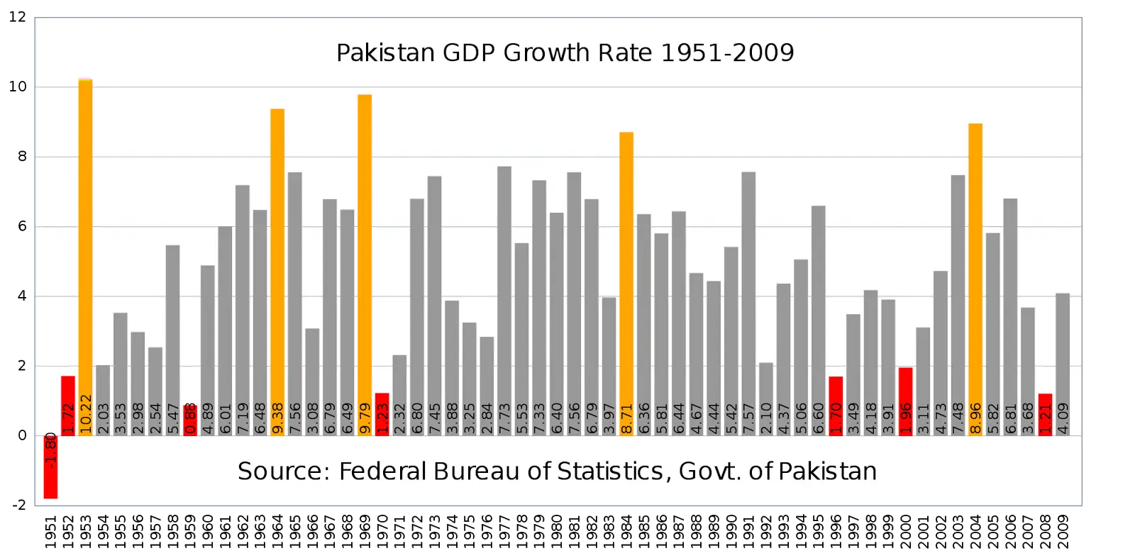
Pakistan GDP Growth Rate Chart from 1951 to 2009