You Might Like
-

Dollar Sign Made of Pills -

Money Bag with Downward Arrows Illustration -

Naira Currency Symbol -

Blue Declining Bar Graph with Arrow -

Euro Symbol with Right Arrow -

Colorful Infographic Data Visualization -

Microeconomics Graph with Curves -

Economic Graph Depicting GDP vs AE -

Yellow Adhesive Tape Roll Illustration -

Blue Toilet Paper Roll Illustration -

Black Ink Bottle -

Lorenz Curve for Income Distribution -

Tablet with Trading Charts -

Blue Adhesive Tape Roll -

White Toilet Paper Roll Stack -

Yellow Spool of Thread for Sewing -

Icons Set Representing Economic and Financial Concepts -

Network Design Decisions Diagram -

Group Protest Illustration with Signs -

Black Marker Icon for Stationery -

White Stationery Erasers -

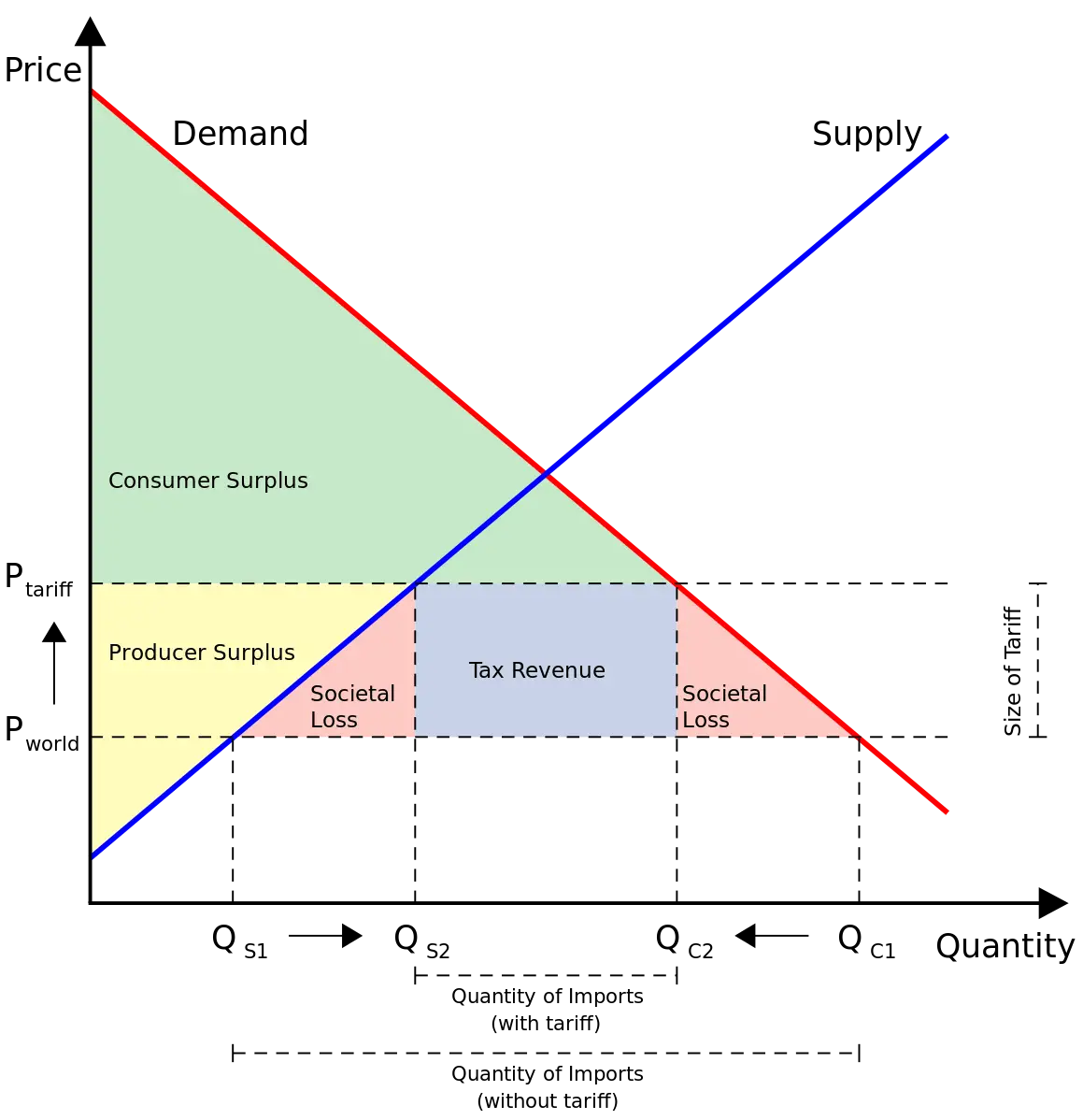
Supply and Demand Graph for Economics Education -
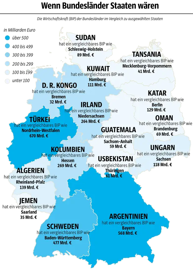
Germany Map with Economic Comparisons -

Business Finance and Statistics Illustration -

Retail Management Diagram -

Graph with Speculator and Hedger Text -

Green Tape Dispenser Illustration -

Stock Market Trading Chart -

Buy and Sell Trading Chart -

Blue Push Pin for Office Use