You Might Like
-
Blue Audio Soundwave Line Graphic -
Oscilloscope Machine with Signal Display -

Audacity Logo -

Magnifying Glass with Wave Line Icon -
Wave Pattern Graph Illustration -
Yellow Circular Logo with Abstract Red and Black Design -

Soundwave Graphic for Audio Visualization -

Green Zigzag Line Illustration -
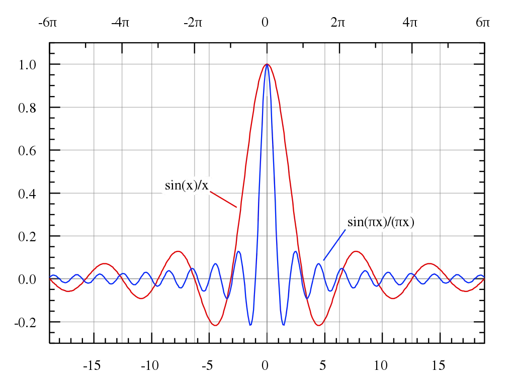
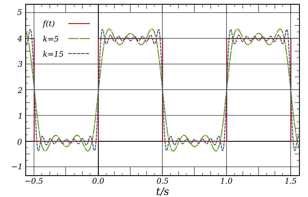
Mathematical Line Graph Representation -

Sound Wave Line Representation -
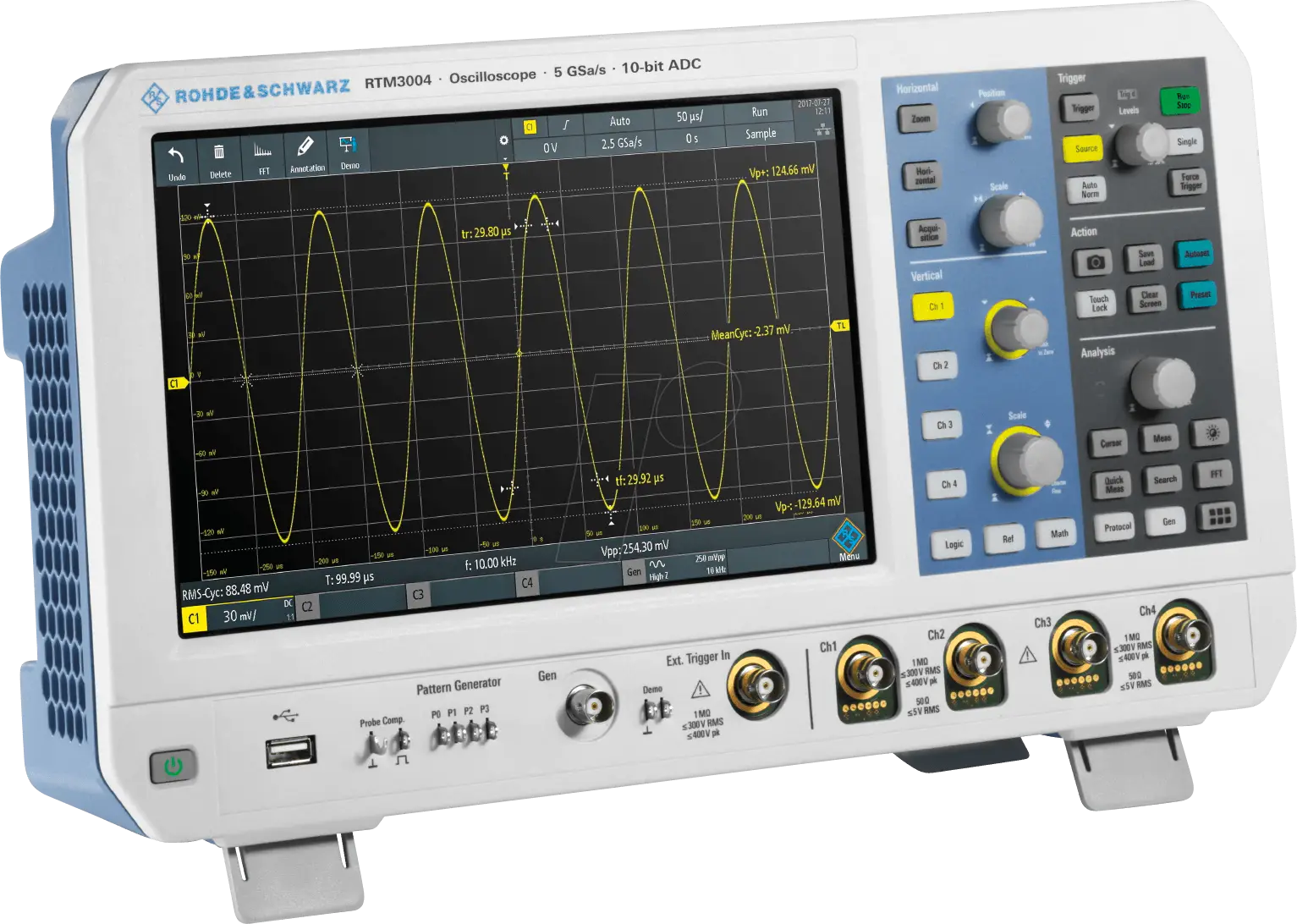
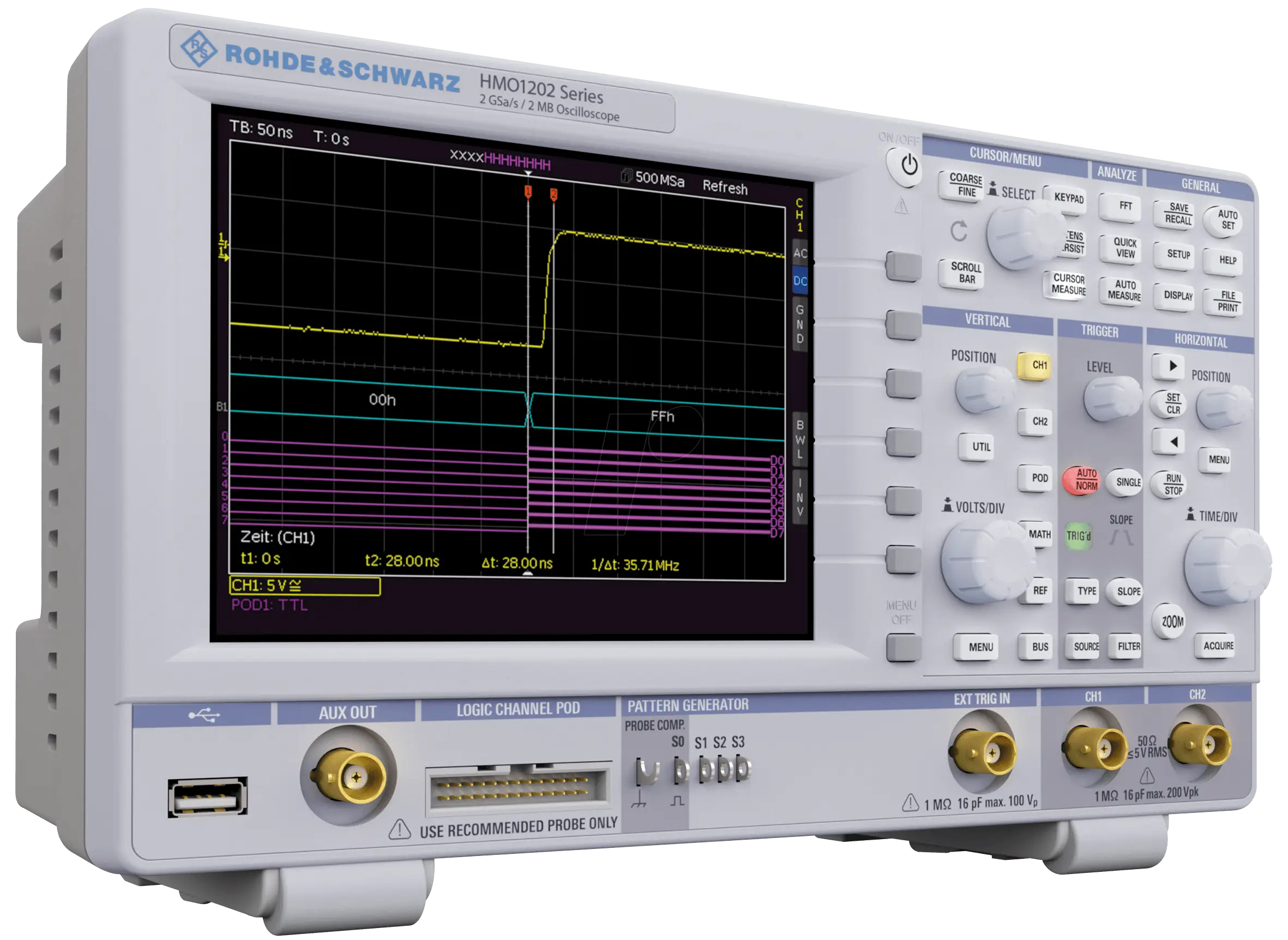
Oscilloscope for Electronic Measurements -
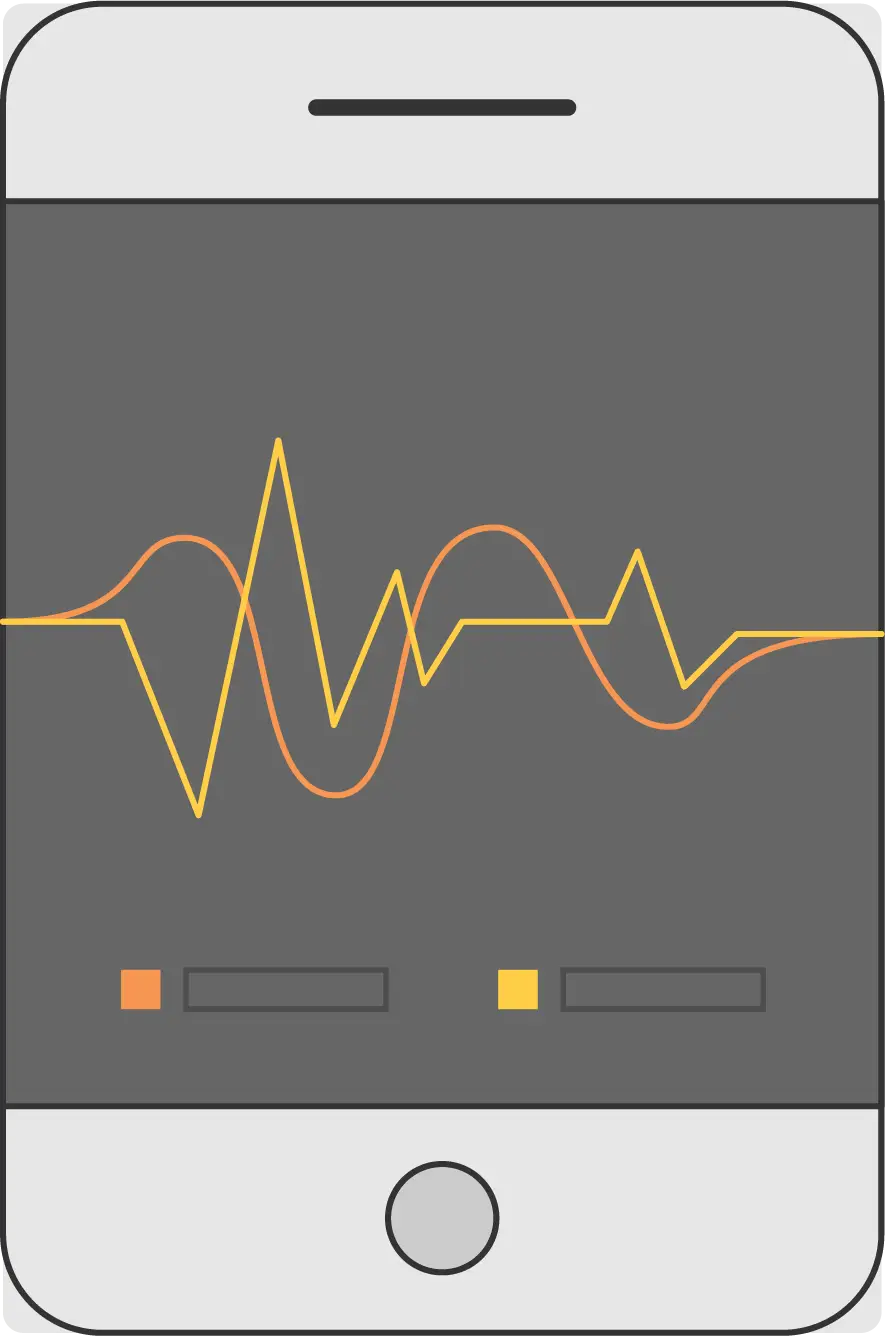
Smartphone with Graph Display -
Waveform Graph Representation -
Green Waveform -

Voice Wave Icon -
Black Heartbeat Icon -

Sound Wave Icon -
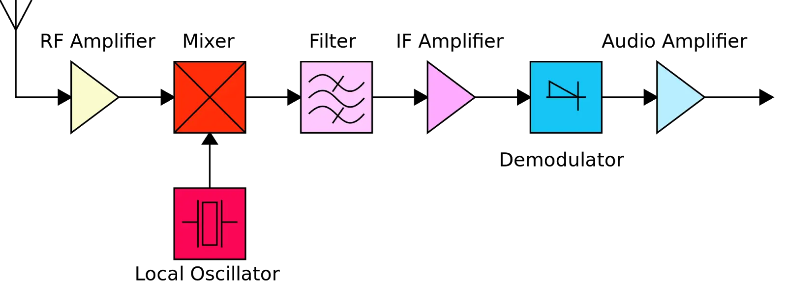
Radio Signal Processing Circuit Diagram -

Sound Wave Graphic Representation -

Data Filtering Icon -
Sound Waves Illustration -
Abstract 3D Peak Artwork with Gradient Colors -
Heartbeat Line Medical Graphic Illustration -

Sound Waveform Representation in Gray -
Headphones with Audio Waves -

Voice and Soundwave Symbol -

Digital Computer Screen Icon in Blue Circle -
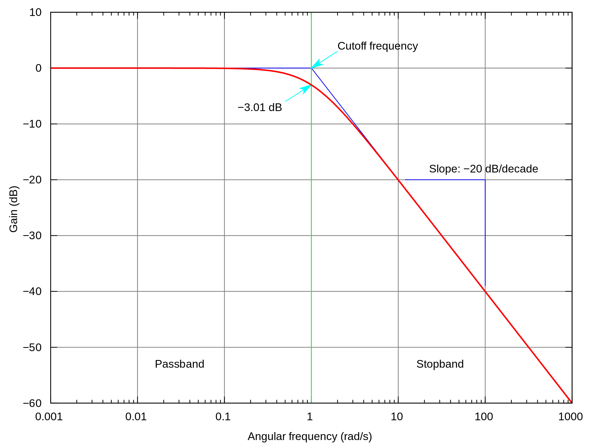
Frequency Response Graph Illustration -
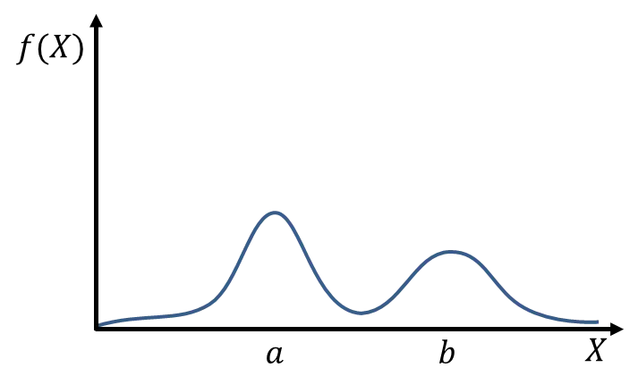
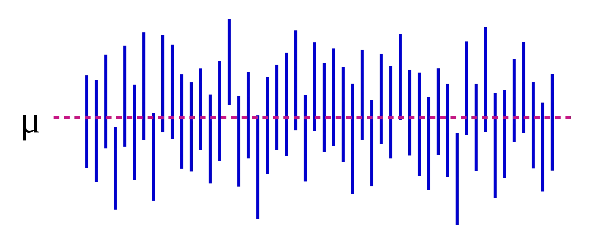
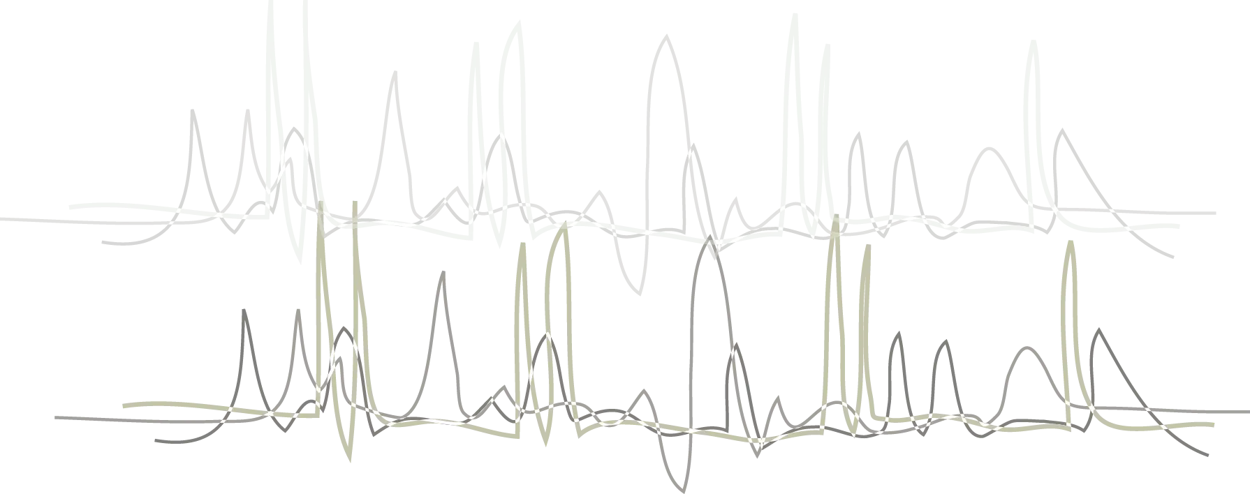
Graph with Variable Peaks and Function Plotting -
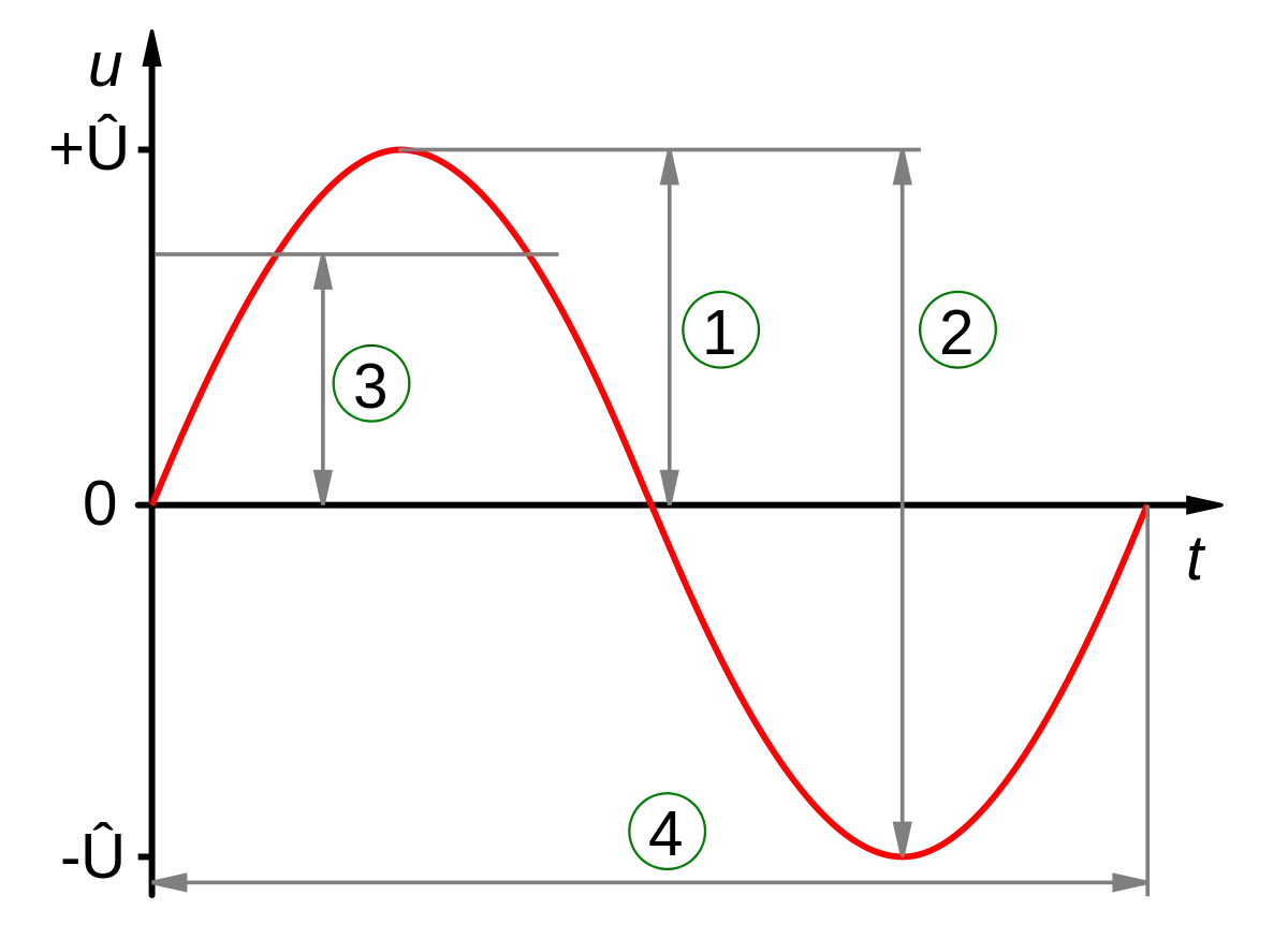
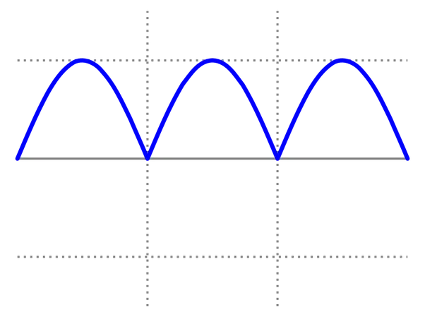
Graph of Sine Wave with Marked Points