You Might Like
-

Cognitive Psychology Components Diagram -

Infographic Pencil with Data Elements -

Blue Declining Bar Graph with Arrow -

Circle Pie Chart Icon -

Python Logo for Programming Enthusiasts -

34,046 CPS Appointments Text -

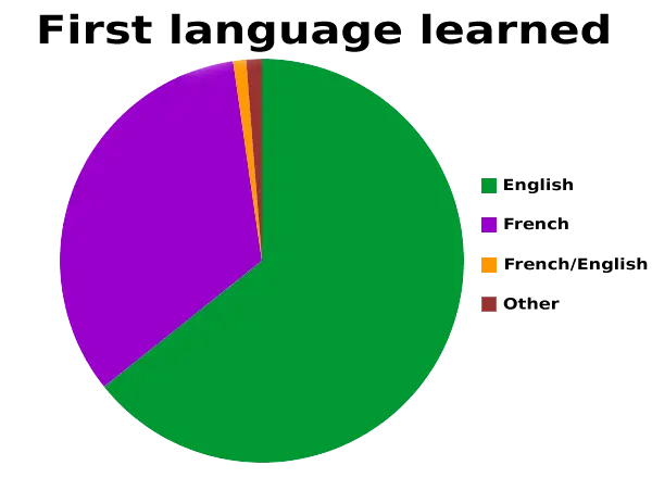
Pie Chart Representation -
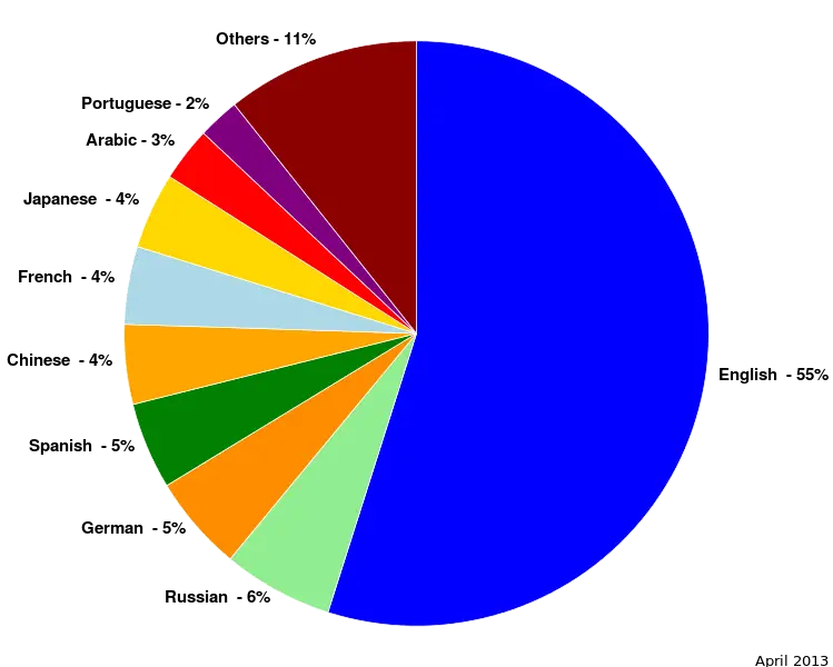
Colorful Statistical Pie Chart -

Calculator and Chart Icon for Data Analysis -

Line Graph for Data Visualization -
Colorful Infographic Data Visualization -

Book Titled 'Exactly What to Say' -

Writing for IELTS Book -
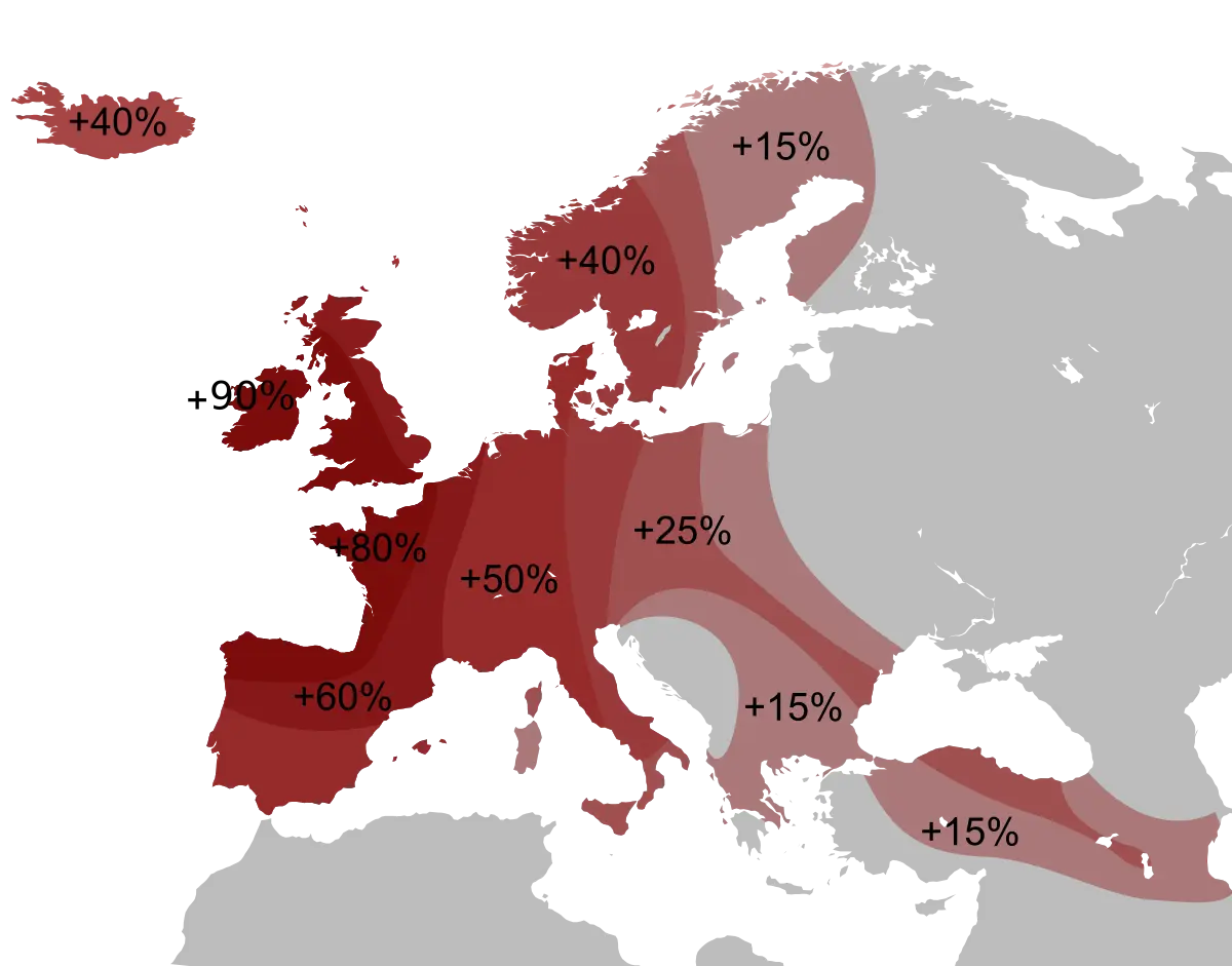
Percentage Map of Europe -
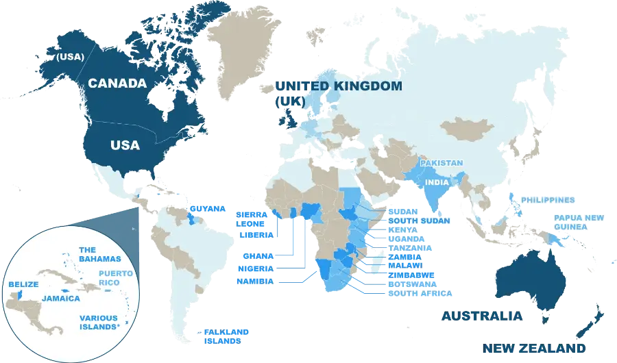
World Map Highlighting English-Speaking Countries -

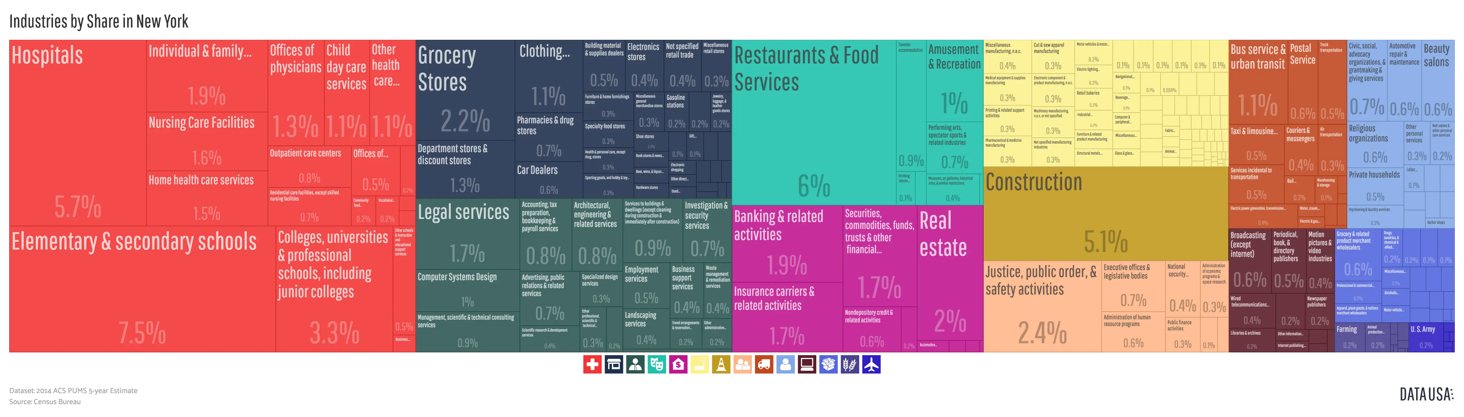
Data Analysis Infographic Design -

House Statistics Icon for Real Estate Analytics -

Tablet with Graphs and Data Analysis -

Data Analysis Icon -

Blue Upward Arrow with Bar Chart Icon -

Data Analysis Document with Magnifying Glass -
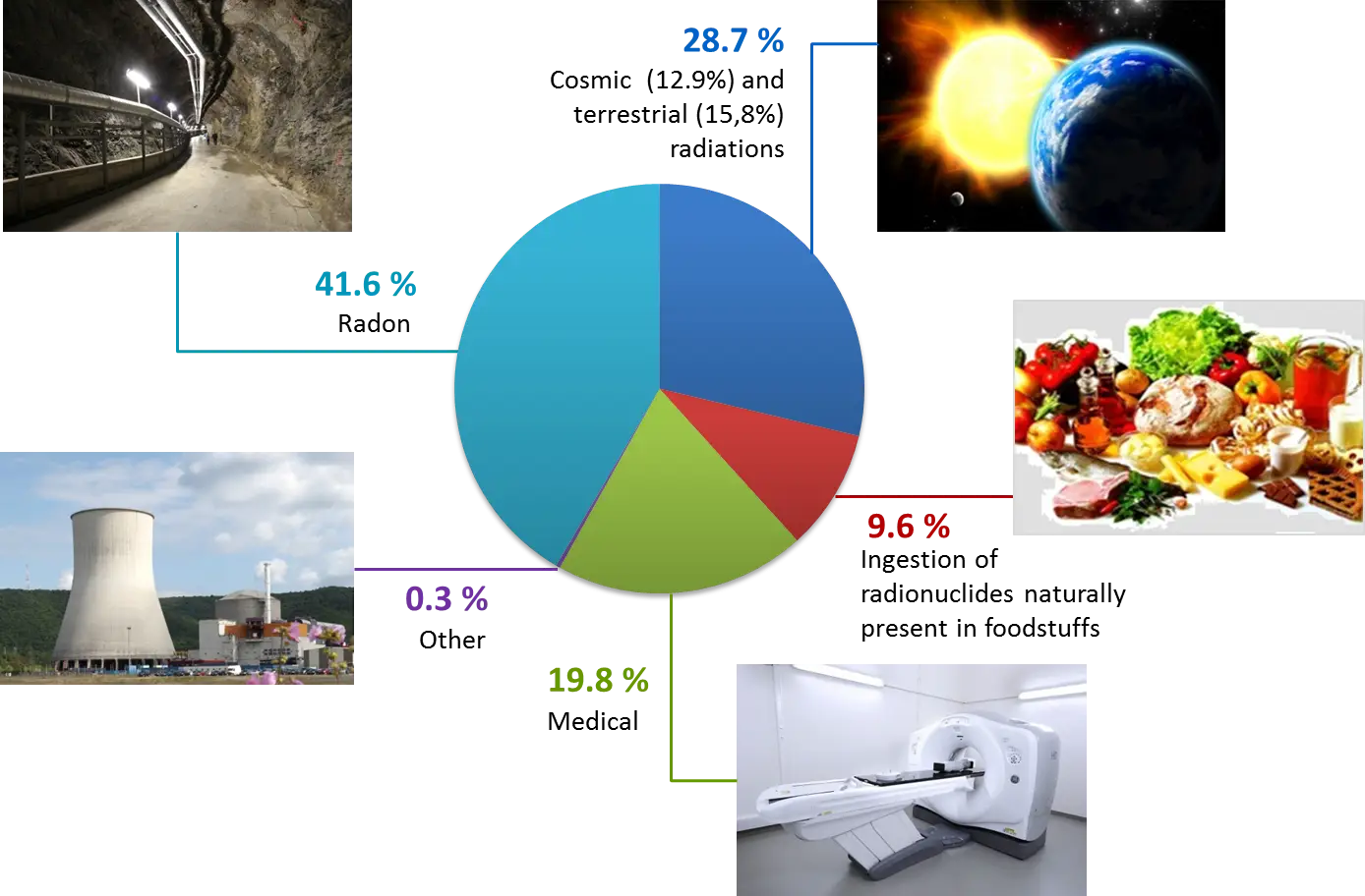
Radiation Sources Pie Chart Infographic -
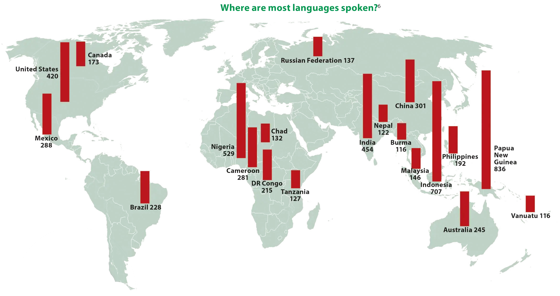
World Map Showing Language Distribution -

Data Analysis Bar Chart on Monitor -

Typography: Letters with Accents -

Blue and Gray Editable World Map -

Language Translation Bubbles Icon -
Colorful Bar Chart Infographic -
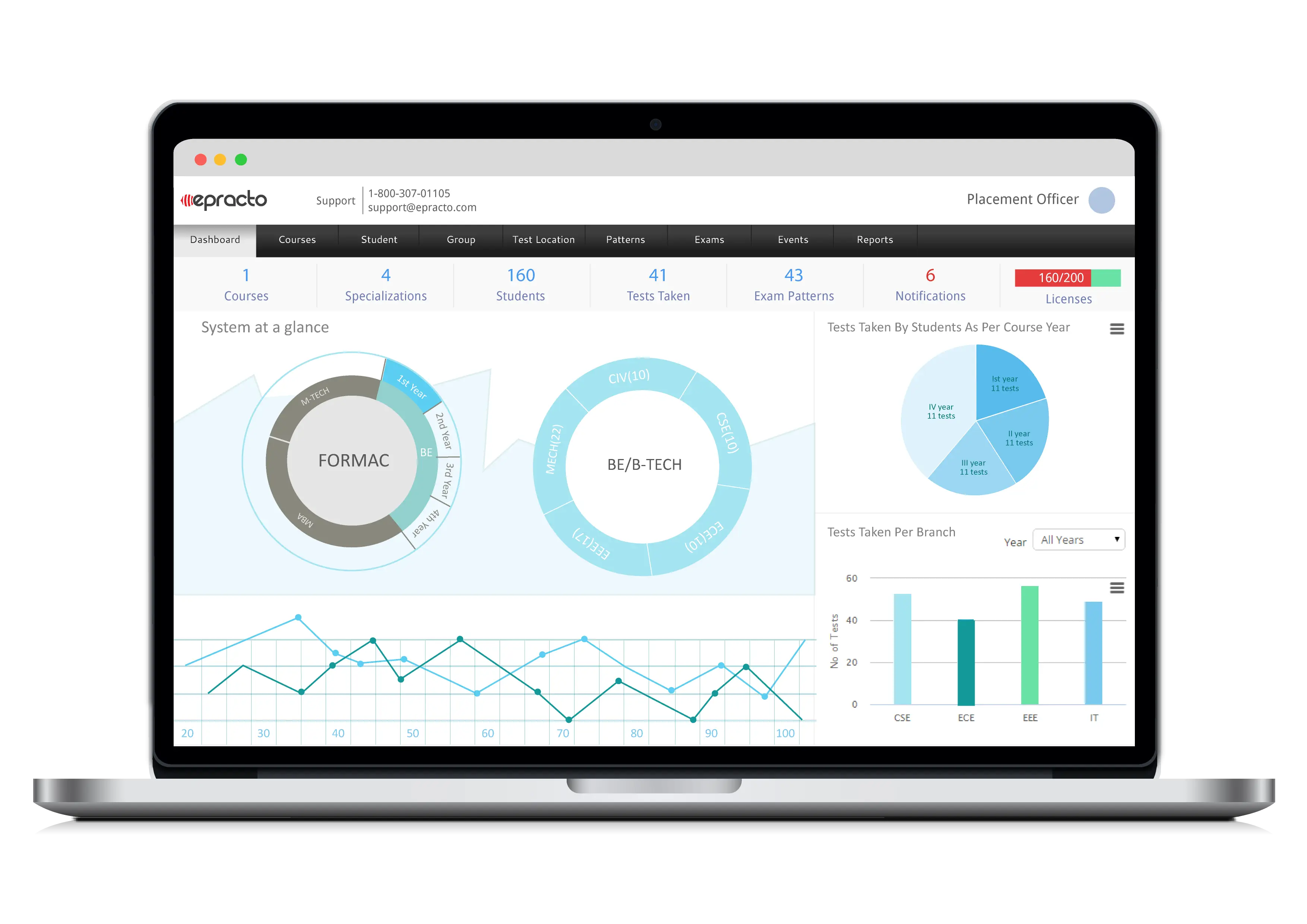
Data Charts on Laptop Screen Business Dashboard -

Tax Pie Chart Illustration