You Might Like
-

Infographic Pencil with Data Elements -

Circle Pie Chart Icon -

Book Icon with Blue Background -

Pie Chart Representation -

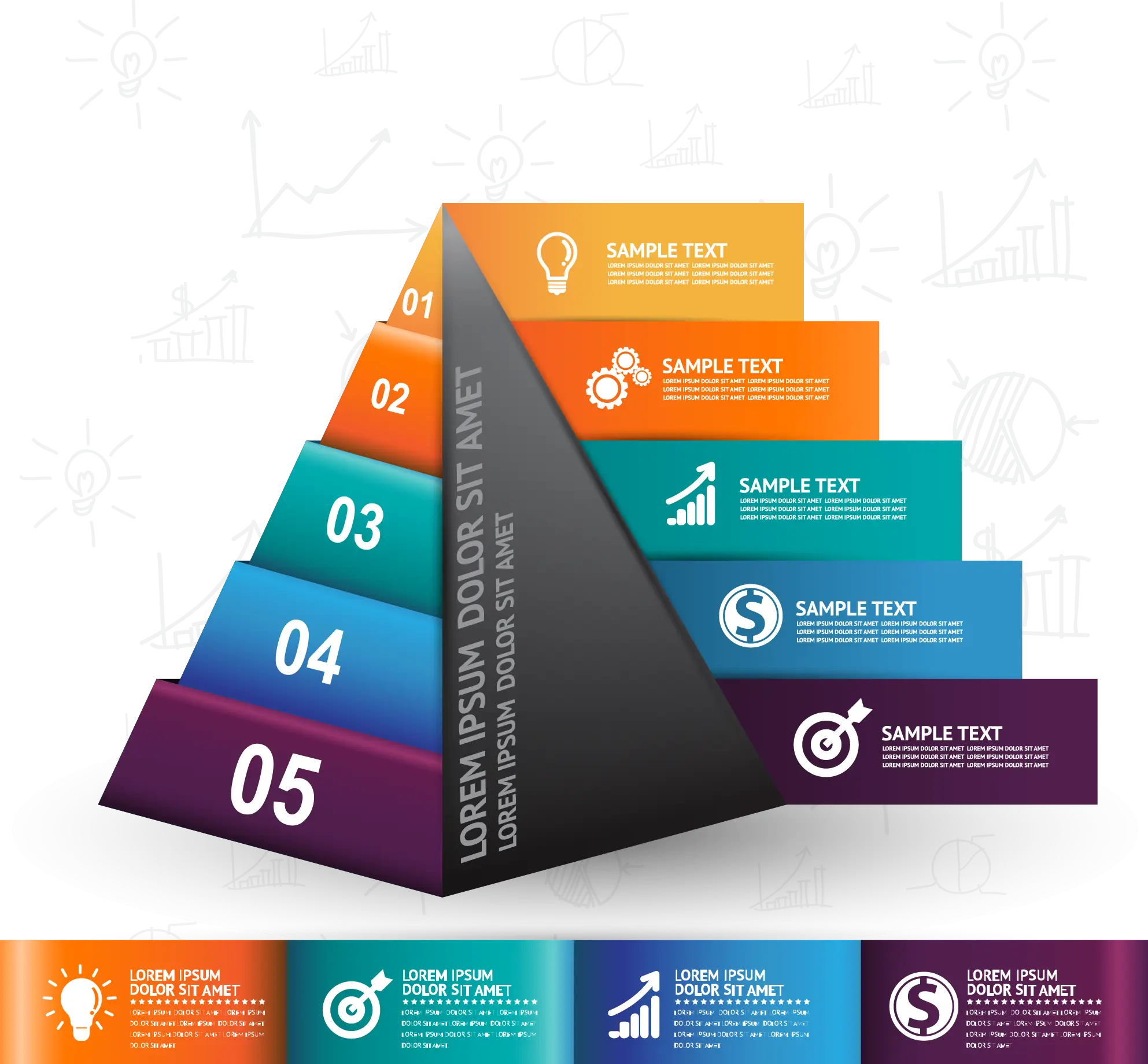
Timeline Infographic Design -
Colorful Infographic for Data Presentation -
Colorful Infographic Data Visualization -
Colorful Infographic Chart -
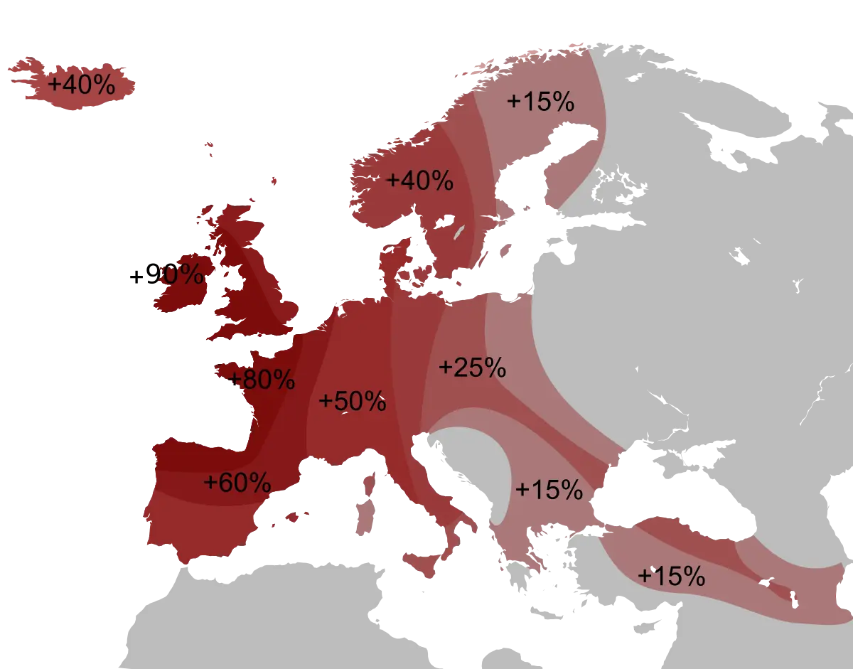
Percentage Map of Europe -

Key Considerations Infographic -
Colorful Infographic Diagram -
Colorful Circular Chart -

Bar Chart Icon for Data Analysis -

Data Analysis Icon -
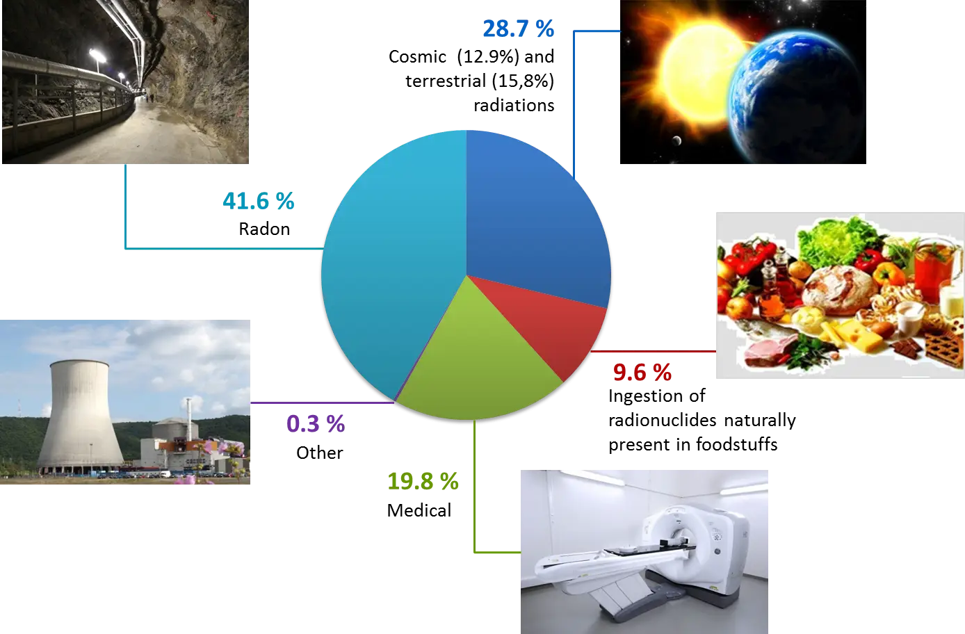
Radiation Sources Pie Chart Infographic -

Hexagon Numbered Infographic Template -
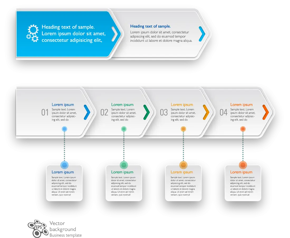
Infographic Arrows with Steps -
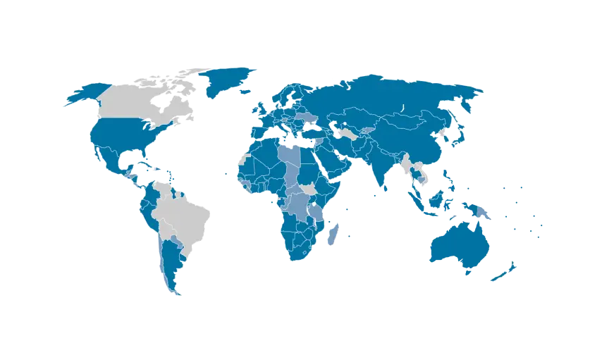
Blue and Gray Editable World Map -
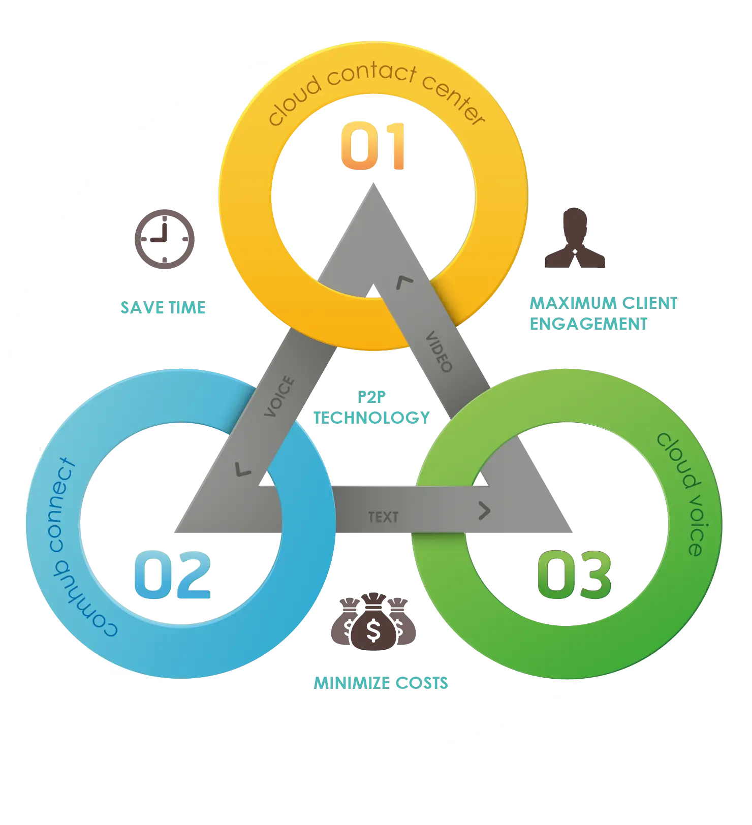
Colorful Infographic Diagram -
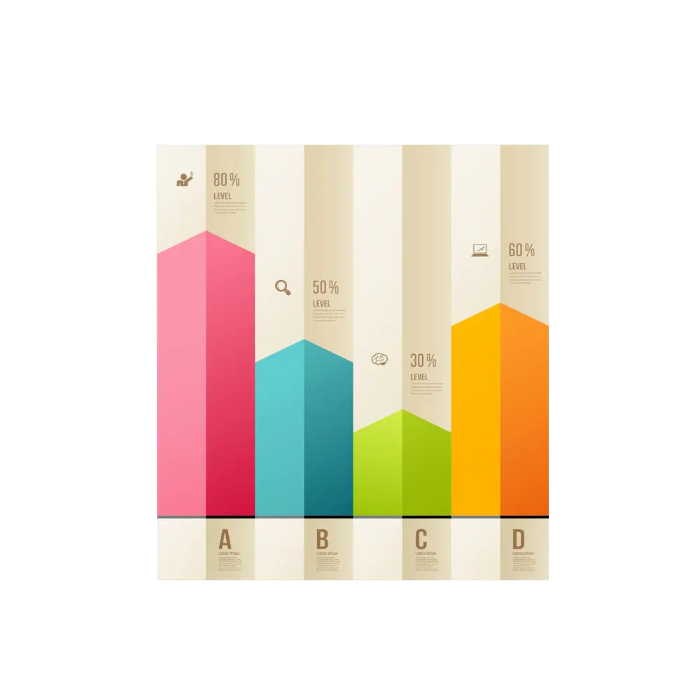
Colorful Bar Chart Infographic -
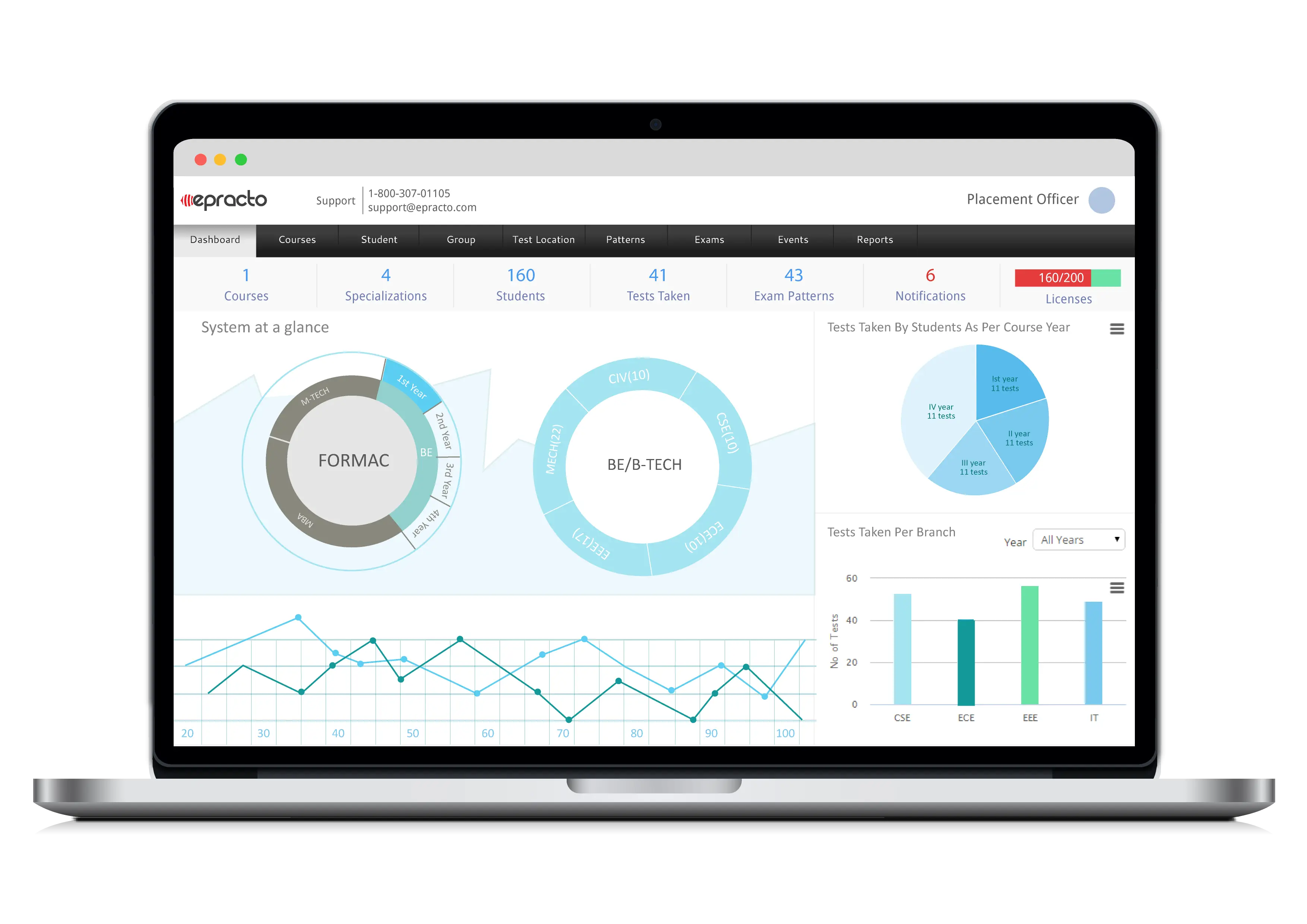
Data Charts on Laptop Screen Business Dashboard -

Simple Blue Bar Graph Chart Illustration -

Mathematical Function Graph with Highlighted Area -

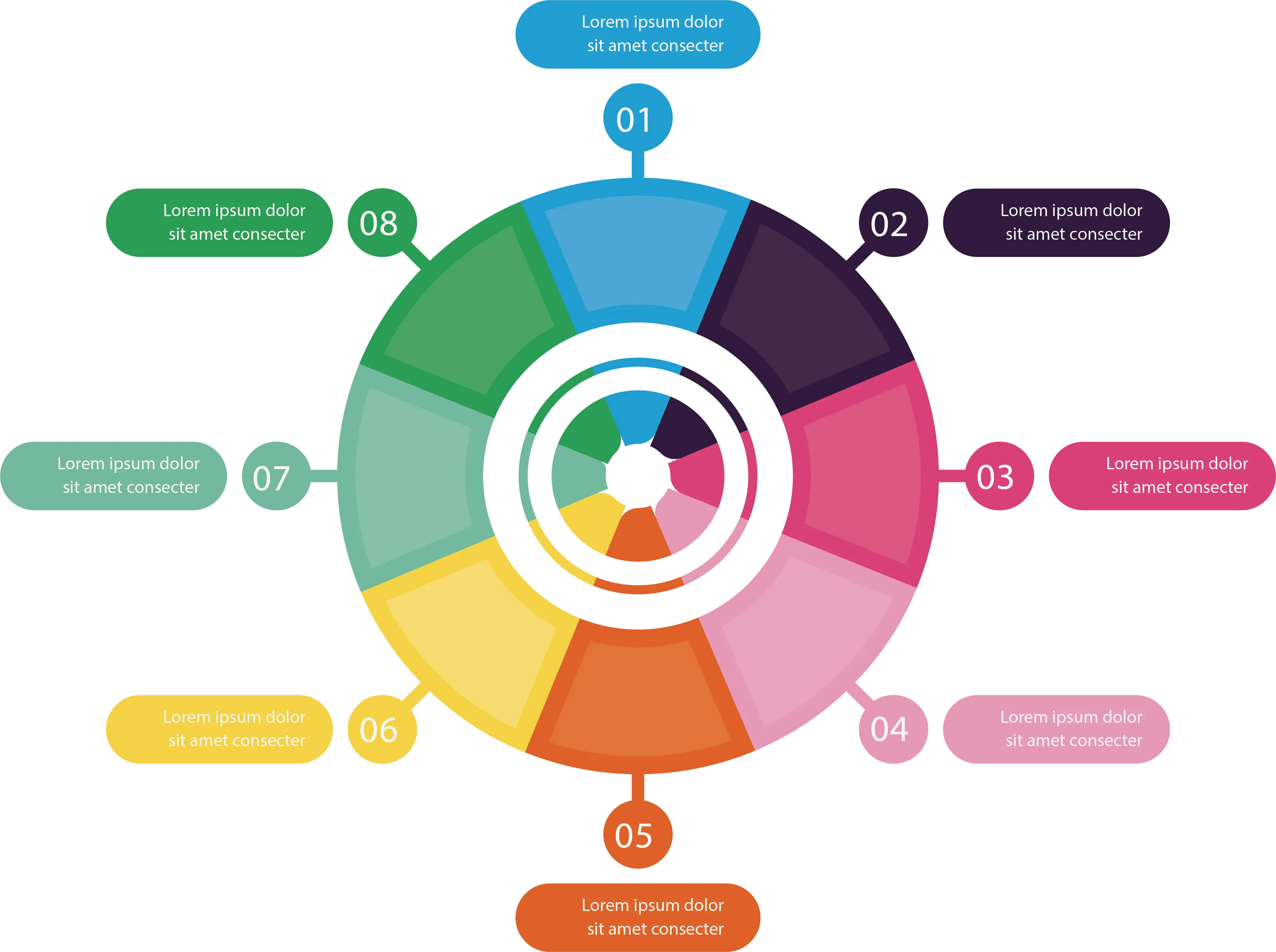
Infographic with Circular Elements -

Hierarchical Structure Diagram -
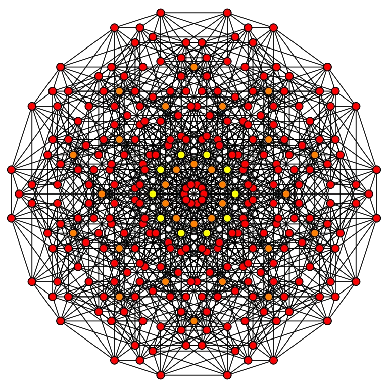
Complex Network Structure with Interconnected Nodes -
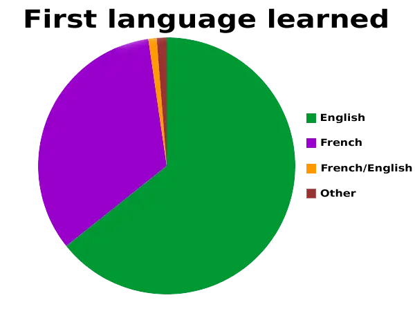
First Language Learned Pie Chart -

Influencer Marketing Infographic -

Simple Circular Progress Bar Design -

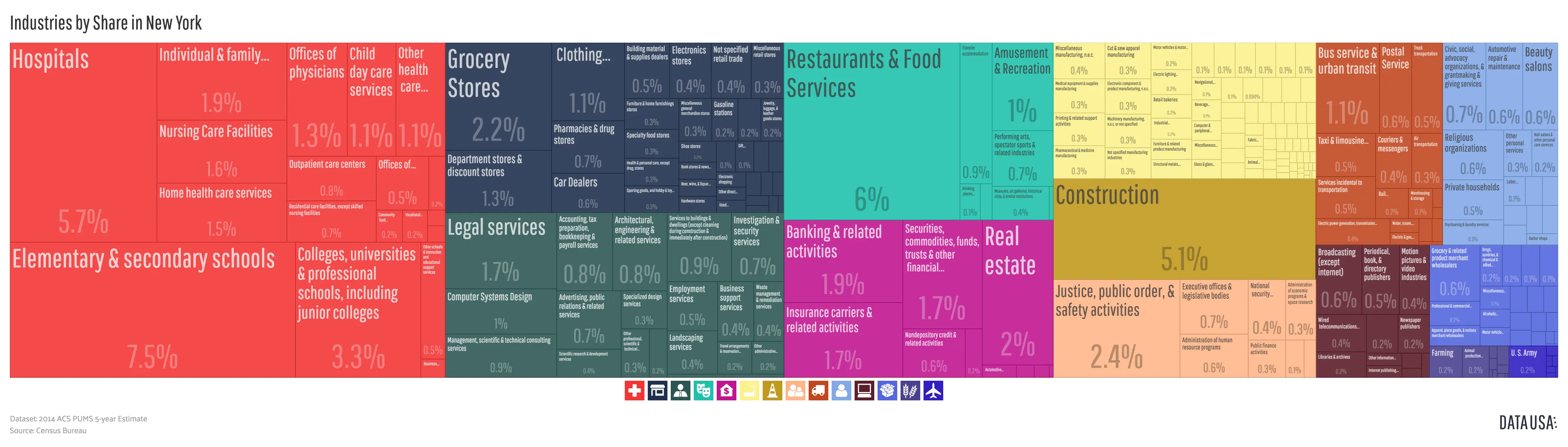
Colorful Infographic Chart