You Might Like
-

Infographic Pencil with Data Elements -

Tablet with Graphs and Data Analysis -

Data Analysis Icon -

Data Analysis Bar Chart on Monitor -
Blue and Gray Editable World Map -
Colorful Bar Chart Infographic -
Data Charts on Laptop Screen Business Dashboard -
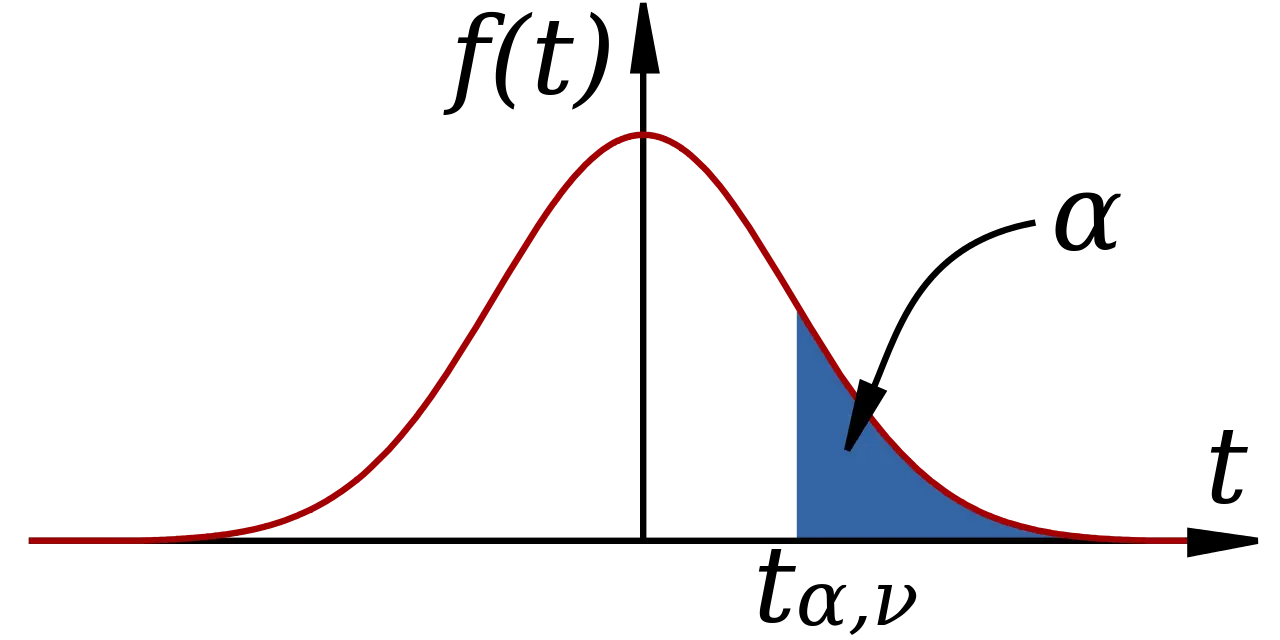
Mathematical Function Graph with Highlighted Area -

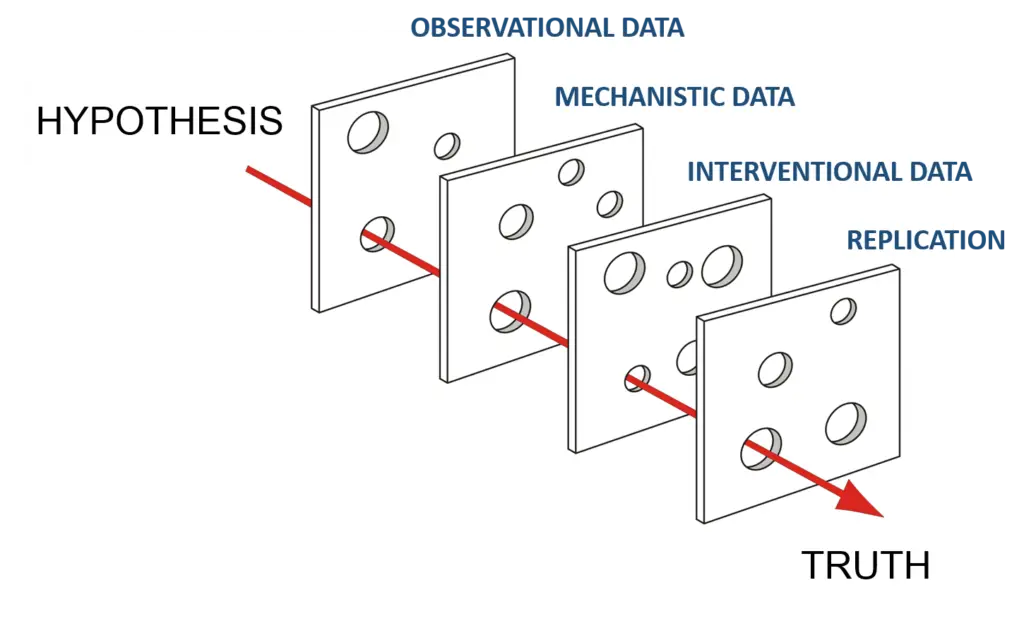
Hierarchical Structure Diagram -
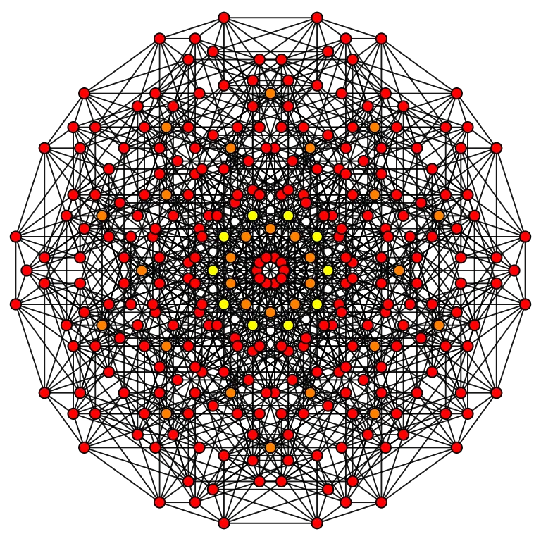
Complex Network Structure with Interconnected Nodes -
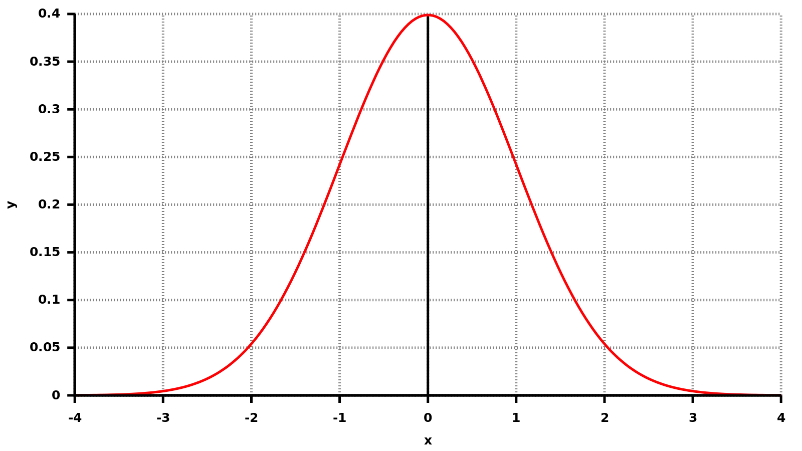
Bell Curve Graph for Statistics -
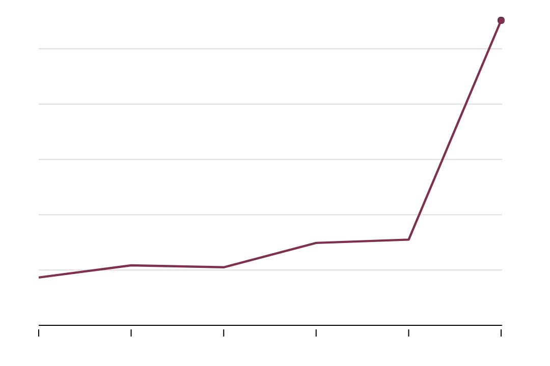
Line Graph Showing a Rising Data Trend -
First Language Learned Pie Chart -

Simple Circular Progress Bar Design -

Colorful Infographic Chart -

Simple Pie Chart -
3D Colorful Graph Chart for Data Representation -

Person Analyzing Data -

Dotted World Map Illustration -
Magic Square Number Puzzle -
Modern Desktop Computer with Data on Screen -

Line Graph with Data Points and Trends -

Data Analytics and Visualization Illustration -

Clock Diagram with Numbers -

Dark Theme Pie Chart Illustration -

Computer with Analytical Graphs -
Data Analysis Diagram -
Pink Bar Chart Icon for Data Analysis -
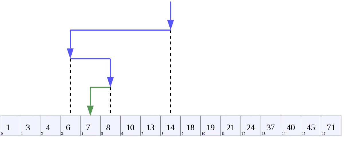
Number Line with Arrows for Educational Purposes -
Colorful Bar Graph for Data Analysis