You Might Like
-

Infographic Pencil with Data Elements -
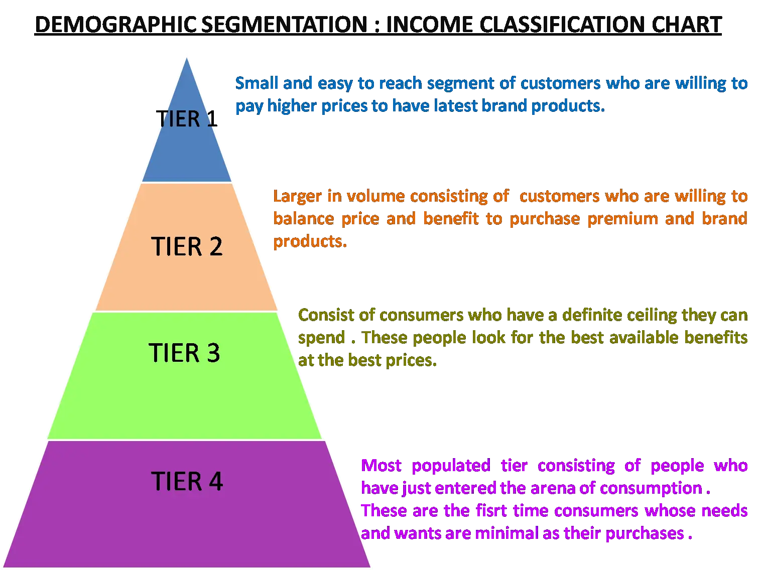
Demographic Segmentation Income Chart -

Data Analysis Icon -
Blue and Gray Editable World Map -
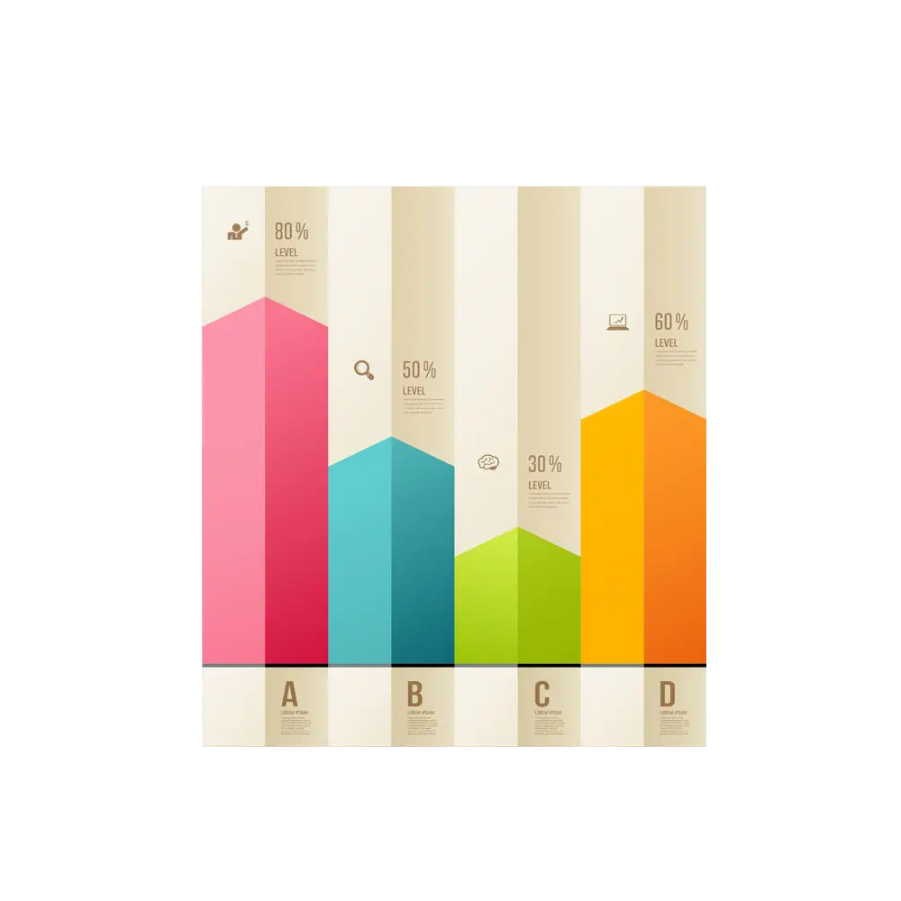
Colorful Bar Chart Infographic -
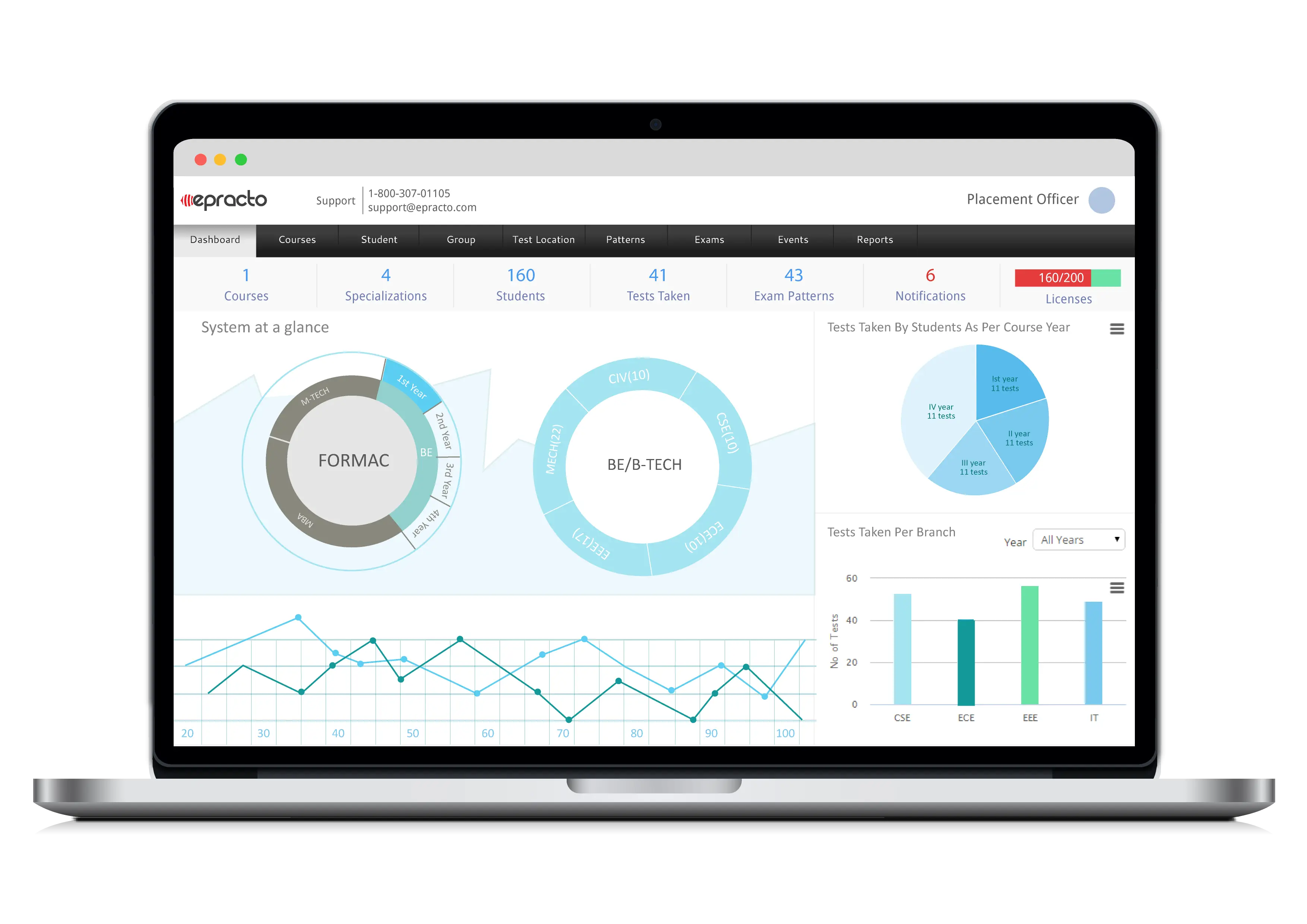
Data Charts on Laptop Screen Business Dashboard -
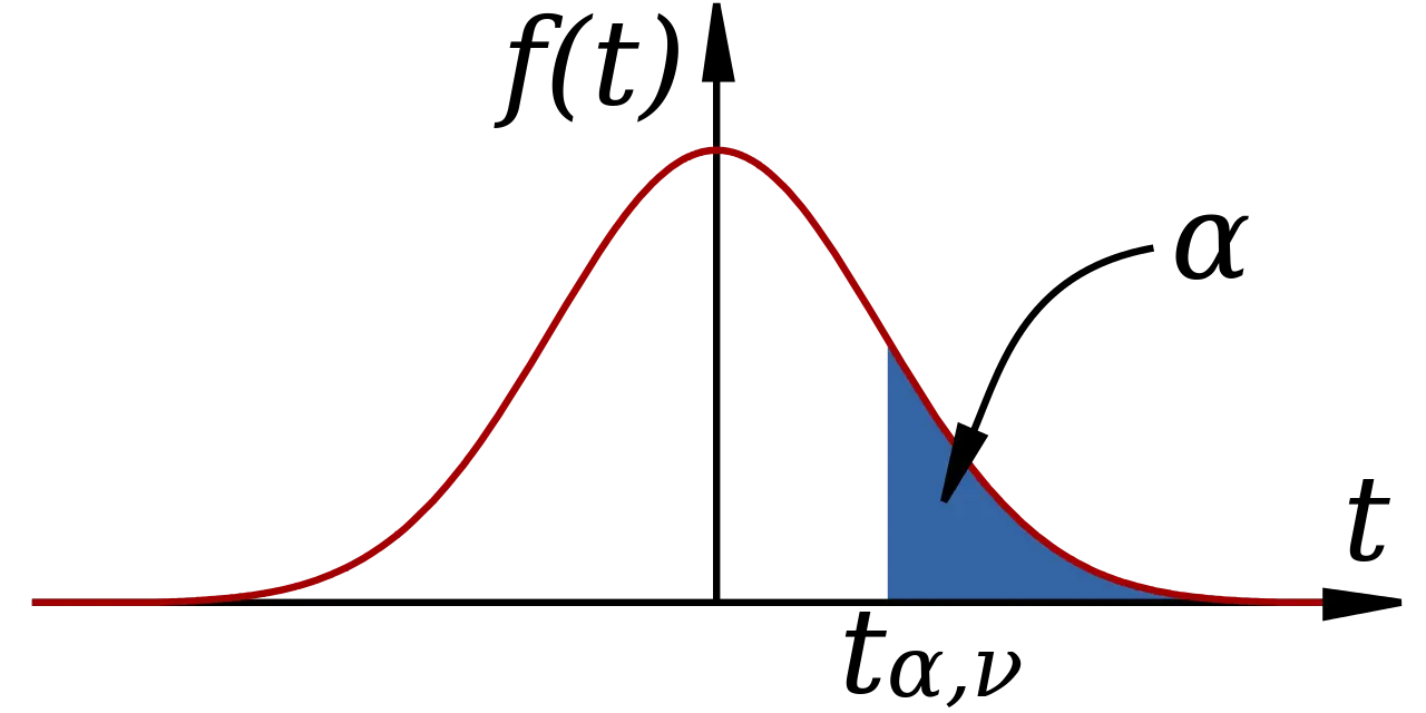
Mathematical Function Graph with Highlighted Area -

Hierarchical Structure Diagram -

Complex Network Structure with Interconnected Nodes -
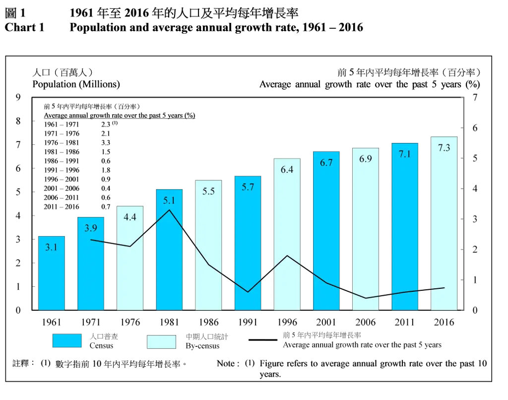
Population and Average Annual Growth Rate Chart -
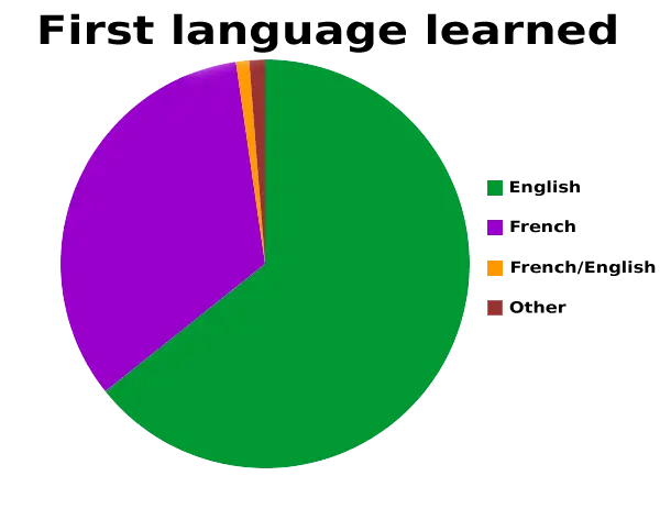
First Language Learned Pie Chart -

Simple Circular Progress Bar Design -

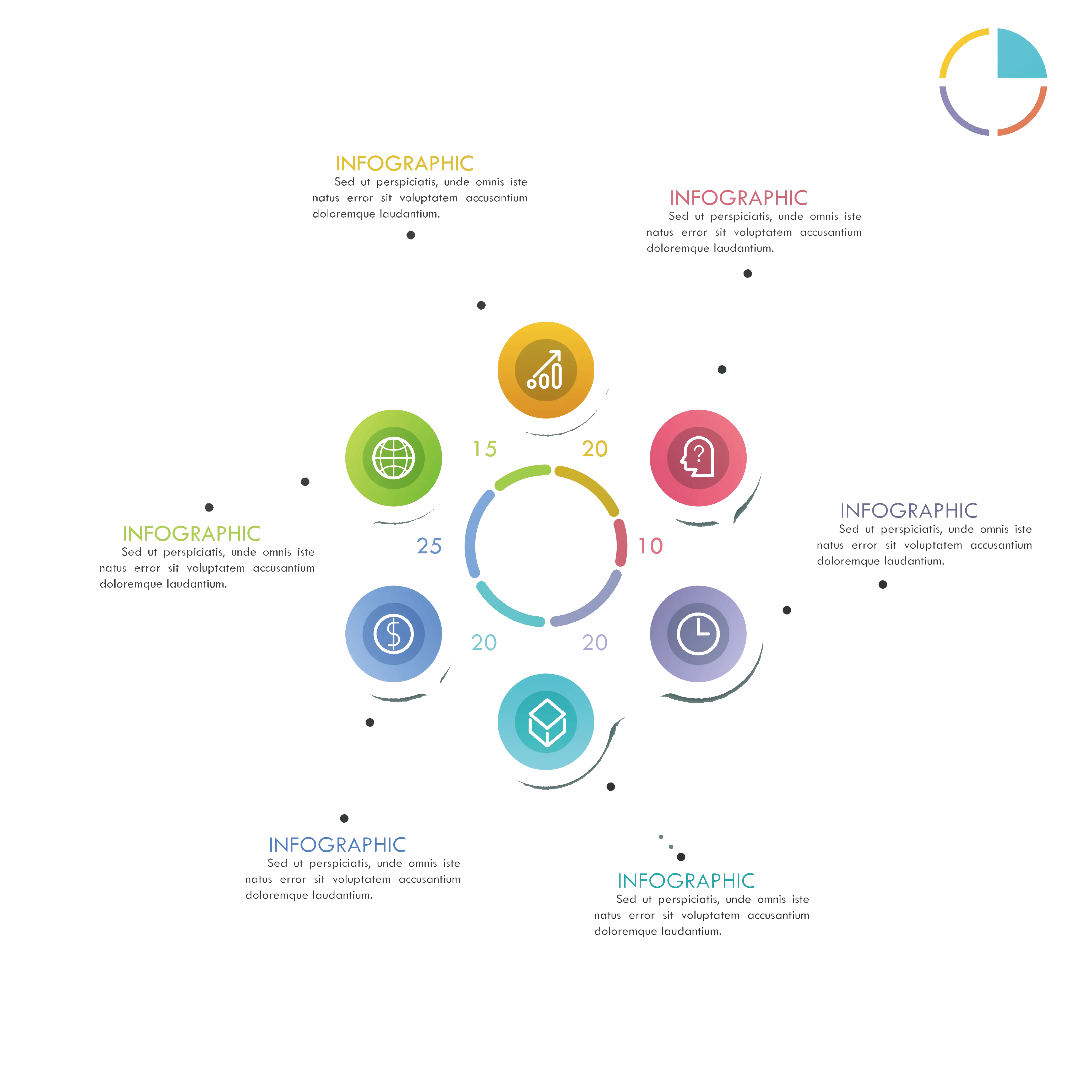
Colorful Infographic Chart -

Simple Pie Chart -
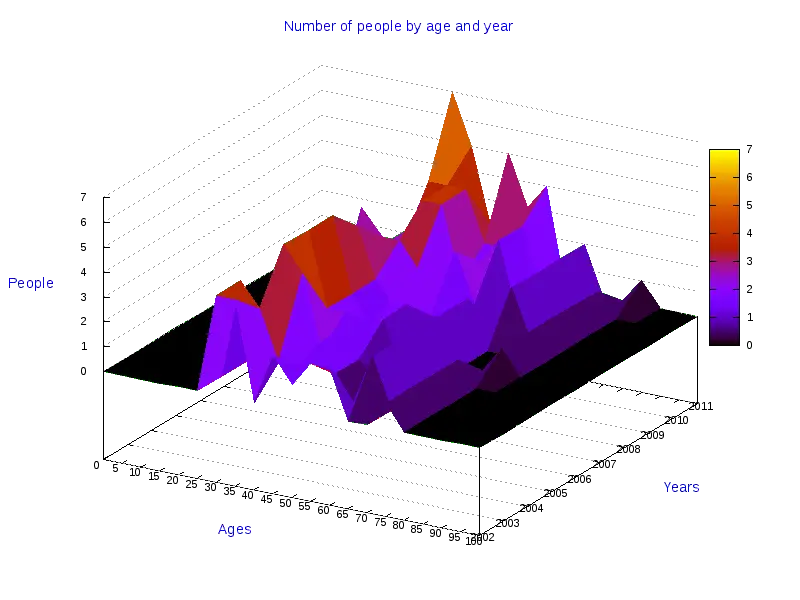
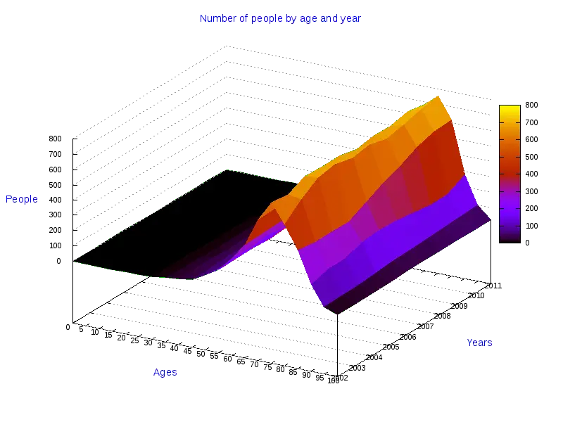
3D Colorful Graph Chart for Data Representation -

Dotted World Map Illustration -

Line Graph with Data Points and Trends -

Data Analytics and Visualization Illustration -

Dark Theme Pie Chart Illustration -

Computer with Cloud and Data Visualization -

Black spiral chart symbolizing data visualization -

Simple Bar Chart Illustration -
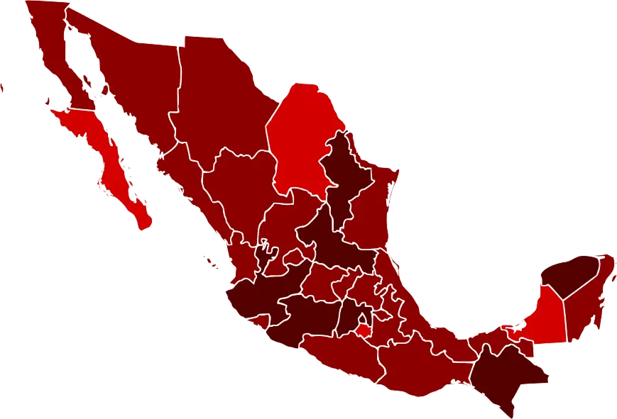
Map of Mexico with Regions Highlighted -

Colorful Circular Chart for Data Visualization -

Geometric Flow Diagram with Connected Shapes -

Colorful Stacked Rectangular Blocks Illustration -
Monochrome Pie Chart for Simple Data Representation -
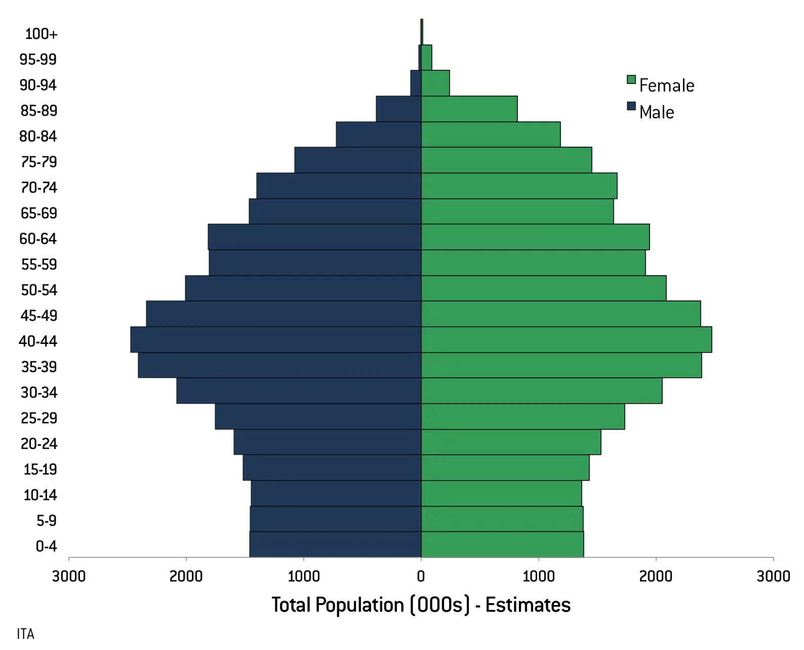
Population Pyramid Graph Showing Age Range Distribution -
Infographic Chart for Data Visualization -
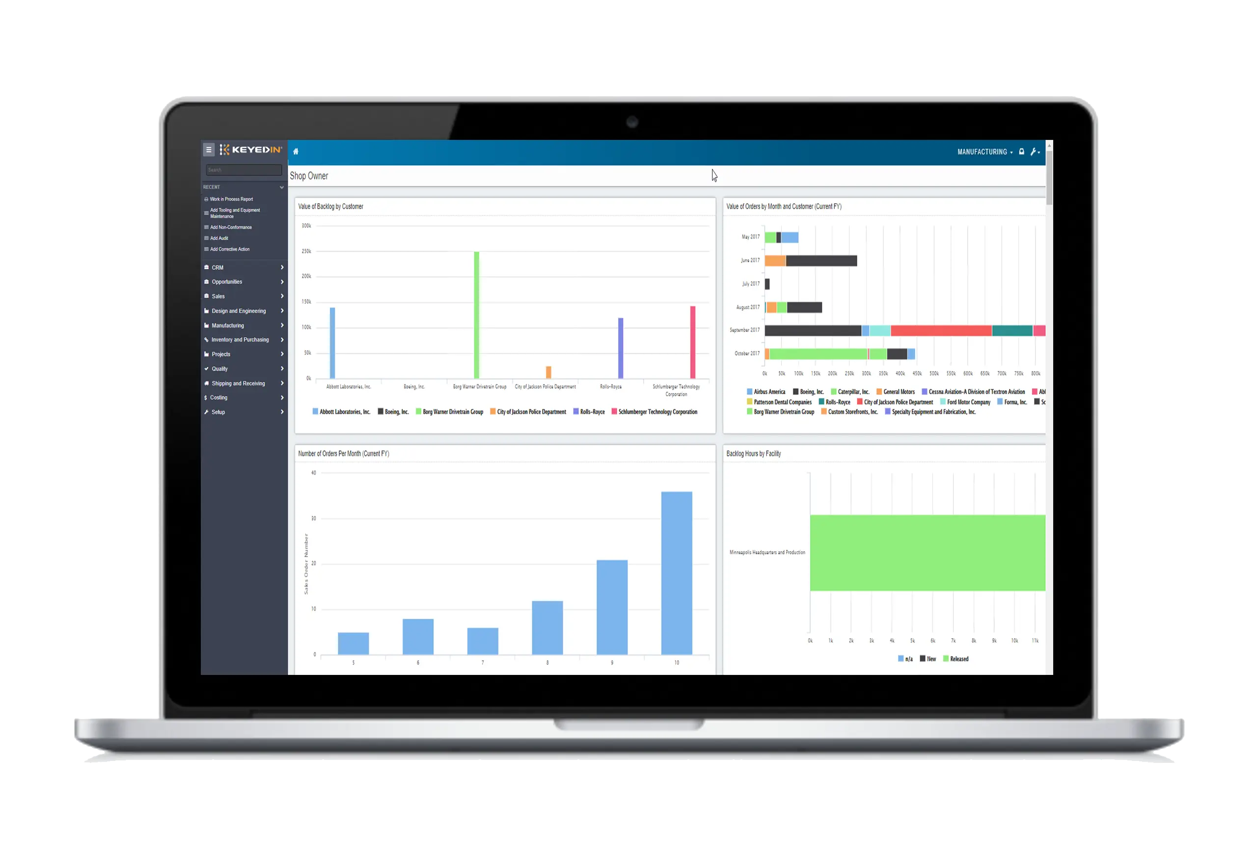
Laptop Displaying Data Analytics Dashboard